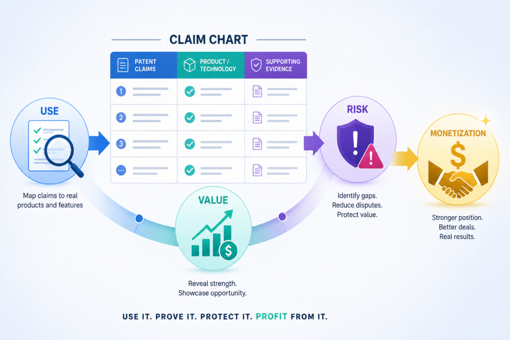
A patent can look strong on paper, but buyers, partners, and investors want something more direct. They want to see what the patent covers, who may be using it, and why it matters in the real world. That is where a claim chart helps.
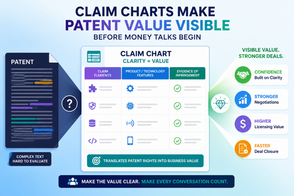
Claim charts make patent value visible before money talks begin
A patent by itself is not always easy to sell, license, or explain. It may cover a strong invention, but the value can stay hidden if the reader has to work too hard to understand it.
This is a real problem when a founder wants to talk with a possible licensee, buyer, partner, or investor.
A claim chart fixes that problem by turning a hard-to-read patent claim into a clear business story.
It shows what the patent says, what a product does, and where the two may connect. That simple link can help move a patent from “interesting” to “worth discussing.”
The key is that a claim chart does not just say your patent is useful. It shows why. It gives the other side a clean path to follow.
Each part of the claim is placed next to real proof from a product, app, device, service, website, user guide, demo, public filing, technical paper, or other source.
A strong licensing talk needs more than a patent number
Many founders think a patent number is enough to start a licensing deal. In real life, it is rarely enough.
A company may receive many patent emails, many pitch decks, and many legal letters. If your message is vague, it is easy to ignore.
A claim chart gives your message weight. It shows that you have done real work. It also shows that you are not just guessing.
You are pointing to clear signs that a product may be using what your patent claims.
This matters because licensing is not only about ownership. It is about fit. The other side wants to know whether your patent reads on something they care about.
They also want to know whether the issue is large enough to deserve time, money, and attention.
A clear claim chart helps answer those questions early. It can make the first call better. It can help your attorney move faster.
It can also help your team avoid weak targets that look exciting at first but do not match the claim language.
The chart should help the reader see the same thing you see
A useful claim chart feels almost like a guided tour. It walks the reader through the patent claim in small steps.
It does not force them to jump from dense patent words to a full product teardown on their own.
This is why the best charts are calm, clean, and direct. They do not shout. They do not overstate. They do not try to win by pressure. They build trust by showing the match part by part.
For example, if a claim says a system receives sensor data, the chart should point to where the target product receives sensor data.
If the claim says the system trains a model, the chart should show where the product trains, updates, or applies that model. If the claim says the output changes a user action, the chart should show that behavior in the product.
That is the power of the format. It slows the argument down just enough for the value to become clear.
At PowerPatent, this same idea matters from the start. Strong patent work begins with clear invention capture, clean claim thinking, and real attorney review.
Founders can see how PowerPatent helps teams build better patent assets here: https://powerpatent.com/how-it-works
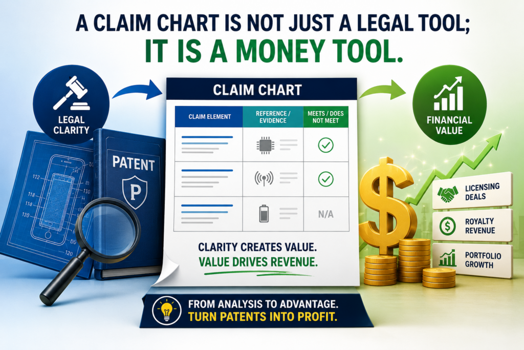
A claim chart is not just a legal tool; it is a money tool
Patent licensing is often treated like a legal fight. Sometimes it can become one, but many good deals start long before anyone wants a fight. They start with a serious business reason.
A company sees that using the patent may help them reduce risk, gain access, protect a product line, or avoid a larger problem later.
A claim chart helps create that business reason. It turns a patent into something people outside the legal team can understand. Product leaders can see the feature match.
Finance teams can see why a deal may be better than a dispute. Business development teams can see whether a partnership makes sense.
This is important for founders because a licensing deal often needs more than one person to say yes.
The legal team may review the claim chart, but the product team may care about the feature, the finance team may care about the cost, and the executive team may care about the risk or market position.
The best chart gives each reader a reason to keep reading
A weak chart only speaks to lawyers. A stronger chart speaks to the full deal team. It uses exact claim language, but it also gives simple context.
It helps a busy reader understand what the invention does and why the target product matters.
That does not mean the chart should be casual or loose. It should still be careful. But careful does not have to mean confusing. In fact, the clearer the chart is, the more useful it becomes.
A good chart should make the reader feel that the patent owner is organized, prepared, and serious. That feeling matters.
Licensing talks often begin with trust. If your first proof is messy, vague, or too aggressive, the other side may shut down. If your first proof is calm and well-built, the talk has a better chance of moving forward.
The chart can shape the tone of the whole deal
The tone of the chart can affect the tone of the deal. A chart that is written like a threat may create defense right away.
A chart that is written like a clear review may open the door to a business talk.
This does not mean you hide your position. It means you present it with care. You show the evidence. You explain the match. You avoid wild claims. You let the work speak.
For a startup, this can be a major edge. Large companies are used to noise. They are used to broad claims and weak outreach.
When a young company shows up with a clean chart, a focused patent, and a clear reason to talk, it stands out.
That is one reason patent work should not be left until the last minute. If your claims are written with real product value in mind, future charts become easier to build.
If your patents are vague or too narrow in the wrong places, monetization becomes harder later.
PowerPatent helps founders think about protection in a more useful way from the beginning, with smart tools and real attorney oversight working together. You can explore the process here: https://powerpatent.com/how-it-works
The first job of a claim chart is to choose the right claim
Not every claim in a patent is a good claim for licensing. Some claims may be too narrow. Some may be too hard to prove.
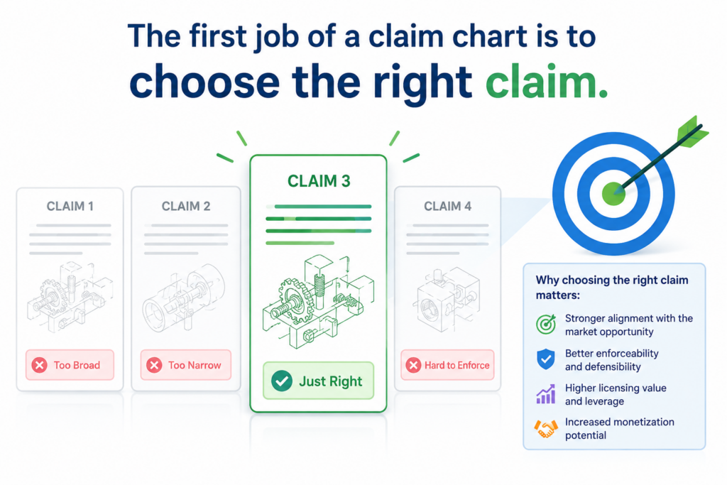
Some may cover a small feature that does not drive much business value. The first tactical step is to pick the claim that gives you the clearest and strongest story.
This is where many teams go wrong. They rush to chart the first claim they see, often claim one, because it appears first. But the first claim is not always the best claim for a licensing talk.
Sometimes a later claim is easier to match to a real product. Sometimes a dependent claim has a detail that makes the evidence stronger. Sometimes a system claim is easier to show than a method claim. Sometimes the reverse is true.
The right claim should be valuable, visible, and provable
A licensing-focused claim chart should start with a claim that has business value. The feature should matter to the product. It should not be a tiny background step that no one cares about.
If the feature helps the product work better, move faster, save money, improve results, or create a better user experience, the chart becomes more persuasive.
The claim should also be visible. This means you can find public or lawful evidence that shows what the product does.
Public evidence may come from product pages, support docs, demos, videos, technical posts, app behavior, API guides, developer docs, marketing pages, or public tests.
A claim can be technically strong, but if you cannot show the match, it may be hard to use in a first licensing talk. You may still have options later, but for early outreach, visible proof is very helpful.
A chart is only as strong as the evidence behind it
The most important rule is simple. Do not build a claim chart on hope. Build it on evidence.
Every row should connect a claim part to something real. That real thing should be clear enough that another person can check it.
If the chart depends on private guesses, hidden assumptions, or leaps in logic, the chart becomes weaker.
This is also why founders should save technical notes, product records, invention details, diagrams, test results, and release history.
Those records can help attorneys understand what was invented and how it differs from older systems. Later, they may also help the team explain the value of the patent asset.
The better your invention record is, the easier it is to build clear patent claims. The clearer your claims are, the easier it is to build strong claim charts. The stronger your charts are, the better your licensing talks can become.
The best claim charts start with the market, not the patent
A common mistake is to start with the patent and then hunt for anyone who might fit it. That can work sometimes, but it often wastes time.
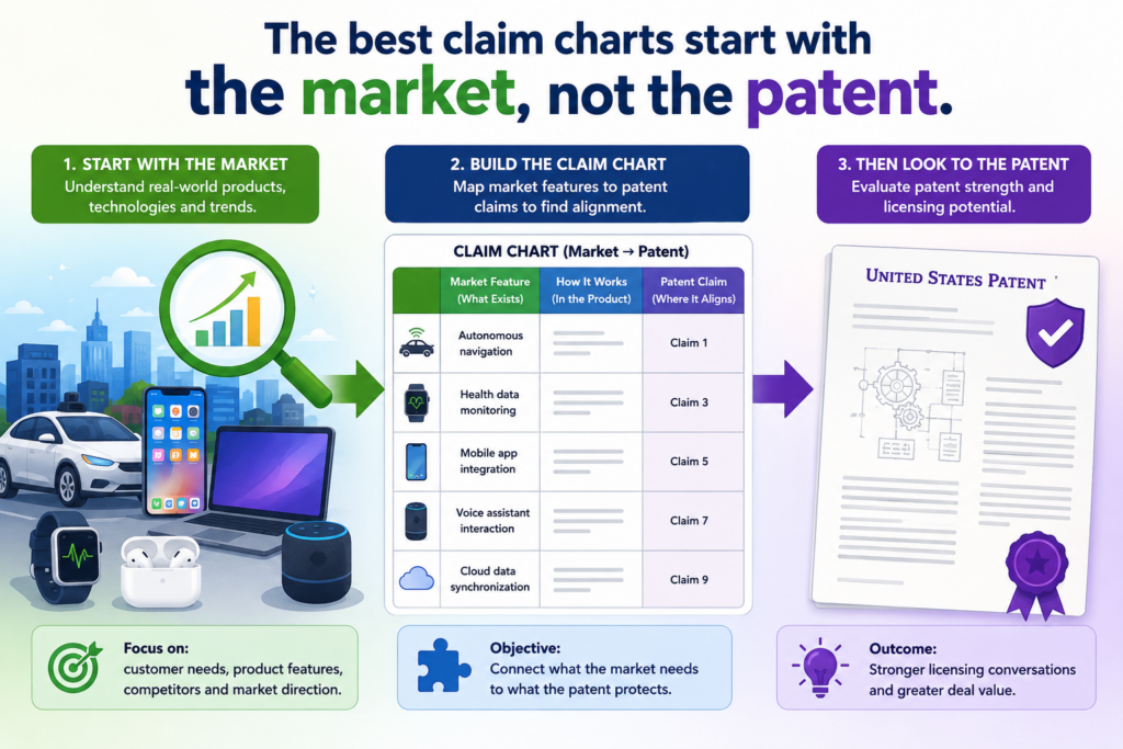
A better way is to start with the market. Look at who is making money from the type of problem your invention solves. Then study how their product works. After that, compare the patent claims to what you find.
This keeps the work grounded in business value. Licensing is not only about finding a match. It is about finding a match that matters.
A small match inside a product no one cares about may not lead anywhere. A clear match inside a fast-growing product can open a much stronger path.
A licensing target should have a real reason to care
The best target is not always the biggest company. The best target is the company that has the clearest business reason to talk. Maybe your patent covers a key feature in their paid product.
Maybe it protects a workflow they promote in sales calls. Maybe it maps to a tool their customers use every day. Maybe it sits close to their main growth plan.
This is why market research matters before the chart is built.
You want to know what the company sells, what it says is special, where it makes money, and what it is trying to protect. If your claim chart connects to those points, the licensing case becomes stronger.
A claim chart that only says “this product may use our patent” is not enough. A better chart quietly shows why the product’s own value story may depend on what your patent covers.
Public product language can make the chart more persuasive
Companies often explain their own products in clear public words. They describe features on websites, help pages, user guides, videos, case studies, release notes, blog posts, and developer pages.
That language can be very useful because it shows how the company itself talks about the feature.
When the company’s own words line up with your claim language, the chart becomes easier to follow. You are not forcing the point.
You are showing the reader that the product appears to do what the claim describes, based on public material.
This does not mean you should twist marketing language into proof it cannot support. The goal is not to stretch.
The goal is to use clean, fair evidence. Strong charts do not need tricks. They need clear matches, careful wording, and proof that a serious reader can check.
For founders, this is also a reminder to write patents with real product use in mind. A patent that connects to market pain, product design, and customer value is easier to explain later.
PowerPatent helps founders protect inventions in a way that supports real business goals, not just paperwork. You can see how that works here: https://powerpatent.com/how-it-works
Each row in the chart should do one clean job
A claim chart usually breaks a patent claim into parts. Each part gets its own row. Then the chart places evidence next to that part. This sounds simple, but it takes care. Each row should make one point and make it well.
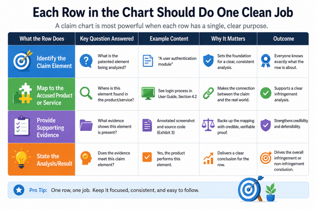
If a row tries to prove too much at once, the reader can get lost. If it mixes several claim parts together, the logic becomes muddy.
If it adds too much extra text, the main match becomes harder to see. The goal is to help the reader move through the claim step by step without confusion.
The claim language should control the structure
The claim should guide the chart. Do not force the chart into a sales pitch first. Start with the words of the claim. Break the claim into clear pieces. Then match each piece to evidence.
For example, if a claim has a system, an input, a processor, a trained model, and an output, each part should be handled with care.
The chart should not jump straight to the final result. It should show how the product appears to include each required part.
This matters because a licensing chart must be more than persuasive. It must be disciplined.
The other side may have attorneys, engineers, and product people review it. If the chart skips steps, they will notice. If the chart stays organized, it becomes harder to dismiss.
A good row should feel simple even when the technology is hard
Deep tech can be complex. AI systems, chips, robotics, biotech tools, cloud platforms, sensors, and data pipelines can all be hard to explain. But a claim chart should still feel simple.
The row should say what the claim requires.
Then it should show what the product appears to do. Then it should explain the link in plain words. That is the rhythm. It does not need drama. It needs clarity.
This is where many founders gain an edge. Engineers often know the technology very well, but they may explain too much at once.
A strong claim chart turns that knowledge into a clean story. It keeps the proof close to the claim. It gives enough detail to be useful, but not so much that the reader loses the thread.
The best charts also avoid overclaiming. Words like “clearly,” “obviously,” or “without question” can make the chart sound less careful.
A better style is direct and steady. Say what the evidence shows. Explain the match. Let the strength come from the facts.
Evidence quality can make or break monetization
A claim chart is not strong because it is long. It is strong because the evidence is good. One clean product manual may be more useful than ten weak screenshots.
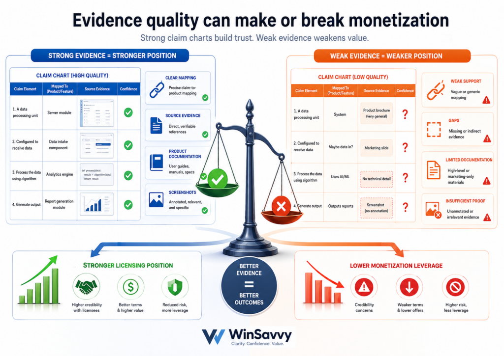
One technical white paper may be better than pages of guesswork. One clear demo may explain more than a long argument.
In patent monetization, evidence is the bridge between the patent and the money. Without evidence, the patent owner is asking the other side to trust a claim.
With evidence, the patent owner can invite the other side to review a real case.
Strong evidence should be specific, dated, and easy to check
Good evidence points to something real. It should be tied to a source. It should show when the source was available, if possible. It should be saved in a way that can be checked later.
This matters because websites change, product pages move, and companies update their language.
A founder who is serious about licensing should treat evidence like an asset. Save copies. Track dates. Keep links.
Record what the evidence shows. Do not rely on memory. A chart built from loose notes can fall apart later when someone asks where the proof came from.
This is especially important for fast-moving fields. AI tools change. Software features change. Hardware specs change.
Cloud services change. A product that matches today may look different next year. The more careful your records are, the better your licensing team can work.
Screenshots alone are often not enough
Screenshots can help, but they should not carry the whole chart when deeper proof is available.
A screenshot may show that a feature exists, but it may not show how the feature works. For some claims, that may be enough. For others, it will not be.
A better chart may combine screenshots with user guides, technical docs, public APIs, demo videos, patents filed by the target, academic papers from the company’s team, product teardown notes, or test results from lawful use of the product.
The goal is to support each claim part with the best available proof.
This does not mean the chart should become a giant evidence dump. Too much evidence can weaken the read.
The chart should include what is needed to make the point clearly. Extra material can be kept in a backup file for deeper review.
This is where attorney oversight matters. A founder may see a strong product match, but an attorney can help test whether the chart tracks the claim language in the right way.
PowerPatent combines smart software with real attorney review so founders can move faster without flying blind. You can learn more here: https://powerpatent.com/how-it-works
The chart should tell a calm story of use, value, and risk
A licensing claim chart is not just a table. It is a story.
The story says that the patent covers a real invention, the target product appears to use that invention, and the match has enough value to deserve a business conversation.
The tone matters because licensing is sensitive. If the chart feels careless, the other side may ignore it.
If it feels too aggressive, the other side may become defensive. If it feels clear, serious, and fair, it can create space for a better talk.
The strongest tone is confident without being loud
Founders often feel pressure to sound forceful. They may think stronger words create a stronger case. In practice, careful words often work better. A good chart does not need to sound angry. It needs to sound prepared.
Use plain language. Show the evidence. Keep the logic tight. Avoid broad claims that go beyond the proof.
Do not turn every row into a speech. The reader should feel that the chart was built by someone who understands both the invention and the business reason for the discussion.
This kind of tone can help the other side stay engaged. It makes it easier for their team to share the chart internally.
It also makes it easier for business people to understand the issue without feeling like they have stepped into a legal fight right away.
The chart should leave room for a deal
The goal of many licensing efforts is not to start a war. The goal is to create a smart deal. That may mean a license fee, a cross-license, a partnership, a sale, a joint development path, or another business outcome.
A good chart supports that goal by giving both sides something concrete to discuss. It helps move the talk away from vague claims and toward real facts.
It lets the patent owner say, in effect, “Here is why we believe this matters. Let’s talk about a fair way to handle it.”
That is a much stronger starting point than a cold email with a patent number and a demand. It is also more useful than a pitch deck that says the patent is valuable without showing why.
For startups, this can be the difference between being brushed aside and being taken seriously.
A clear claim chart can show that the company is not only inventive, but also disciplined. It shows that the team understands how to turn IP into leverage.
A claim chart should separate what you know from what you believe
A strong claim chart does not pretend that every fact is fully proven at the first stage. In many licensing talks, you may only have public information.
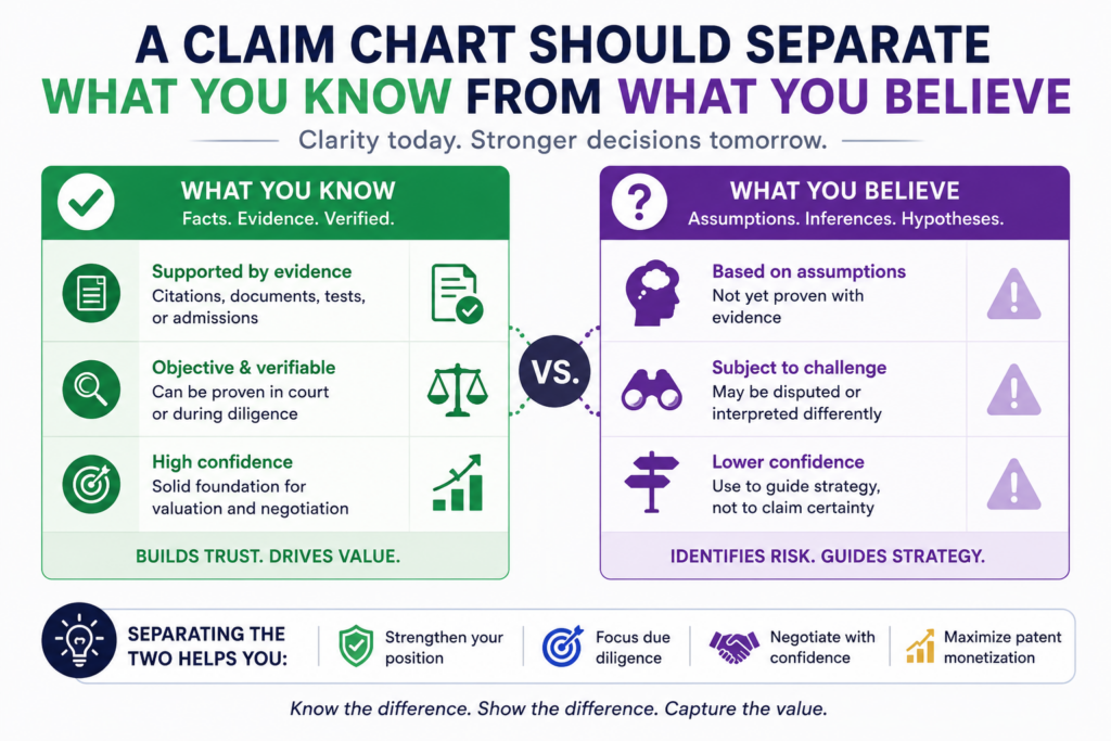
You may have product pages, support docs, videos, screenshots, demos, and outside reviews. That can be enough to start a serious talk, but it may not prove every hidden step inside a system.
This is why the chart should be honest about the source of each point. It should show what the evidence says, what the product appears to do, and where more review may be needed. This does not make the chart weaker.
It often makes it more credible.
When a chart is careful, the reader can trust it more. The other side may not agree with every point, but they can see that the chart was built with discipline.
That matters when the goal is to open a real licensing discussion, not just send a scary letter.
Careful wording protects the strength of the chart
The words you use in a claim chart matter. If the evidence shows that a product includes a feature, say that.
If the evidence only suggests that a product likely performs a step, say that with care. Do not turn a possible match into a certain claim unless the proof supports it.
This kind of wording is not weak. It is smart. It shows that you understand the difference between public evidence and final proof. It also helps your attorney guide the next move.
For example, a public demo may show that an AI tool gives a certain output after receiving user data. That may support parts of the claim.
But if the claim also requires a certain model training step, and the demo does not show training, you may need technical docs, product papers, or other lawful evidence to support that part.
The chart should not hide that gap. It should handle it clearly.
The reader should never feel tricked by the evidence
A claim chart loses force when the reader feels that the evidence was stretched. If a product page says one thing, do not make it sound like it says ten things.
If a screenshot shows a result, do not claim it proves every process behind the result. If a support doc describes one feature, do not use it to prove a different feature without a clear link.
This is where good judgment matters. The goal is not to win one row at any cost. The goal is to build a chart that can survive review.
A clean chart may include a short note that says a certain internal step is inferred from public behavior or from technical documentation.
That can be useful as long as the inference is fair. A reader may still question it, but they can understand how you got there.
This level of honesty can also help your own team. It shows which parts of the case are strong and which parts need more research. That makes the chart a planning tool, not just an outreach tool.
PowerPatent helps founders move from raw invention details to stronger patent work with clear structure and real attorney oversight.
That kind of early clarity can make later licensing work much easier. You can see how the platform works here: https://powerpatent.com/how-it-works
The best monetization charts connect the patent to revenue
A claim chart should prove a technical match, but the best licensing charts also point toward business value. This does not mean the chart should become a finance model.
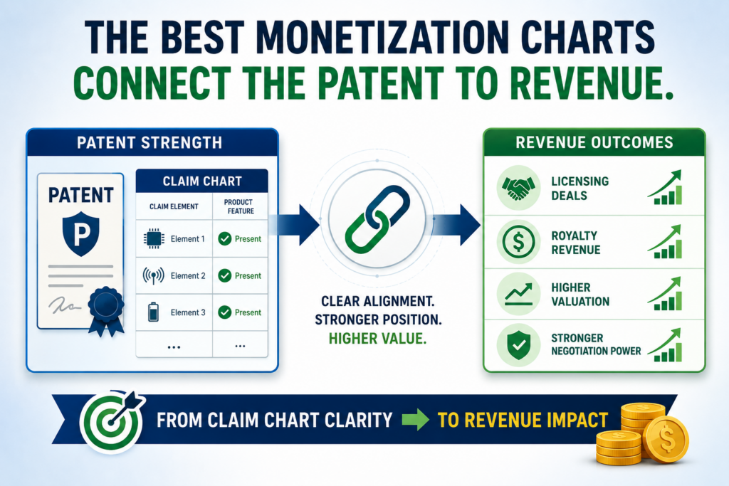
It means the chart should help the reader see why the claimed feature matters to the product, the customer, or the market.
This is where many charts fall short. They show a possible match, but they do not help the business team understand why the match matters.
A patent owner may have strong evidence, yet still fail to create deal momentum because the value story is missing.
A better chart gives the legal team enough detail to review the claim match and gives the business team enough context to understand the money issue.
It shows not only that the product may use the patented idea, but also that the use may support something important.
The chart should make the value feel practical, not abstract
A licensing team wants to know what the feature does in the real world. Does it help users save time? Does it make the product more accurate?
Does it reduce cost? Does it make the system easier to scale? Does it help the company win customers? Does it support a paid tier or premium feature?
You do not need to make wild claims. You need to connect the dots in a plain way. If the target company promotes the feature as a reason to buy the product, that matters.
If customer stories talk about the feature, that matters. If the feature appears in pricing pages, demos, onboarding flows, or sales material, that may also matter.
This kind of context helps the licensing talk move beyond a dry technical review. It helps the other side see why the patent owner believes the issue has business weight.
A patent tied to a key product feature has more deal power
A patent that maps to a small background feature may still have value, but a patent that maps to a core product promise can be far more powerful.
If the target company uses the feature to win users, grow revenue, or stand out from rivals, the licensing discussion becomes more serious.
This is especially true in deep tech markets. A small technical edge can drive large business results. Better data handling can make an AI product more useful.
A stronger sensor method can improve device performance. A better chip design can reduce power use. A cleaner workflow can make a platform easier to adopt.
The chart should help show that connection. It should not turn into a sales essay, but it should include enough context for the reader to understand why the claim match matters.
For startups, this is also a lesson about patent strategy. Protecting the right part of the invention matters. If your patent covers the feature that creates customer value, you have a stronger asset. If your patent only covers a side detail, monetization may be harder.
That is why founders should think about patents before the market has already moved past them.
PowerPatent helps technical teams capture inventions early, shape them clearly, and work with real attorneys to avoid weak filings that miss the business point. You can learn more here: https://powerpatent.com/how-it-works
A claim chart can help you qualify targets before outreach
Licensing outreach can take time, energy, and money. You do not want to chase every company that looks interesting.
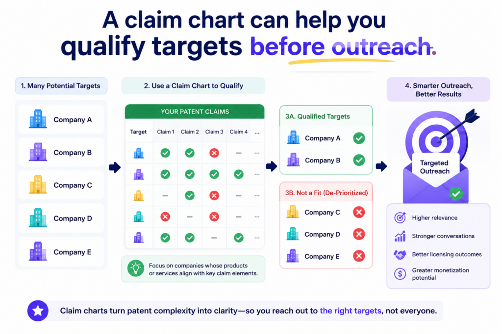
You want to focus on targets where the claim match, evidence, business value, and deal path all make sense.
A claim chart can help you sort this out before you contact anyone. It gives your team a way to compare targets in a calm and structured way.
Instead of saying, “This company looks like a good fit,” you can ask a better question. How many claim parts can we support with clear evidence?
That question can save a founder from wasting months on the wrong target.
Weak charts should be found early, not after outreach
It is much better to discover a weak chart inside your own team than after sending it to a possible licensee. If the evidence is thin, the claim is a poor fit, or the business value is low, you should know that early.
This is why internal claim charting is useful even when you are not ready to start licensing talks.
It can reveal which patents have the clearest market value. It can show which claims are easiest to prove. It can also show where your patent portfolio may have gaps.
For example, you may find that one patent sounds impressive but is hard to map to real products. You may find that another patent has a narrower claim, but the match is much easier to show.
You may find that a target company uses a similar idea, but in a way that misses one required claim part.
These findings are not failures. They are signals. They help you spend your effort where it has the best chance of turning into value.
A target score should come from proof, not excitement
Founders are naturally excited about their inventions. That is a strength. But monetization needs more than excitement. It needs proof.
A target should not rise to the top only because it is famous, well-funded, or active in your space. It should rise because the chart is strong.
A practical target review should look at the claim fit, the quality of public evidence, the importance of the feature, the size of the product opportunity, and the chance that the company has a reason to deal.
The more these points line up, the stronger the target becomes.
This does not need to be complicated. Even a simple internal review can help your team avoid random outreach. The point is to make decisions based on evidence, not hope.
A claim chart also helps you see when not to act. Sometimes the chart shows that the match is too thin.
Sometimes it shows that more research is needed. Sometimes it shows that the patent may be useful against a different target instead. Knowing this before outreach protects your time and your credibility.
Claim charts help founders talk to attorneys with more control
Many founders feel lost when they talk about patents with attorneys. They know the product. They know the market. They know why the invention matters. But patent language can feel far away from daily startup life.
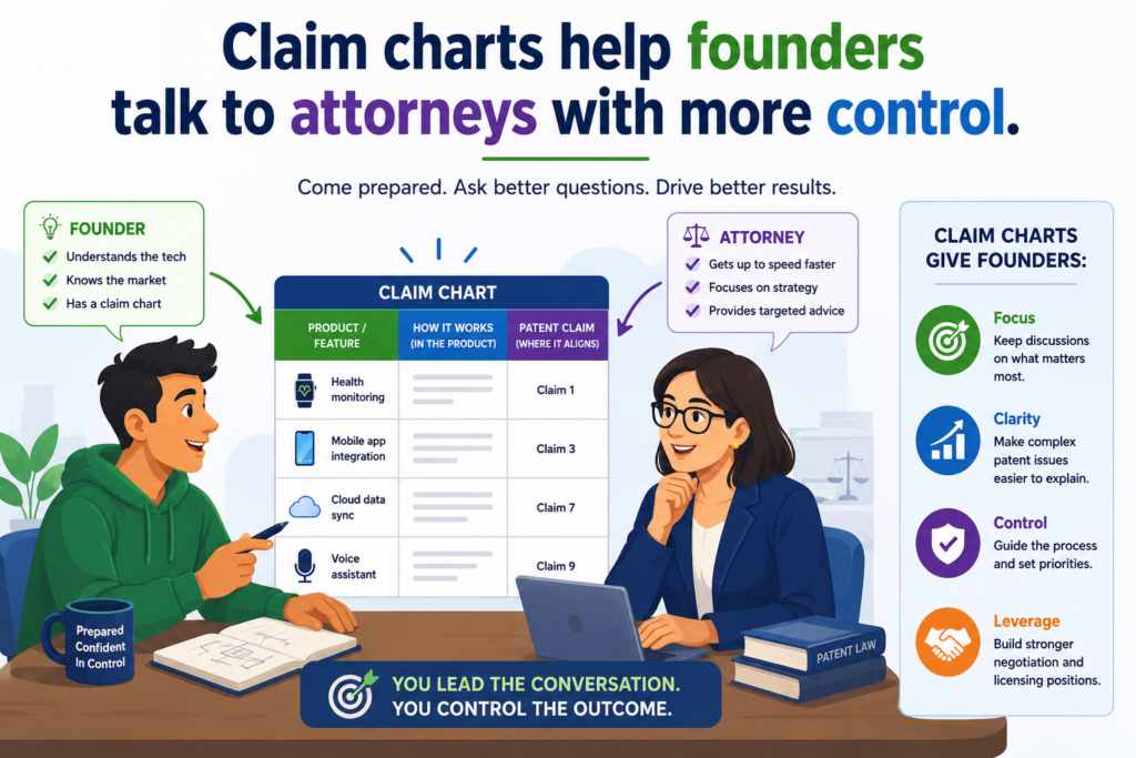
A claim chart can close that gap. It gives the founder and attorney a shared document to work from. The founder can explain the product evidence. The attorney can test the claim match.
Together, they can decide whether the chart is strong enough for outreach, licensing talks, diligence, or deeper review.
This makes the process less vague. Instead of asking, “Is this patent valuable?” the team can ask, “Does this claim map to this product in a way we can support?” That is a much better question.
A chart makes attorney review faster and more focused
Attorneys can help more when the facts are organized. If a founder sends a pile of links, screenshots, notes, and product pages, the review can take longer.
If the founder sends a clear chart with claim parts, evidence, and source notes, the attorney can focus on the real issues.
This can save time. It can also reduce confusion. The attorney can quickly see where the evidence is strong, where the wording needs care, and where the chart may need more support.
This is one reason software can help. A structured process can guide founders to capture invention details, map product features, and prepare useful materials before attorney review.
But software alone is not enough. Patent work still needs human judgment. It needs legal skill. It needs someone who can test the claims and protect the founder from avoidable mistakes.
Smart software and real attorneys should work together
The future of patent work is not founders doing everything alone. It is also not slow, expensive work hidden inside old systems. The better path is a mix of smart software and real attorney oversight.
That is the model PowerPatent is built around. It helps founders move faster, stay more organized, and turn technical ideas into stronger patent assets without losing the safety of attorney review.
For startups that care about speed and quality, that mix can be a major advantage.
A strong claim chart may come later in the life of a patent, but the seeds are planted early. The invention needs to be captured well. The claims need to be shaped with care.
The filing needs to support future business use. When those pieces are handled well, licensing and monetization become much more realistic.
Explore how PowerPatent helps founders protect what they are building here: https://powerpatent.com/how-it-works
Use claim charts to find the cleanest path to a licensing offer
A claim chart should not only help you prove a point. It should help you choose a path.
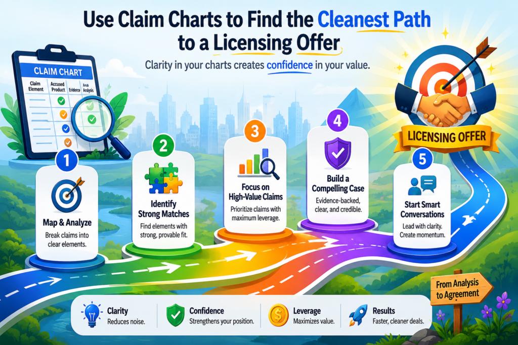
Once you see how a product lines up with your patent claim, you can decide what kind of licensing offer makes sense.
Some targets may be a fit for a simple license. Some may be a fit for a broader partnership.
Some may be better as buyers of the patent. Some may not be worth contacting at all. The chart gives you a clearer way to make that call.
This is important because patent monetization can go wrong when the ask is not tied to the facts. If the chart shows a small use, a giant demand may feel out of place.
If the chart shows a core product feature, a stronger ask may make sense. The chart helps your team stay grounded.
The chart should shape the deal, not just support the claim
Many people think the chart is only there to show possible use of the patent. That is only part of its job. A good chart can also shape the business terms.
For example, if the chart points to one feature in one product, the license may be narrow. If the chart points to a family of products, the license may need a wider scope.
If the same claim maps to several product lines, the deal may need to account for that. If the chart shows that the patented feature sits inside a paid tool, that may guide how value is discussed.
The chart does not replace deal work. It gives the deal work a stronger base. It helps the patent owner avoid random pricing and vague demands. It also helps the other side understand why the offer has a real reason behind it.
A narrow chart can still support a smart deal
A claim chart does not need to cover everything to be useful. Sometimes one clear match is enough to start a serious talk. A narrow chart can work well when the evidence is strong and the feature matters.
This is where founders need to be careful. Do not think a chart is weak just because it is focused. Focus is often a strength.
A chart that maps one claim to one important product feature may be much more useful than a huge chart that tries to connect every patent to every product.
A focused chart can also make the first conversation easier. It gives the other side a clean issue to review.
It lowers confusion. It can lead to a faster response because the team does not have to sort through too much at once.
For a startup, this can be a smart way to begin. Start with the strongest chart. Start with the clearest match. Start where the value is easiest to see. Then let the conversation grow if the facts support it.
PowerPatent helps founders build stronger patent assets before these hard talks begin.
With smart software and real attorney oversight, teams can protect what matters early and avoid weak filings that make licensing harder later. You can see how it works here: https://powerpatent.com/how-it-works
Use claim charts to avoid weak patent licensing pitches
A weak licensing pitch often sounds exciting at first but falls apart when someone asks for proof. It may say the patent covers a huge market. It may name big companies.
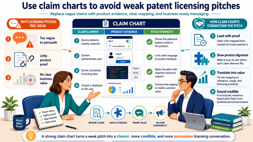
It may talk about billion-dollar product lines. But when the reader asks how the claim maps to the product, the answer is thin.
A claim chart protects you from that mistake. It forces the pitch to earn its place. It makes you show the match before you make the ask. That discipline can save a founder from embarrassment, wasted time, and poor strategy.
The best licensing pitch is not the loudest one. It is the one that can survive review.
Your pitch should grow out of the chart
A founder should not write the pitch first and then build a chart to support it. That leads to weak logic. The better move is to build the chart first and let the pitch grow from what the chart actually shows.
When the chart is strong, the pitch becomes easier to write. You can say why you are reaching out. You can point to the patent.
You can explain that your team has reviewed public product information. You can offer to discuss a business path. The message can stay short because the chart carries the detail.
This also helps you avoid saying too much too soon. A first licensing message should not try to explain every technical point.
It should open the door. The chart can support that door-opening message with enough substance to be taken seriously.
A good pitch feels calm because the work is already done
When the chart is weak, the pitch often becomes too dramatic. It tries to make up for missing proof with big words.
That rarely works with smart companies. They can sense when a message is all pressure and no support.
When the chart is strong, the pitch can be calm. You do not need to sound desperate. You do not need to oversell. You can simply show that there appears to be a real issue worth discussing.
This is a better posture for a founder. It signals that you are serious, prepared, and open to a business solution. It also gives the other side room to engage without feeling attacked from the first sentence.
The key is to treat the chart as the base of the whole campaign. The target list, the first email, the deck, the attorney review, and the licensing ask should all connect back to what the chart shows.
When everything points to the same clear case, the effort feels much more professional.
PowerPatent is built for founders who want this kind of control. It helps teams protect inventions with speed, structure, and attorney support, so the patent portfolio can become a real business asset instead of a dusty file. Learn more here: https://powerpatent.com/how-it-works
Use claim charts to support patent sales and investor diligence
Licensing is not the only way to make money from patents. Sometimes a company may want to sell a patent.
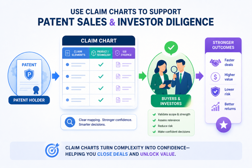
Sometimes a startup may want to use patents to support fundraising, acquisition talks, or a strategic partnership. In each case, claim charts can help buyers and investors understand what they are looking at.
A patent sale can be hard when the buyer has to guess where the value sits. A claim chart reduces that guesswork.
It can show possible market use, product fit, and technical strength. It can also help the buyer see how the patent might fit into their own portfolio.
For investors, the chart can make patent value feel more real. Instead of hearing that the startup has patents, they can see what those patents may cover in the market.
A chart can turn a patent portfolio into a clearer asset story
A patent portfolio can be hard to explain when it includes many filings, claims, families, and technical areas. A claim chart helps simplify the story without watering it down.
A startup might use claim charts to show that one patent maps to a current product category, another maps to a future platform area, and another protects a key technical method.
This kind of view helps an outside reader see why the portfolio exists.
That matters in diligence. Buyers and investors do not just want to know that patents were filed. They want to know whether the patents protect something important.
They want to know whether the claims are tied to product value. They want to know whether the company has thought clearly about its moat.
A chart can make diligence faster and less painful
Diligence can feel slow because people ask for proof from many angles. They may ask what the invention is, what the claims cover, how the patent supports the business, and whether other companies use similar methods.
A claim chart can answer some of those questions in one place. It gives the diligence team a structured way to review the patent.
It also helps your own team stay consistent. Instead of explaining the patent differently each time, you have a clear document that anchors the discussion.
This does not mean every diligence review will be easy. Strong buyers still ask hard questions. Good investors still dig deep. But a clear chart can reduce confusion and show that your team has done serious work.
For a founder, that signal matters. It shows that the company is not treating patents as decoration. It shows that the team understands how IP connects to market power, product value, and future deal options.
This is exactly why early patent work should be practical. A rushed filing may check a box, but it may not hold up well when money is on the line.
PowerPatent helps startups file with more clarity, speed, and attorney guidance, so the work can support real company goals. See how PowerPatent helps here: https://powerpatent.com/how-it-works
Use claim charts to spot gaps in your patent strategy
A claim chart can do more than help you monetize one patent. It can show you where your patent strategy is strong and where it needs work. This is one of its most useful hidden benefits.
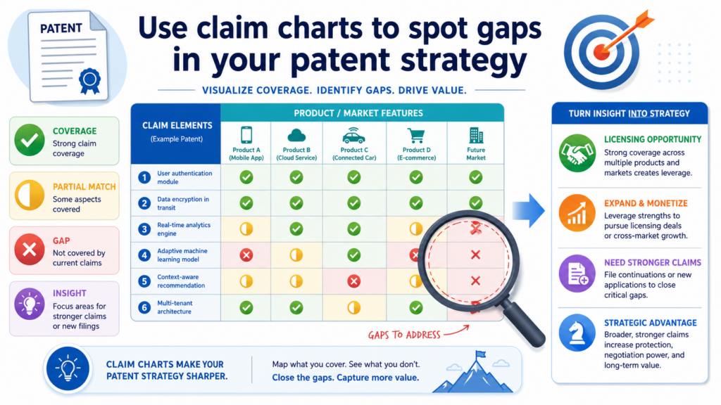
When you chart your claims against real products in the market, you may discover that your patent covers one part of the value chain but misses another.
You may see that your claims are strong for your own product but harder to use against outside products. You may find that your claims cover the backend system but not the user-facing feature that drives revenue.
These lessons are valuable because they can guide your next filings.
A weak chart can point to the next invention to protect
A weak chart is not always bad news. Sometimes it shows that the company needs a better patent plan going forward. It may reveal that the real market value sits in a feature that was not claimed clearly.
It may show that competitors are solving the same problem in a different way. It may reveal that your next filing should focus on a wider system, a key workflow, or a more visible product layer.
This is why founders should not wait until they want to license before thinking about claim charts. Internal charting can help shape new filings while the product is still growing.
It can help the team ask better questions about what makes the invention valuable and what others may copy.
A patent strategy should not be frozen after one filing. Startups change fast. Products change fast. Markets change fast. Your patent plan should keep up.
The chart can reveal whether your claims match the business
The most useful patents often protect what the business truly depends on. That could be a model pipeline, a device design, a data method, a chip structure, a robotic process, a security workflow, or a system that makes the product easier to use at scale.
A claim chart can help test whether the claims match that business center. If the chart maps cleanly to the feature that customers care about, that is a good sign.
If the chart only maps to a small side process, the patent may still matter, but it may not be the strongest monetization asset.
This is not a reason to panic. It is a reason to improve. The best startups keep learning. They file around the parts of the product that create real edge.
They capture new inventions as the system changes. They work with attorneys who understand both the technology and the company goal.
PowerPatent gives founders a faster, clearer way to capture these ideas and turn them into attorney-reviewed patent filings.
That can help protect today’s product while building a stronger IP base for tomorrow. Explore the process here: https://powerpatent.com/how-it-works
Use claim charts before you talk about price
Price is one of the hardest parts of patent licensing. Founders often want to know what the patent is worth before they have built the full proof story.
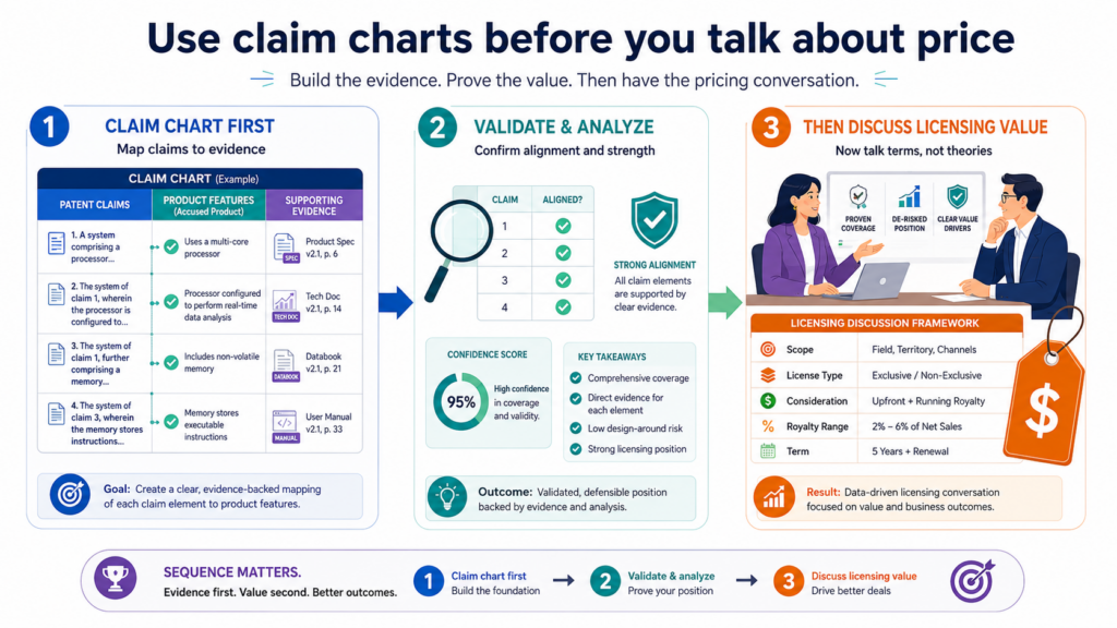
That is understandable, but it can lead to weak talks. A number without support is easy to reject.
A claim chart gives the price talk a better base. It does not set the final price by itself, but it helps explain why a license should have value at all.
It shows what the patent may cover, where the target product may use it, and why that use may matter.
This makes the money talk feel less random. Instead of asking for a fee because the patent sounds important, you can point to a real product connection. That changes the tone of the deal.
The chart helps you avoid pricing from emotion
Founders are close to their inventions. They know how much work went into the idea.
They remember the late nights, the failed builds, the hard tests, and the moments when the system finally worked. So it is natural to feel that the patent should be worth a lot.
But licensing price is not based only on effort. It is based on business use, risk, value, proof, and deal leverage. A claim chart helps bring those points into view.
If the chart shows a small feature with limited use, the pricing path may need to be modest. If the chart shows a major feature across a large product line, the pricing path may be stronger.
If the chart shows several products using the same claimed method, the value story may grow.
A better price starts with a better proof file
A claim chart should sit inside a larger proof file. That proof file may include the patent, the chart, source records, market notes, product pages, technical documents, screenshots, and attorney comments.
Together, these materials help support the business case.
This proof file can help your team stay calm during pricing talks. It can also help you avoid making claims that the evidence does not support.
The more organized your proof is, the easier it becomes to explain your position.
This is especially useful when the other side pushes back. Pushback is normal. A company may say the patent does not apply, the feature is not important, or the value is too low.
A strong chart does not end every debate, but it gives you a clear place to return. It keeps the conversation tied to facts.
Founders who want stronger monetization options should think about this early. The best pricing talk often begins long before the first license offer.
It begins when the invention is captured well, the patent is drafted with care, and the claims are built around real business value.
PowerPatent helps founders build that base with smart software and real attorney oversight. You can see how the process works here: https://powerpatent.com/how-it-works
Use claim charts to prepare for pushback without sounding defensive
Every serious licensing talk will face questions. That does not mean the chart is bad. It means the other side is doing its job. They may question the claim meaning.
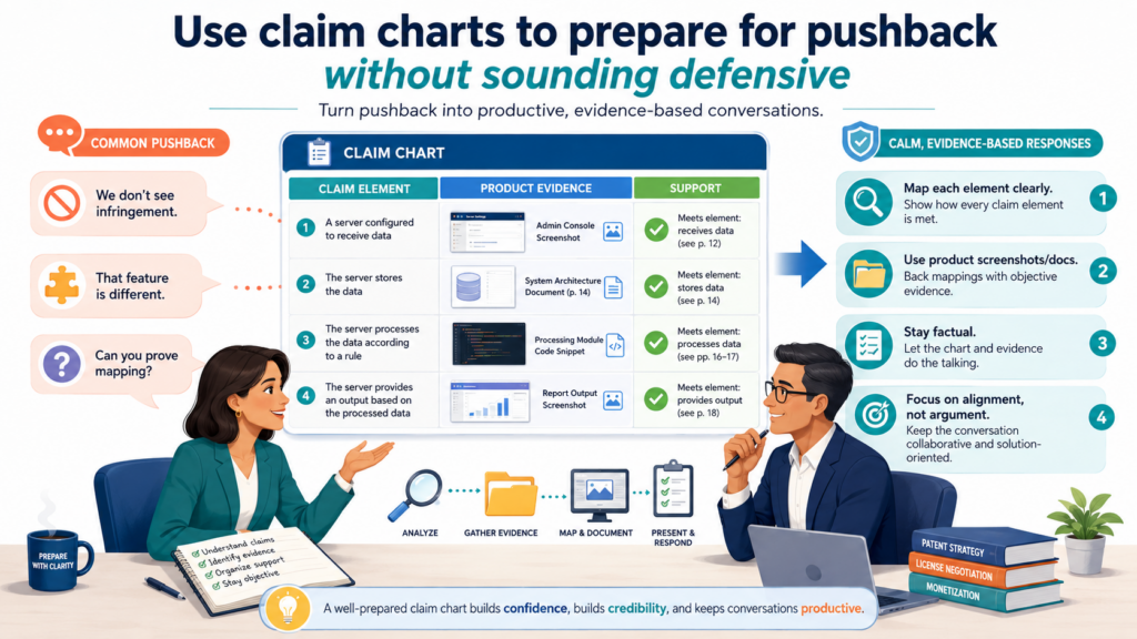
They may say their product works in a different way. They may argue that the patent does not cover the feature. They may ask for more proof.
A good claim chart helps you prepare for this before the meeting starts. It shows where your case is strongest.
It also shows where the other side may push. That lets your team answer with calm facts instead of emotion.
The goal is not to win every point in the first call. The goal is to keep the discussion alive and grounded.
Pushback should be treated as useful information
When a company pushes back, listen closely. Their response may reveal how they see the product, how they read the claim, or where they think the chart is weak.
That information can help you improve the chart and sharpen the licensing path.
Founders sometimes react too quickly when challenged. They may try to defend every row with equal force. That is not always wise. Some rows may be stronger than others.
Some may need more proof. Some may need attorney review. A calm response builds more trust than a loud one.
A strong chart gives your team room to say, “Here is the evidence we relied on,” and “Here is why we believe this part of the claim is met.” That kind of answer is clear and serious.
The best answers come from work done before the call
Before outreach, your team should read the chart like the other side will read it. Look for weak links.
Look for claim terms that may be argued. Look for evidence that may be too thin. Look for places where the product may have changed.
This review should not be rushed. A chart that seems strong to the inventor may look different to a patent attorney or a product expert. That is why outside review can be so useful.
You also want to avoid turning a licensing call into a technical fight too early. The chart should support a business talk.
If the other side raises a hard technical issue, note it, review it, and respond with care. A thoughtful follow-up is often better than a forced answer on the spot.
This is where PowerPatent’s model can help founders. Smart software can organize the invention and evidence, while real attorneys can help test the strength of the patent work.
That mix gives founders more confidence before they step into serious business talks. Learn more here: https://powerpatent.com/how-it-works
Use claim charts to keep your team aligned
Patent monetization is not just a legal task. It can involve founders, engineers, product leaders, finance people, outside counsel, investors, and business partners.
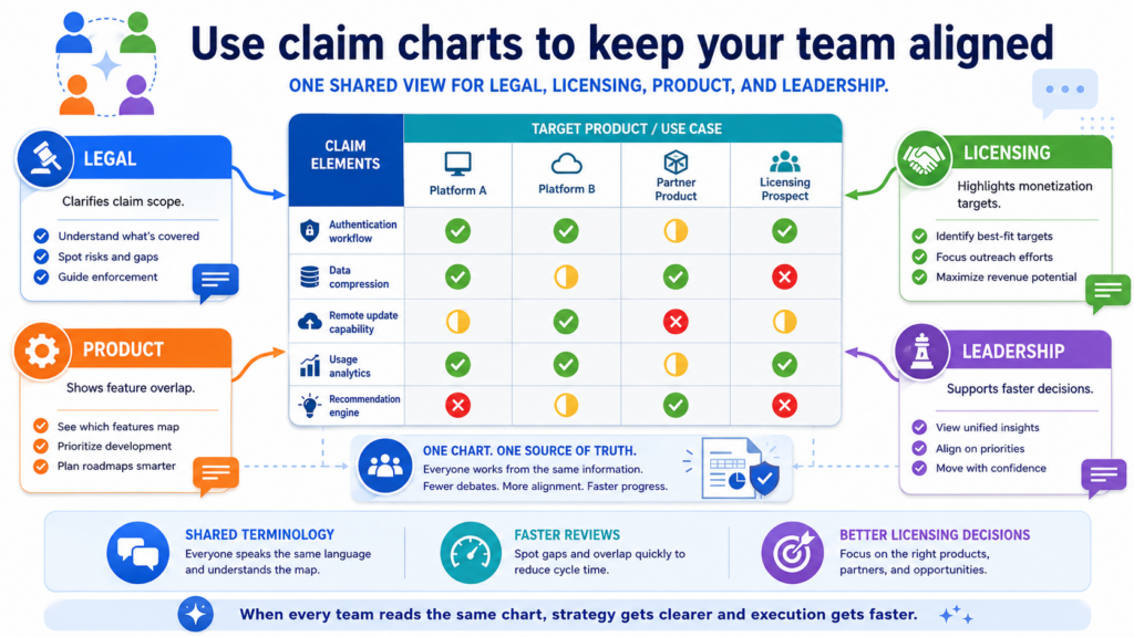
When all of these people use different words to describe the same patent, confusion grows fast.
A claim chart gives the team one shared view. It shows what the patent says, what the target product appears to do, and where the evidence sits. That shared view can prevent mixed messages.
This matters because licensing talks can move across many rooms. One person may handle the first outreach.
Another may speak with counsel. Another may explain the technology. Another may talk about business terms. If the team is not aligned, the story can drift.
A shared chart keeps the message clean
A clean message is powerful. It helps the team say the same thing in a steady way. It also helps avoid overpromising. The founder can talk about the business value.
The engineer can explain the technology. The attorney can address the claim language. Everyone works from the same base.
This is useful even for small startups. In fact, it may be more important for small startups because they have less time to waste. A messy process can drain focus. A clear chart keeps the effort organized.
The chart can also help new team members understand the patent faster. Instead of reading a full patent cold, they can first see how the key claim maps to a real product or market feature.
That makes the patent feel less abstract.
Good alignment protects credibility
Credibility is easy to lose in licensing. If one person says the patent covers one thing and another says something different, the other side may lose trust.
If the outreach message says one thing but the chart shows another, the talk can weaken.
A claim chart helps protect against that. It creates a record of the team’s current position. It can be reviewed, improved, and updated as new evidence appears. It also helps the team know when not to speak beyond the proof.
For founders, this is a major benefit. You do not need to become a patent expert overnight. But you do need a clear way to manage the asset. A claim chart gives you that control.
The same idea applies when building the patent in the first place. You want your invention records, patent drafts, attorney comments, and business goals to stay connected.
PowerPatent is designed to help founders keep that process clearer and faster, with attorney oversight built in. You can explore it here: https://powerpatent.com/how-it-works
Use claim charts to decide when not to monetize
Not every patent should be licensed right now. Not every target should be contacted. Not every chart should leave your team.
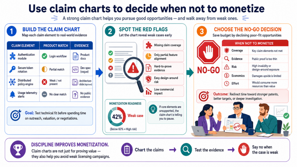
Sometimes the smartest move is to wait, gather more evidence, file more patents, improve the portfolio, or focus on a different target.
A claim chart can help you make that call. This is one of its most practical uses. It can tell you when the case is not ready.
That may sound negative, but it is actually helpful. A weak outreach can damage credibility. It can alert the market before you are ready. It can waste money on legal review. It can distract the founder from better opportunities.
Restraint can be a strong monetization move
Good patent strategy is not just action. It is timing. If the product evidence is thin, the chart may need more work.
If the target company is not yet making real money from the feature, waiting may make sense. If your own patent family is still growing, you may want to strengthen the portfolio first.
A founder should not confuse delay with weakness. Sometimes waiting gives the asset more value. A market may grow. A product may become more central. More public evidence may appear. A new filing may cover a better angle.
The claim chart can help you watch these changes. It gives you a way to track what is missing and what would make the case stronger.
The best patent owners know when to hold the asset
A patent can be a tool for licensing, sale, defense, fundraising, partnership, or market position. Monetization is only one path. The best path depends on the company’s larger goal.
For example, a startup may choose not to license a patent because it wants to keep a product edge. Another startup may hold the patent for acquisition leverage.
Another may wait until a market leader’s product becomes more mature. Another may use the patent in investor talks instead of licensing talks.
The chart helps make those choices less emotional. It shows the current strength of the case. It also shows what kind of business use may be possible later.
This is why founders should build patents with a long-term view. A patent filed today may matter most two or three years from now.
If the filing is rushed or unclear, future options may shrink. If the filing is thoughtful and attorney-reviewed, future options can grow.
PowerPatent helps founders protect inventions before the moment becomes urgent.
It gives teams a cleaner way to move from idea to filing with smart software and real attorney support. See how it works here: https://powerpatent.com/how-it-works
Use claim charts to build a stronger first licensing conversation
The first licensing conversation is not the place to explain every detail of your patent. It is the place to create enough trust and interest for the other side to keep talking.
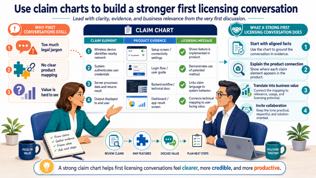
A claim chart can help you do that because it gives the conversation a clear center.
Without a chart, the first call can become vague. One side talks about the patent. The other side asks what product is involved.
Someone asks what part of the product matters. Then the discussion starts to drift. A chart prevents that drift. It gives everyone the same page to look at.
The goal is not to overwhelm the other side. The goal is to show that your team has done real work and has a clear reason for reaching out.
A first call should focus on the strongest match
You do not need to discuss every claim, every patent, or every possible target product in the first call. That can make the conversation feel heavy and unfocused. A better move is to start with the cleanest match.
Pick the claim that is easiest to explain. Pick the product feature that has the clearest evidence. Pick the business point that matters most. Then use the chart to guide the talk in a calm way.
A strong first call often comes down to one simple message. Your patent appears to cover a feature that matters to their product, and you would like to discuss a fair business path. That is enough to begin.
The chart should support the call, not take over the call
A claim chart is a tool, not the whole conversation. If you treat it like a script, the call may feel stiff. If you use it as a guide, the call can feel much more natural.
You might walk through only the top rows. You might explain why the evidence caught your attention. You might ask whether their team is open to a deeper review. The point is to keep the talk moving without losing the facts.
This is also where tone matters. The chart should give you confidence, but not make you sound combative.
The best licensing conversations feel serious, fair, and focused. They do not feel like a random threat.
For founders, this can be a big shift. You are not begging for attention. You are not trying to scare anyone. You are presenting a clear business issue with proof behind it.
If you want to build patents that can support real business talks later, PowerPatent gives you a cleaner way to start.
It brings smart software and real attorney oversight together so your filings are built with more care from the beginning. See how it works here: https://powerpatent.com/how-it-works
Conclusion
Claim charts help founders turn patents into clear business tools. They show what the patent covers, where a product may use it, and why that use may matter. For licensing, sales, funding, or strategy, they replace guesswork with proof. The best charts are simple, careful, and tied to real market value.
They help teams choose better targets, prepare stronger talks, and avoid weak claims before money is on the table. If you want patents that can support real business moves, start with better invention capture, smarter filings, and attorney review. See how PowerPatent works here: https://powerpatent.com/how-it-works