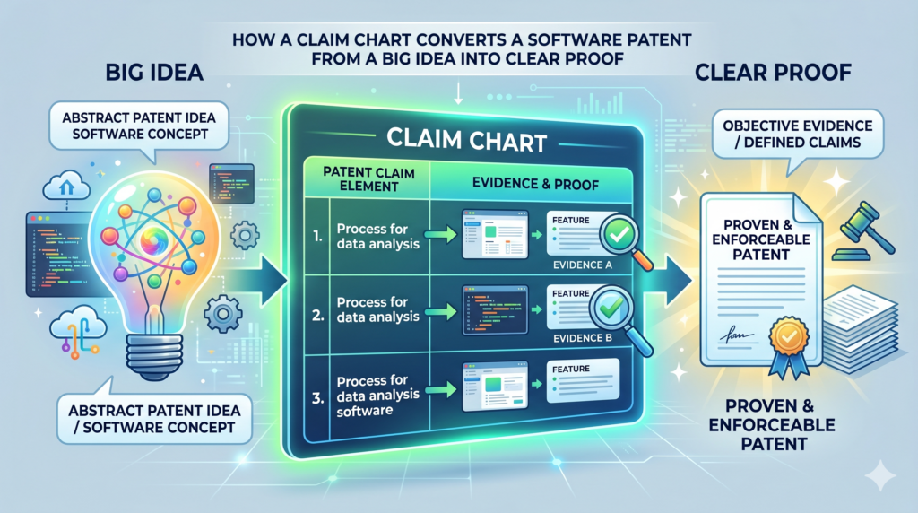
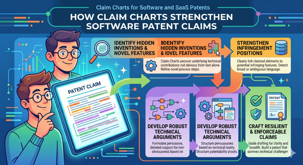
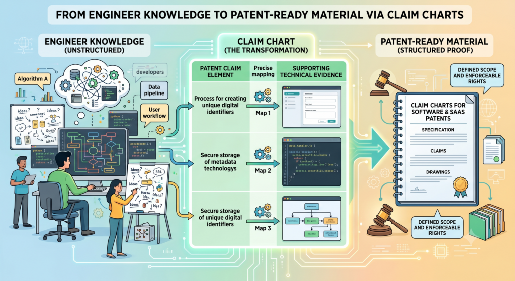
A claim chart may sound like a dry legal tool. It is not. For a software or SaaS startup, it can be one of the clearest ways to show why your invention matters, how it works, and where the value lives.
A claim chart turns your software patent from a big idea into clear proof
A software patent can feel hard to explain because software is not something people can hold in their hands. A device may have parts you can see. A chair has legs. A camera has a lens.
A drone has motors. But a SaaS product often works through screens, rules, data, code, and back-end actions that happen in seconds.
That is where a claim chart helps.
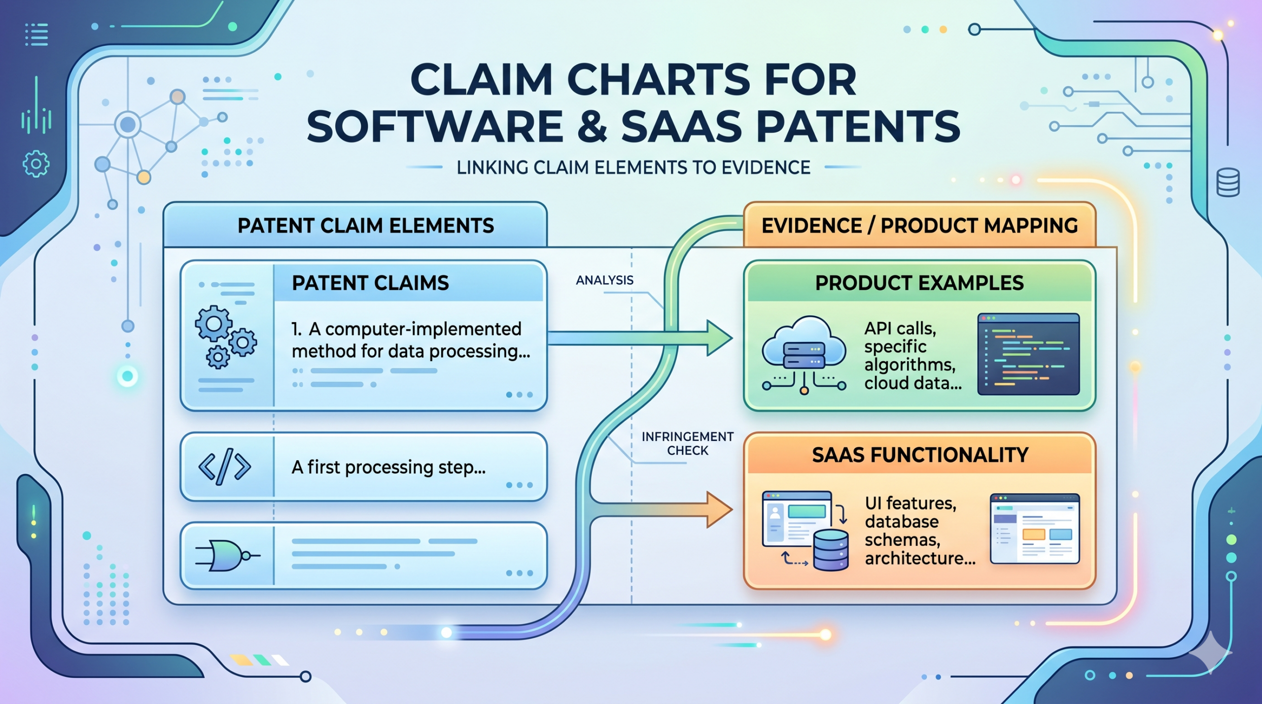
A claim chart takes each part of a patent claim and connects it to a real part of the product. It makes the invention easier to see. It shows where each feature lives.
It also helps a founder, engineer, or patent attorney spot gaps before those gaps become expensive problems.
For a software company, this is huge. Your strongest invention may not be the app itself. It may be the way the system ranks data, sends alerts, routes tasks, trains a model, changes a user flow, syncs records, or makes a process faster. A claim chart helps explain that in a clean, step-by-step way.
A claim chart is not just for lawsuits or big companies
Many founders hear “claim chart” and think it only matters when a company is fighting over a patent. That is one use, but it is not the only use. A claim chart can be useful much earlier, even before you file.
When you are getting ready to patent a software idea, a claim chart can help you map the invention against your product notes, code logic, system diagrams, user stories, and screenshots.
It can help your patent team understand what is truly new. It can also help you avoid writing a patent that sounds broad but does not clearly protect the core system.
That matters because broad words alone do not make a strong patent. A strong patent needs support. It needs a clear story. It needs enough detail to show how the invention works in real life.
If you are building something technical and want a faster way to turn that work into a strong patent plan, PowerPatent can help you organize the invention, capture key details, and work with real patent attorneys without slowing your build cycle. You can see the process here: https://powerpatent.com/how-it-works
The simple way to think about a claim chart is as a map between words and proof
A patent claim is made of parts. Each part describes something the invention does or has. In software, those parts might be tied to actions like receiving data, checking a rule, changing a score, generating an output, or sending a message to another system.
A claim chart places those parts on one side and the matching proof on the other side. The proof can come from many places. It may come from a product screen. It may come from an API flow.
It may come from a system design doc. It may come from a code comment, a database schema, a demo video, a workflow, or a model pipeline.
This is powerful because it removes guesswork. Instead of saying, “Our platform has an AI matching system,” the chart can show exactly where the matching starts, what data it uses, how the score is made, how the result changes the user path, and what output the system creates.
That level of detail is often the difference between a weak patent draft and a strong one.
Why claim charts matter so much for software and SaaS patents
Software moves fast. SaaS products change even faster. A team may ship five product changes in a week. A model may be updated. A flow may be redesigned.
A feature may move from the front end to the back end. An API may change. A rule that once lived in code may move into a config file.
This speed is great for growth. It can be risky for patents.
If your team does not capture the invention clearly, the key details can get lost. Months later, no one remembers why a certain logic path was built, what problem it solved, or what made it different from older tools. A claim chart helps lock down the important parts while they are still fresh.
A good claim chart protects the real value, not just the surface feature
Many software patents become weak because they focus too much on what the user sees. The screen may be useful, but the true invention often lives under the screen.
For example, a dashboard may look simple. But behind that dashboard, your system may be pulling data from five sources, cleaning the data, finding risk patterns, ranking results, changing what each user sees, and learning from user feedback. The dashboard is only the visible layer. The value is in the system behavior.
A claim chart helps separate the surface from the substance. It asks a deeper question: what is the system doing that is new, useful, and hard for others to copy?
That question is central for SaaS companies. A SaaS product often wins because of speed, scale, automation, or smart decision logic. Those are not always obvious from a screenshot. They need to be explained.
The best claim charts show the cause and effect inside the software
A weak description says the system “analyzes data” or “uses machine learning” or “automates a workflow.” Those words are too loose. They do not show what is really happening.
A stronger claim chart shows cause and effect. It explains what input enters the system, what rule or model acts on that input, what decision is made, and what output changes because of that decision.
For a SaaS patent, that chain matters. It shows that the product is not just a generic computer doing normal work. It shows a specific technical process tied to a real result.
For example, a claim chart for a customer support SaaS tool might show how the system receives a support message, extracts issue signals, compares them to prior cases, assigns a risk score, routes the ticket to a team, and changes the response deadline based on the score. That is much clearer than saying, “The software improves support routing.”
The more clearly you can show that chain, the easier it is for your patent team to write claims that match the real invention.
A claim chart can also help your team make better product choices
This is the part many founders miss. A claim chart is not only a patent tool. It can also sharpen your product thinking.
When you chart a claim, you are forced to define what your product does in exact terms. You start to see which parts are core and which parts are just nice to have.
You may notice that one feature is not really new, while another back-end step is far more valuable than you thought.
That can guide what you document, what you keep secret, what you patent, and what you build next.
This is especially helpful for startups that are moving quickly. You do not want to patent everything. You want to protect the parts that give you an edge. A claim chart helps make that edge easier to see.
Founders should use claim charts before memory fades
The best time to capture invention details is while the team is still close to the work. That may be right after a prototype works. It may be after a major technical breakthrough.
It may be when a customer asks, “How did you make this so much faster?” It may be when an engineer solves a hard problem in a way that was not obvious.
Do not wait until a fundraise, a deal, or a competitor scare forces you to think about patents. By then, the team may be busy, the code may have changed, and the original reasoning may be hard to recover.
PowerPatent is built for this kind of fast-moving team. It helps founders capture invention details while they are still fresh, then pairs smart software with attorney oversight so the patent process feels less painful and more useful. You can learn how that works here: https://powerpatent.com/how-it-works
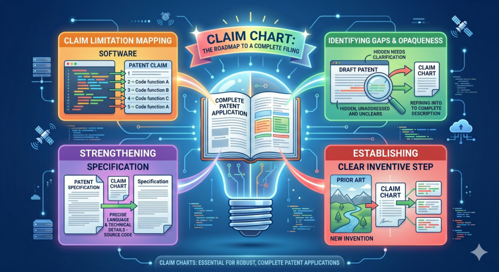
What a claim chart should capture in a software patent
A useful claim chart does not need to be fancy. It needs to be clear. The goal is not to impress someone with legal language. The goal is to show how the claimed invention connects to real technical work.
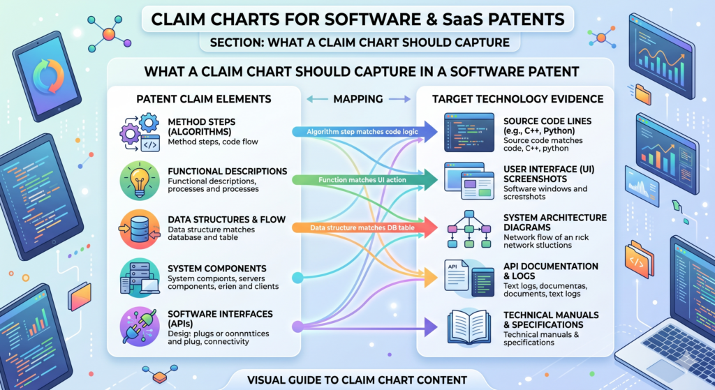
For software and SaaS patents, the chart should capture the system steps, the data being used, the rules or models applied, the output created, and the technical result.
It should also capture where those things happen. That may be on a user device, a server, a cloud system, a database, a browser, a mobile app, or a third-party service.
The claim chart should start with the product problem
Before you chart the invention, you need to understand the problem. This does not mean a vague business problem like “companies waste time.” It means the real technical or workflow problem your software solves.
Maybe the system reduces manual review. Maybe it finds errors earlier. Maybe it syncs records that used to conflict. Maybe it lowers compute use. Maybe it makes a model more accurate with less training data.
Maybe it routes work in a way that avoids delay. Maybe it lets a user finish a task with fewer steps because the system handles decisions in the background.
That problem matters because the patent story should not sound like software for the sake of software. It should show why the invention exists.
A strong chart explains what changed because of the invention
Every good software invention changes something. It changes speed. It changes accuracy. It changes control. It changes how data moves. It changes how a user acts. It changes how a system responds. It changes how decisions are made.
Your claim chart should make that change easy to see.
For example, suppose your SaaS platform helps hospitals match patients to care plans. A weak chart might say the system receives patient data and recommends a care plan.
A stronger chart would show what patient signals are received, how they are weighted, how conflicts are handled, how the system chooses between plans, and how the final plan is updated when new data comes in.
That is the kind of detail that helps a patent attorney understand where the invention lives.
The chart should connect each claim part to real proof
A claim chart works best when it does not rely on memory alone. A founder may know the product deeply, but a patent needs more than “trust me, it works.” The chart should point to proof.
That proof may be a screenshot showing a user action. It may be a system diagram showing data flow. It may be a product spec showing a rule. It may be a code path showing how a score is made.
It may be a demo showing the output. It may be a database table showing stored values. It may be an API response showing how systems talk to each other.
The proof does not need to be public. It does not need to be polished. It just needs to help your patent team see the invention clearly.
The best proof shows the invention at the right level of detail
Too little detail creates a weak chart. Too much detail can bury the point. The goal is to explain the invention at the level where the value is clear.
For a software patent, this often means showing the logic without dumping every line of code. Code can help, but the patent story usually needs to describe what the code does in plain terms.
A chart can say that a scoring engine compares event frequency, user role, and time delay to create a risk value. That is often more useful than copying a long code block that only one engineer can read.
The chart should also avoid being so narrow that it protects only one exact version of the product. Your SaaS product will change. The patent should support the core idea while still being grounded in real technical detail.
That balance is where real attorney oversight matters. PowerPatent helps technical teams bring the raw invention details forward, then works with patent professionals to shape those details into stronger filings.
See how PowerPatent helps founders move from invention capture to patent strategy here: https://powerpatent.com/how-it-works
How to read a software patent claim before making a chart
A patent claim can look strange at first. It may feel long, dense, and unnatural. That is normal. Claims are written in a special way because they define the protected invention.
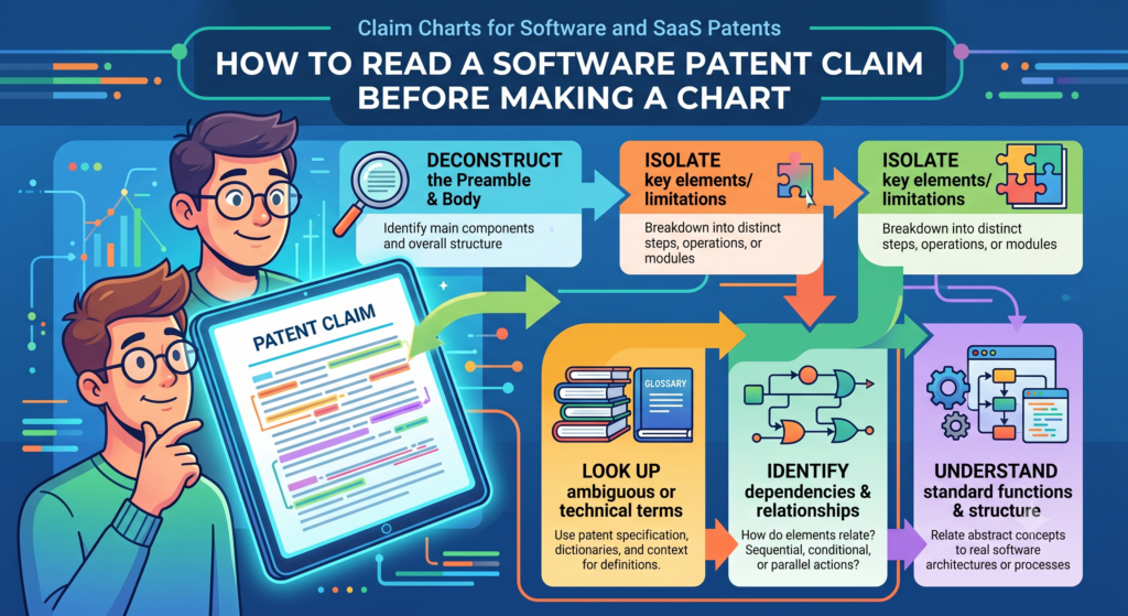
But you do not need to be scared of them. For a founder or engineer, the first step is to break the claim into smaller parts. Each part usually describes one piece of the system or one action the system performs.
Once you break it apart, the claim becomes much easier to work with.
A claim is easier to understand when you treat it like a workflow
Most software claims describe a process. That process may happen across servers, databases, devices, models, APIs, and user screens. The claim may start with receiving information.
Then it may process that information. Then it may generate a result. Then it may cause another action.
That is basically a workflow.
So when you read a claim, look for the flow. Ask what comes in, what happens next, where the system makes a decision, and what comes out. This simple method can make even a complex software claim easier to chart.
The key is to avoid jumping straight into legal words
Do not start by trying to sound like a lawyer. Start by understanding the claim in plain English.
If the claim says the system receives event data from a client device, you can translate that as, “The app gets user or system activity from the customer side.”
If it says the system generates a ranked set of actions based on a model output, you can translate that as, “The system scores possible next steps and puts them in order.”
This plain meaning helps your product and engineering teams contribute. That is important because they often know the invention best.
A patent process becomes much stronger when the people who built the system can explain what is really happening. That is why tools like PowerPatent are so useful for startups.
They make it easier for technical teams to share the right details and for attorneys to turn those details into better patent work. The process is explained here: https://powerpatent.com/how-it-works
Each claim part should be matched to one clear product fact
When you build the chart, do not try to prove the entire claim in one long paragraph. That creates confusion. Instead, match each claim part to a clear product fact.
If one claim part says the system receives data, point to where that happens. If another part says the system filters the data, point to the filtering step.
If the next part says the system creates a score, show how the score is made. If the final part says the system changes a user interface based on the score, show the screen or workflow change.
This makes the claim chart easier to review. It also helps reveal weak spots.
Gaps in the chart are not failures because they are warning signs
A gap in a claim chart is not always bad. It may simply mean the claim needs to be changed. It may mean the product proof needs to be collected. It may mean the invention is different from what the team first thought.
This is why claim charts are so useful early in the patent process. They help you catch issues before filing, before investor review, before partner talks, or before a competitor enters the space.
A good chart gives you control. It lets you see the patent story instead of guessing.
A practical claim chart example for a SaaS workflow invention
Let’s make this real.
Imagine your startup has built a SaaS platform that helps finance teams catch risky invoices before payment.
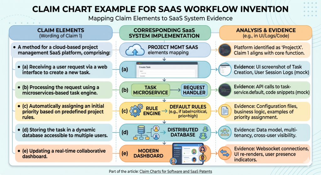
The system pulls invoices from email and accounting tools, checks each invoice against vendor history, compares payment timing, looks for unusual changes, and sends high-risk items to a manager before money leaves the company.
That may sound like a simple fraud tool. But the invention may be much more specific.
The valuable part might be how the system blends vendor behavior, timing patterns, user approval history, and document signals into a risk score that changes the workflow.
The claim chart should follow the way the system really works
The chart would start by showing that the system receives invoice data from connected sources.
Then it would show that the system extracts key values, such as vendor name, amount, due date, bank details, and approver identity. Then it would show how the system compares those values against past records.
From there, it would show the scoring step. This is often where the invention lives. Maybe the system creates a risk score based on several signals that are weighted differently.
Maybe it gives extra weight to a bank account change if the vendor has not changed payment details in the past year. Maybe it lowers the score if the same approver has approved similar invoices before.
The chart would then show the output. The system may pause payment, send a warning, change the invoice status, request extra approval, or add the invoice to a review queue.
The most useful chart explains why the workflow is not generic
Many SaaS tools receive data and send alerts. That alone may not be enough. The chart should show what is special about this system.
The special part may be the timing logic. It may be the way the system handles missing data. It may be the way it learns from prior approvals.
It may be the way it updates the risk score when a vendor sends a revised invoice. It may be the way the system explains the risk to a human reviewer in simple terms.
This is the level of thinking that can turn a basic feature into a patent-ready invention story.
PowerPatent helps founders and engineers bring this detail out early, while the product logic is still fresh.
That can make the patent process faster, clearer, and less painful. You can see how PowerPatent supports this kind of workflow here: https://powerpatent.com/how-it-works
The founder’s job is not to write legal claims alone
Founders do not need to become patent lawyers. Engineers do not need to stop building and spend weeks learning patent language.
But they should be able to explain the product in a way that shows the invention.
That means sharing what problem the team solved, why old methods were not enough, what the system does differently, and where the proof lives.
A claim chart is one of the cleanest ways to do that. It gives your attorney better raw material.
It helps avoid long back-and-forth calls. It also helps the team stay aligned on what the patent is really trying to protect.
Better inputs usually lead to better patent work
Patent quality often depends on the quality of the invention details at the start. If the patent team only gets a vague product pitch, the filing may also become vague.
If the team gets clear workflows, data flows, examples, screenshots, and technical notes, the filing can become much stronger.
This is why software founders should not treat patents as paperwork. A patent is a business asset. It can support fundraising, deals, market position, and long-term defensibility. But it only works well when it is built on real detail.
A claim chart helps make that detail visible.
A claim chart helps you find the real invention inside your SaaS product
A SaaS product can have many features, but not every feature is worth patenting. Some features are common. Some are simple design choices.
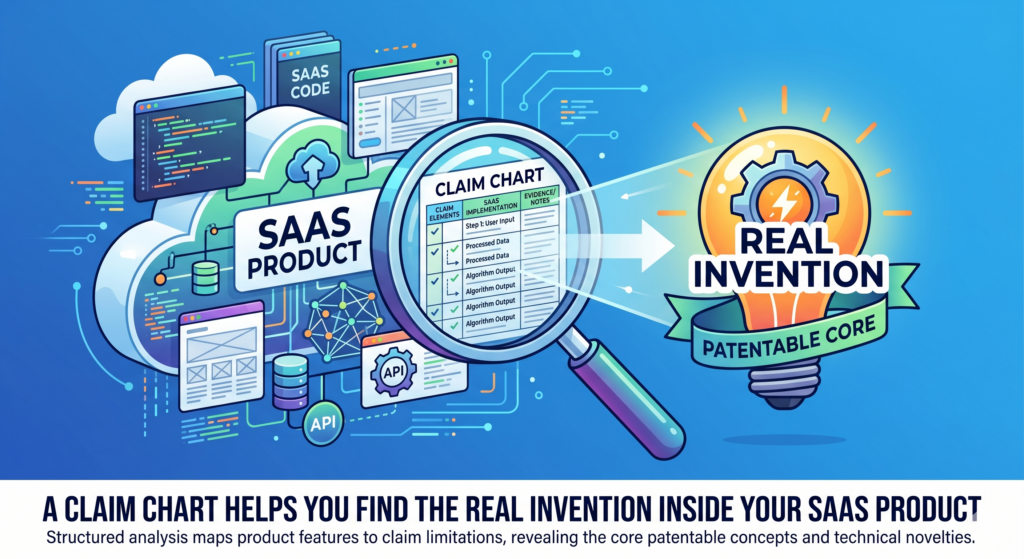
Some are useful, but easy for others to build around. The real invention is usually deeper. It is the part that solves a hard problem in a new way.
This is why a claim chart is so useful. It forces you to slow down and ask what the software is actually doing. Not what the homepage says.
Not what the sales deck says. Not what the user clicks. What the system does behind the scenes.
For a founder, this can be a powerful moment. You may realize that the thing you thought was the invention is only the outer layer.
The stronger idea may be the logic, the timing, the data match, the scoring method, the training path, or the way the system changes a workflow based on live inputs.
The visible feature is often not the strongest part of the patent
A user may see a button, a dashboard, a warning, a score, or a report. That is the visible feature. It matters, but it may not be the best part to protect.
The better patent story may be what happens before that result appears. The system may collect signals from many sources. It may clean messy data. It may detect a pattern.
It may change a rule based on user behavior. It may pick one action from several options. It may update the next step in a workflow without asking the user to think.
That hidden work can be where the value lives.
A claim chart helps you trace that hidden work. It turns the product from a flat feature list into a clear technical story.
That story can help your patent attorney write stronger claims and avoid missing the parts that make the product hard to copy.
The goal is to protect the engine, not just the paint
Think of your SaaS product like a car. The screen is the paint. The user flow is the seat and steering wheel. The back-end logic is the engine. A weak patent may talk too much about the paint. A stronger patent gets closer to the engine.
This does not mean the user interface never matters. Sometimes the way a screen changes based on system logic can be part of the invention.
But the screen should usually be tied to a deeper process. The patent should explain why the screen changes, what data caused it, and what useful result comes from that change.
For example, a hiring platform may show a ranked list of job candidates. The list itself is not enough.
The stronger point may be how the system combines skill signals, past project data, employer needs, time limits, and interview feedback to create a changing rank that improves with each hiring cycle.
That is the engine. That is what the claim chart should help uncover.
A founder should use the chart to ask sharper questions
The best claim charts do more than record what already exists. They help your team ask better questions. When you chart the invention, you may notice that one part is unclear.
You may realize that your system makes a key decision but no one has written down how it works. You may find that a model output is important, but the product team has never explained why that output is different from a normal score.
That is not a problem. That is an opening.
It gives the team a chance to capture the invention while it is still alive in everyone’s head. It also gives your patent team better material to work with. Instead of asking broad questions, they can focus on the parts that truly matter.
A clear chart can save hours of back-and-forth
Patent work often slows down because the invention is not clear at the start. The founder explains it one way.
The engineer explains it another way. The attorney hears a third version. Then everyone spends weeks trying to line up the story.
A claim chart can reduce that mess.
It gives everyone one shared view. It shows the claim part, the product fact, and the proof. When the team sees the same map, the process moves faster.
That matters for startups because time is not free. Every week spent untangling a patent story is a week not spent building, selling, hiring, or raising.
PowerPatent is built to help with this exact problem. It helps founders capture technical details early and work with real patent attorneys who can turn those details into stronger filings. To see how the process works, visit https://powerpatent.com/how-it-works
How to build a claim chart for a software invention without making it painful
A claim chart should not feel like a giant legal project. It should feel like a smart product exercise.
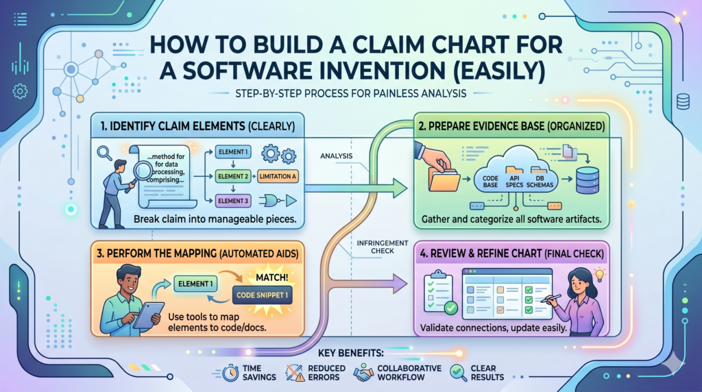
The goal is to explain the system clearly enough that someone outside the engineering team can understand what is new, how it works, and why it matters.
Start with one core invention. Do not try to chart the whole platform at once. A SaaS product may have many patentable ideas.
If you try to cover all of them in one chart, the result becomes muddy. Pick one technical problem and one system solution.
For example, do not chart your whole fintech platform. Chart the method your system uses to detect risky account changes before a payment is sent.
Do not chart your whole health app. Chart the way your system updates a care recommendation when new patient data arrives.
The first step is to write the invention in plain words
Before you touch claim language, explain the invention like you are talking to a smart founder who has never seen the product.
Use simple words. Say what problem existed, what your system does, and what changes because of it.
This simple version is not the final patent claim. It is the seed. It helps everyone stay grounded.
For example, you might write that the system watches user behavior inside a SaaS app, detects when a user is likely stuck, picks the best help action based on the user’s role and past actions, and changes the help message in real time. That is clear. It gives the chart a direction.
From there, you can break the idea into steps. The system receives data. The system checks data. The system creates a score or decision.
The system changes an output. The system stores feedback. Each step can become part of the chart.
Keep the chart close to the real product
A common mistake is to make the invention sound bigger than the product. This can feel tempting. Founders want broad protection.
But if the chart drifts too far from what the system actually does, it becomes weak.
The best chart is grounded in the real product while still pointing to the wider idea. It should show what your system does today, but also help your patent team understand the core method that could apply across future versions.
This balance is important for SaaS because your product will change. You may change your stack. You may change the front end. You may move from rules to models.
You may add new data sources. A good patent strategy looks for the invention that survives those changes.
That is one reason PowerPatent pairs software with attorney review. The software helps capture the raw details.
The attorney oversight helps shape those details into a patent strategy that is not too vague and not too narrow. Learn more here: https://powerpatent.com/how-it-works
The second step is to collect proof before writing too much
Once you know the invention, collect the proof. This may include product screens, data flow notes, model notes, API docs, design specs, demo clips, customer workflow examples, and short comments from the engineers who built the system.
Do not wait until the end to gather proof. Proof changes the way you think. You may discover that one step is handled by a third-party tool.
You may find that a feature has not shipped yet. You may see that the true invention is in a different part of the flow than you first thought.
This is normal. It is better to learn this early.
A claim chart without proof can become a wish list. A claim chart with proof becomes a working map.
The proof does not need to be pretty
Founders sometimes delay patent work because their docs are messy. They think everything needs to be clean before they can start. That is not true.
A rough system diagram can help. A screenshot with notes can help. A short video can help. A code comment can help.
A Slack note from an engineer can help. The point is not to create perfect files. The point is to capture the facts before they are lost.
The most useful proof often comes from the people closest to the work. Ask the engineer what was hard. Ask the product lead what changed after the feature shipped.
Ask the customer success team what customers can now do that they could not do before. These answers can bring the invention into focus.
What software founders should avoid when making claim charts
A claim chart can make a patent stronger, but only if it is built with care. A messy chart can create confusion.
A shallow chart can hide the real invention. A chart filled with vague words can make a strong product look ordinary.
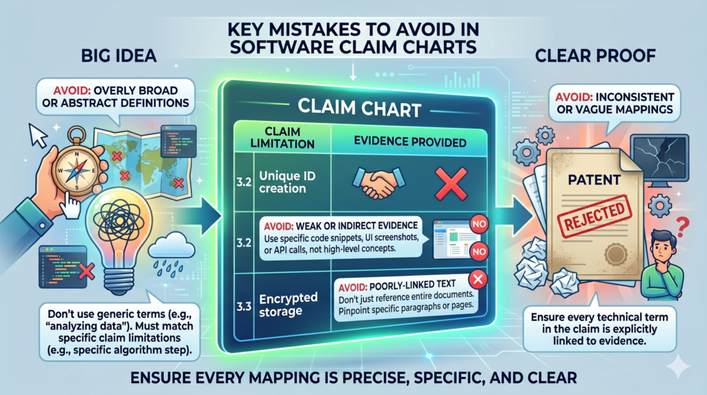
The biggest mistake is using broad labels instead of real detail. Words like “AI,” “automation,” “analytics,” “cloud,” “optimization,” and “personalization” may sound strong, but they do not explain much by themselves. A chart should show what those words mean in your system.
If the system uses AI, say what the model receives, what it predicts, how that prediction changes the workflow, and how the system handles the result.
If the system automates a task, say what decision used to require manual work and how the software now makes or supports that decision.
Do not chart the marketing message instead of the invention
Marketing language is built to persuade. Patent work needs to explain. Those are different jobs.
A homepage may say your platform “helps teams move faster with smarter insights.” That may be good sales copy, but it is not enough for a claim chart.
The chart needs to explain how the system creates those insights and what makes the process different.
This is where many startups need help. They are great at pitching the value. They may be less practiced at describing the technical path behind that value. A good claim chart bridges that gap.
The chart turns “faster onboarding” into a real process. It turns “better fraud detection” into steps, data, rules, and outputs.
It turns “smarter recommendations” into a clear chain of inputs, decisions, and results.
Strong patent work starts when you move past slogans
A slogan may open the door, but it cannot carry the patent. The patent needs the “how.” How does the system know the user is stuck? How does it pick the next action?
How does it update the score? How does it avoid false alerts? How does it reduce extra clicks? How does it handle missing data?
These questions are where strong patents are born.
For example, a cybersecurity SaaS company may say it detects threats faster. That is a good outcome. But the claim chart should show the deeper method.
It might show that the system receives event data from different tools, groups related events by device identity, compares behavior to a normal pattern, raises risk only when a sequence meets a time rule, and then changes access permissions before a human responds.
That is much stronger than a slogan.
Do not make the chart so narrow that it only covers today’s exact build
The opposite mistake is making the chart too tied to one version of the product. This can happen when a team copies code details without explaining the wider method.
Code matters, but patents should often protect the broader technical idea, not just one exact code path.
For example, your current system may use PostgreSQL, a specific queue service, and a certain model type. Those details may be useful proof, but they may not be the invention.
The invention may be the way the system detects conflicting records and resolves them before syncing data across accounts.
If the chart focuses only on the current stack, it may miss the broader value.
A good chart says enough to prove the invention, but not so much that it traps the patent inside one build.
The right level of detail protects what matters most
The right level of detail is not always obvious. Too broad can be weak. Too narrow can be easy to avoid. The goal is to describe the invention in a way that is clear, supported, and useful for the business.
This is where working with the right patent team helps. You want a process that respects how fast startups move, but still gives the invention the care it deserves.
PowerPatent helps founders bring in technical details from the product side and pair them with real attorney oversight so the filing is both practical and strong.
For founders who want patents without the old-school drag, the PowerPatent process is worth seeing here: https://powerpatent.com/how-it-works
How claim charts help during investor, partner, and buyer review
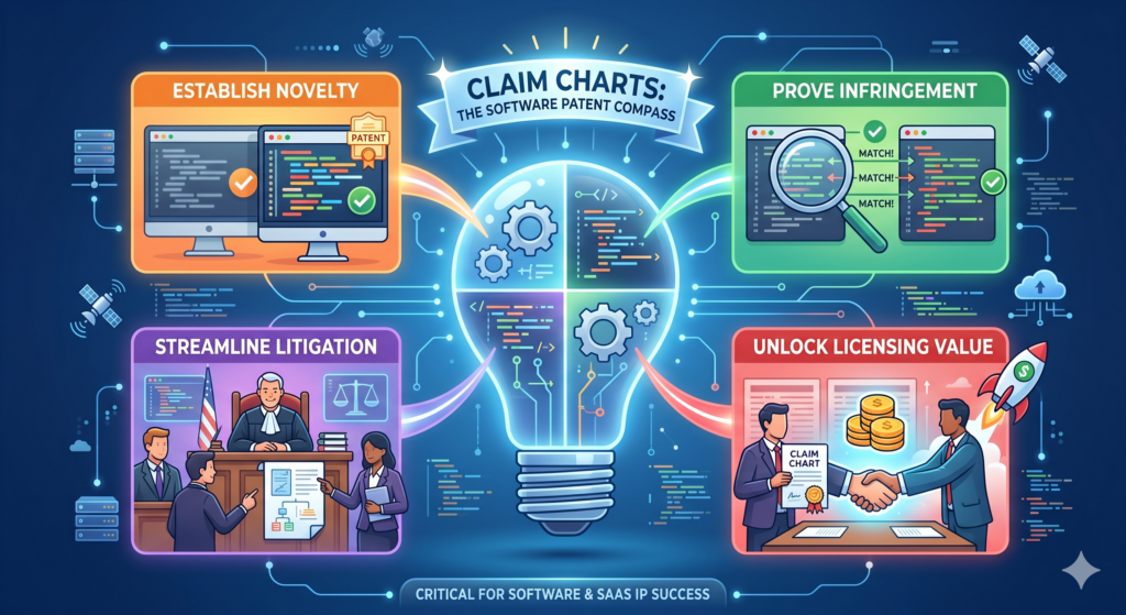
Patents are not only about stopping copycats. They can also help show that your company has built something real and hard to replace.
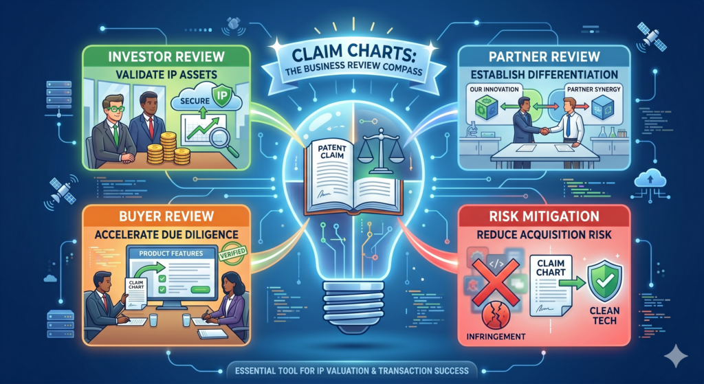
This matters when you are raising money, working with enterprise partners, or preparing for a future sale.
A claim chart can support that story because it gives structure to your IP. It helps you explain what is protected or what you are trying to protect.
It can also show that your patent work is not random. It is tied to the core product.
Investors do not want a pile of vague filings. Partners do not want confusion. Buyers do not want messy ownership questions.
They want to see that your team knows what it built and has taken smart steps to protect it.
A claim chart can make your patent story easier to trust
When someone reviews your IP, they may not read every patent document in detail.
They may ask what the patents cover, why they matter, and how they connect to the product. A claim chart can help answer those questions in a clean way.
It shows the link between the patent language and the working product. This can make the patent feel less abstract. It can also help a reviewer understand why the invention matters to the business.
For a SaaS company, this is useful because the value may be hidden in the back end.
A claim chart can show that your patent work is tied to the scoring engine, routing method, model pipeline, sync process, or automation layer that makes the product special.
Clear patent records can reduce stress later
Startups often move fast and clean things up later. That can work for some parts of the business, but it is risky with IP.
If you wait too long, it may be hard to prove who invented what, when it was built, how it worked, or why it was different.
A claim chart can become part of a cleaner record. It can help show the invention path.
It can help your team remember the key details. It can also help future reviewers see that your patent work was tied to real product choices.
This does not mean the chart should replace legal work. It should support it. It gives your patent team and business team a shared way to explain the value.
Better patent clarity can help founders move with more confidence
Founders have enough uncertainty. Product risk, market risk, funding risk, hiring risk, sales risk. IP should not add more fog than needed.
A clear claim chart can give you a better view of what you are protecting. It can help you decide which inventions deserve filings, which ones need more proof, and which ones may be better kept as internal know-how.
It can also help you avoid spending money on patents that do not support the business.
That kind of clarity is powerful.
A patent should not feel like a mystery box. It should feel like a tool. When you understand what the patent is trying to cover, you can make better decisions around product, funding, partnerships, and long-term strategy.
PowerPatent helps turn invention chaos into a clearer path
Software teams build fast. Ideas live in tickets, pull requests, diagrams, docs, demos, and people’s heads.
PowerPatent helps pull those pieces together so founders can protect what matters without losing weeks to confusion.
The platform combines smart software with real attorney oversight, which means you do not have to choose between speed and quality.
You can move quickly while still giving your invention the careful support it needs.
For deep tech startups, SaaS teams, AI builders, and engineers, that can make patents feel less like a burden and more like a smart growth move. You can see how PowerPatent helps here: https://powerpatent.com/how-it-works
A claim chart helps you decide what to patent now and what to save for later
A growing SaaS company can create many inventions in a short time. One sprint may produce a better search method. Another may add a smarter routing flow.
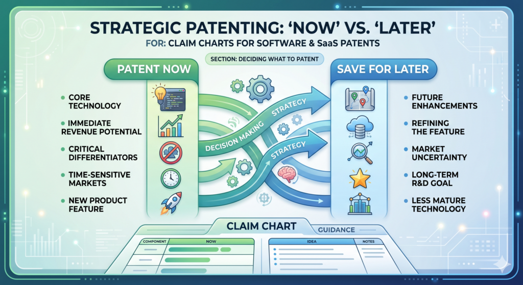
Another may improve how data is cleaned, scored, or shown to users. Soon, the team has a pile of smart work, but no clear way to decide what should be protected first.
This is where a claim chart becomes a decision tool.
It helps you see which ideas are central to the business and which ones are side features. It can show which inventions are already supported by real product proof and which ones still need more work.
It can also help you avoid filing too early on a vague idea that has not been shaped enough.
A good patent strategy is not about filing everything. It is about protecting the inventions that create real value, block easy copying, and support the company’s future.
The best invention to patent is usually tied to the core product advantage
When you look at a SaaS product, ask what makes the product hard to replace. It may not be the first thing a user sees. It may be the way the system handles messy inputs, makes decisions, updates records, predicts risk, or adapts to each customer.
A claim chart helps you test that. If the chart shows that the claimed idea touches the main product workflow, solves a real pain, and creates a clear result, it may be a strong patent target.
If the chart only points to a small design choice or a feature that competitors can avoid with a tiny change, it may not be the best first filing.
This kind of judgment matters. Startups do not have endless time or money. Every patent should earn its place.
The chart should help you rank inventions by business value and technical depth
A strong invention usually has both business value and technical depth. Business value means the invention matters to customers, revenue, retention, deals, or market position.
Technical depth means the invention is more than a simple idea. It has a real method, system behavior, or design choice that can be explained and supported.
A claim chart brings these two sides together. It shows how the technical steps support the business result.
For example, a sales software company may have a feature that recommends the best time to contact a lead. The business value is clear. But the chart should show the technical depth. How does the system pick the time?
Does it use past response patterns, account stage, buyer role, calendar signals, and message type? Does it update the timing after each failed attempt? Does it change the recommendation when a new stakeholder enters the deal?
Those details help show whether there is a real invention or only a useful feature.
A claim chart can also show when an idea is not ready yet
Not every good idea is ready for a patent filing today. Sometimes the product team has a direction, but not enough detail.
Sometimes the model is still changing. Sometimes the system works in a demo, but not in production. Sometimes the technical edge is still unclear.
A claim chart makes this visible. If you cannot explain the steps, the inputs, the outputs, and the result, the idea may need more product work before it becomes patent-ready.
This does not mean the idea is bad. It means the team should keep capturing notes as the system matures. The chart can become a living record. As the product becomes clearer, the patent story becomes clearer too.
Filing too soon on a thin idea can waste a valuable chance
A weak early filing can create a false sense of safety. The team may believe it has protected the invention, but the filing may not cover the strongest version of the product.
Later, when the product improves, the early filing may not support the details that matter most.
This is why invention capture should be steady, not rushed. Founders should not wait forever, but they should also avoid filing on a half-formed idea with no real support.
PowerPatent helps solve this tension by making it easier to capture invention details as they appear, then work with real patent attorneys to decide what is ready and what needs more shaping.
That way, founders can move fast without turning patent work into guesswork. See how it works here: https://powerpatent.com/how-it-works
A claim chart helps your attorney write stronger software patent claims
A patent attorney can do better work when the invention is clear. That sounds simple, but it is one of the biggest reasons claim charts matter. The attorney is not inside your codebase every day.
They did not sit in every product meeting. They may not know which bug took three weeks to solve or which workflow change made customers say, “This is exactly what we needed.”
A claim chart gives the attorney the missing context.
It shows the product facts. It shows the technical flow. It shows where the invention lives. It also helps the attorney ask better questions. Instead of starting with a blank page, they can start with a map.
Better claim drafting starts with better invention detail
A software patent claim should not read like a product slogan. It should define a real system or method. To do that well, the attorney needs to understand the moving parts.
They need to know what data enters the system, where it comes from, how it is changed, what rules or models act on it, what result is created, and how that result changes the software behavior. They also need to know which parts are required and which parts are optional.
A claim chart can make this clear without forcing the founder to write legal language. The founder and engineering team can explain the product in normal words. The attorney can then turn that into stronger claim language.
The chart gives the attorney more room to build a useful claim set
A strong patent filing often includes claims at different levels. Some claims may focus on the broad system idea. Others may cover narrower versions, special cases, or important technical details. This gives the filing more depth.
A claim chart helps the attorney see those layers. It may show a core workflow that should be protected broadly. It may also reveal backup details that can support narrower claims if needed. Those backup details can be very important.
For example, a SaaS tool may use a special method to merge duplicate customer records. The broad idea may involve detecting conflicts across data sources and creating a trusted record.
The narrower details may involve how the system handles time stamps, user roles, confidence scores, or manual overrides. Those details can help build a richer patent filing.
Without a chart, those details may be missed.
A claim chart can reduce costly misunderstandings
Misunderstanding the invention can lead to weak claims. It can also lead to delays. The attorney may draft one version, the founder may say it misses the point, the engineer may correct the flow, and the team may have to start over.
A claim chart lowers that risk because it gives everyone a shared reference.
The chart does not need to be perfect. It just needs to be clear enough to show the invention path. The attorney can refine it, challenge it, and use it to guide the filing. But the chart gives the process a stronger starting point.
Clear communication is a real advantage for fast teams
Startups move quickly, and patent work often fails when the process cannot keep up. A founder may not have time for long meetings. An engineer may not want to write a long memo. The team may be focused on shipping.
That is why the capture process matters. It should fit the way modern teams work. It should help gather the right details without pulling everyone away from the product for days.
PowerPatent is built around this idea. It helps teams turn technical work into patent-ready material with smart software and attorney oversight.
Founders get more speed and more structure, while attorneys get better invention inputs. To explore the process, visit https://powerpatent.com/how-it-works
A claim chart can help you avoid weak software patent language
Weak software patent language often sounds impressive at first. It may use words like “intelligent,” “dynamic,” “automated,” or “optimized.” But if those words are not tied to real system steps, they do not carry much weight.
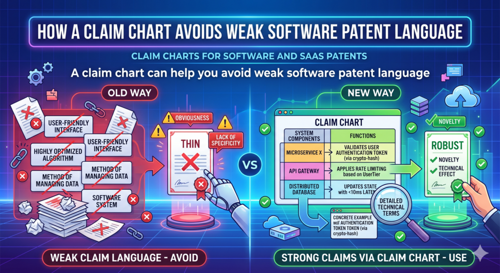
A claim chart helps strip away empty words.
It forces the team to explain what the system actually does. When the chart is done well, every important phrase is tied to a real product fact. This makes the patent story sharper and more believable.
For a software or SaaS company, this is critical. The world is full of tools that collect data, process data, and show results. Your patent needs to show what your system does in a specific and useful way.
Vague words should be replaced with clear system behavior
Instead of saying the software “intelligently routes tasks,” the chart should explain how the routing works.
Does the system read task type, user load, past completion time, customer value, and deadline risk? Does it assign work based on a changing score? Does it update the route when a user becomes unavailable?
Instead of saying the platform “personalizes content,” the chart should explain what signals are used and how the content changes.
Does the system look at user role, past clicks, account stage, error history, and time in workflow? Does it choose a message, hide a step, or change the next screen?
Plain detail beats fancy wording.
A clear chart makes the invention sound stronger because it is easier to believe
People trust what they can understand. This is true for users, investors, partners, and patent reviewers. If the invention is explained in clear steps, it feels real. If it is buried under vague words, it feels weak.
This does not mean the patent should be simple in a careless way. It means the core idea should be clear.
A smart person should be able to read the chart and understand what the software does, even if they are not the engineer who wrote the code.
That kind of clarity is rare. It also makes the patent process smoother.
The chart should show the technical result, not just the business result
A business result is what the customer cares about. A technical result is what the system changes to create that value. Both matter, but they are not the same.
For example, the business result may be faster onboarding. The technical result may be that the system detects missing setup steps, predicts which step blocks activation, and changes the user’s next screen to remove that block.
The business result may be fewer payment errors. The technical result may be that the system compares invoice fields against prior vendor patterns, flags conflicting payment data, and pauses payment before release.
A claim chart should connect these two. It should show how the technical steps create the customer value.
This is especially important for AI and machine learning inventions
Many founders say their product uses AI. That alone is not enough. The chart should explain the role of the AI inside the system.
What does the model receive? What does it output? How is that output used? Does the system change a workflow, update a record, pick a next step, generate a warning, or improve a later prediction? Does the system combine model output with rules or user feedback? Does it handle low-confidence results in a special way?
These details can matter a lot. AI patents are often strongest when they explain the full system around the model, not just the fact that a model exists.
PowerPatent helps AI and SaaS teams capture these details in a way that is easier to turn into strong patent filings.
The goal is not to slow the team down. The goal is to protect the hard work behind the product. You can see how PowerPatent supports that here: https://powerpatent.com/how-it-works
A claim chart helps connect the patent to the product roadmap
A SaaS product is never finished. The team is always adding, cutting, testing, and improving. That means your patent strategy should not only look at what exists today. It should also understand where the product is going.
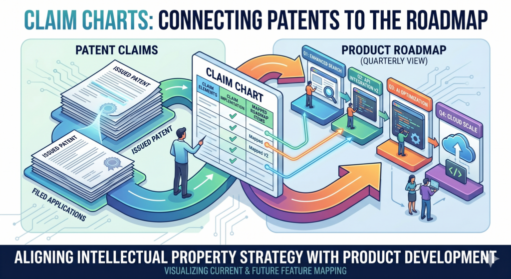
A claim chart can help with that.
When you map the invention, you can see which parts are stable and which parts may change.
You can also see which future features may build on the same core idea. This helps your patent team think more clearly about how the filing may support the roadmap.
The best patent work protects the product direction, not just the current screen
The current product screen may change next month. The back-end service may be rebuilt. The model may be retrained. The user flow may be simplified. But the core invention may stay the same.
A claim chart helps identify that core.
For example, your SaaS platform may currently show a risk score in a dashboard. Later, that same score may trigger an automated action without showing the dashboard at all. If the patent only focuses on the dashboard, it may miss the future value.
If the chart focuses on how the risk score is created and used to change system behavior, the patent story may better match the roadmap.
This is why claim charts should include both today’s proof and tomorrow’s direction.
Roadmap context helps your patent team avoid narrow protection
A patent filing does not need to describe every future feature in detail, but it should be written with awareness of where the product may go.
If your attorney knows that the system may later support more data sources, new model types, or different user actions, they can think more carefully about how to describe the invention.
This does not mean making wild guesses. It means sharing realistic product direction.
If the current product uses email data, but the roadmap includes chat, voice, and CRM data, that may matter.
If the current product sends alerts, but the roadmap includes automated approval changes, that may matter too.
A claim chart can make these future paths visible without losing focus on the working invention.
The chart can guide what your team documents next
Once you see the invention clearly, you can become more intentional about documentation. You may realize that your team should save model notes, system diagrams, test results, workflow examples, or records of key design choices.
This does not need to become a heavy process. It can be simple and lightweight. The point is to avoid losing the story.
When an engineer solves a hard problem, capture why the old way failed and how the new method works.
When a customer reacts strongly to a feature, capture what changed in the workflow. When a model improvement creates a better result, capture what input or process made the difference.
Small records today can make a big difference later
Patent work becomes much easier when the team has real records. You do not need perfect notes. You need useful notes. A short design doc, a diagram, a product ticket, or a clear demo can save hours later.
The claim chart can point your team toward the records that matter most. Instead of saving everything, you can save the proof that supports the core invention.
That is a practical way to make patents part of the build process without turning engineers into paperwork machines. It also helps founders stay in control of the IP story as the product grows.
PowerPatent helps make this easier by giving founders a clearer path from invention capture to attorney-backed filings.
For teams that want to protect what they are building while staying focused on growth, the process starts here: https://powerpatent.com/how-it-works
A claim chart can reveal what competitors may try to copy
A smart SaaS founder does not only think about what the product does today. They also think about what a competitor might copy tomorrow.
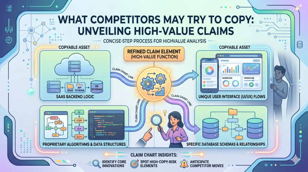
This does not mean acting from fear. It means being clear about the parts of the product that create the most value.
A claim chart helps with that because it shows the parts of the system that are hard to see from the outside. A competitor may see your dashboard, your demo, your pricing page, or your sales deck.
But they may not know the exact method behind your routing engine, matching logic, scoring method, model feedback loop, or data sync process.
That hidden layer is often where copying risk lives.
A good chart helps you protect the parts that are easy to admire but hard to see
Competitors often copy outcomes. They see that your product gives users better results, faster setup, cleaner data, fewer errors, or smarter alerts. Then they try to build something that looks close enough.
A claim chart helps your team ask a better question. What would they need to copy to get the same result?
That answer may not be the screen. It may be the chain of steps behind the screen. It may be the way your system handles edge cases.
It may be the way your platform uses feedback from one customer action to change the next action. It may be the way your system treats low-quality data differently from trusted data.
When you chart these steps, your patent strategy becomes more focused. You stop trying to protect the whole product in a vague way. You start protecting the parts that make the product work.
The chart should show what makes your system hard to replace
A strong SaaS business often has a hidden edge. Maybe the product becomes smarter as users interact with it. Maybe the system can process messy data that older tools reject.
Maybe your workflow gives customers a useful answer with fewer steps. Maybe your back-end logic prevents errors before a human even sees them.
These are the kinds of details that deserve attention.
For example, a legal tech SaaS tool may help teams review contracts faster. That outcome is broad.
The real invention may be that the system detects clause conflicts across past contracts, maps them to a customer rule set, creates a risk reason, and changes the review queue based on that reason.
That is more than “contract review automation.” That is a specific software process. A claim chart can help make it visible.
A competitor view can sharpen your claim chart
When you create a claim chart, look at the invention from the outside. Imagine a competitor wants to build a similar product without seeing your code. What public parts would they copy first?
What hidden parts would they need to figure out? Which steps would let them create the same customer result?
This exercise can help you find the most important parts of the invention.
It can also help you avoid over-focusing on small details. If a competitor can avoid a narrow claim by changing a button label, moving a screen, or using a different database, the chart may need to go deeper.
The goal is to capture the technical method that gives you leverage.
Strong patent strategy starts with knowing what must not be easy to copy
Not every idea needs a patent. But when a software method is central to why customers choose you, it deserves serious attention.
A claim chart can help you see that clearly. It turns “we have a great feature” into “this is the system behavior that makes the feature valuable.” That is the kind of thinking that helps founders build stronger IP.
PowerPatent helps founders do this without making the process feel slow or painful. The platform helps capture technical details from the product, while real patent attorneys help shape those details into stronger filings. You can see how PowerPatent works here: https://powerpatent.com/how-it-works
A claim chart helps turn engineer knowledge into patent-ready material
Engineers often know the invention better than anyone. They know which part was hard.
They know which approach failed. They know which shortcut did not work. They know which design choice made the system faster, cleaner, safer, or more useful.
The problem is that this knowledge often stays inside their heads, code comments, tickets, or private chats. It may never make it into the patent process unless someone pulls it out in the right way.
A claim chart gives engineers a simple way to share what matters.
Engineers should explain the hard part, not write legal text
An engineer does not need to write a patent claim. That is not the job. The engineer’s job is to explain the system with enough detail that the patent team can understand what was built and why it matters.
That means explaining the hard part in plain words.
For example, instead of saying, “The classifier improves routing,” the engineer can explain that the system receives support messages, extracts signals from message text and account history, predicts the type of issue, checks the confidence level, and only auto-routes the issue when the confidence is above a set level. If confidence is low, the system asks for more context or sends it to a human queue.
That is useful. That gives the patent team something real to work with.
The best engineer notes explain why the chosen method was not obvious
A claim chart becomes much stronger when it includes the reason behind the design. Why did the team choose this method? What older approach failed? What made the problem tricky? What result improved after this change?
These notes do not need to be long. They just need to be honest and specific.
For example, the team may have tried a simple keyword match and found that it created too many false alerts.
Then they built a system that combines user role, timing, past actions, and message type before sending an alert. That story matters because it shows there was a real problem and a specific technical solution.
A patent attorney can use that context to better understand the invention.
Product managers can help connect technical steps to customer value
Engineers know the system. Product managers often know the customer pain. A strong claim chart needs both.
The chart should not only say what the system does. It should also show why that action matters. Does it cut manual review? Does it reduce duplicate work? Does it lower error rates?
Does it speed up setup? Does it help users make better decisions? Does it let a company run a workflow that used to break at scale?
That link between technical action and customer value makes the invention easier to understand.
The founder should act as the bridge between product value and patent value
The founder is often the best person to connect the dots. They understand the market, the product, the customer, and the company’s future. They can help decide which technical details matter most for the business.
A claim chart gives the founder a way to guide the patent story without writing the patent alone.
That is important because patents should not be disconnected from the company’s goals. They should support the product, the roadmap, the moat, and the story you tell investors or partners.
PowerPatent makes this easier by giving founders and technical teams a simpler way to capture invention details, then combining that with real attorney oversight.
For busy SaaS teams, this means less confusion and a stronger path from idea to filing. See how it works here: https://powerpatent.com/how-it-works
A claim chart helps you make your patent filing more complete
A patent filing should give enough detail to support the invention. For software, that often means describing more than one version of the system.
It may include different ways to collect data, process data, create outputs, update rules, train models, or change a user workflow.
A claim chart can help your team see which details should be included before the filing is prepared.
This matters because software products change. If your patent filing only describes one exact version, it may not support the way your product grows. If it describes the invention too broadly with no support, it may become weak. The chart helps find the middle ground.
A complete filing often needs examples, alternatives, and edge cases
Software systems rarely work in only one clean path. Real users create messy data. Systems fail. Inputs are missing. APIs return odd results. Models produce low-confidence outputs. Users take unexpected actions.
These edge cases can be valuable. They often show the real intelligence of the system.
For example, a SaaS tool that syncs customer data may have a special way to handle conflicting records.
If two systems show different job titles, different email addresses, or different account owners, the tool may choose which value to trust based on source rank, time stamp, user role, and past correction history.
That conflict logic may be more patent-worthy than the basic sync.
Edge cases can show where the invention is strongest
A simple happy path may make the product look ordinary. Edge cases can reveal the design choices that make it special.
A claim chart should capture how the system behaves when things are not perfect. What happens when data is missing? What happens when two signals conflict?
What happens when a model is unsure? What happens when a user overrides the system? What happens after the override?
These answers can give the patent filing more depth. They can also help your attorney write claims and examples that better match the real product.
A claim chart can help avoid missing important backup details
Backup details are the extra support that can make a filing stronger. They may not be the main claim, but they can help protect narrower versions of the invention.
For software, backup details might include how data is grouped, how a score is updated, how a rule is selected, how a user action changes future outputs, how the system handles timing, or how a model result is combined with a rule-based check.
These details can be easy to miss when everyone is focused on the big idea.
A stronger filing gives your patent team more options later
Patent work can involve back-and-forth with the patent office. During that process, having more support in the filing can matter.
If the original filing includes useful examples and variations, your attorney may have more room to adjust claim language while still staying tied to the invention.
That flexibility can be valuable.
It starts with better invention capture. A claim chart is one of the cleanest ways to capture those details before they disappear into old tickets, stale docs, or changed code.
PowerPatent helps founders capture these details early, then work with real patent attorneys to turn them into stronger patent filings. For teams that want both speed and quality, this is a better way to protect software inventions. Learn more here: https://powerpatent.com/how-it-works
A claim chart helps keep the patent focused on the customer’s real pain
A software patent should not float above the product like a vague idea. It should connect to a real problem that customers feel. When the patent story connects to the customer’s pain, it becomes easier to understand why the invention matters.
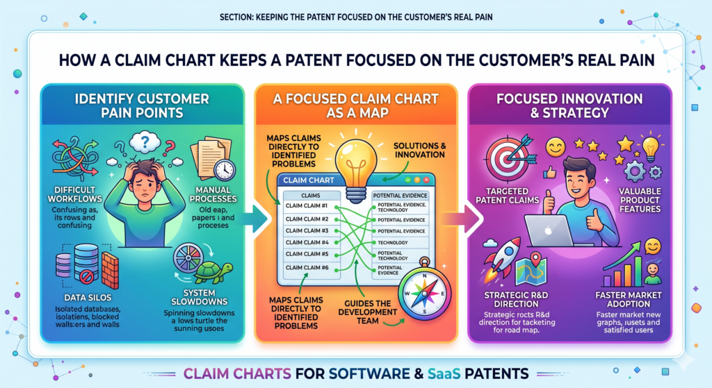
A claim chart helps make that connection clear.
It shows how the system takes action inside the software to solve a real problem. It can connect a messy workflow to a clean result.
It can show how a slow process becomes faster, how a manual step becomes automatic, or how a risky action becomes safer.
Customer pain gives the claim chart a stronger center
Start with the pain. What did users struggle with before your product? What took too long? What caused errors? What needed expert review? What blocked scale? What made old tools fail?
Then connect that pain to the software steps.
For example, a customer success platform may help teams predict churn. The customer pain is that account teams often find out too late.
The invention may be a system that detects weak usage patterns, compares them with customer stage and support history, creates a churn risk reason, and changes the next recommended action for the account owner.
That is specific. It connects the pain to a technical path.
A patent story becomes stronger when the result is easy to feel
The best software inventions are not abstract. They create a result people can feel. A user saves time. A team avoids an error. A company catches risk sooner. A system becomes easier to control. A workflow becomes less fragile.
A claim chart should bring that result into the open.
This does not mean filling the chart with emotional language. It means clearly showing the link between system behavior and useful outcome.
When that link is strong, the invention becomes easier to explain to attorneys, investors, partners, and internal teams.
The chart should show both the before state and the after state
A simple before-and-after view can make a claim chart much stronger. Before the invention, the user may have needed to check five tools. After the invention, the system pulls signals from those tools and creates one action.
Before the invention, errors were found after damage was done. After the invention, the system catches risk before the action is completed.
This kind of contrast makes the invention easier to understand.
It also helps your patent team explain the problem and solution in a cleaner way.
The best charts make the invention feel practical and real
A patent should not feel detached from the business. It should protect a real advantage. A claim chart helps by keeping the invention grounded in the product and the user problem.
When done well, it gives founders more confidence. It gives attorneys better detail. It gives the company a clearer IP story.
That is exactly the kind of process modern software teams need. PowerPatent helps founders move from raw invention details to stronger attorney-backed patent filings without the old-school friction. See how it works here: https://powerpatent.com/how-it-works
A claim chart helps prove that your software patent is tied to real work
A strong software patent should not feel like an idea floating in the air. It should feel tied to real work your team has done.
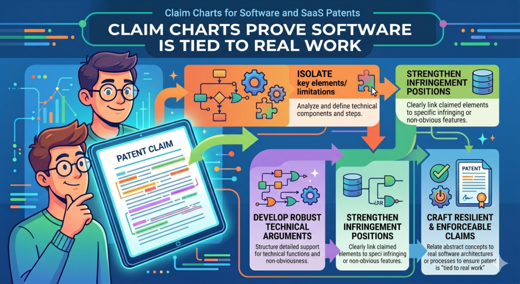
That is one reason claim charts are so useful. They connect the words in the patent to the system your team built, tested, and improved.
This matters because software can be easy to describe in broad terms. Anyone can say they use automation, AI, rules, or data.
But a real invention has shape. It has inputs, steps, outputs, and results. A claim chart helps show that shape.
For SaaS founders, this is especially important because your product may change often. The chart helps capture the invention at a point in time, before code changes, screens move, or team memory fades.
A claim chart gives your patent story a stronger base
When your patent story is built on real product facts, it becomes more useful. Your attorney can draft with more confidence.
Your team can explain the invention more clearly. Investors and partners can understand why the filing matters.
The chart does not need to include every small product detail. It should focus on the parts that prove the invention.
If the claim says the system creates a score, the chart should show where that score comes from. If the claim says the system changes a workflow, the chart should show what changes and why.
That kind of support makes the patent feel grounded.
The strongest charts show the invention through real examples
A real example can make a claim chart much easier to understand. Instead of only saying the system detects risk, show one risk case. Instead of only saying the system recommends an action, show one action path.
Instead of only saying the system updates a model, show what new data causes the update.
For example, a SaaS platform for field service teams may predict which job will miss its deadline.
The chart can show a real path where the system receives job location, technician load, traffic delay, part status, and customer priority. It then creates a delay score and changes the dispatch order.
That example gives the invention life. It helps the patent team see not just what the system does, but why it matters.
Product proof can come from many places inside the company
Many founders think proof must be formal. It does not. A claim chart can be supported by product specs, screenshots, system maps, test notes, API docs, design files, data examples, internal demos, and engineering notes.
What matters is that the proof helps explain the invention clearly.
A rough diagram may be more useful than a polished slide. A short engineer note may be more helpful than a long marketing page.
A simple before-and-after workflow may show the invention better than a complex technical memo.
The goal is not to create a perfect museum record. The goal is to give your patent team enough clear material to protect the right thing.
The best time to collect proof is while the team still remembers the build
Memory fades fast in startups. An engineer may remember a hard design choice today and forget the details six months later.
A product manager may remember why one workflow changed, but that context may vanish after three releases.
A claim chart helps capture the story early.
This is one of the reasons PowerPatent is built for modern technical teams. It helps founders gather the important invention details from the people closest to the work, then connects that with real attorney oversight.
The result is a smoother path from working product to stronger patent filing. You can see how it works here: https://powerpatent.com/how-it-works
A claim chart helps you explain AI features without sounding vague
AI features can be powerful, but they are often explained poorly. Many teams say their system uses AI to make something smarter. That may be true, but it is not enough for a strong patent story.

A claim chart helps you explain the AI in simple, useful terms. It shows what the system receives, what the model does, what output is created, and how that output changes the software. This is much stronger than saying the system uses machine learning.
For SaaS patents, this matters because the AI is often only one part of the invention. The real value may be how the model works with rules, user actions, business data, timing, or feedback.
The chart should explain the role of the model inside the full system
An AI model by itself may not tell the whole story. The claim chart should show where the model fits into the larger workflow.
For example, the system may collect customer usage data, clean the data, group events by account, send selected signals into a model, receive a churn score, compare that score with contract value, and then trigger a custom action for the account owner.
That is a system. It is not just “AI predicts churn.”
The chart should show the path from raw data to useful action. This helps your patent team understand whether the invention is in the model, the data prep, the scoring logic, the action trigger, the feedback loop, or the full chain.
AI patent value often lives in how the output is used
A model output is only useful if the system does something with it. A claim chart should make that action clear.
Does the output change a user screen? Does it create a task? Does it block an action? Does it adjust a setting? Does it route work to a different person? Does it update a later model run? Does it ask for more data when confidence is low?
These are important details. They show how the AI creates a practical result.
For example, a medical workflow tool may use AI to rank patient messages.
But the stronger invention may be that the system changes the review order, asks for missing context, and routes high-risk cases based on a mix of model output and clinic rules.
That is the kind of system behavior a claim chart should capture.
The chart should show how the system handles weak or uncertain AI results
Real AI systems are not perfect. Sometimes a model is unsure. Sometimes the data is poor. Sometimes two signals point in different directions. A strong SaaS product often has special logic for these cases.
That logic can be very important for patents.
If the model confidence is low, does the system ask the user a question? Does it send the item to review? Does it use a backup rule? Does it wait for more data? Does it mark the output as uncertain and stop automation?
These choices can make the system safer, more useful, and more defensible.
Handling uncertainty can be part of the invention
Many AI tools look good in demos but fail in messy real life. A product that handles messy inputs well may have a real technical edge.
A claim chart should capture that edge. It should not only show the clean path. It should show what happens when the system faces real-world problems.
That is where many strong AI and SaaS inventions live. They do not just make predictions. They make the predictions useful, safe, and tied to the workflow.
PowerPatent helps AI builders and SaaS founders turn these hidden system details into stronger patent filings with smart software and real attorney oversight.
To see how PowerPatent helps technical teams protect what they are building, visit https://powerpatent.com/how-it-works
A claim chart helps keep your software patent aligned with your moat
A patent should support the parts of your company that make you hard to copy. That is your moat. In software, your moat may come from data, workflow design, model behavior, system speed, customer lock-in, or a better way to solve a painful problem.
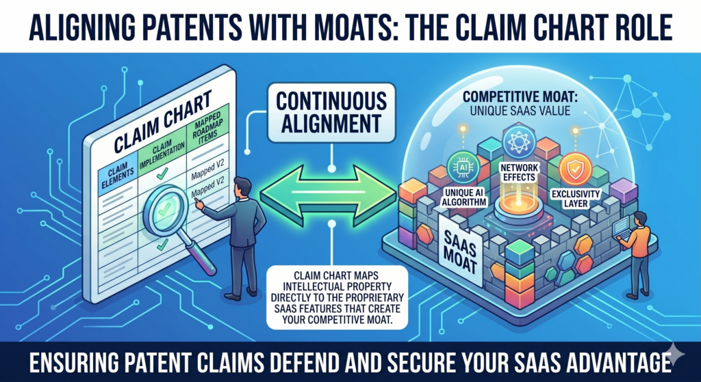
A claim chart helps connect your patent work to that moat.
Without a chart, patent filings can drift toward surface features. With a chart, the team can keep asking whether the claim points to the real advantage. This makes the patent strategy more useful for the business.
Your moat is often deeper than your product demo
A demo shows what the user sees. A moat is often what the system does to create that result again and again.
For example, a logistics SaaS platform may show a clean delivery dashboard. But the moat may be the way the system predicts delays, updates routes, handles missing carrier data, and changes customer alerts based on risk.
A claim chart helps your team look below the demo. It asks what part of the system creates the advantage. It also helps you see whether the patent claim is aimed at that advantage or just the visible result.
A claim chart should make the hard-to-copy part clear
When you read the chart, the hard-to-copy part should stand out. It may be a special data flow. It may be a ranking method.
It may be an error handling method. It may be a way to train a model using user actions. It may be a way to update a workflow in real time.
If the chart does not show anything hard to copy, the invention may need more thought. The team may be charting the wrong feature. Or the claim may need to be framed around a deeper system step.
This is why claim charts are not just legal support. They are strategic tools. They help founders decide whether the patent is aimed at the right layer of the business.
A patent should support the story you tell the market
Founders often talk about speed, accuracy, trust, control, or automation. A strong claim chart helps explain how the product delivers those promises.
If your company says it helps teams move faster, the chart should show the software steps that remove delay. If your company says it catches risk earlier, the chart should show how the system detects risk before damage happens.
If your company says it makes work easier, the chart should show what decisions the software handles for the user.
This makes your patent story and product story work together.
Strong IP is easier to value when it is tied to the business
A patent that protects a random side feature may not help much. A patent that protects a core workflow, scoring method, or system behavior can matter much more.
A claim chart helps make that link visible. It shows how the protected invention supports the thing customers care about and competitors may want to copy.
That kind of clarity can help during fundraising, sales talks, partner review, and long-term planning.
It also helps founders feel more in control of their IP, instead of feeling like patents are just expensive documents they do not fully understand.
PowerPatent is built for founders who want that control. It helps technical teams capture the real invention, then pairs that work with attorney guidance so the filing supports the business. See how PowerPatent works here: https://powerpatent.com/how-it-works
Conclusion
Claim charts help software and SaaS founders turn hidden technical work into clear, useful patent support. They show what your system does, why it matters, and where the proof lives, so your patent can protect the real engine behind the product, not just the screen users see.
For fast teams, this clarity saves time, reduces mistakes, and helps attorneys write stronger filings. The best move is to capture invention details while they are fresh. PowerPatent makes that easier with smart software and real attorney oversight, without pulling your team away from building the company itself. See how it works here: https://powerpatent.com/how-it-works