AI patents can get messy fast. One claim may talk about training data, model steps, feature extraction, prompts, embeddings, inference, feedback loops, or hardware. A claim chart brings all of that into one clear view.
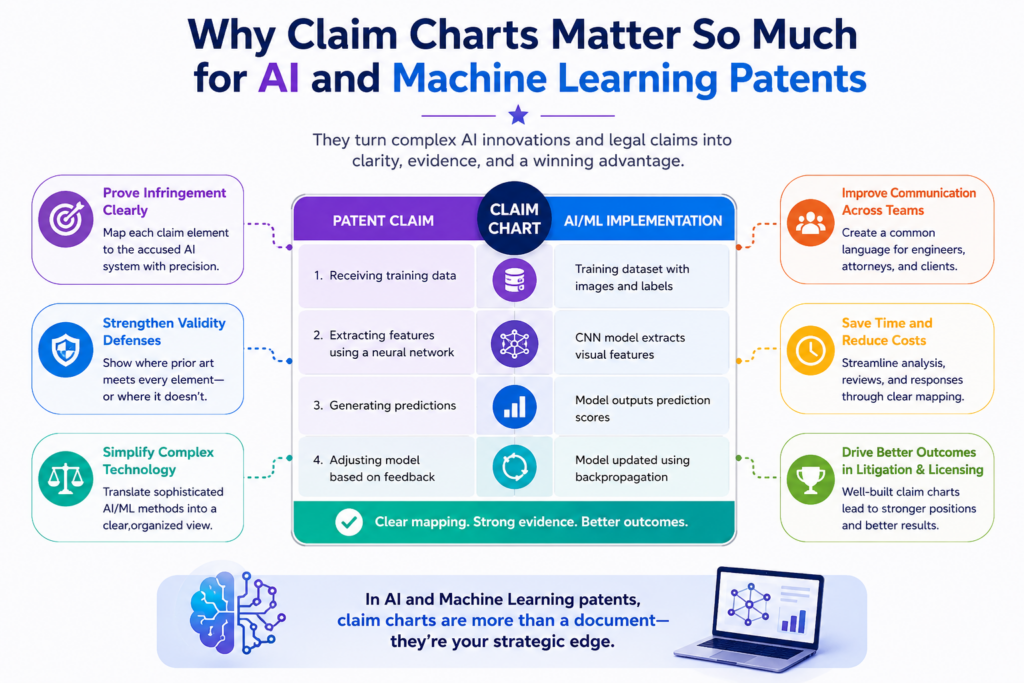
Why claim charts matter so much for AI and machine learning patents
A claim chart is one of the most useful tools in AI patent work because it forces the invention to become clear. It takes a patent claim, breaks it into small parts, and lines each part up with real proof.
That proof may come from code, model flow, system logs, diagrams, product screens, training steps, test results, or a live feature inside the product.
For AI and machine learning patents, this matters because the invention often lives inside layers of math, data, software, and system behavior. A founder may know the product is new.
An engineer may know the model works in a smart way. But unless the patent team can show where each claimed step appears, the patent can become too loose, too broad, or too hard to defend.
A strong claim chart turns a complex AI idea into a clean map. It helps everyone see what the invention is, how it works, where it shows up, and how it connects to the words in the patent.
Claim charts make hidden AI work easier to see
Many AI inventions are not obvious from the outside. A user may click a button and get a smart answer, but the real value may happen behind the screen.
The system may clean messy data, choose a model path, score outputs, improve a prompt, update a memory layer, or rank results in a new way.
That hidden work can be hard to explain in a normal product demo. A claim chart gives that work a place to live.
It lets the team point to each part of the system and say, “Here is where this step happens. Here is why this step is not just normal software. Here is how the model creates a better result.”
This is especially useful when a startup has fast-moving code. The team may change the model, swap tools, tune prompts, or add new data sources.
Without a chart, the patent story can drift away from the real product. With a chart, the patent stays tied to what the product actually does.
The goal is not to make the patent longer, but to make it stronger
A claim chart is not about adding more words for the sake of it. It is about making every important word count. When the chart is done well, weak spots become clear early.
The team can see when a claim is too vague, when a feature is not supported, or when a key step needs better detail.
This saves time later. It also helps avoid the painful mistake of filing a patent that sounds impressive but does not match the actual invention.
For AI founders, that mistake can be costly because the product may move faster than the patent process. Once the core details are lost, they can be hard to rebuild.
That is why PowerPatent is built for technical teams that want speed without losing quality.
The platform helps founders turn real invention details into clear patent work, with smart software and real attorney review. You can explore the process here: https://powerpatent.com/how-it-works
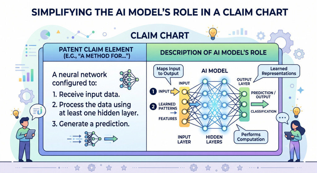
What a claim chart actually shows in an AI patent
A claim chart shows how each part of a patent claim connects to facts. Think of it as a side-by-side view of words and proof. On one side, you have the claim language.
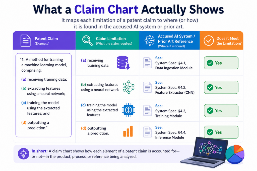
On the other side, you have the matching details from the product, model, code, documents, or outside system.
This simple format is powerful because patent claims can be dense. Even when the invention is simple in the founder’s mind, the claim may include many parts.
It may say that a system receives data, transforms the data, trains or applies a model, generates an output, checks that output, and updates something based on feedback.
Each of those parts needs support. A claim chart helps the team check whether the support is real, clear, and complete.
AI claim charts must connect both software behavior and model behavior
A normal software claim chart may focus on system steps, user actions, databases, screens, servers, or APIs. An AI claim chart often needs to go deeper.
It may need to show what data goes into the model, how the model uses that data, what the model produces, and how the system uses the result.
For example, a patent may claim a way to detect risk in medical images, predict equipment failure, match buyers with products, or create code suggestions.
The chart should not only say that a model is used. That is too thin. It should show what the model receives, what the model does differently, and why the result matters.
This is where many AI patent drafts get weak. They treat the model like a magic box.
They say the system “uses AI” or “applies machine learning,” but they do not explain the real engine. A good claim chart pushes the team to be more honest and more exact.
The best claim charts make the invention feel simple without making it shallow
The chart should not bury the reader in raw code or heavy math. It should explain the invention in a way that a smart person can follow. That means the evidence should be clear, but not messy.
A code path may matter, but the chart should explain what the code does in plain words. A model diagram may help, but the chart should show why the diagram supports the claim.
For founders, this is a key point. You do not need to become a patent expert to help build a strong claim chart.
You need to explain what your system does, where the new part lives, and why it works better than the old way. The legal structure can be handled by the patent team, but the invention truth must come from the builders.
PowerPatent helps capture that builder knowledge before it fades. Instead of forcing founders into long back-and-forth emails, it helps organize the technical story so attorneys can review it with more context and less guesswork.
See how it supports the workflow here: https://powerpatent.com/how-it-works
How claim charts help before you file an AI patent
Many people think claim charts are only used after a patent exists. That is not true. For AI startups, a claim chart can be useful before filing because it helps shape the patent strategy early.
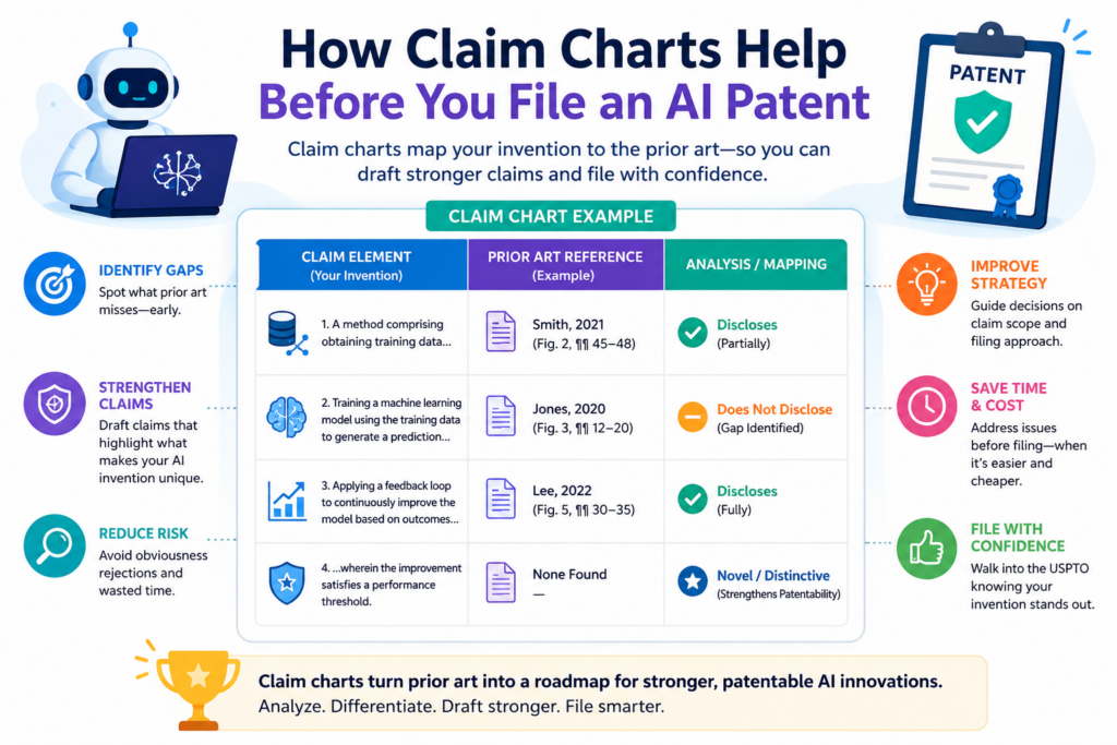
Before filing, the chart can act like a stress test. It helps the team look at a draft claim and ask whether the invention is actually supported by the product.
If a claim says the model improves output quality through a feedback loop, the team should be able to point to where that loop happens.
If a claim says the system selects a model based on user context, the team should show how that context is found and used.
This early check can make the final patent much better. It can also reveal missing details before they become problems.
Early claim charts help teams find the real invention faster
AI products often include many moving parts. A startup may use a base model, a custom layer, a data pipeline, a ranking engine, a workflow tool, and a user feedback loop.
Not all of that is patent-worthy. Some parts may be standard. Some parts may be open-source. Some parts may be new only in how they are combined.
A claim chart helps separate the ordinary parts from the special parts. This is valuable because patents should focus on what gives the company an edge. The chart makes the team ask better questions.
What step creates the better result? What part would be hard for a rival to copy without copying the core idea? What did the team solve that others were missing?
Those questions are simple, but they are powerful. They turn patent work from a vague task into a focused business move.
A weak chart can show you where the patent needs more support
If a claim chart feels empty, that is a warning sign. Maybe the claim is too broad. Maybe the draft does not explain the model well enough.
Maybe the product has not reached the feature yet. Maybe the team has evidence in code but has not written it down.
That warning is useful. It is much better to find gaps before filing than after. Once a patent application is filed, adding new matter can be hard. That means the first filing should capture the invention with care.
For AI founders, this is where speed and quality must work together. Filing fast can matter, especially when the market is moving.
But fast should not mean thin. A good process helps you move quickly while still recording the important details.
That is one of the reasons PowerPatent pairs smart AI tools with real patent attorney oversight.
The software helps collect and shape the technical material, while attorneys help make sure the filing is aimed in the right direction. You can learn more here: https://powerpatent.com/how-it-works
How claim charts help after an AI patent is filed
After filing, claim charts can still play a major role. They can help the company explain the patent to investors, partners, buyers, or internal leaders.
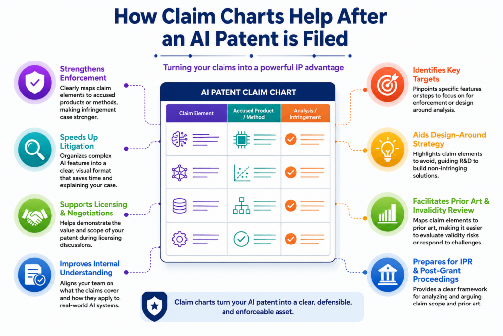
They can also help the team compare the patent to products in the market, including possible competitor systems.
This does not mean a founder should rush into conflict. Most startups do not want to spend energy on patent fights. But they do need to know what they own. A patent that no one understands is hard to use.
A claim chart helps turn the patent into something the business team can read, discuss, and act on.
It also helps during company growth. As the product changes, the team can use the chart to see whether the current product still lines up with the filed claims.
If the product has moved in a new direction, that may point to another filing.
Claim charts help make patents useful for the business team
A patent should not sit in a folder and gather dust. It should support the company’s goals.
That may mean helping with fundraising, showing technical depth, protecting a key model workflow, supporting a partnership, or building value for a future exit.
A claim chart gives leaders a clearer way to talk about the patent. Instead of saying, “We have an AI patent,” the team can say, “This patent covers the way our system selects training samples, scores model output, and updates the decision layer based on live feedback.” That is a much stronger story.
It also helps investors understand why the patent matters. Investors do not want vague claims about “AI.”
They want to know what is hard to copy. A claim chart can show that in a grounded way.
The chart becomes a bridge between the patent and the product
AI startups often have a gap between legal words and engineering truth. The patent may use formal wording.
The product team may speak in code, models, tickets, and experiments. The business team may care about market edge. A claim chart brings those worlds closer.
When done well, it does not replace attorney judgment. It supports it. It gives the attorney better facts. It gives the founder more control. It gives the company a clearer view of what has been protected.
That clarity can reduce waste. It can help the team decide whether to file more, adjust claim focus, document a new model feature, or create better internal records.
It can also stop the company from overvaluing a weak patent or overlooking a strong one.
For founders who want patent work to feel less slow and less confusing, PowerPatent gives a practical path.
It helps technical teams move from invention notes to attorney-backed patent work with less drag. You can see the full workflow here: https://powerpatent.com/how-it-works
What makes AI and machine learning claim charts different
AI and machine learning claim charts are different because the invention may not be a fixed rule. In older software, the system often follows a clear set of steps.

In AI, the system may learn from data, change weights, improve through feedback, adapt to context, or produce outputs that are not written by hand.
That makes the chart more important. It needs to explain not just what the system does, but how the intelligent part fits into the larger process.
The chart should help the reader see the shape of the invention without getting lost in model details.
A good AI claim chart also pays attention to data. In many AI systems, the data is not just input. It may be part of the invention.
The way data is selected, cleaned, labeled, weighted, split, stored, or reused can be the key value.
The model is only one part of the patent story
Founders sometimes think the model is the whole invention. That can be true in rare cases, but often the stronger story is around the full system.
The real edge may come from how the data is prepared, how the model is placed inside a workflow, how results are checked, or how feedback improves later outputs.
For example, a startup may use a known model but apply it in a new safety process. Another company may create a better ranking method for model outputs.
Another may build a special loop where human review improves future results without slowing the user down.
The claim chart should capture that larger story. It should not stop at “we use a neural network.” That phrase alone does very little. The chart should show the role of the model in the invention and why that role matters.
The best AI claim charts show flow, proof, and business value
A useful chart does three things at once. It shows the flow of the system, gives proof for each claim part, and keeps the business value in view.
This is how the chart becomes more than a legal tool. It becomes a practical map of the company’s technical edge.
For an AI founder, that edge may be speed, accuracy, lower cost, safer output, better user fit, smarter automation, or stronger data use. The chart should help make that edge visible.
This is where great patent work starts to feel less like paperwork and more like product strategy.
You are not just filing because someone told you to. You are choosing what to protect because it is tied to how your company wins.
PowerPatent was built for this kind of founder. The goal is to help you move fast, stay clear, and protect the parts of your AI system that matter most. The process is simple to explore here: https://powerpatent.com/how-it-works
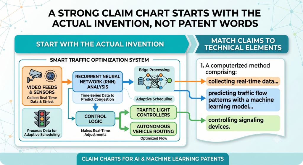
A strong claim chart starts with the actual invention, not the patent words
A good AI claim chart does not start with fancy patent wording. It starts with the real thing your team built. This matters because AI products often sound the same from far away.
Many companies say they use data, models, prompts, feedback, scoring, or automation. Those words are common now. They do not show what makes your system special.
The real value is usually in the exact way your system works. It may be the order of steps. It may be the way the system picks data.
It may be the way the model checks its own output. It may be the way user actions shape the next result. It may be the way your tool reduces bad results without slowing down the user.
A claim chart should help uncover that exact value. It should not force your invention into broad language too soon.
When that happens, the chart may look clean, but it will not be useful. It may hide the most important parts of the invention instead of making them clear.
Your claim chart should begin with the builder’s view of the product
The builder’s view is simple. What problem did you see? What did you build? What happens first? What happens next? What does the model receive? What does it produce?
What does the system do with the output? What gets saved, changed, ranked, blocked, approved, or sent back into the loop?
These questions sound basic, but they are the heart of strong AI patent work. Many weak patents skip this level of detail. They talk about “using machine learning” without showing the working path.
That may sound broad, but it can also become soft. A claim chart makes the path harder to ignore.
For example, if your system uses an AI model to review support tickets, the claim chart should not stop at “the model classifies tickets.”
It should show what ticket data is used, how past cases shape the result, how confidence is checked, how urgent cases are handled, and what action the system takes after the model output.
The best charts capture the invention before the team forgets the small decisions
Startups move fast, and small choices are easy to forget. An engineer may tune a model in a way that solves a major problem.
A founder may change the workflow after seeing customer behavior. A product lead may add a guardrail that makes the system safer. These choices can become part of the invention story.
But if no one records them, they may vanish. By the time a patent draft is reviewed weeks or months later, the team may only remember the final product, not the path that made it new.
This is why early invention capture matters. PowerPatent helps founders and engineers turn product knowledge into clear patent material while the details are still fresh.
It gives technical teams a faster way to collect what matters, then pairs that with real attorney oversight. You can see the workflow here: https://powerpatent.com/how-it-works
The claim chart should show where the AI system creates a better result
A claim chart is not only about matching words to features. It should also help show why the invention matters. This is very important for AI and machine learning patents because many AI systems do similar tasks on the surface.
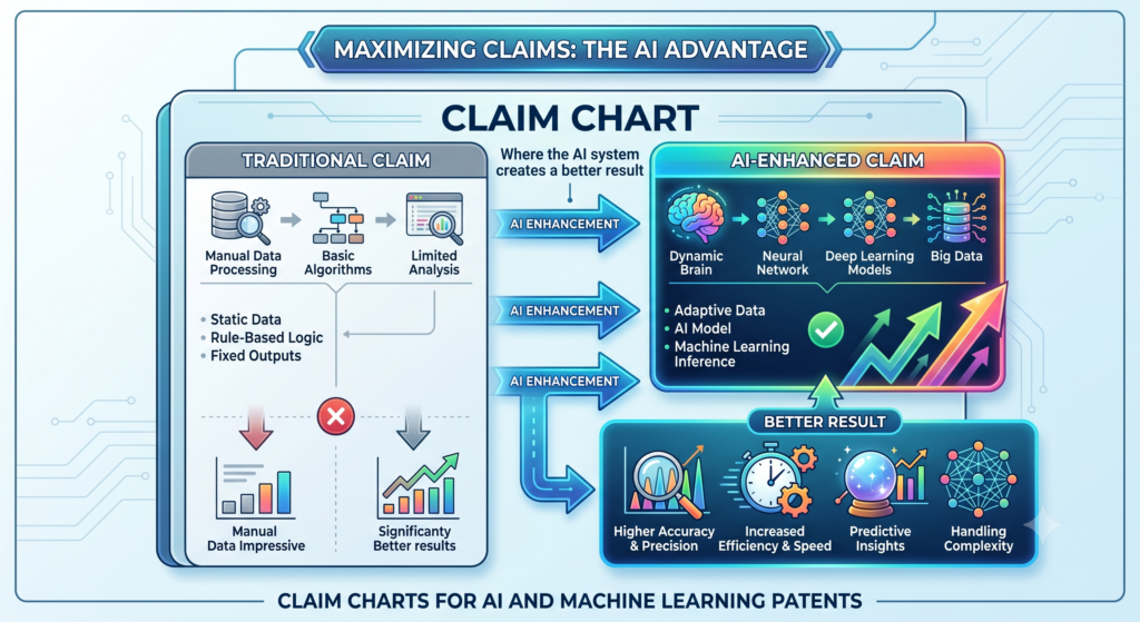
They predict, classify, rank, generate, detect, recommend, or summarize. The stronger question is what your system does better and how it gets there.
A useful chart should connect the claimed steps to the outcome. If the system reduces false alerts, the chart should point to the model step or data step that causes that improvement.
If the system gives better search results, the chart should show how the ranking or embedding process works. If the system makes safer outputs, the chart should show how it checks, filters, or corrects the result.
This makes the patent story more grounded. It also helps founders explain the invention in business terms. A patent is not just a record of code. It is a record of a useful technical edge.
Better results need to be tied to real system behavior
It is not enough to say the AI is faster, smarter, or more accurate. Those words need support. A claim chart should help show what part of the system creates the improvement.
Maybe the system removes bad training examples before model training. Maybe it uses a special score before sending the result to the user. Maybe it combines two model outputs in a way that lowers risk.
This is where the chart becomes practical. It pushes the team to explain the cause and effect. The chart should make it clear that the better result is not a lucky outcome. It comes from a designed system.
For example, a fraud detection product may improve results by grouping user actions into time windows before sending them into a model.
The chart should show that grouping step, the model input, the risk score, and the decision action. That is much stronger than saying the product “uses AI to detect fraud.”
A good chart helps the patent feel tied to value, not just technology
Founders do not file patents just because technology exists. They file because the technology supports the company’s edge.
The claim chart should keep that edge visible. It should help show how the invention protects revenue, product quality, customer trust, speed, safety, or scale.
This is especially helpful when talking with investors or partners. They may not want to read a full patent application.
But they may want to understand what is protected and why it matters. A well-made chart can help tell that story in a clear way.
PowerPatent is built for founders who want this kind of clarity without getting buried in legal process. It helps turn complex AI work into patent-ready material that real attorneys can review and refine. Learn how it works here: https://powerpatent.com/how-it-works
AI claim charts should treat data as part of the invention story
In AI systems, data is often where the magic starts. The model matters, but the model is only as useful as the data it gets.
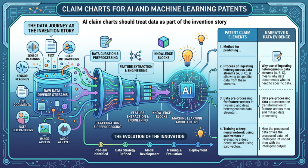
The way your system gathers, cleans, labels, filters, groups, weights, or updates data may be the core reason your product works better.
That is why a claim chart for an AI patent should pay close attention to data steps. These steps may look boring from the outside, but they can be very important.
A better data flow can create better model output. A smarter label process can reduce errors. A better feedback system can help the model improve over time.
When the chart ignores data, it may miss the real invention. This is common when teams focus only on the model name or the final output.
But in many cases, the most protectable idea is not “we used a model.” It is “we built a better way to feed, guide, update, or use the model.”
The chart should explain what data enters the system and why that data matters
A strong chart shows the type of data used by the system and how the system handles it.
It may include user behavior, sensor readings, images, text, voice, code, system logs, device status, transaction records, or past decisions. The key is not just naming the data. The key is showing how the data supports the claimed step.
For example, if a model predicts machine failure, the chart should show which signals are used, how they are prepared, and how the output leads to an action.
If a model reviews legal documents, the chart should show how document text, clauses, metadata, and user goals are used. If a model creates design options, the chart should show how design limits and user feedback shape the result.
This level of detail makes the claim chart more useful. It also helps the patent team avoid empty language.
Data handling can be the difference between a weak AI claim and a strong one
Many AI claims become weak because they sound like a model is simply dropped into a normal workflow. The chart can fix that by showing the special data path. Maybe your system uses a rare data source.
Maybe it changes raw input into a special form. Maybe it ranks data before model use. Maybe it stores feedback in a way that changes future outputs.
These details can matter a lot. They help show that the invention is not just a generic AI tool. It is a specific system with a specific way of working.
This is also why founders should not wait too long to document data choices. As teams grow, data pipelines change. Labels change. Training sets change. The reason behind a design choice may get lost.
PowerPatent helps teams collect those details early, so the patent process can move with more speed and less guesswork. You can explore the process here: https://powerpatent.com/how-it-works
The chart should make the model’s role clear without turning into a math paper
AI founders often worry that patent work will force them to explain every model detail in a painful way.
A good claim chart should not do that. It should make the model’s role clear, but it does not need to become a research paper. The goal is to explain what the model does inside the claimed system and how that supports the invention.
This is a balance. If the chart says too little, the invention may feel vague. If it says too much, the chart may become hard to read and hard to use. The best version sits in the middle.
It gives enough detail to show the model’s job, inputs, outputs, and effect, while keeping the language simple.
For many AI patents, the model type may matter less than the workflow around it. In other cases, the model design itself may be important. The chart should help the team see which is true.
Do not hide the model inside broad words
A weak claim chart may say the system “uses a machine learning model” and move on. That is rarely enough. The chart should explain what the model receives and what it returns.
It should show whether the model classifies, predicts, ranks, embeds, segments, generates, detects, translates, clusters, or scores.
It should also explain how the rest of the system uses the model output. A prediction by itself may not be the invention. The invention may be what happens after the prediction.
The system may start a workflow, block an action, ask for review, update a profile, change a prompt, route a task, or train a later version.
This makes the chart more real. It shows the model as part of a working system, not as a buzzword.
Clear model detail helps both patent quality and team alignment
When the model’s role is clear, the patent team can draft better claims. The engineering team can confirm whether the patent matches the product.
The business team can see what is being protected. Everyone gets a shared picture.
This shared picture is valuable because AI startups change quickly. A team may replace one model with another. It may move from a third-party model to an internal model.
It may add a fine-tuned model, a retrieval layer, or a safety checker. A clear chart helps the company see whether the invention still lives in the same system path, even as tools change.
PowerPatent helps teams turn these moving parts into a cleaner patent workflow. The software helps organize the invention, and real attorneys help shape it into stronger protection. You can learn more here: https://powerpatent.com/how-it-works
Claim charts help founders avoid vague AI patent language
Vague language is one of the biggest risks in AI patent work. It can make a patent sound broad, but it can also make the patent less useful.
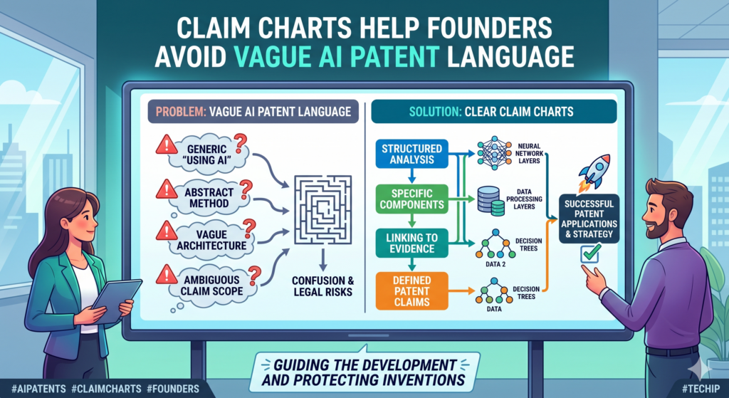
Words like “intelligent,” “adaptive,” “automated,” “optimized,” and “AI-powered” may sound good in a pitch deck. In a patent setting, they need support.
A claim chart helps catch vague language early. It forces each phrase to connect to something real. If the claim says the system is adaptive, the chart should show what changes, when it changes, and what causes the change.
If the claim says the system optimizes a result, the chart should show what score, rule, model output, or feedback signal drives that improvement.
This makes the patent stronger because it replaces cloudy words with clear steps. It also makes the founder’s story stronger because the team can explain the invention without hiding behind buzzwords.
Every important claim phrase should point to a real feature or action
A useful claim chart asks a simple question again and again. Where does this happen in the product? If no one can answer, the claim may need work.
The issue may be a drafting issue, a missing detail issue, or a product mismatch issue. Any of those can be fixed more easily when found early.
For example, a claim may say the system “updates a model based on user feedback.”
The chart should show what feedback is collected, how it is stored, how it affects the model or decision layer, and when the update happens. Without that detail, the claim may sound like a wish instead of a system.
This does not mean the chart must include every tiny line of code. It means the chart should show enough real support to make the claim believable and useful.
Clear language gives founders more control over the patent process
When patent language stays vague, founders lose control. They may not know what the patent covers. Engineers may not know whether the draft matches the system.
Investors may not know why the patent matters. A claim chart helps fix this by making the patent easier to inspect.
That control is a big part of modern patent work. Founders should not have to feel lost while protecting their company.
They should be able to see the connection between the invention, the claim, and the business goal.
PowerPatent was built to give technical founders that kind of clarity. It helps you move from raw invention details to attorney-backed patent work with less delay and less confusion. See how it works here: https://powerpatent.com/how-it-works
Claim charts help you test whether your AI patent claim is too broad or too narrow
A claim chart is useful because it shows whether the claim matches the real invention at the right level. This is one of the hardest parts of AI patent work. If the claim is too broad, it may sound strong, but it may not have enough support.
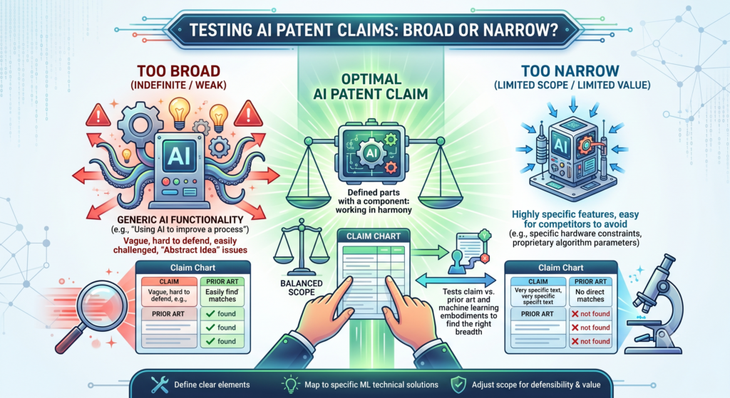
If the claim is too narrow, it may protect only one small version of the product and leave easy ways for others to design around it.
For AI and machine learning inventions, this balance matters even more. Your product may change models, switch data sources, add new steps, or improve the workflow over time.
A strong claim should be tied to the heart of the invention, not just one temporary build choice.
A claim chart helps you see that balance before the patent is filed or before you rely on it for a business goal. It gives the team a clear way to ask, “Are we claiming the real edge, or are we missing it?”
A broad claim still needs clear support from the system
Broad claims can be valuable when they are done well. They can cover the main idea without locking the company into one exact model, one exact data type, or one exact screen.
But broad does not mean vague. A broad claim still needs a clear invention story behind it.
For example, a claim may cover selecting a model based on context. That can be a broad idea. But the claim chart should still show what context means, where that context comes from, how the system uses it, and what changes because of it.
Without that support, the claim may look like a broad wish instead of a real system.
The chart helps the team test the claim in a practical way. If the claim language cannot be mapped to the system, the wording may need to be sharpened. If the system has more depth than the claim shows, the claim may need to be expanded.
Narrow claims can still be powerful when they protect the right point
A narrow claim is not always bad. In some cases, a focused claim can be very useful because it maps tightly to the company’s strongest feature.
This is especially true when the feature is hard to copy, central to the product, and tied to a clear business result.
The problem starts when the claim is narrow for the wrong reason. Maybe it includes a model type that does not matter.
Maybe it names a data format the team may stop using. Maybe it limits the invention to one product screen, even though the real value happens in the back-end workflow.
A claim chart helps catch these traps. It shows which details are essential and which details are just current design choices. That can help the patent team protect the invention in a smarter way.
PowerPatent helps founders work through these choices faster by turning raw technical detail into organized patent material that attorneys can review.
That means less guessing, fewer blind spots, and more control over what gets protected. You can see how the process works here: https://powerpatent.com/how-it-works
A good AI claim chart should show the full path from input to useful output
An AI system is often only meaningful when you see the full path. Data enters the system. The system cleans it, shapes it, enriches it, or compares it with other data.
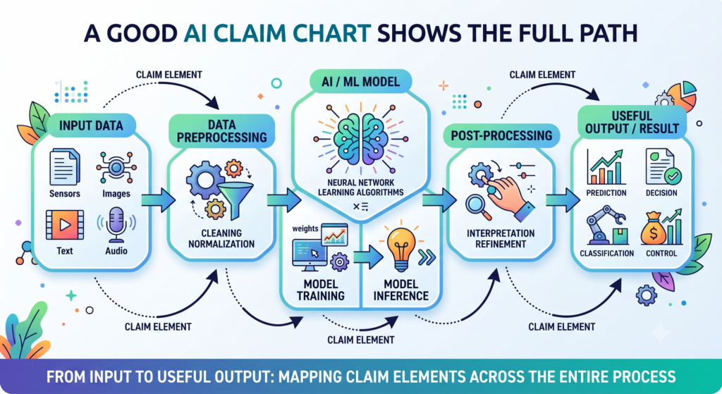
A model then uses the data to create a result. The product takes that result and turns it into an action, decision, warning, score, draft, match, or recommendation.
A claim chart should make that full path clear. It should not focus only on the final output. It should show how the output is made and why the process matters.
This is especially important because many AI tools produce similar-looking results. Two products may both create a risk score, but one may use a much smarter path to get there.
Two tools may both generate a draft, but one may use a special review loop that makes the draft safer and more useful.
The strongest charts make the system flow easy to follow
The chart should help the reader move through the invention step by step. First, it should show what the system receives.
Then it should show what the system does with that input. Then it should show how the model is used. Then it should show what happens after the model output is created.
This matters because patent claims often break the invention into parts. If the chart only gives scattered proof, the story can feel broken.
A better chart keeps the flow intact. It lets the reader understand the system as a working product, not just as a set of isolated words.
For example, a claim chart for an AI hiring tool should not only say that the system reviews resumes.
It should show how resume data is converted, how job needs are represented, how candidate fit is scored, how bias checks or review steps are applied, and how the final recommendation is used by the workflow.
The output should be tied to a real action, not just a result on a screen
Many AI inventions become stronger when the output leads to something useful. A score may trigger a route. A generated answer may be checked before it is shown.
A prediction may change how a device runs. A model result may update a user profile or start a follow-up step.
The claim chart should capture that action. This helps show that the invention is not just producing information in the abstract. It is changing how the system works.
This is where founders can bring real value to the patent process. You know what the product does after the AI result appears.
You know what is automatic, what is reviewed, what is stored, and what improves the user experience. Those details can make the patent story much stronger.
PowerPatent gives founders a practical way to capture those details while the product is still fresh in the team’s mind.
The platform helps organize the invention, and real attorneys help turn it into stronger patent work. Learn more here: https://powerpatent.com/how-it-works
Claim charts help separate the AI feature from normal product plumbing
Every AI product has normal product parts. There may be login screens, dashboards, databases, APIs, user profiles, admin tools, and cloud servers.

These parts matter to the product, but they may not be the invention. The claim chart helps separate the basic product plumbing from the real technical edge.
This is important because a patent should not spend too much energy on ordinary parts unless they support the invention. If the claim chart focuses too much on generic screens or basic storage, the core AI idea may get buried.
A strong chart keeps attention on the parts that create the special result. It may still mention the normal parts, but only as needed to explain the full system.
The chart should not confuse a feature with the invention
A feature is what the user sees. The invention is the system that makes the feature work in a new or useful way. Sometimes they overlap, but not always.
For example, a user may see a “smart summary” button. That button is a feature.
The invention may be the way the system selects source text, filters risky content, uses user role data, checks the summary against original records, and updates the next prompt based on corrections. The button matters, but the hidden process may matter much more.
The claim chart should help tell that difference. It should map the claim to the system behavior behind the feature, not just the visible screen.
The best charts protect what rivals would need to copy
This is a very practical way to think about claim charts. Ask what a rival would need to copy to get the same advantage.
Would they need your data preparation step? Your model selection logic? Your output check? Your feedback loop? Your special scoring method? Your workflow timing?
Those are the points the claim chart should make clear. The chart is not just a document for lawyers. It is a business tool that helps identify the parts of the product that create leverage.
For a founder, this can change the way you think about patents. The goal is not to patent every screen or every model name. The goal is to protect the parts of the system that make your company harder to copy.
That is why PowerPatent is built for deep tech teams and engineers. It helps capture the real invention from the people who built it, then brings in attorney oversight to shape that knowledge into better patent work. You can explore how it works here: https://powerpatent.com/how-it-works
A claim chart should include proof that an engineer would trust
The best AI claim charts do not rely on vague claims from a marketing page. They use proof that a technical person would recognize as real.
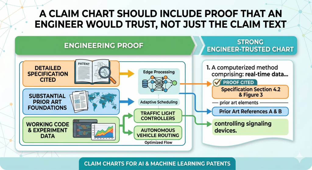
That does not mean the chart has to be filled with raw code. It means the chart should connect claim language to reliable evidence from the actual system.
This evidence may come from design notes, architecture diagrams, product flows, model cards, data pipeline records, test results, internal demos, screenshots, technical specs, logs, or code comments.
The point is to show that the claimed step is not just an idea. It exists in the system or is clearly described as part of the invention.
For AI startups, this kind of proof can be easy to lose. Teams build quickly. Notes live in many tools. Decisions happen in chat. Engineers move on. A claim chart helps gather these pieces into a more stable record.
Good evidence makes the chart easier to trust
A claim chart should make the reader feel grounded. When the chart says the system filters training data, it should point to the place where that filtering is shown.
When the chart says the model produces a confidence score, it should explain where that score appears and how the system uses it. When the chart says feedback changes future results, it should show how the feedback is captured and applied.
This helps attorneys, founders, and engineers work from the same facts. It also helps reduce back-and-forth. When the proof is clear, the patent team does not have to guess what the invention means.
Clear evidence also helps avoid overclaiming. If the chart cannot support a phrase, that phrase may need to be changed. That is not a setback. It is how stronger patent work gets built.
Evidence should explain the system without exposing more than needed
Founders sometimes worry that sharing technical details in patent work means giving away too much. That concern is fair. A good patent process should be careful.
The goal is to explain the invention well enough to support strong protection, while being thoughtful about what should stay private as trade secret material.
A claim chart can help with this balance. It shows what details are needed to support the claim and what details may not need to be included.
This is where attorney guidance is important, especially for AI systems where model details, training data, and internal methods may be sensitive.
PowerPatent helps founders move through that balance with a mix of software and real attorney oversight.
The goal is to make patent work faster and clearer without treating sensitive technical detail casually. See how the process works here: https://powerpatent.com/how-it-works
Claim charts make it easier to spot missing patent filings as the AI product grows
AI products change fast. A model gets better. A data pipeline changes. A new workflow is added. A safety layer is built.
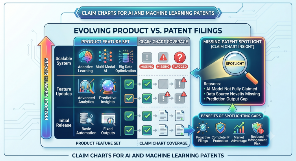
A customer asks for a new control. A prompt system becomes more advanced. A simple feature turns into a core engine for the whole product.
These changes can create new invention opportunities. But if the team is not watching, they may never be captured.
A claim chart can help because it gives the company a clear view of what the current patent covers and what it does not cover.
When the product grows beyond the chart, that can be a sign. It may mean the company has built something new that deserves its own patent filing.
Product changes should be compared against the chart, not just remembered in meetings
Founders often talk about new features in roadmap meetings, sprint reviews, or customer calls.
Those talks are useful, but they are not always enough for patent planning. The team needs a way to compare new technical work against existing patent coverage.
A claim chart can serve as that comparison point. If the new feature still maps to the same claim path, the existing patent may remain relevant.
If the new feature adds a new model step, a new data source, a new feedback process, or a new control system, the team may want to look closer.
This does not mean every product change needs a patent. It means the team should not let important changes pass by unseen.
A living claim chart can help build a stronger patent portfolio
The most useful claim charts are not always static. For a growing AI company, they can become part of a living IP process.
As the product changes, the team can update the chart, note new gaps, and decide what should be protected next.
This makes patent work less reactive. Instead of waiting until fundraising, diligence, a competitor launch, or an acquisition review, the company can keep its invention record current. That creates more control and fewer last-minute scrambles.
For AI founders, this matters because speed is part of the game. The companies that win often learn faster, build faster, and protect the right pieces earlier.
PowerPatent helps make that possible by giving technical teams a clearer, faster way to turn inventions into attorney-backed patent filings. You can see how it works here: https://powerpatent.com/how-it-works
Claim charts help AI founders explain patents to investors without sounding vague
Investors hear the word AI all day. They also hear the word patent all day. Neither word is enough on its own.
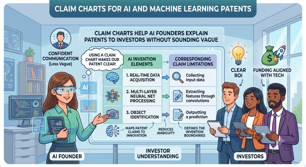
A founder who says, “We have AI patents,” may sound prepared, but that statement does not show what is protected or why it gives the company power.
A claim chart helps turn that broad claim into a clear story. It lets a founder explain the exact part of the system that is protected.
It can show how the product receives data, how the model handles it, how the system checks the result, and how the output creates value for users.
This is important during fundraising because investors want to understand what makes the company hard to copy.
They may not want a deep legal lecture. They want a simple answer to a sharp question. What have you built that others cannot easily clone?
A claim chart helps answer that question with proof instead of hype.
The investor story should be clear enough to explain in plain words
A strong claim chart gives founders better language. Instead of saying the company has a patent around “AI automation,” the founder can say the patent covers a system that turns messy customer data into ranked actions, checks the output, and improves future suggestions based on user feedback.
That is easier to understand. It also sounds more real. The investor can see the system working in their mind.
They can connect the patent to product value. They can also see that the company is not just chasing buzzwords.
This matters because many AI startups look similar from the outside. A clear patent story can help show depth. It can show that the team has thought carefully about the engine behind the product, not just the user interface.
A claim chart can make diligence less painful
During diligence, investors may ask what patents the company owns, what the patents cover, and whether they match the product.
Without a claim chart, the founder may need to explain everything from scratch. That can lead to confusion, delay, and long email threads.
With a claim chart, the company has a cleaner starting point. The chart can show the link between the patent and the product in a way that is easier to review. It does not replace legal advice, but it can make the whole process smoother.
This is one reason founders should treat patent work as part of company building, not as a side task. When the patent story is clear early, it becomes easier to use later.
PowerPatent helps founders build that clarity from the start. It helps technical teams capture invention details, organize them, and work with real patent attorneys to turn those details into stronger filings. You can see how it works here: https://powerpatent.com/how-it-works
Claim charts help engineers give better input without becoming patent writers
Engineers are often the best source of invention detail. They know what was hard. They know why the system was designed a certain way.
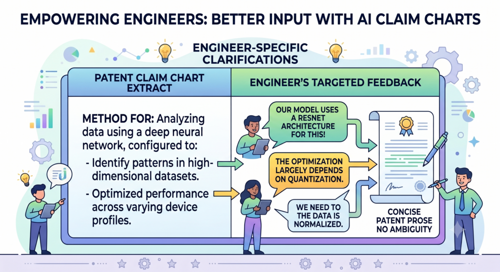
They know which shortcuts failed, which model path worked, and which data step made the product better.
But engineers usually do not want to write patent language. They should not have to. Their job is to explain the system clearly. The patent team’s job is to shape that into the right form.
A claim chart creates a simple bridge. It gives engineers a way to confirm whether a claim matches the product.
They can point out missing steps, wrong assumptions, or vague words. They can also add proof, such as diagrams, code notes, test records, or examples.
This makes the patent process faster and more accurate.
Engineers can use claim charts to correct the invention story early
When a draft claim is shown to an engineer without context, it may feel abstract. The engineer may not know what feedback is needed.
A claim chart makes the review more practical. It breaks the claim into parts and asks whether each part exists in the system.
That is much easier to answer. The engineer can say that a step happens in the data pipeline, that a score is generated after model inference, or that the feedback loop is not yet live.
These comments are simple, but they can make a huge difference.
They help avoid patents that sound good on paper but do not match the real product. They also help the patent team draft with more confidence.
The best engineer input is specific, not polished
Engineers do not need to write beautiful sentences for a claim chart. They need to give useful facts.
They can explain what happens, where it happens, what input is used, what output is created, and why the step exists.
That raw detail is gold. It helps the patent team understand the invention at the right level. It also helps separate important design choices from routine implementation choices.
For AI and machine learning patents, this is especially valuable because small technical choices can carry big weight.
A certain way of filtering data, setting thresholds, selecting examples, or routing outputs may be central to the invention.
PowerPatent is designed to help engineers and founders share those details without getting trapped in slow legal back-and-forth.
The software helps collect the technical story, and real attorneys help refine it. Explore the process here: https://powerpatent.com/how-it-works
Claim charts can help protect AI workflows, not just AI models
Many founders think an AI patent must be about the model itself.
That is not always true. In many cases, the more valuable invention is the workflow around the model. The model may be known, but the way the system uses it may be new and important.
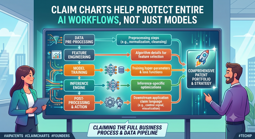
This is common in applied AI. A company may use a model in a special product flow, combine it with business rules, guide it with user context, check its output, and feed results back into later steps.
The value comes from the full process, not just the model.
A claim chart helps show that process. It can make the workflow visible. It can show how the system turns AI output into a useful action, decision, or control step.
That matters because workflow inventions are often closer to the customer problem. They show how the AI becomes useful in the real world.
The workflow may be where your real business edge lives
A model can often be swapped. A workflow is harder to copy when it is tied to product insight, customer behavior, and hard-earned design choices.
The workflow may show how your team learned to solve the real problem better than others.
For example, a healthcare AI tool may not be valuable only because it makes a prediction.
It may be valuable because it routes uncertain cases to human review, compares outputs against patient history, and sends alerts only when several signals agree.
A finance AI tool may not be valuable only because it scores transactions. It may be valuable because it groups behavior over time, detects sudden changes, and adjusts the review path based on risk level.
A claim chart helps capture these paths in a way that is clear and usable.
A workflow chart can show what happens before and after the model
The model is often the middle of the story. The steps before and after the model may matter just as much.
Before the model, the system may clean data, select context, create embeddings, retrieve records, or build a prompt. After the model, the system may rank outputs, apply checks, store results, trigger actions, or learn from feedback.
A good claim chart should not skip those parts. It should show the full chain because that chain may be the true invention.
This is also where PowerPatent can help technical founders move faster. The platform helps gather the full invention story, not just the headline idea.
Real patent attorneys then help shape that story into protection that fits the business. See how it works here: https://powerpatent.com/how-it-works
Claim charts make competitor review more grounded and less emotional
Founders watch competitors closely. That is normal. When a rival launches a similar AI feature, the first reaction may be frustration. It may feel like they copied the idea.
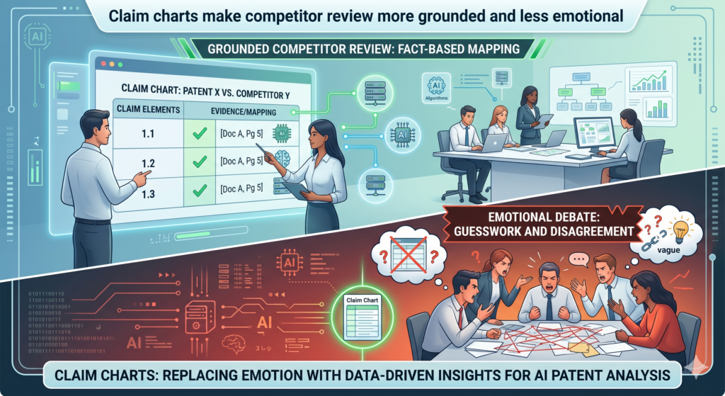
But feelings are not enough. A company needs a grounded way to compare the patent claim to the competitor’s product.
A claim chart can help. It allows the team to look at each claim part and ask whether the competitor’s product appears to include that part. This does not mean the answer will be easy.
AI systems can hide their internal steps. But the chart still gives the team a clear review method.
It keeps the discussion focused. Instead of saying, “They copied us,” the team can ask, “Does their system seem to receive the same type of data, apply the same model step, use the same feedback path, and create the same action?”
That is a much stronger way to think.
Competitor claim charts should be careful and fact-based
When looking at a competitor product, it is easy to guess too much. A public demo may show the output, but not the internal process.
A marketing page may say the product uses AI, but not how the data is handled. A user screen may show a score, but not how that score is made.
A careful claim chart separates what is known from what is inferred. Known facts may come from public product pages, demos, documentation, job posts, technical papers, API docs, or user tests. Inferred points should be treated with caution.
This matters because patent decisions can affect legal cost, business strategy, and investor trust. The chart should not be a place for wild guesses. It should be a place for clear thinking.
The goal is to make better decisions, not start fights
Most startups should not turn every competitor concern into a legal battle. That can drain focus and money. But they should understand their position.
A claim chart can help the company decide whether to monitor a competitor, gather more facts, talk to counsel, adjust product strategy, or file more patents.
The chart gives structure to the decision. It helps leaders avoid both extremes. They do not ignore a serious issue, and they do not overreact to a surface-level similarity.
PowerPatent helps founders build stronger patent assets before these moments happen. When your filings are clearer and better tied to your product, you have more confidence when the market gets noisy. Learn more here: https://powerpatent.com/how-it-works
Claim charts help founders decide what to keep secret and what to patent
AI companies often have two kinds of valuable knowledge. Some should be protected through patents. Some may be better kept as internal know-how. The hard part is knowing the difference.
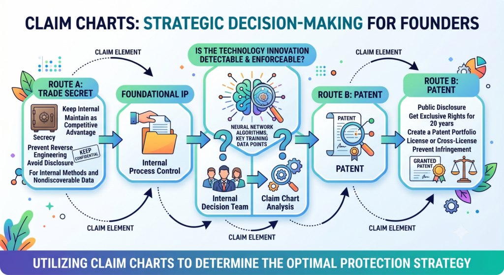
A claim chart can help because it forces the team to look at what must be disclosed to support the patent and what may not need to be shared. This is very important for machine learning systems.
Training data, model weights, tuning methods, and internal scoring rules can be sensitive.
That does not mean founders should avoid patents. It means they should be thoughtful. A strong patent filing can protect key system ideas while still being careful about internal details.
The right balance depends on the invention, the product, the market, and the company’s goals.
This is where attorney oversight matters. Software can speed up the process, but good judgment is still needed.
The chart helps reveal what is central to the patent story
When a claim chart is built well, it shows which facts are needed to support the claim. Some details are central.
Others are extra. For example, the patent may need to explain that the system selects training examples based on a quality score. It may not need to reveal every private rule used to tune that score.
The chart helps the team see that difference. It gives the patent attorney a better view of what the company has built, so they can help decide how to explain the invention without giving away more than needed.
This is especially helpful for founders who fear that patent work means exposing everything. A good process is more careful than that.
Smart patent work protects the edge without being careless
The goal is not to dump every secret into a filing. The goal is to protect the invention in a way that supports the business. Sometimes that means filing on the system workflow.
Sometimes it means filing on the data handling method. Sometimes it means protecting the way the model output is checked or used. Sometimes it means keeping certain tuning details private.
A claim chart helps organize that decision. It gives the team a clear map of what is being claimed and what evidence supports it.
PowerPatent gives founders a faster, clearer way to work through these choices. It combines smart software with real patent attorney review, so technical teams can move quickly while still being careful. See how it works here: https://powerpatent.com/how-it-works
Conclusion
A strong claim chart turns an AI patent from a vague idea into a clear business asset. It shows what the invention does, where each step lives in the product, and why the system is hard to copy. For AI and machine learning teams, this clarity matters because the best ideas often sit inside data flows, model behavior, feedback loops, and smart workflows.
When founders map those details early, they file with more confidence and fewer blind spots. PowerPatent helps make that process faster, clearer, and attorney-backed. Start here: https://powerpatent.com/how-it-works