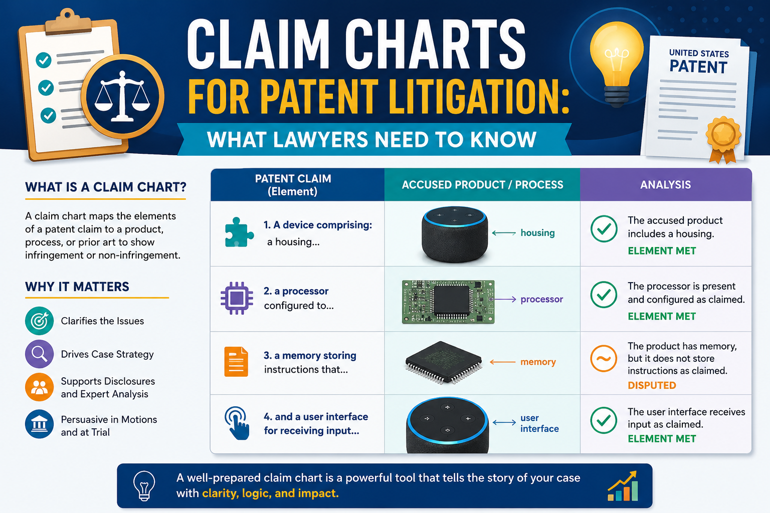
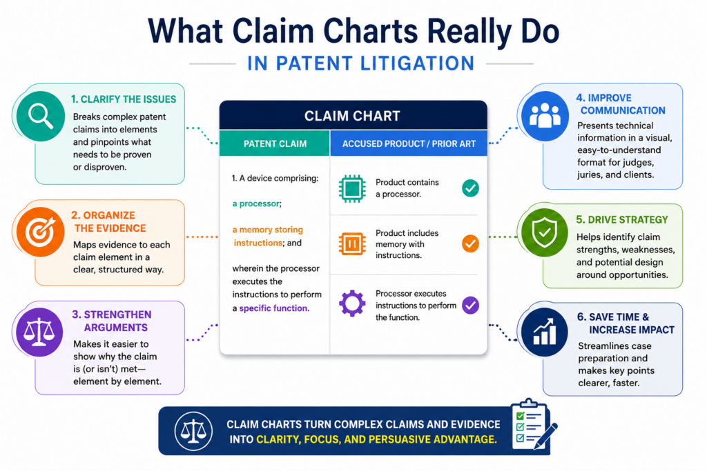
Claim charts can make or break a patent case. They show, in plain terms, how each part of a patent claim maps to a product, system, method, or piece of proof. When done well, they help lawyers tell a clean story. When done poorly, they create gaps, delays, and risk.
What claim charts really do in patent litigation
A claim chart is where a patent case starts to become real. Before the chart, the case may sound strong in a meeting. The patent may look broad. The product may look close.
The story may feel right. But the claim chart forces the team to answer the hard question: can we prove that each part of the claim is found in the accused product or method?
That is why a good claim chart is not just a document. It is a pressure test. It takes the words of the patent claim and places them next to facts.
Those facts may come from source code, product guides, sales pages, manuals, testing, public videos, customer use, internal papers, or expert review. The chart shows whether the case has a clean path or whether it is built on hope.
For lawyers, this matters because patent litigation moves fast once the case begins. Deadlines come early. The other side will attack weak spots. The court may require detailed infringement contentions.
A client may want a clear view of risk before spending more money. A claim chart gives the legal team a working map before those moments arrive.
PowerPatent helps teams build stronger patent work from the start by combining smart software with real attorney oversight. For founders and technical teams that want better patents without slow back-and-forth, see how it works here: https://powerpatent.com/how-it-works
A claim chart turns a broad patent claim into a focused proof story
Patent claims are written in careful words. Those words define the protected invention. In a lawsuit, the lawyer must show that the accused product meets each required part of at least one claim.
Missing one part can put the whole theory at risk.
This is where claim charts earn their value. They break the claim into smaller pieces and connect each piece to proof. The chart does not let the team hide behind a broad theme. It asks for a real match, step by step.
A weak chart may say, in effect, “the product does this.” A strong chart shows where, how, and why. It points to the screen, the code path, the device part, the user action, the data flow, or the technical document that supports the point.
It also explains the link in simple words, so a judge, client, expert, or opposing lawyer can follow the logic.
The best charts make the case easier to understand without making it shallow
The goal is not to turn a hard technical issue into a vague story. The goal is to make the hard issue clear. That means the chart should keep the claim language intact, but it should also explain the proof in plain terms.
A lawyer should be able to look at the chart and quickly see the theory. An expert should be able to test it. A client should be able to understand why the case has value.
A partner should be able to spot the risk. A court should be able to see that the party has done real work, not just made broad claims.
That simple test can improve almost every chart. Ask whether each row helps someone understand the match between the patent and the accused product. If the answer is no, the row needs more work.
Why claim charts matter long before trial
Many people think claim charts are mainly trial tools. That is too narrow. In most patent cases, claim charts matter long before anyone reaches a jury.
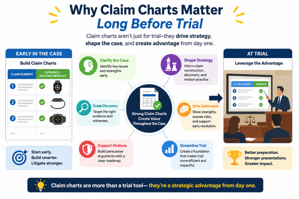
They shape the case from the first review through settlement talks, discovery, expert reports, and claim construction.
A chart built early can save months of wasted effort. It can show which claims are worth pressing and which should be left alone.
It can show whether more investigation is needed before filing. It can help the client understand the strength of the case before the budget grows. It can also show where the other side may attack.
This is especially important in technical cases. Products change. Public documents may be thin. Source code may not arrive until discovery. Engineers may describe the same feature in different ways.
A claim chart gives the team one place to organize the facts and keep the theory steady as new evidence comes in.
Early charts help lawyers decide whether the case is ready
Before filing or sending a demand letter, lawyers need more than a feeling. They need a grounded view of whether the accused product likely meets the claim. A first claim chart does not need every hidden fact. But it should show enough to support a serious legal position.
This early chart helps answer basic but vital questions. Is the accused product truly close to the claim? Are the most important claim elements visible from public sources? Are some elements only likely to be found in source code or internal documents?
Is there a clean theory for direct infringement? Is there a need to consider indirect infringement? Is the claim language broad enough to cover the accused feature without stretching too far?
These questions matter because a rushed chart can lead to a rushed case. And a rushed case can become expensive very quickly.
A strong early chart protects the client from paying for guesswork
Patent litigation is costly. No client wants to spend large sums only to learn later that a key claim element is missing. That is why the early chart should be honest, not inflated.
If a row is based on public proof, say so. If a row is based on a reasonable belief that discovery may confirm, make that clear in the internal case review. If a row has a gap, do not hide it. Mark it, discuss it, and decide whether the gap is acceptable at that stage.
This kind of clear thinking builds trust. It also helps lawyers give better advice. A client can handle risk when the risk is explained. What hurts clients is false comfort.
For technical founders and inventors, the same idea applies before litigation ever starts. A patent written with clear technical support is easier to chart later.
PowerPatent helps teams capture the invention in a cleaner way early, with software that keeps the process moving and attorney review that helps avoid weak spots. Learn more here: https://powerpatent.com/how-it-works
What a useful claim chart should include
A useful claim chart should do three things at once. It should preserve the exact claim language. It should identify the accused feature or action. It should connect the two with proof and clear reasoning.
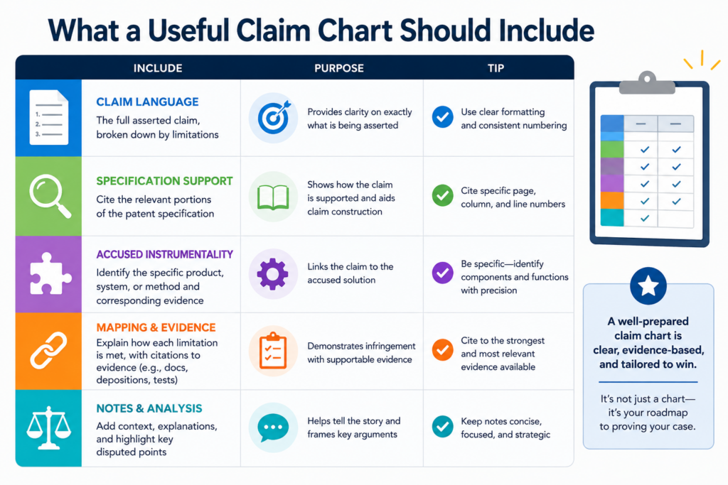
This sounds simple, but it is where many charts fall apart. Some charts include too much claim text in one row, which makes the proof hard to match. Some charts include proof but no explanation.
Some charts use screenshots without saying why they matter. Some charts quote a product guide but fail to connect the quote to the claim words.
A good chart is not a scrapbook. It is not a pile of screenshots. It is not a legal brief pasted into a table. It is a clean proof tool. Every row should move the case forward.
The claim language must be broken down with care
The first step is deciding how to split the claim. This choice matters more than many teams think. If the chart breaks the claim into pieces that are too large, the proof becomes muddy.
If it breaks the claim into pieces that are too tiny, the chart becomes hard to read and may lose the flow of the invention.
A good rule is to split the claim by meaningful parts. Each row should track a claim element or phrase that needs separate proof. For method claims, the rows often follow the steps.
For system claims, they may follow parts, modules, processors, memory, data stores, or functions. For software claims, the chart may need to show not just that a feature exists, but that the system performs the claimed action in the claimed way.
The chart should also keep the exact claim words visible. Do not rewrite the claim in softer words and chart only the rewrite. Plain English explanations are useful, but they should sit beside the claim language, not replace it.
The proof column should show both source and meaning
Evidence in a claim chart should be more than a citation. A screenshot, manual quote, code excerpt, or test result should be tied to the claim phrase it supports. The lawyer should explain why the evidence matters.
For example, if a claim requires “receiving a request from a client device,” the chart should not merely show a webpage that says users can submit requests.
It should explain how that webpage, API call, network log, or technical guide shows a request being received from a client device. The explanation should be short, but it should close the gap.
This is the part that makes the chart useful to the whole team. A chart with raw proof still forces every reader to do the lawyer’s work again. A chart with proof and meaning saves time and reduces confusion.
How lawyers should think about evidence in claim charts
Evidence is the heart of a claim chart. But not all evidence has the same force. A public marketing page may help show what a product does at a high level. A user guide may show how customers use a feature.
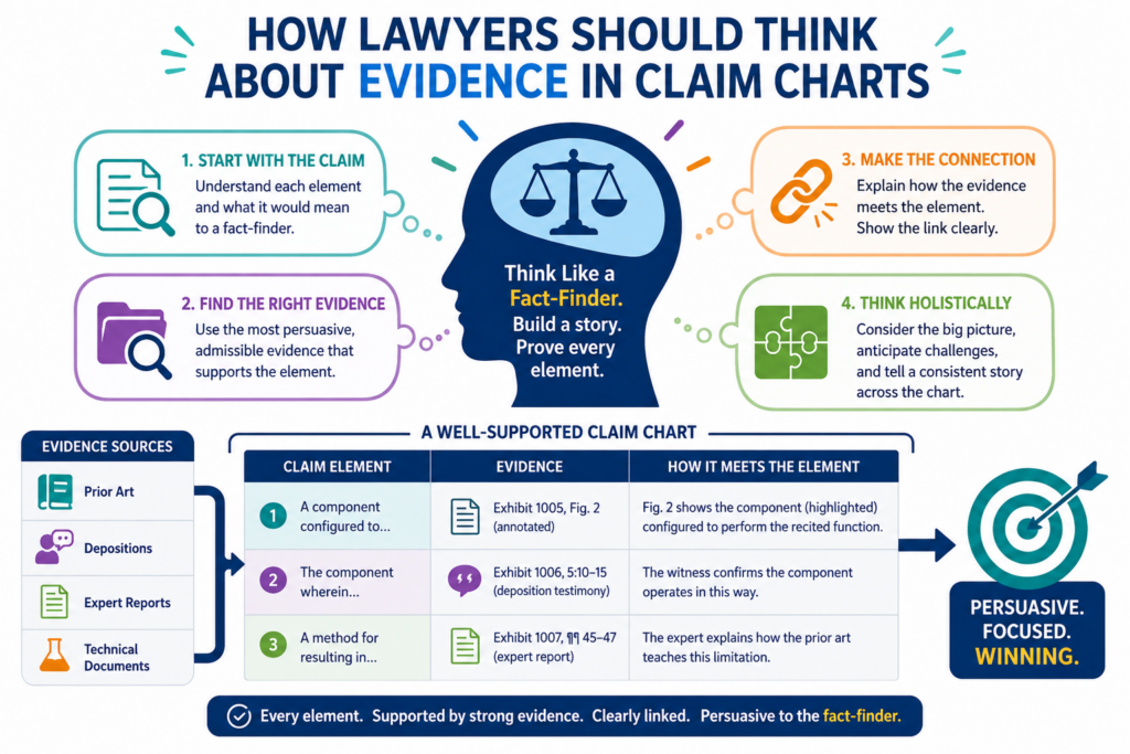
A technical white paper may show system design. Source code may show the actual operation. Testing may show real behavior. Internal documents may show design choices, knowledge, or intent.
A smart lawyer does not treat all proof as equal. The chart should reflect the strength of the evidence and the purpose it serves. Some proof helps start the case. Some proof supports final contentions.
Some proof may become expert material. Some proof may be useful in settlement but not strong enough for trial.
Public evidence is often the starting point, not the finish line
Before discovery, lawyers often rely on public information. This can include product pages, help centers, developer docs, patent filings, app store pages, videos, demos, public code, conference talks, and customer-facing materials.
These sources can be very helpful, especially in software and platform cases where many features are explained online.
But public proof has limits. Companies often describe features in broad terms. They may not show the internal steps. They may leave out technical details that matter to the claim.
They may update pages over time. That means lawyers should preserve public evidence carefully and avoid overreading it.
A public page may show that a product performs a claimed function. It may not show exactly how the product performs it. If the claim requires a specific technical path, the chart should flag what public evidence shows and what still needs discovery.
Source code and technical records can change the whole case
In many software cases, the most important evidence appears later. Source code, design documents, architecture diagrams, ticket histories, commit records, API logs, and internal emails may confirm or weaken the early theory.
This is why a claim chart should be treated as a living work product. The first version may rely on public material.
Later versions should add stronger proof when discovery begins. The team should not simply add documents to the chart. It should sharpen the theory.
When new proof arrives, ask what it changes. Does it confirm the accused system works as expected? Does it reveal a different path? Does it show that only some product versions infringe?
Does it show that the claimed step is done by a user, a server, a partner system, or a third-party tool? These details can affect the whole litigation plan.
PowerPatent’s approach is built around this same truth: strong patent work starts with clear technical facts.
When software and attorney review work together, teams can capture more detail early and reduce painful gaps later. See the process here: https://powerpatent.com/how-it-works
Why claim construction must shape the chart from the start
Claim construction is the process of deciding what key claim words mean in the case. It can change the value of a claim chart in a big way.
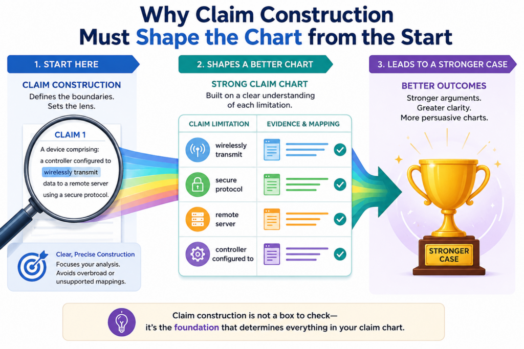
A chart that ignores likely claim construction issues may look strong at first but fall apart later.
Lawyers should read the claims, the patent specification, the file history, and the accused product evidence with claim meaning in mind.
The chart should not assume every claim term gets the broadest possible meaning. It should also not make silent choices that later become a problem.
If a term has a likely dispute, the team should know that early. The chart may need to show proof under the preferred meaning and, when useful, under a backup meaning.
This does not mean the chart should become bloated. It means the chart should be built with eyes open.
The chart should not depend on a meaning the court may reject
One common mistake is building a chart around an aggressive reading of a claim term without testing whether that reading fits the patent. This can happen when the accused product is close, but not quite close enough under the natural meaning of the claim language.
That kind of stretch may feel useful early, but it can weaken the case. The opposing side will find it.
The court may reject it. The client may lose leverage. A better path is to face the issue early and decide whether the claim can support the theory.
This does not mean lawyers should avoid strong positions. Patent cases often require hard arguments. But those arguments should be built on the patent record and the facts, not on wishful wording.
Good charts keep room for the legal theory without hiding the risk
A practical chart can include clear internal notes about claim meaning. It can identify terms that may need construction.
It can state why the accused feature meets the term under the proposed reading. It can also flag risks for the team.
For example, if a claim term may require a certain kind of “server,” the chart should not just point to any remote system and move on.
It should explain why the accused component qualifies. If there are several possible components, the chart should identify the best one and why.
This helps the lawyer build a cleaner argument. It also helps the expert. Most of all, it helps the client understand the true shape of the case before key money and strategy decisions are made.
How to make claim charts more persuasive without making them too long
A persuasive claim chart is not always a long claim chart. In fact, a chart that is too long can be less useful. The reader gets tired. The key proof gets buried. The theory becomes hard to see.
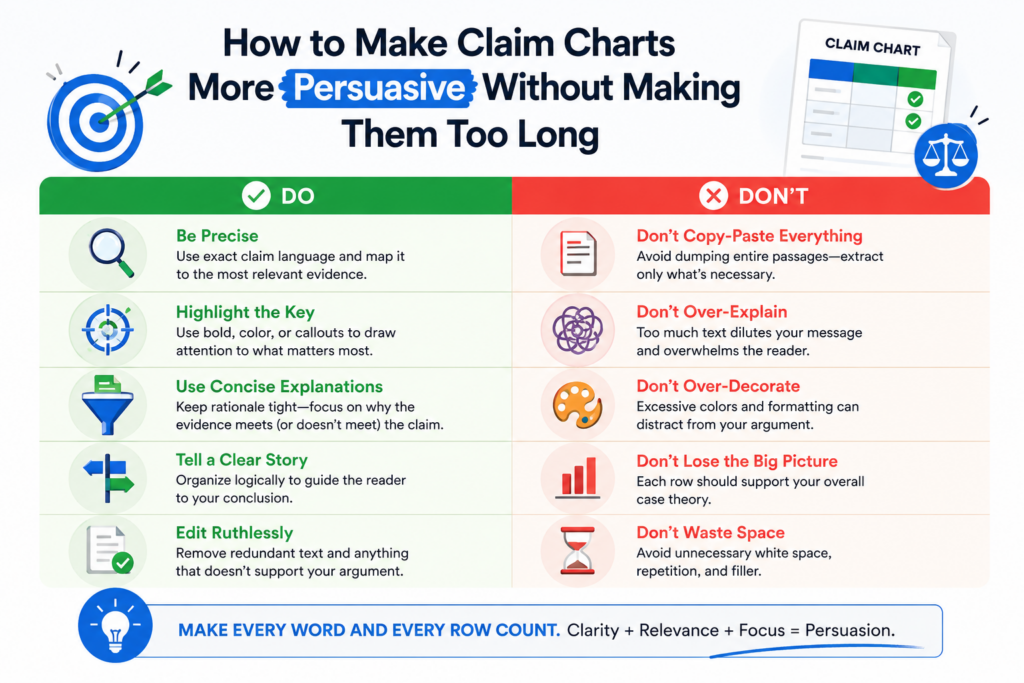
The goal is to give enough detail to prove the point without turning every row into a full brief. A chart should be complete, but it should also be readable. That balance takes judgment.
Strong charts use clean structure, direct language, and strong evidence. They avoid filler. They do not repeat the same general statement in every row. They do not stuff in every possible screenshot. They choose the best proof and explain it well.
Each row should carry its own weight
A good test is simple: can each row stand on its own? If a row claims that a product has a certain feature, the evidence and explanation in that row should support that point. The reader should not have to search ten pages back to understand what the row means.
This matters because claim charts are often read under pressure. A partner may review them before a client call. A client may use them to decide whether to fund the case.
An expert may use them to prepare a report. Opposing counsel may look for weak spots. A judge may see parts of them in motion practice.
Each row should be clear enough to survive that pressure.
The best writing in a chart is plain, tight, and exact
Lawyers do not need fancy words to make a strong chart. They need exact words. Instead of saying the accused product “clearly practices the claimed invention,” say what the product does and why that action matches the claim phrase.
Plain writing helps because patent cases are already hard. The technology may be complex. The legal rules may be dense.
The court may have limited time. Clear writing lowers the friction.
This is also why strong patent drafting matters long before litigation. When the invention is captured with clear detail, later charting becomes easier. When the patent record is thin, the litigation team must work harder to explain the fit.
PowerPatent helps founders create better patent work early, with smart tools and attorney oversight built for modern technical teams. Start here: https://powerpatent.com/how-it-works
How to choose the right claims before building the chart
A claim chart is only as strong as the claim behind it. If the team charts the wrong claim, even a clean chart can waste time. The first job is not to chart everything. The first job is to choose the claims that give the case the best path.
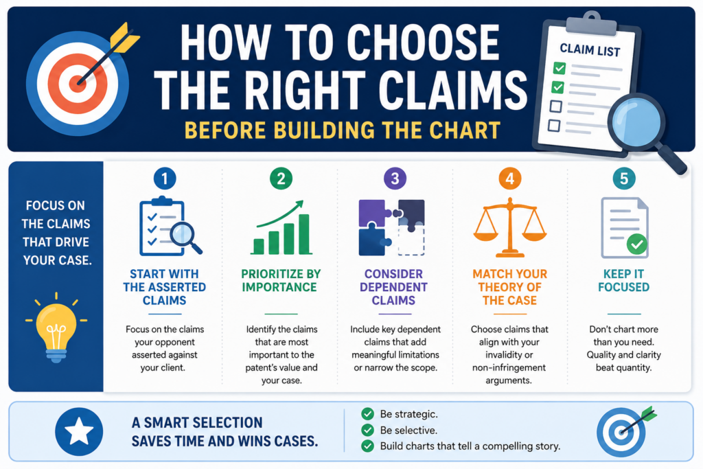
That means the lawyer should look for claims that are clear, provable, and valuable. A broad claim may look attractive, but it may also face stronger invalidity attacks.
A narrow claim may be easier to prove, but it may cover less money or fewer product versions. The right choice often sits between those two points.
A smart litigation team does not treat all claims the same. It ranks them. It asks which claims match the accused product most directly.
It asks which claims avoid messy claim construction fights. It asks which claims can be proven with evidence that is likely to exist. It also asks which claims matter most to damages.
This early choice can save a case from becoming too wide. When a case starts with too many claims, the team can drown in its own work. Discovery gets harder.
Experts get pulled in too many directions. The story gets weaker. A focused chart helps the team move faster and speak with more force.
PowerPatent helps technical teams build stronger patent assets earlier, so later claim mapping is less painful and more useful. You can see how the software and real attorney review work together here: https://powerpatent.com/how-it-works
The best claim is not always the broadest claim
Many lawyers and clients are drawn to the broadest claim first. That makes sense. A broad claim can seem more powerful.
It may appear to cover more products, more use cases, and more revenue. But in litigation, broad can also mean exposed.
A broad claim may be easier for the other side to attack with older technology. It may also use terms that need hard claim construction fights. If the accused product only fits under a stretched reading, the chart will show that weakness fast.
A narrower claim may be better when it tracks the accused feature closely. It can give the team a cleaner proof path. It may also help the lawyer tell a stronger story because the match feels natural, not forced.
The right question is not, “Which claim sounds biggest?” The right question is, “Which claim gives us the strongest, clearest, most useful case?”
The chart should reveal claim strength, not hide claim weakness
A strong chart is honest. It does not try to make every claim look equal. It shows where the proof is strong and where the proof is thin. That is a feature, not a flaw.
When a claim element needs a big leap, the chart should make that plain to the legal team. When an accused feature only fits if the court adopts a certain meaning, the team should see that early.
When a claim requires action by more than one party, the chart should not gloss over who does what.
This is how lawyers avoid late surprises. It is much better to find a problem during claim selection than after expert reports, after a Markman order, or after the client has spent a large part of the budget.
How to chart direct infringement without creating hidden gaps
Direct infringement is often the first theory lawyers test. In simple terms, the lawyer must show that one party makes, uses, sells, offers, imports, or performs what the claim requires.
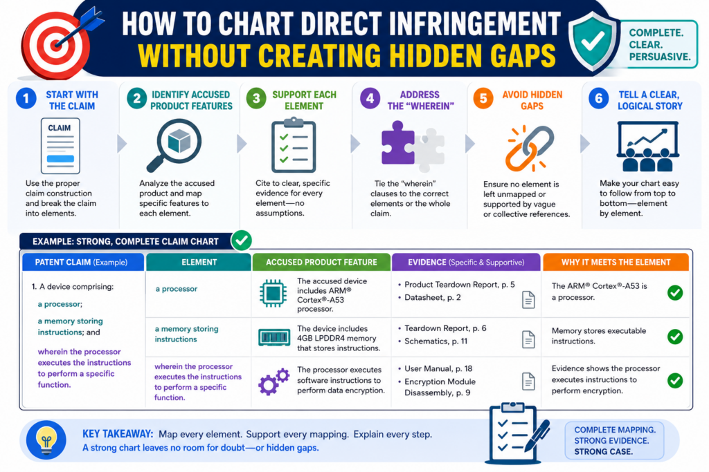
The details depend on the claim type, but the chart must always answer the same basic question: who did the claimed thing, and where is the proof?
This sounds simple until the product is a modern software system. A feature may run partly on a phone, partly on a cloud server, partly in a browser, and partly through a third-party service.
A user may trigger a step. A vendor may host the system. A customer may control settings. A partner may supply data.
A claim chart must handle those facts with care. It should not simply say “the accused system performs the step” if different actors are involved. It should show the role of each actor and why the legal theory still works.
System claims and method claims need different charting habits
A system claim often focuses on parts, components, or functions. The chart may need to show that the accused product includes each part or is configured to perform each function.
For software, this may mean mapping claim language to servers, apps, databases, models, processors, memory, instructions, or user interfaces.
A method claim is different. It requires steps. The chart should show that the steps are performed, and it should identify who performs them.
This is especially important when customers use the accused product. If the accused company does not perform every step itself, the team must think carefully about the legal theory.
That difference can change the whole case. A system claim may be easier to map to a product offering.
A method claim may need stronger proof of actual use. The chart should make that difference clear instead of blending the two together.
The “who performs the step” question should never be left for later
One of the most dangerous hidden gaps in a claim chart is actor confusion. The chart may show that a step happens somewhere in the system, but it may not show who performs it. That can become a major problem.
For example, a claim may require receiving data, processing it, and sending an alert. If the accused company’s server receives and processes the data, but the customer’s device sends the alert, the chart needs to explain the theory.
If a third-party platform performs part of the process, the chart must deal with that too.
A good chart names the actor or component tied to each step. It does not need to overargue every legal issue in the chart itself, but it should give the team enough detail to know whether the direct infringement theory is clean.
How to chart indirect infringement with a stronger proof trail
Indirect infringement often depends on more than product matching. The chart may need to show that the accused party encouraged, helped, or caused another party to infringe.
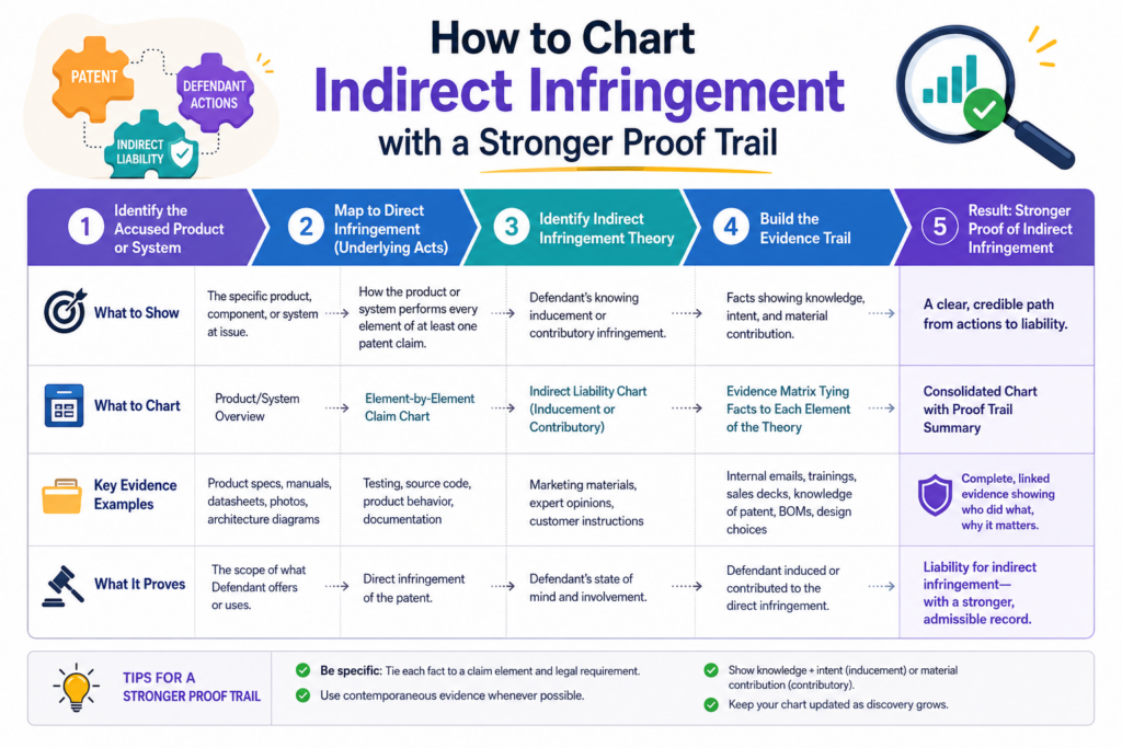
It may also need facts about knowledge and intent. That means the chart should be built with a wider evidence view.
This is where many teams make the chart too narrow. They focus only on the product feature and forget the conduct around the feature.
But for indirect infringement, the story may live in setup guides, training pages, customer emails, sales decks, developer docs, onboarding flows, support tickets, and public statements.
A lawyer should ask how the accused party teaches customers to use the product. Does the company tell users to turn on the accused feature? Does it give steps that match the claimed method?
Does it promote the benefit that comes from using the feature in the claimed way? Does it provide tools that make the infringing use easy?
The claim chart should not become a dumping ground for intent evidence, but it should point to the key proof that supports the theory.
Customer use must be shown with care and common sense
When a theory depends on customer use, the chart should show that customers actually use the product in the claimed way or are instructed to do so. Public guides can help.
Tutorials can help. Product screenshots can help. Customer case studies can help. Usage data, once discovered, can be even stronger.
The chart should avoid vague claims like “users can do this.” Capability can matter in some settings, but for method claims, actual performance often matters. The stronger chart explains why the evidence shows use, not just possibility.
If the accused company publishes a guide that tells customers to perform each claimed step, that may be powerful.
If the product design pushes users through those steps as part of normal use, that may also be powerful. The chart should connect that proof to the claim language in a direct way.
A strong indirect chart links product design, instructions, and real use
The best indirect infringement charts often read like a clean path. First, the accused product has the feature. Next, the company teaches or supports the use of that feature. Then, customers use the feature in a way that meets the claim.
That path must be backed by evidence. A guide may show instruction. A demo may show the intended workflow.
A support page may show common use. Analytics or customer records may show actual use. Internal documents may show knowledge of the patent or knowledge of the accused conduct.
The lawyer should keep the chart simple, but not thin. Each piece of proof should have a job. If the proof does not help show the feature, the instruction, the customer action, or the mental state, it may belong somewhere else.
For startups building important technology, this is another reason to protect inventions early and clearly.
Good patents make later proof work easier. PowerPatent helps founders move faster while still getting real attorney guidance. Learn how it works here: https://powerpatent.com/how-it-works
How to use claim charts during discovery without losing control
Discovery can turn a clean early chart into a mess if the team is not careful. New documents arrive. Source code review begins. Engineers give testimony.
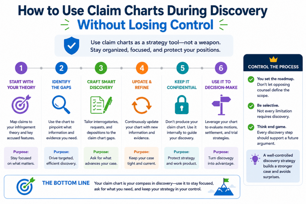
Product versions change. The accused company gives narrow answers. The team may find new proof, new problems, or both.
The claim chart should grow during discovery, but it should not become a warehouse. Lawyers need a process for updating the chart without burying the main theory.
Every new piece of evidence should be tested before it is added. Does it support a claim element? Does it replace weaker proof? Does it show a new product version? Does it change the theory? Does it create a new risk?
A chart that grows without discipline becomes hard to use. A chart that is updated with care becomes more powerful with each round of discovery.
Discovery should sharpen the chart, not just make it longer
Early charts often rely on public proof. Discovery should add deeper proof. But deeper does not always mean more. Sometimes one strong source code cite is better than five marketing pages.
One clear technical document can replace several weak screenshots. One engineer answer can explain what many product pages only suggest.
This is why the team should revise, not merely add. When stronger evidence appears, the chart should be cleaned.
Old proof can be moved to backup files. Weak proof can be removed. The explanation can become more exact.
This keeps the chart useful for the next stage of the case. It also helps experts. An expert does not need a mountain of loose material. An expert needs the best proof tied to the claim language in a way that can be checked.
Version control is not optional when charts keep changing
A litigation chart may have many lives. There may be an early case review version, a pre-suit version, a contention version, a source-code version, an expert version, and a trial version. If the team does not track changes, confusion follows.
Lawyers should know which chart is current, what changed, why it changed, and what evidence supports each version.
This matters when contentions are served. It matters when amendments are requested. It matters when experts rely on the chart. It matters when the other side claims the theory shifted too late.
Clean version control also helps the client. When the chart changes because new proof was found, the client should understand whether the case got stronger, weaker, or simply clearer.
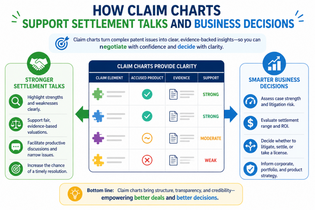
How claim charts support settlement talks and business decisions
A good claim chart is not only for court. It can be a business tool. It can help both sides see risk. It can help a client decide whether to settle, license, press forward, or narrow the case.
It can help a founder or company leader understand the value of the patent without getting lost in legal language.
In settlement talks, a clear chart can do what a long letter cannot. It can show the match between the claim and the accused product in a simple, visual way.
It can make the risk feel concrete. It can also show that the patent owner has done serious work and is not relying on vague claims.
That does not mean every chart should be shared in full. Lawyers must choose what to disclose and when. But even an internal chart can make settlement strategy much sharper.
The chart can turn a legal dispute into a business conversation
Many business leaders do not think in claim terms. They think in product risk, money, delay, market impact, and control. A claim chart helps translate the legal case into those business terms.
If the chart shows a clean read on a core revenue feature, the case may carry more settlement weight. If the chart shows only a minor feature, the damages story may be smaller.
If the chart shows a product version issue, the settlement discussion may need to account for dates and changes. If the chart shows a design-around path, the business conversation may shift toward future changes.
This is why lawyers should build charts that can be understood beyond the litigation team. The chart should be legally serious, but still readable.
A strong chart helps the client make hard calls with less fear
Clients often face hard choices in patent cases. Settle now or keep going. Add claims or narrow them.
Push for source code or focus on documents. File suit or keep negotiating. These choices are easier when the proof is organized.
A clear chart gives the client a grounded view. It does not remove risk. It makes risk visible. That is what good counsel should do.
For founders, this is the heart of smart IP work. The goal is not to collect patents for show. The goal is to protect real inventions in a way that supports real business moves.
PowerPatent helps teams do that with modern software and real patent attorney oversight, built for speed and clarity. Start here: https://powerpatent.com/how-it-works
How to avoid the most common claim chart mistakes
A claim chart can look polished and still be weak. Nice formatting does not fix missing proof. Long quotes do not fix unclear thinking. A chart only works when it shows a clean match between the claim and the accused product.
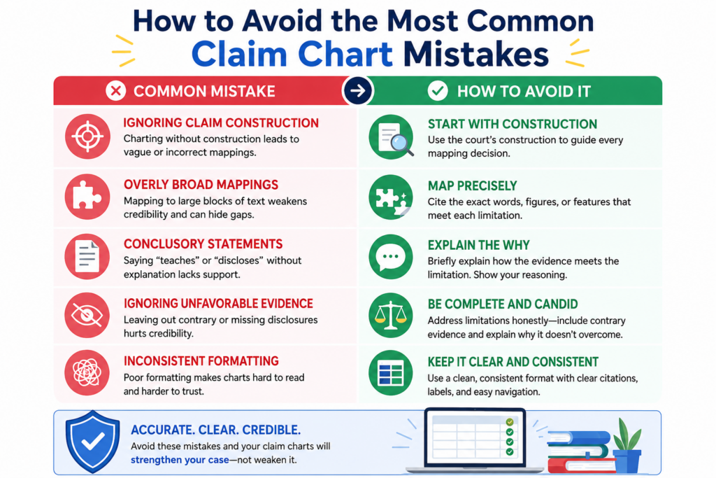
The most common mistakes are not always obvious at first. They often hide inside charts that feel busy.
The team may have many screenshots, long product guide excerpts, and pages of text. But when someone asks, “Where is this exact claim part shown?” the answer becomes soft.
That is why lawyers should review claim charts with a sharp eye. The chart should not just look complete. It should be complete in the places that matter.
A chart should never skip an element or bury a weak match
Patent claims are unforgiving. If one required part is missing, the infringement theory may fail. So the chart must treat every claim element with care. Even small words can matter. A phrase that seems minor may become the key fight later.
A common mistake is giving strong proof for the easy parts and thin proof for the hard parts.
The chart may spend three pages proving a feature everyone agrees exists, then use one vague sentence for the part that will actually be disputed. That is backwards.
The chart should spend the most care where the risk is highest. If a claim term is likely to be attacked, the chart should explain the proof with more care.
If the accused product only meets a step in a certain mode, version, or setting, the chart should say that clearly. If the evidence is not yet complete, the internal team should know that too.
The weak row is where the other side will aim first
Opposing counsel will not treat the chart like a friendly reader. They will look for the row that asks the court to make the biggest leap.
They will look for a missing actor, a missing step, an unsupported assumption, or a claim term used in a loose way.
That is why each row should be tested as if it will be attacked. The lawyer should ask whether the proof really shows what the row says.
The lawyer should also ask whether the explanation uses clear words or hides behind broad labels.
A row that says “the system performs this function” may not be enough. The better row says which part of the system performs the function, what evidence shows it, and how that action meets the claim language. That kind of clarity makes the chart harder to break.
How to write claim chart explanations that a judge can follow
Claim charts often fail because the explanation is too thin or too dense. If the explanation is too thin, the reader has to guess.
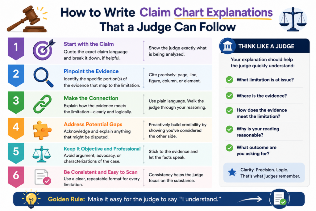
If it is too dense, the key point gets lost. The best writing sits in the middle. It is clear, exact, and easy to follow.
Lawyers sometimes think technical writing must sound complex to be serious. The opposite is true. In a patent case, clear writing shows control. It tells the reader that the team understands the invention, the product, and the proof.
A good claim chart explanation should feel like a bridge. On one side is the claim language.
On the other side is the evidence. The explanation helps the reader walk from one to the other without falling into a gap.
Simple words make technical proof stronger, not weaker
A claim chart should use the terms needed for the technology. But it should not add hard words just to sound legal or technical.
If the product sends data from a phone to a server, say that. If the model sorts images by type, say that. If the software checks a rule before showing an alert, say that.
This does not mean the chart should be casual or loose. It means the chart should be plain and exact. A judge should not need to decode the writing before reaching the proof.
Good chart writing also avoids empty words. Phrases like “clearly,” “obviously,” and “without question” do not prove anything. Strong evidence proves the point. Strong explanation makes the point easy to see.
The best explanations answer the hidden question in the reader’s mind
Every chart row creates a hidden question. The reader asks, “Why does this evidence meet this claim phrase?” The explanation should answer that question directly.
If the claim requires storing a user profile, the chart should not only show a screenshot with a user name.
It should explain how the accused system stores profile data, where that is shown, and why the data is a user profile under the claim.
If the proof comes from a help page, say what the help page shows. If later discovery gives stronger proof, update the row.
This style helps the legal team too. When the explanation is clear, it becomes easier to turn the chart into contentions, expert report material, motion arguments, and trial themes. The same clean thought can travel through the case.
PowerPatent is built around the same idea. Strong patent work should not hide inside confusing language. It should make the invention easier to see, protect, and use.
You can learn how PowerPatent combines smart software with real attorney oversight here: https://powerpatent.com/how-it-works
How to handle source code in claim charts without creating chaos
Source code can be the strongest evidence in a software patent case, but it can also create major confusion.
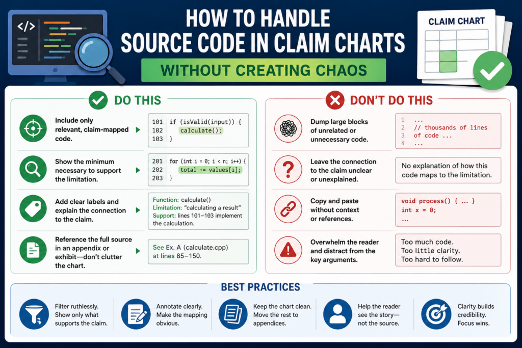
Code is detailed, layered, and easy to misread. A lawyer may know the claim theory, but the code may require an expert, a technical consultant, or an engineer to explain what is really happening.
A claim chart should not paste large blocks of code without purpose. That can make the chart harder to use.
The goal is not to show as much code as possible. The goal is to show the right code and explain how it supports the claim element.
Source code also needs careful handling because it is often produced under strict rules. Access may be limited.
Notes may be controlled. Printing may be restricted. The team must follow the protective order and keep the chart process clean.
Code evidence should be tied to behavior, not just file names
A common mistake is pointing to code files without explaining what the code does. A file name can help, but it is rarely enough. The chart should connect the code to system behavior.
For example, if the claim requires ranking results based on a score, the chart should identify the code path that creates or uses the score. It should explain how the score affects the ranking.
It should also connect that behavior to other proof, such as technical documents, test results, or product output, when available.
This matters because source code can be misunderstood. The other side may argue that the cited code is unused, optional, old, or not part of the accused feature.
The chart should be built to face those attacks. It should show not only that the code exists, but that it matters.
A source code chart should help the expert tell a clean story
Experts often carry the technical weight in software patent cases. A good source code chart helps the expert build a clear opinion. It gives the expert a path through the code and ties that path to the claim language.
The chart should not try to replace expert analysis. But it should support it. Each source code cite should have a reason to be there.
Each explanation should make clear how the code connects to the product feature and the claim element.
The best charts also connect code to real-world use. Code alone may show a function. Product documents may show how that function appears to users.
Testing may show the feature in action. Together, those sources can make the infringement story much stronger.
How to use claim charts to prepare experts and witnesses
Claim charts are powerful tools for expert work. They help the expert see the claim theory, review the proof, test the facts, and prepare opinions.
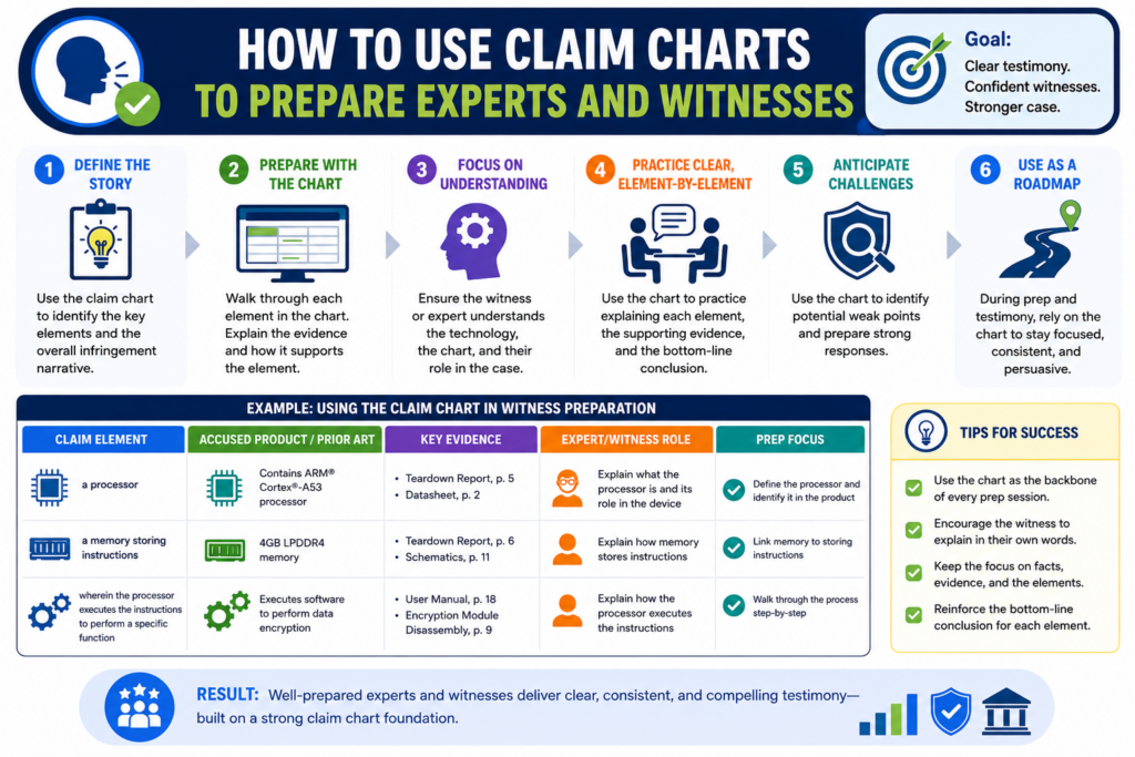
A messy chart makes expert work slower. A clean chart helps the expert focus on the real issues.
The chart should not force the expert to rebuild the whole case from scratch. It should give a clear starting point.
The expert can then test the theory, add technical depth, and explain the product in a way the court can trust.
The same is true for fact witnesses. Engineers, product managers, and company witnesses may not think in claim language.
A chart helps the legal team prepare questions that connect the witness’s knowledge to the case issues.
Experts need a chart that is accurate, complete, and easy to test
An expert should be able to review a claim chart and understand the theory behind each row. The expert should also be able to check whether the cited proof supports that theory.
This is where precision matters. If the chart overstates the evidence, the expert may lose confidence in it.
If the chart leaves gaps, the expert may need more time and more documents. If the chart mixes several theories in one row, the expert may struggle to give a clean opinion.
A strong expert chart separates what is known from what is argued. It uses exact citations. It keeps the claim language clear. It explains the technical link without hiding the hard parts.
The chart should help the expert sound clear, not scripted
The purpose of the chart is not to give the expert canned lines. It is to help the expert understand the case deeply enough to explain it in natural, clear language.
A good expert can take a technical issue and make it understandable. The chart should support that goal.
It should show the expert where the proof lives, how the system works, and why the product meets the claim. Then the expert can build an opinion that feels grounded, not rehearsed.
This also helps with depositions. When the chart is clean, the expert can stay anchored. When the other side asks about a claim element, the expert can point to the proof and explain the link. That makes the case feel more stable.
For founders and technical teams, this shows why early patent quality matters. A patent that clearly explains the invention gives future experts better ground to stand on.
PowerPatent helps teams capture technical ideas with speed, structure, and attorney guidance. See how it works here: https://powerpatent.com/how-it-works
How to make claim charts useful for damages strategy
In patent litigation, proving infringement is not the whole job. The team also needs to think about value. A claim chart can help with that if it is built with damages in mind from the start.
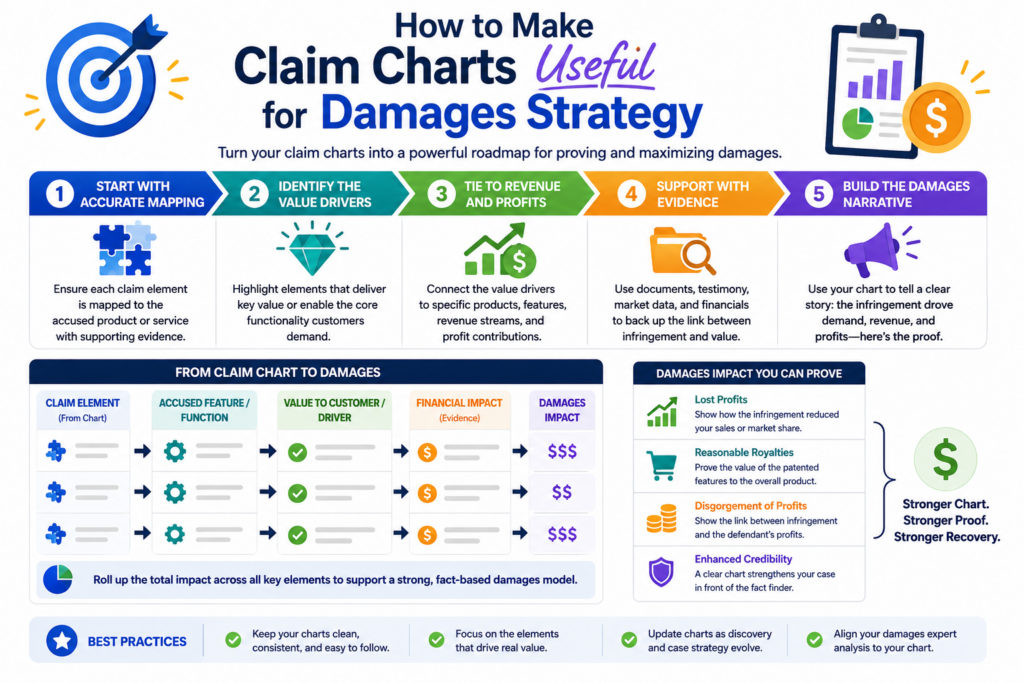
The chart can show whether the patented feature is central to the accused product or only a small part.
It can show which product versions include the feature. It can show when the feature appeared, how it is used, and whether it drives customer demand. Those facts can shape the damages story.
A chart that ignores damages may still prove infringement, but it may miss the business force of the case.
A chart that tracks value can help the team speak about harm, leverage, and resolution in a more practical way.
The strongest damages story often starts with product importance
If the accused feature is central to the product, the case may have greater value. If the feature is rarely used or easy to remove, the value may be lower. The chart can help the team see this early.
The lawyer should look for evidence showing how the accused party talks about the feature. Does the company promote it? Does it appear in demos?
Is it part of the paid tier? Is it used to win customers? Is it tied to speed, accuracy, cost savings, safety, or user growth?
These facts may not belong in every infringement row. But they should be captured somewhere in the case work.
They can help damages experts, settlement teams, and business decision makers understand why the patent matters.
A chart can connect technical proof to business value
The best litigation teams do not treat technical proof and damages as separate worlds.
They connect them. If the chart shows that a claimed feature powers a key product benefit, that link may become important later.
For example, a software feature may reduce processing time. A medical device feature may improve ease of use. A machine learning feature may make results more accurate.
A network feature may lower system load. If those benefits are tied to customer demand, pricing, or market position, the chart can help point the team toward stronger damages proof.
This does not mean the infringement chart should become a damages report. It means the chart should help the team notice value signals early and preserve them for later use.
How to use claim charts when the accused product changes
Modern products do not sit still. Software updates every week. Cloud tools change behind the scenes. AI models are replaced.
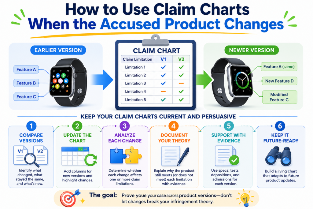
Devices get new firmware. Features are renamed, moved, hidden, or rebuilt. A claim chart that treats the accused product as frozen can become stale fast.
This is a real issue in patent litigation. A product may infringe in one version but not another. A company may make changes after a demand letter, after the complaint, or during discovery.
Some changes may be true design-arounds. Others may be cosmetic. The chart must help the legal team see the difference.
The best practice is to chart with time in mind. The lawyer should ask when the accused feature existed, which versions used it, how it changed, and whether users still have access to older versions.
A chart that includes dates and product versions can save the team from confusion later.
PowerPatent helps founders and technical teams protect what they are building before the market shifts around them.
The platform combines smart software with real attorney oversight, so teams can move faster without losing control. See how it works here: https://powerpatent.com/how-it-works
Product versions should be treated as facts, not footnotes
It is easy to chart “the product” as if there is only one version. That can create trouble.
In real cases, there may be desktop versions, mobile versions, enterprise versions, free versions, beta versions, regional versions, API versions, and customer-specific builds.
Each version may matter. A feature in the enterprise product may not exist in the free product. A cloud function may have changed after a certain release.
A mobile app may perform one step locally while the web app performs it on a server. These are not minor details when a claim chart is being used to prove infringement.
A careful chart names the accused product with enough detail. It does not just say “the app” or “the platform” when that could mean several things. It identifies the feature, the version, the date range, and the proof tied to that version.
A design change should trigger a fresh chart review
When the accused party changes the product, the legal team should not assume the old chart still works.
It may work. It may not. The only safe move is to review the claim elements again against the changed product.
This review should be practical. Did the same function move to a different component? Did the company remove one step but keep the result? Did the user workflow change?
Did the data path change? Did the technical benefit remain the same? Did the change affect only future use, or did older versions remain active?
A true design-around can change damages, injunction strategy, settlement value, and the future shape of the case.
A shallow design change may have less impact. The chart helps the team tell the difference without guessing.
How to prepare claim charts for court deadlines
Many patent cases have early rules for infringement contentions. These rules often require detailed claim charts that identify asserted claims, accused products, and the proof showing how each claim element is met. Waiting until the deadline is close is a mistake.
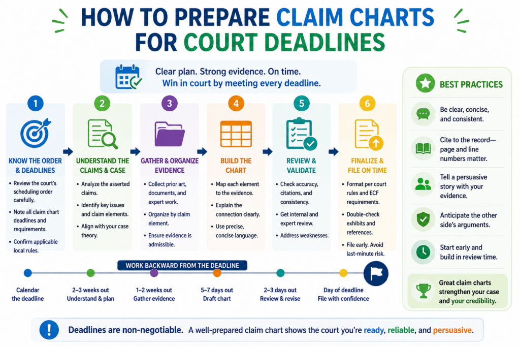
A court-facing chart needs more discipline than an internal chart. It must be clear, complete, and consistent.
It should not include loose guesses or half-formed theories. At the same time, it may need to preserve room for facts that are only available through discovery.
This is where good drafting matters. The chart should say enough to give notice of the theory while staying grounded in the evidence available at that time. The lawyer must avoid overclaiming.
But the lawyer also should not make the chart so narrow that it blocks the case from growing when new facts appear.
A deadline chart should be built from the strongest current proof
Before serving contentions, the team should clean the chart. This is not the time for a messy draft. Each claim element should have the best proof available.
Weak screenshots should be replaced with stronger documents when possible. Repeated filler should be removed. Explanations should be direct.
The chart should also match the legal theory. If the case is about a specific feature, the chart should not wander into unrelated product areas. If the theory depends on customer use, the chart should show that clearly.
If source code discovery is needed to confirm internal operation, the chart should explain the public basis for the position and leave room to add code proof later where allowed.
This process takes judgment. A chart that is too vague invites attack. A chart that is too rigid can trap the team. The goal is a chart that is firm, fair, and ready to support the next stage.
Consistency across filings matters more than many teams expect
A claim chart does not live alone. It may connect to the complaint, infringement contentions, discovery responses, expert reports, claim construction positions, motions, and settlement papers.
If those materials tell different stories, the other side will use that against the patent owner.
That is why the litigation team should check key terms across documents. The same accused feature should not be called by five different names without explanation.
The same claim element should not be mapped to different product parts unless there is a clear reason. The same theory should not shift quietly from one actor to another.
Consistency builds trust. It also protects the team from needless fights about notice and shifting theories. A clear chart makes the whole case easier to manage.
How to make claim charts work with invalidity defenses
A claim chart is often thought of as an infringement tool. But smart lawyers also use it to think about invalidity.
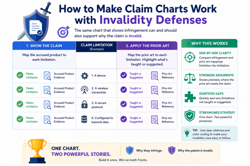
Every infringement theory has a shadow side. If the claim is read broadly enough to cover the accused product, the other side may argue that older technology also fits.
That does not mean the patent owner should avoid strong readings. It means the team should test the reading.
A claim chart can help by showing the exact meaning being used for each claim element. Once that meaning is clear, the team can ask whether prior art creates a risk under the same reading.
This is one of the best ways to avoid a trap. A lawyer should not argue for a broad meaning in infringement and then act surprised when the same meaning creates invalidity pressure.
The infringement read and the validity read must be able to live together
The chart should help the team keep its positions honest. If a claim term is mapped broadly to the accused product, the team should review whether that same broad meaning sweeps in old products, papers, patents, or systems. If it does, the team may need a more careful theory.
This does not mean the chart has to include a full invalidity analysis. But the chart should be written with awareness of that risk. The lawyer should avoid language that creates needless exposure.
For example, saying that any system that “uses data” meets a claim phrase may be too loose if the patent actually requires a more specific kind of data use.
Better writing protects the case. It explains why the accused product meets the claim because of the specific way it works, not because the claim covers every basic idea in the field.
A good chart helps the team avoid winning one fight and losing another
Patent litigation is full of tradeoffs. A broad infringement position may help against the accused product but hurt against prior art. A narrow position may help validity but weaken infringement. The chart is where these tradeoffs become visible.
The legal team should use the chart as a meeting point between infringement counsel, validity counsel, technical experts, and the client.
If everyone works from different assumptions, the case can drift. If everyone works from the same chart, the team can spot conflicts early.
That kind of discipline is especially important for deep tech inventions. The invention may involve code, models, hardware, data flows, sensors, networks, or complex systems.
A clean chart helps the team keep the theory aligned across every part of the case.
How claim charts help lawyers tell a better story
A patent case is not won by a chart alone. But a strong chart can become the backbone of the story. It shows what the invention is, what the accused product does, and why the match matters.
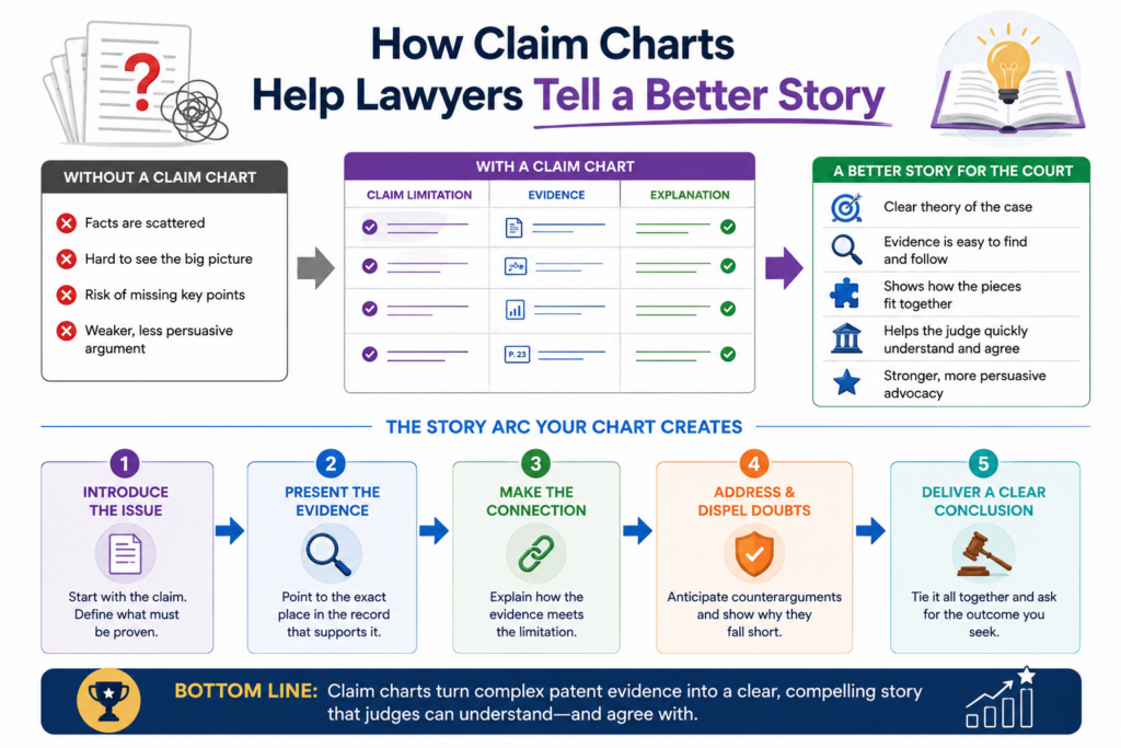
This story must be simple enough for non-technical readers to follow. That includes judges, jurors, business leaders, and sometimes even the client’s own board.
The chart should support a larger message: the patented invention solved a real problem, and the accused product uses that solution.
When a chart is built only as a legal checklist, it may prove points but fail to persuade. When it is built as a proof story, it does both.
PowerPatent helps founders protect real technical breakthroughs in a way that is easier to explain and act on. It is built for teams that want strong IP without slowing down their company. Learn more here: https://powerpatent.com/how-it-works
The strongest story starts with the problem the invention solved
Before readers care about claim elements, they need to understand the problem. What was hard before the invention?
What did the inventor make better? Why did the solution matter? How does the accused product benefit from that same idea?
The claim chart should not become a marketing story. But it should support a clear theme. If the invention improved speed, the chart should help show how the accused product uses that speed improvement.
If the invention improved accuracy, safety, scale, cost, or user control, the chart should connect the proof to that benefit where the claim language allows it.
This makes the case feel less abstract. It helps the reader see why the patent exists and why the accused conduct matters.
A chart should help the team explain without overclaiming
The best patent stories are strong because they are true. A lawyer should not turn a small feature into the whole product unless the evidence supports that.
A lawyer should not say the accused company copied the invention unless there is proof. A lawyer should not stretch technical facts to make the story sound bigger.
Good claim charts keep the story honest. They anchor each point in evidence. They show where the patented idea appears in the accused product. They also show the limits of the case.
That honesty can make the story more persuasive, not less. Judges and juries can sense when a party is reaching. A careful chart helps the lawyer speak with confidence because the proof is already organized.
Conclusion
Claim charts are not side documents in patent litigation. They are the proof engine of the case. A strong chart helps lawyers see what is real, what is weak, and what needs more work before money, time, and trust are put at risk. It connects the patent claim to the accused product in a way judges, experts, clients, and business teams can understand.
The best charts are clear, honest, and built early. For founders and technical teams, stronger patents make this work easier later. PowerPatent helps build that foundation with smart software and real attorney oversight: https://powerpatent.com/how-it-works