An Office Action can feel like a wall. You read the examiner’s points, see the cited patent papers, and wonder how to answer without giving away too much or saying the wrong thing. At PowerPatent, we believe patent work should feel clear, not painful. Smart software and real attorney review can help you map claims, find gaps, and respond with more control. You can see how that works here: https://powerpatent.com/how-it-works
Why claim charts make Office Action responses easier to handle
A claim chart helps you slow the Office Action down. That matters because an Office Action is often packed with many moving parts.
The examiner may point to one old patent for one part of your claim, another paper for a second part, and then say the whole idea would have been clear to a skilled person.
If you answer that in a loose way, your response can become hard to follow. Worse, it can miss the real gap.
A claim chart gives the response a clear path. It lets you place each claim part in its own space. Then you can ask a simple question for each part: does the cited art really show this, or is the examiner stretching?
That one question can change the whole response.
For founders and engineers, this is very practical. You do not need to start by writing a perfect legal answer.
You start by mapping the facts. You take the claim, split it into plain pieces, and compare those pieces against the examiner’s cited references.
This gives your patent attorney cleaner input, better technical detail, and a stronger base for the response.
A strong chart can also help you avoid panic edits. Many founders see a rejection and think they must narrow the claim right away. Sometimes that is needed. Many times, it is not.
The chart helps you see whether the examiner has truly found every part of the claim. If not, you may have room to argue before giving up claim scope.
A claim chart turns examiner language into a simple side-by-side review
The examiner’s language can feel hard to read because it is often written in a dense format.
A single paragraph may cite several lines from a patent paper, mention a figure number, and then state that a claim part is taught by that reference. That can sound final. But it is not final. It is an assertion that must be checked.
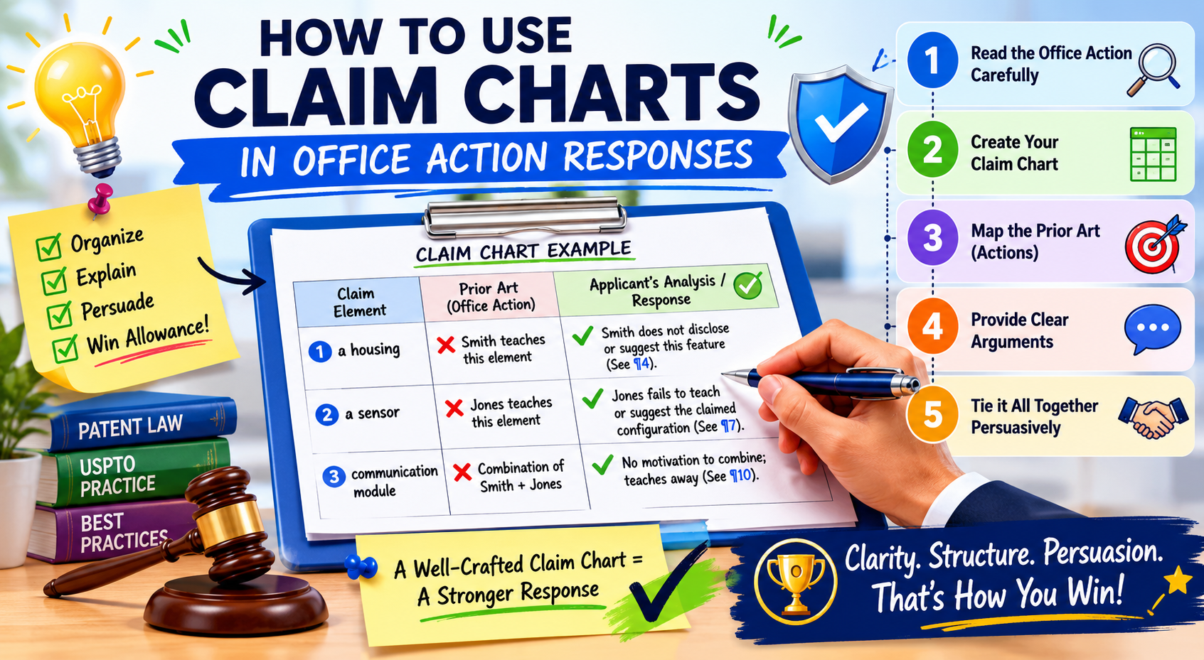
The claim chart gives you a simple way to check it. On one side, you place the exact claim part. On the other side, you place what the examiner says supports that part.
Then you add your technical notes. This is where founders and engineers can add real value because they often know the invention better than anyone else.
The goal is not to argue loudly. The goal is to make the difference obvious. When a claim says your system does something in a certain order, but the cited art only shows a general tool that works in a different way, the chart helps make that clear.
When the examiner points to a broad feature but misses the specific control logic, the chart helps expose that gap.
The best claim charts make the missing piece easy to see
A good claim chart does not try to sound fancy. It does not bury the point in long words. It makes the missing piece easy to spot.
The reader should be able to look at one row and understand why the cited art does not match the claim.
This is why the chart should be built around the actual claim words. Do not rewrite the claim in a vague way.
Keep the exact words close. Then explain the meaning in plain terms beside it. This keeps the response tied to the record while still making it easy for a human to understand.
At PowerPatent, this kind of structure is a big part of making patent work move faster. Smart software can help organize claim language, cited art, and response notes, while real attorney review helps make sure the final answer is careful and strong.
You can see how PowerPatent helps founders move from invention details to attorney-backed patent work here: https://powerpatent.com/how-it-works
The chart helps your team decide whether to argue, amend, or do both
One of the hardest parts of responding to an Office Action is deciding what to do next. You may be able to argue that the examiner is wrong. You may need to amend the claim. Or you may need a mix of both.
The claim chart helps with that decision because it shows where the fight is strong and where it is weak. If the examiner has not shown a key part of the claim, an argument may be the best first move.
If the examiner has found most of the claim, but your invention has a deeper technical feature that is not yet in the claim, an amendment may make sense.
This is where claim charts become more than a reading tool. They become a decision tool. They help your team see the risk before drafting the response. That can save time and reduce back-and-forth with your attorney.
The chart should lead to a clear response strategy
A claim chart should not sit in a folder as a research note. It should lead to a clear response plan.
After the chart is built, your team should know which claim parts are strongly supported by the examiner’s references and which parts are not. You should also know which technical details might be added if an amendment is needed.
This is especially useful for startups because patent budget and founder time are limited. You do not want to spend days debating vague ideas. You want to know the best path fast. A chart gives you that.
The deeper value is control. Instead of feeling pushed around by the Office Action, you can look at the record and make a smart choice.
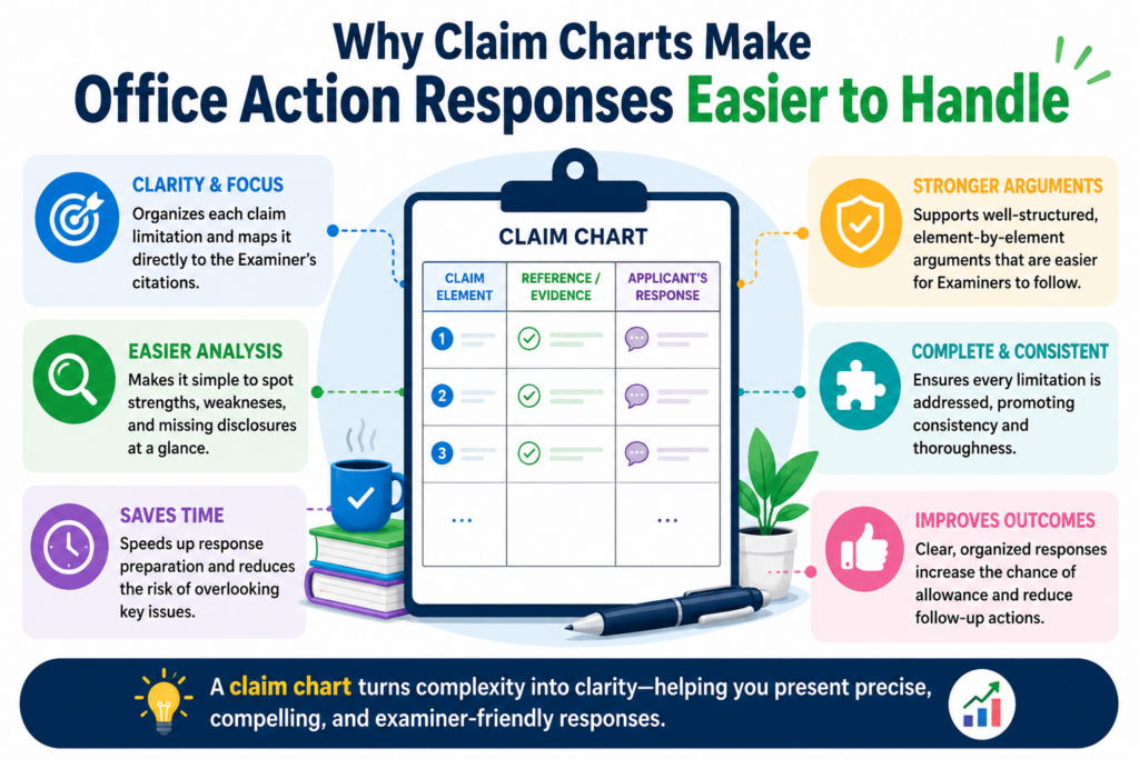
How to read the Office Action before building the claim chart
Before you build the chart, you need to read the Office Action with the right mindset. Do not read it like a defeat.
Read it like a map. The examiner is showing you where they think the claim is weak. Your job is to test each point and find the places where the examiner’s reading does not hold.
Start with the independent claims first. These are usually the broad claims that stand on their own. If the independent claim can be saved, many dependent claims may still have value.
If the independent claim needs a change, the dependent claims may give you clues about what to add.
Read the rejection slowly. Look for the claim number, the type of rejection, the cited reference, and the exact part of the reference the examiner relies on. Do not jump straight to drafting arguments. First, collect the pieces.
You should separate what the examiner says from what the reference actually shows
This step is easy to skip, but it is one of the most important parts of the whole process. The examiner may say that a reference teaches a claim part. That does not always mean the reference truly does.
It may teach something close. It may teach only part of the feature. It may teach the opposite. It may mention a word that sounds similar but works in a different way.
Your chart should keep these things separate. One area should capture the examiner’s position. Another area should capture what the reference actually shows. Another area should capture your team’s response notes.
This matters because Office Action responses often fail when they argue against a loose summary instead of the actual cited text.
A good chart keeps everyone honest. It forces the team to compare the claim against the real evidence, not just the examiner’s conclusion.
The cited reference should be checked with technical eyes
Founders and engineers should not assume the cited art works the same way as their invention just because it uses similar words. Many technical ideas share common terms.
A “model,” “module,” “processor,” “score,” “profile,” or “network” can mean very different things depending on how it is used.
Read the cited part like an engineer. Ask what input it receives, what process it performs, what output it creates, and why it works that way. Then compare that flow to your claim.
If your claim depends on a certain timing step, data structure, feedback loop, training method, sensor path, or control rule, check whether the reference truly has that same feature.
This is where many useful arguments come from. The difference is often not in the broad idea. It is in the way the system actually works.
You should mark the exact claim words that matter most
Not every word in a claim has the same weight in the response. Some words are broad setup language.
Some words carry the heart of the invention. When building a claim chart, you need to identify the words that matter most to the rejection.
These may be words about order, timing, structure, data movement, control logic, thresholds, model training, user action, machine action, or how two system parts interact.
The examiner may treat these words as small details. Your job is to decide whether they are actually the key to the invention.
Once you find those words, keep them visible in the chart. Do not let them get lost. The best response often grows from a careful reading of one phrase that the examiner moved past too quickly.
The strongest response usually starts with the smallest missed detail
Many Office Action responses are won or improved because someone noticed a small detail that changed the meaning of the claim. The examiner may have found a system that collects data, but not one that changes a model based on that data.
The examiner may have found a tool that ranks items, but not one that ranks them using your specific signal. The examiner may have found a workflow with similar steps, but not the claimed order of those steps.
This is why the chart matters. It gives small details a place to stand. It makes them visible. It gives your attorney the raw material needed to build a clean response.
When you work with PowerPatent, the goal is to make this kind of review easier and faster.
You can bring the technical truth of your invention into a process that is backed by smart tools and real patent attorneys, so your response is not just fast, but also thoughtful. Learn how the process works here: https://powerpatent.com/how-it-works
How to build a claim chart that actually helps the response
A useful claim chart is not just a table. It is a thinking tool. It helps you see what the claim says, what the examiner thinks the old reference shows, and where the real difference sits. When the chart is done well, the response almost starts to write itself.
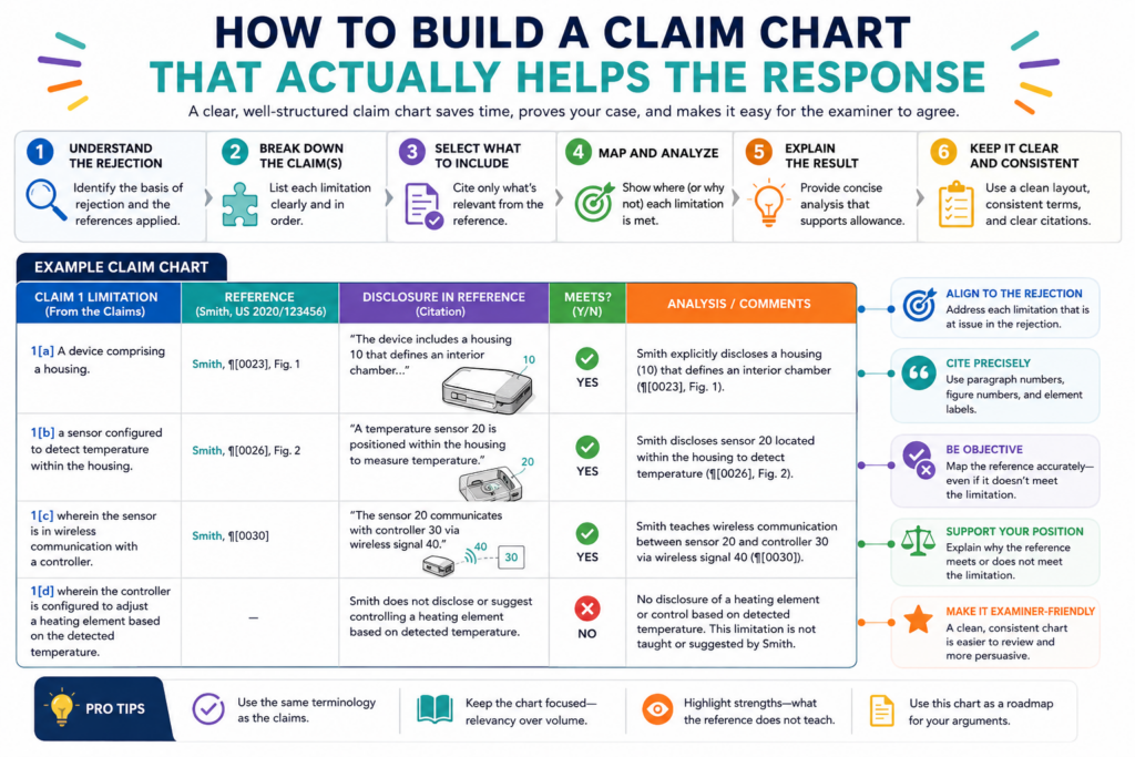
The key is to keep the chart focused. Do not turn it into a dumping ground for every thought.
Each row should answer one clear question: does the cited reference show this claim part in the way the claim requires? If the answer is no, the chart should explain why in plain words.
A good chart usually starts with the claim text. Take the full claim and split it into smaller parts. Each part should be short enough to compare against the cited art.
But do not cut the claim so much that you lose the meaning. Some phrases only make sense when read together, especially when they describe a relationship between two steps or two system parts.
Once the claim is split, place the examiner’s cited support beside each part. Then add your own technical review.
This is where your team can add the most value. You can explain what the old reference really does, what it does not do, and why your invention is different in a way that matters.
The chart should track the exact claim language first
The first job of the chart is to protect the meaning of the claim. That means the exact claim words should stay visible.
Do not reduce the claim to a loose summary too early. When you do that, you may lose the detail that makes your invention stand apart.
For example, if the claim says a system “updates a machine learning model based on a detected change in sensor behavior,” do not reduce that to “updates a model.”
The shorter phrase may sound easier, but it removes the real limit. The important part may be the detected change, the sensor behavior, or the way the update is triggered.
This matters because examiners often rely on broad readings.
They may find a reference that updates a model, but not one that updates it based on the specific trigger your claim requires. If your chart keeps the full phrase in view, that gap becomes easier to find.
Your attorney can then decide whether the gap supports an argument, an amendment, or both. That is the value of the chart. It turns a broad rejection into a more exact discussion.
The best chart does not argue before it compares
It can be tempting to start writing response language right away. But the chart should first compare.
Keep the early notes simple and factual. State what the claim requires. State what the examiner cites. State what the reference actually shows. Then explain the gap.
This order keeps the work clean. It also helps avoid weak arguments. If you start with the conclusion, you may shape the facts around what you want to say. If you start with the comparison, the right answer becomes easier to see.
This is one reason PowerPatent is built for founders who want a clearer way to work with patent counsel. When invention details, claim language, and attorney review come together in a structured way, the whole response process feels less scattered.
You can see how PowerPatent helps teams move faster with more control here: https://powerpatent.com/how-it-works
Your chart should include the examiner’s view without accepting it as true
A strong chart gives the examiner’s position a fair place. This does not mean you agree with it. It means you capture it clearly so you can test it.
If the examiner cites paragraph numbers, column lines, figures, or examples, place them in the chart next to the claim part they are meant to support.
Then read those cited parts yourself. Do not rely only on the examiner’s summary. Many response ideas come from checking the actual reference and seeing that the cited section is thinner than it first seemed.
Sometimes the examiner cites a part that mentions similar parts but not the same function. Sometimes the reference shows the result but not the claimed way of getting that result.
Sometimes it shows the same pieces, but they are not connected in the claimed manner. Those are the kinds of gaps your chart should capture.
The response should grow out of the strongest chart rows
Not every row in the chart will become part of the final response. Some rows will show that the examiner probably has enough support for a basic claim part. That is fine. You do not need to fight every point.
The best response usually focuses on the rows where the gap is clear and important.
These are the rows that show a missing claim element, a wrong reading, a broken combination, or a technical difference that changes how the invention works.
This keeps the response sharp. It also respects the examiner’s time. A clear response that focuses on the main issue is usually stronger than a long response that argues every small point with the same level of force.
How to find the strongest gaps in the examiner’s rejection
The strongest gaps are often hiding in plain sight. They are not always found in the longest claim phrase. They are often found in the link between two ideas.
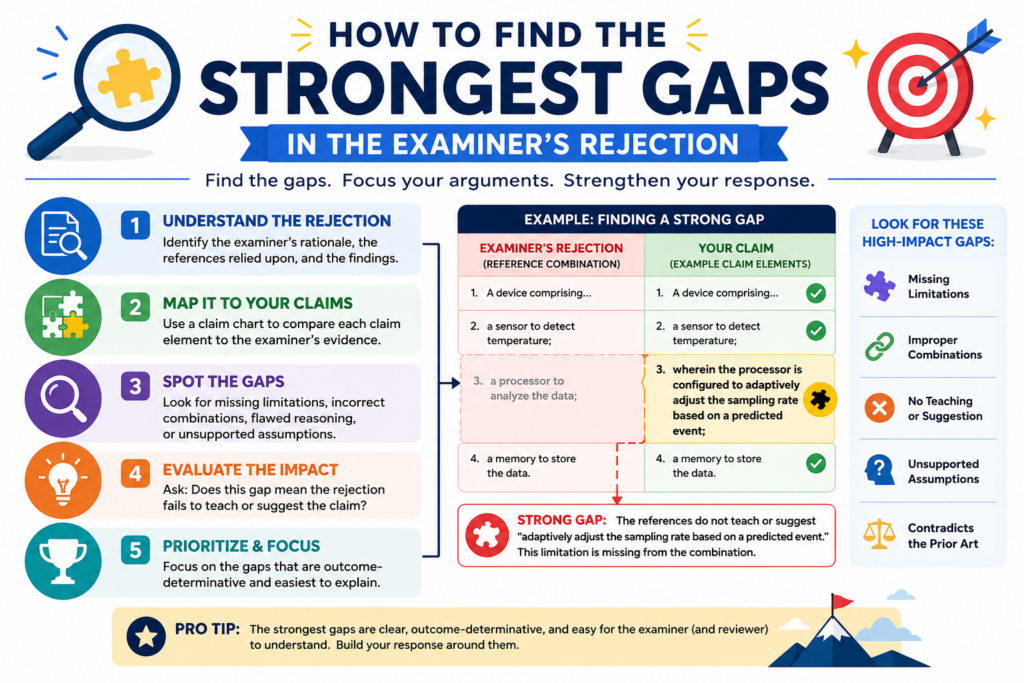
A reference may show part A and part B, but not the claimed relationship between them. A reference may show a similar outcome, but not the claimed process. A reference may show a general tool, but not your specific technical rule.
This is why you should look beyond matching words. A claim chart is not a word search. It is a meaning search.
The question is not whether the old reference uses similar terms. The question is whether it teaches the same thing the claim requires.
In software, AI, robotics, sensors, biotech tools, and other deep tech fields, this point is huge. Many references use overlapping words.
But the actual systems may work in very different ways. Your chart should help explain that difference in a simple, grounded way.
You should look for missing steps, missing links, and missing reasons
A missing step is usually easy to understand. The claim requires an action, and the cited reference does not show that action.
But the stronger argument may come from a missing link. The reference may show two actions, but not the claimed connection between them.
For example, your claim may require that a risk score controls when a device changes operating modes. The reference may show a risk score in one part and operating modes in another part.
But if the reference does not use the score to control the mode change, then the examiner may not have shown the full claim.
A missing reason can also matter. In some rejections, the examiner combines two or more references and says a skilled person would have put them together.
Your chart can help test whether that combination makes sense. If the references solve different problems, use different data, or would not work well together, the chart can flag that issue for your attorney.
The most useful gaps are technical, not emotional
It is normal to feel frustrated when an Office Action seems unfair. But frustration does not help the response. Technical facts do.
A strong chart does not say, “This is clearly different.” It explains how it is different. It does not say, “The examiner is wrong.” It shows that the cited reference lacks a specific step, structure, trigger, output, order, or connection.
That kind of precision gives your attorney better material. It also helps the examiner follow your point without feeling attacked. The tone should be firm, clear, and calm.
You should pay close attention to claim order and timing
Order and timing are often powerful in Office Action responses. Many inventions are not just about what happens. They are about when it happens and what causes it to happen.
A cited reference may include similar actions, but in a different order or under different conditions.
For example, a claim may require detecting an event before changing a model setting. If the reference changes settings first and only later checks performance, that may not match the claim.
Or a claim may require sending data only after a device confirms a threshold. If the reference sends data all the time, the timing may be different in a meaningful way.
Your chart should make these timing points easy to see. Do not hide them in long notes. Tie them to the exact claim words and the exact part of the reference.
Small timing differences can protect big business value
For startups, timing details can be tied to the real value of the product.
Your edge may come from when your system acts, when it avoids action, or when it updates itself. That can affect speed, cost, battery life, accuracy, safety, or user trust.
So do not treat timing as a minor detail. In many inventions, it is the secret sauce. A claim chart can help bring that secret sauce into the response without turning the response into a long technical story.
PowerPatent helps founders turn these kinds of technical details into stronger patent work with smart software and real attorney oversight.
That means your team can move fast without losing the details that may matter most. See how it works here: https://powerpatent.com/how-it-works
How to use the claim chart to decide whether to argue, amend, or combine both
A claim chart is most useful when it helps you make a choice. After you map the claim against the examiner’s cited art, you should have a better view of the road ahead.
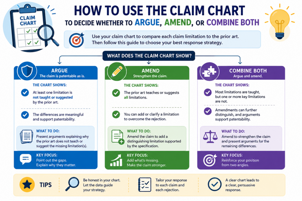
You may see that the examiner missed a key claim part. You may see that the claim is too broad as written. You may see that a small change could make the invention much clearer.
This is where many founders need to be careful. The first reaction to a rejection is often to add more detail to the claim. That can work, but it can also give away more than needed.
Once you add limits, your claim may become narrower. That may still be the right move, but it should be done with care.
A claim chart helps you avoid rushed edits. It lets you ask whether the current claim already has a strong difference.
If it does, your attorney may be able to argue that the examiner has not met the burden. If the chart shows that the examiner has found most of the claim, then an amendment may be the better path.
The goal is not to “win” every sentence. The goal is to protect the invention in a way that supports the business.
The chart should show whether the missing part is already in the claim
Before you amend, look closely at the claim as it stands. Sometimes the answer is already there.
The examiner may have read the claim too broadly or may have skipped a key phrase. In that case, the chart should make the existing claim language shine.
For example, your claim may already require a special way of processing data. The examiner may point to a reference that processes data in a general way.
If the chart shows that the cited reference lacks the special process, then an argument may be enough.
This is why the exact words matter. A single phrase can carry the whole response. If that phrase is already in the claim, you may not need to add more.
You may need to explain what the phrase means and why the old reference does not teach it.
A strong argument protects claim scope when the facts support it
Claim scope is the space your patent may cover. Broader claims can be more valuable, but only if they are supported and allowed. A strong argument can help protect that space when the examiner’s rejection has a real gap.
The chart helps your attorney decide whether the gap is strong enough to stand on. If the missing part is clear, central, and tied to the claim words, then an argument may be a smart first step.
The response can walk the examiner through the chart logic without sounding like a fight.
This is often where founders feel more in control. Instead of blindly narrowing the claim, they can see why the claim may still have room to survive as written.
The chart should also show when an amendment may create a faster path
There are times when an amendment is the best move.
If the examiner has found the broad version of your idea in the cited art, but your real product uses a more specific and stronger technical method, then adding that method may help move the case forward.
The claim chart can point to the best amendment. Look for the rows where the cited art is close but still different.
Then ask what detail from your invention creates the cleanest distance. That detail should be supported by the patent application as filed. It should also matter to the product or the technical advance.
A weak amendment adds words without adding real strength. A strong amendment makes the claim clearer, harder to reject, and more tied to the value of the invention.
The best amendment is narrow enough to help but not so narrow that it hurts
This is a delicate balance. You do not want a claim so broad that it keeps getting rejected. You also do not want a claim so narrow that it is easy for others to avoid. The chart helps you find the middle.
A good amendment often comes from a feature that is already important to how the invention works.
It may be a trigger, a rule, a data path, a model update step, a device response, or a control condition. The chart helps show why that feature is missing from the cited art.
PowerPatent is built to help founders keep this balance in view. The software helps organize the invention and the patent record, while real patent attorneys help guide the response.
That means you can move faster without making careless choices that weaken your protection. You can learn more here: https://powerpatent.com/how-it-works
How to turn the claim chart into a strong written response
Once the chart is clear, the written response should become much easier. You are no longer starting from a blank page.
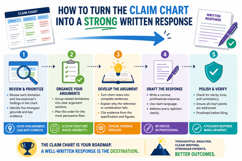
You already know the claim parts, the examiner’s position, the cited support, and the gaps. Now the job is to turn that work into a clear answer.
The response should not copy the whole chart unless the format calls for it. In many cases, the chart is an internal tool.
It helps shape the argument. The final response can use the strongest rows and turn them into a smooth explanation.
The best response is calm and direct. It does not need to sound angry. It does not need to use heavy legal words.
It should explain that the cited reference does not teach the claim as arranged, or that the examiner has not shown a certain required feature. Then it should point to the exact claim language and explain the difference.
This is where simple writing wins. If the point is strong, make it easy to understand.
The response should begin with the main reason the rejection is wrong
Do not make the examiner hunt for your point. If the chart shows one central missing feature, lead with it. State the claim requirement in plain terms, then explain why the cited art does not meet it.
For example, you might explain that the claim requires a device to change its operation only after a certain signal is detected.
Then you might explain that the cited reference sends data without that condition. That is a clean point. It is easy to follow.
A response gets weaker when it tries to say too many things at once.
The chart may contain many notes, but the final response should focus on the best ones. Use the chart to choose the strongest path, not to overload the page.
The strongest response makes the examiner’s next step easy
A good response helps the examiner see what needs to be done. If the examiner missed a claim part, the response should make that gap clear.
If the claim was amended, the response should explain how the new language addresses the rejection. If the cited references do not fit together well, the response should explain the technical reason.
This does not mean the response should be soft. It should be firm. But it should also be easy to process.
The easier your point is to understand, the harder it is to ignore.
Founders sometimes think patent writing must sound complex to be strong. That is not true.
Strong patent work is often clear, exact, and plain. The chart helps create that kind of writing because it forces the team to think one claim part at a time.
The response should avoid weak language and vague claims of difference
A weak response says the invention is “different” without showing how.
A strong response explains the exact difference and ties it back to the claim. This is why the chart is so helpful. It gives you the proof before you write the sentence.
Avoid broad statements that sound good but do not prove much. Saying the invention is faster, better, smarter, or more advanced may not help unless the claim actually requires the feature that creates that benefit. The response should stay close to the claim.
If the claim is about how data is filtered before a model update, talk about that. If the claim is about a device changing modes based on a threshold, talk about that.
If the claim is about a special order of steps, talk about the order. Do not drift into a sales pitch inside the response.
The response can be simple without being shallow
Simple writing does not mean shallow thinking. In fact, simple writing often requires better thinking. You need to know the point well enough to say it clearly.
A strong response may explain that the cited art fails to show the claimed trigger, the claimed link between two modules, or the claimed order of steps.
That can be said in plain words. The key is to support the point with the claim language and the cited reference.
This is also where PowerPatent can help teams work better with attorneys. Engineers can bring the real technical details. The platform can help keep those details organized.
Attorneys can shape the final response with care. That mix can make the process faster, cleaner, and less stressful. See how PowerPatent works here: https://powerpatent.com/how-it-works
How founders and engineers should add technical notes without creating noise
Founders and engineers can make a claim chart much stronger because they know how the invention really works.
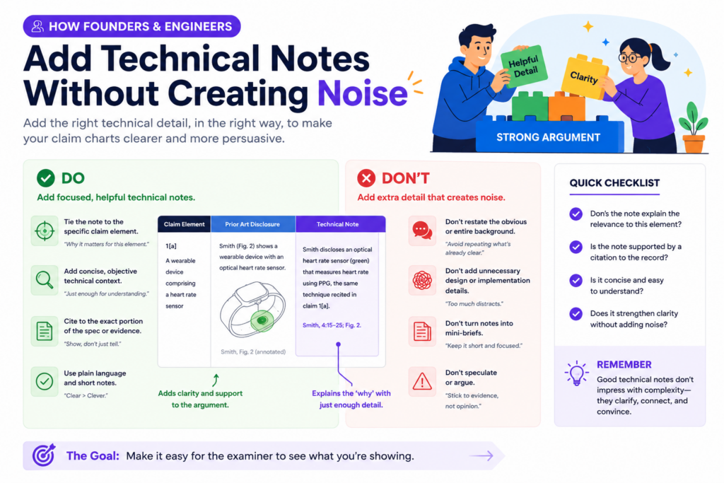
They know why a design choice was made, what problem it solved, and what would break if the system worked the way the cited reference works. That insight is gold during an Office Action response.
But technical notes need to be added with care. A claim chart is not the place to explain the whole product history.
It is not the place to describe every design path the team tried. It should focus on the specific claim language and the specific rejection.
The best technical notes are short, exact, and tied to the claim. They explain why the examiner’s cited reference does not match the claim as written.
They may point out a missing step, a different data flow, a different trigger, a different model behavior, or a different device state. The goal is to give the attorney clean material that can be shaped into a strong response.
A founder should not try to make the chart sound legal. That is not the job. The founder’s job is to make the technical truth easy to understand.
Technical notes should explain what the system does and what the cited art does not do
A useful note starts with the real behavior of the invention. It explains how the claimed feature works in practice.
Then it compares that behavior to what the cited reference shows. This gives the attorney a clear bridge between the product and the patent claim.
For example, the note might explain that the claimed system does not merely collect sensor data. It first detects a change pattern, then uses that pattern to decide whether a model update should happen.
If the old reference only collects data and updates on a fixed schedule, that is a real difference.
This type of note is powerful because it is grounded. It does not say the invention is better in a broad way. It says the invention works in a different way that maps to the claim words.
That is the kind of detail that can move a response from weak to strong.
Technical notes should be written for a smart reader who is not on your team
The examiner is not in your product meetings. Your attorney may understand the patent, but may not know every product detail. The note should make the point clear without relying on inside language.
Avoid internal names, team shortcuts, code names, and product slang unless they are explained. If your team calls a feature “the clean room pass,” explain what it actually does.
If your system uses a special scoring step, explain what signal is used, what decision it affects, and how that differs from the cited reference.
This does not mean the note should be long. It means the note should be clear. A good note may only be a few sentences, but those sentences should remove doubt.
PowerPatent helps teams bring this kind of technical detail into the patent process without turning it into chaos.
The platform is built to help founders organize invention facts while real patent attorneys guide the legal path. You can see how it works here: https://powerpatent.com/how-it-works
Technical notes should not accidentally narrow the invention too much
This is an important point. Founders often know the current product version very well. But the patent claim may be meant to cover more than the current version.
If the technical note only describes one narrow build, it may make the team think the claim should be narrowed more than needed.
For example, your current product may use a neural network, but the claim may be written to cover a broader type of model.
Your current device may use one sensor type, but the invention may work with other sensors too. Your current workflow may use one threshold value, but the key idea may be that the threshold changes based on context.
The claim chart should help protect what matters without locking the invention to one product detail unless that detail is needed.
The safest technical notes separate the core idea from the current product version
A good note can say what the current product does while also making clear what the broader invention requires. This helps the attorney understand both the real build and the bigger idea.
For instance, the note might explain that the current product uses a temperature sensor, but the claim feature is really about detecting a change in operating conditions before changing the control mode.
That distinction matters. It may help avoid adding a sensor limit that is not needed.
This is one of the reasons attorney oversight matters. Smart software can help gather and organize the details, but a real patent attorney can help decide which details belong in the claim and which details should stay in the background.
That mix can help founders avoid costly mistakes while still moving fast.
How to use claim charts when the examiner combines two or more references
Many Office Actions do not rely on only one old reference. The examiner may use one reference for most of the claim, then add a second reference for a missing feature.
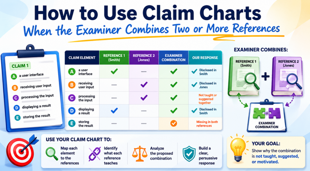
Sometimes a third reference is added too. This can make the rejection feel harder to answer.
A claim chart can make this much easier to handle. Instead of treating the rejection as one big wall, the chart shows which reference is being used for which claim part. That helps you see whether the combination actually fills every gap.
This is important because a combination is not strong just because each reference teaches something.
The question is whether the combined teachings truly show the claimed invention in a sensible way. Your chart can help test that.
The chart should show the base reference, the added reference, and the exact reason the examiner gives for combining them. That reason matters. It is often where the best response can be found.
The chart should show whether the references fit together in the way the examiner claims
Two references may look related at a high level, but they may not fit together technically. One may solve a different problem. One may use a different data type.
One may work in real time while the other works offline. One may require a system design that would break the other.
Your chart should capture those fit problems in plain words. Do not just say the references are different. Explain why the difference matters.
For example, one reference may describe a cloud-based training system that updates models after large batches of data are collected. Another reference may describe an edge device that changes behavior in real time to save power.
The examiner may say these can be combined. But if the claim requires real-time control at the device based on local signals, the cloud training reference may not fill the gap.
That kind of technical mismatch can become a strong response point.
A combination argument should focus on function, not just field
It is not enough to say both references are from the same general field. Two AI systems, two medical devices, or two robotics papers may still work in very different ways. The better question is whether their functions line up.
A strong chart asks how each reference receives data, processes data, makes a decision, and creates an output.
Then it asks whether those paths can be combined without changing the basic operation of one or both references.
This is where engineers can be especially helpful. They can spot when a proposed combination looks simple on paper but would not make sense in a real system.
They can explain why the timing, architecture, data type, or control flow would not match.
At PowerPatent, the goal is to help technical teams bring these real-world details into the patent response process without slowing the company down.
Smart tools help keep the work organized, and real attorneys help turn the strongest points into a careful response. Learn more here: https://powerpatent.com/how-it-works
The chart should test whether the examiner has shown every claim part after the combination
Even when two references are combined, there may still be a missing claim element. This is common.
The examiner may use the second reference to cover one feature, but the full claim may require a specific link between that feature and another step.
That link can be the key. The old references may show the pieces, but not the claimed relationship. Your chart should make that clear.
For example, the first reference may show a user profile. The second reference may show a ranking engine.
But your claim may require updating the ranking engine based on a change in the user profile that is detected during a live session. If neither reference shows that live-session update link, the combination may still miss the claim.
This is why each row of the chart should ask more than, “Where is this word found?” It should ask whether the claim part is shown as arranged and connected.
The response should not let the examiner rebuild the invention with hindsight
Hindsight means looking at your invention first, then using it as a guide to pick pieces from older references.
In plain terms, it is like seeing the finished puzzle and then saying the pieces were easy to put together.
A claim chart can help guard against that. It can show that the examiner’s combination only makes sense after knowing your invention.
It can show that the old references did not point toward the same solution, did not solve the same problem, or did not give a clear reason to make the claimed change.
This point should be handled with care by the attorney, but the facts often come from the technical team. The chart gives those facts a place to live.
A strong Office Action response does not need to be loud. It needs to be clear. It should show that the claim is not just a pile of known parts.
It is a specific solution with a specific structure, flow, or control path that the cited art does not teach.
How to build claim charts for software, AI, and deep tech inventions
Software, AI, and deep tech inventions need extra care in claim charts because the real invention is often hidden inside the flow.
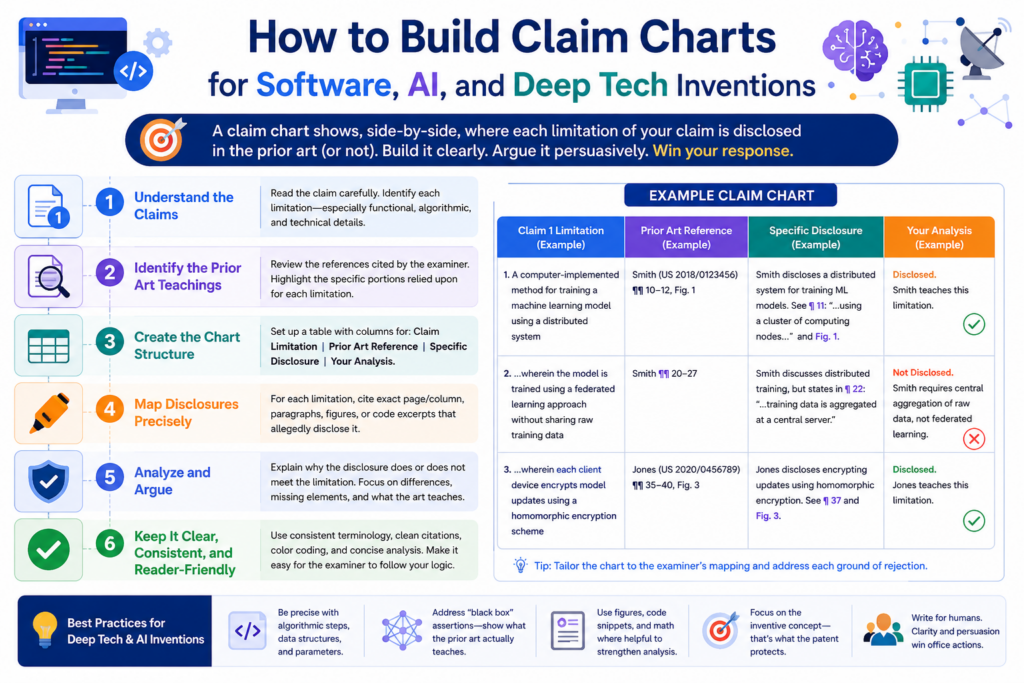
The product may look simple from the outside, but the value may come from how data moves, how a model changes, how signals are ranked, or how a system reacts under certain conditions.
This is why a claim chart for these inventions should not stop at matching words.
If the examiner finds a reference that says “model,” “prediction,” “training,” or “processor,” that does not mean the reference teaches your invention. Those words are broad. The real question is how the system works.
For a software or AI claim, the chart should track the input, the process, the decision, and the output. It should also track what causes the system to act. Many strong inventions are built around triggers.
A system may act only after a threshold is met, only after a pattern is found, only after a user state changes, or only after a model confidence score falls below a set level.
Those details can be the heart of the response. If the cited art does not teach that same trigger or flow, the claim chart should make that gap easy to see.
A software claim chart should focus on data flow and decision flow
In software, the same result can be reached in many ways. Two systems may both recommend an item, flag a risk, update a record, or change a setting. But the path may be totally different. Your chart should show that path.
A weak chart says the old reference does not show the invention because your product is newer or smarter.
A strong chart says the old reference receives different data, applies a different rule, updates at a different time, or sends a different output to a different part of the system.
This is the kind of detail that matters. If your claim requires a model to be updated based on live behavior, and the old reference updates a model using old stored data, that difference may matter.
If your claim requires a ranking score to change a device action, and the old reference only displays a score to a user, that difference may matter too.
The chart should make these points plain. The goal is not to impress the reader with technical depth. The goal is to make the true difference hard to miss.
The chart should explain what happens inside the black box
Many software and AI rejections treat systems like black boxes. The examiner may point to a broad feature and assume it covers the claimed logic. Your chart can push back by opening the box.
For example, do not just say your system “uses AI.” Explain what the model receives, what it measures, what changes based on the result, and how that step is tied to the claim.
If the cited reference only uses a model for a general prediction, but your claim uses model output to control a later system step, the chart should state that clearly.
This also helps your attorney avoid over-narrowing the claim. The response can focus on the true claim gap instead of adding product details that may not be needed.
PowerPatent helps technical teams capture these kinds of details without slowing down the patent process.
Smart software keeps the invention organized, while real patent attorneys help turn technical facts into strong patent work. You can see how it works here: https://powerpatent.com/how-it-works
An AI claim chart should not treat every model as the same thing
AI claims can be tricky because examiners may find older references that use models, classifiers, scores, or training steps. But an AI invention is rarely just “using a model.”
The useful part is often what the model is trained on, when it is updated, how its output is used, or how the system responds when the model is uncertain.
Your claim chart should spell this out. If the claim requires a model to be trained using a special set of signals, the chart should compare that training data against the cited reference.
If the claim requires the model output to trigger a change in another device or process, the chart should check whether the reference teaches that same trigger.
This is also where founders should be careful with broad words. Saying “the reference does not use our AI” is not enough. The chart should explain the specific model behavior that is missing.
The strongest AI arguments often come from how the model is used
A model by itself may not be the full invention. The stronger point may be what the system does with the model output.
Does it block an action, change a threshold, tune a device, select a workflow, reduce a data load, or route a task to a different process?
That action can be very important. If the old reference only predicts something for display, but your claim uses the prediction to control a system, the difference is not just cosmetic. It changes how the system works.
Your chart should make that difference simple. A clear row can show that the claim requires the model output to drive a claimed action, while the cited reference only reports or stores the output. That is the kind of clean gap that can support a focused response.
How to use claim charts for dependent claims without wasting effort
Dependent claims are often where good response options hide. They may include extra details that were added to protect fallbacks.
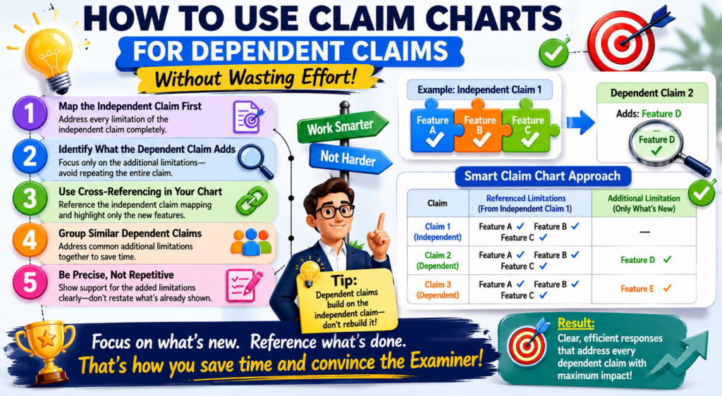
When an Office Action rejects the independent claim, these dependent claims can help you find safer ground.
A claim chart should not ignore them. But it should not treat every dependent claim with the same level of detail either.
The best approach is to use the independent claim chart first, then review the dependent claims for features that may help overcome the rejection.
A dependent claim may add a specific trigger, data source, device action, model update rule, user condition, safety check, or output format. If that added feature is not shown in the cited art, it may become useful.
It may support an argument that the dependent claim should be allowed. It may also provide language that could be moved into the independent claim if an amendment is needed.
This is why dependent claims are not just backup words. They are tools. A claim chart helps you see which ones are worth using.
The dependent claim chart should focus on the added feature
When charting a dependent claim, do not repeat the whole independent claim unless needed. Focus on what the dependent claim adds. That is usually where the value sits.
For example, if the independent claim covers updating a model, the dependent claim may say the update happens only after a confidence score falls below a set level.
The chart should focus on whether the cited art teaches that confidence-based trigger.
This keeps the work lean. It also helps your attorney see which dependent claims have real power. Some dependent claims may not add much against the cited art. Others may create a clean path forward.
The point is to find leverage. You are looking for the claim language that gives the response the strongest support with the least unnecessary narrowing.
A strong dependent claim can become the bridge to allowance
Sometimes the independent claim is too broad to win as written, but a dependent claim has the missing detail that makes the invention clear. In that case, the dependent claim can guide the amendment strategy.
This does not mean you should always move dependent claim language into the independent claim. It means you should understand the option.
Your attorney can decide whether the move makes sense based on the rejection, the written application, the business goal, and the risk of narrowing.
The chart makes that decision easier. It shows whether the dependent feature truly creates distance from the cited art.
If it does, the team can decide whether to argue for the dependent claim, amend the independent claim, or pursue a mix of both.
PowerPatent is designed for this kind of practical patent work. It helps founders and engineers organize the details that matter, while real attorneys help shape the response in a way that protects the business. Learn how PowerPatent helps teams move faster here: https://powerpatent.com/how-it-works
Dependent claims can reveal what the examiner missed
Sometimes an examiner rejects dependent claims quickly, using a short explanation or a broad statement.
Do not assume that means the rejection is strong. A dependent claim may contain a detail that the examiner did not fully address.
Your chart should check each dependent claim against the cited support. If the examiner cites the same reference section for several different dependent claims, read that section with care.
It may not support all of them. It may support one general idea but miss the specific added feature.
This is a common place to find response points. The chart lets you slow down and ask whether the examiner has truly shown the added feature or only treated it as obvious without enough support.
The best dependent claim review is selective and sharp
You do not need to turn every dependent claim into a long debate. That can weaken the response and waste time. Instead, use the chart to find the few dependent claims that offer the most value.
A good dependent claim argument is clear, short, and tied to the added language.
It should explain that the cited art does not teach the added feature and why that feature matters to the claim.
This is especially useful for startups that need strong protection but also need speed. You want to spend effort where it can change the outcome. Claim charts help you do that.
Common claim chart mistakes that weaken Office Action responses
A claim chart can make an Office Action response much stronger, but only if it is built with care. A weak chart can do the opposite. It can hide the best argument, confuse the team, or push the response toward a bad amendment.
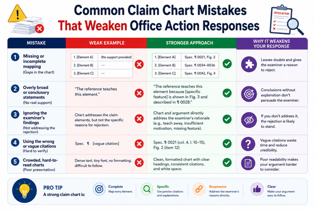
The most common mistake is treating the chart like a word-matching exercise. This happens when someone searches the cited reference for the same words used in the claim and stops there.
But patent claims are not just words. They describe how parts work together. A reference may use the same word and still fail to teach the claimed feature.
Another mistake is trying to argue every row with the same force. Not every claim part will be the key to the response.
Some parts may be clearly shown in the cited art. That is normal. A strong response does not need to fight every inch. It needs to focus on the points that matter most.
A third mistake is adding too much product detail too soon. Founders often want to explain everything about the product.
That instinct is good, but the response must stay tied to the claim. Extra details can create noise, and in some cases, they can make the invention sound narrower than it really is.
A claim chart should not become a storage bin for every possible argument
A crowded chart is hard to use. If each row contains long notes, side comments, product history, and rough argument ideas, the main point gets buried. The chart should help the team see clearly. It should not create more work.
The better approach is to keep each row focused on the claim part being reviewed. State what the claim requires.
State what the examiner relies on. State what the cited art actually teaches. Then state the gap in plain words.
That simple structure helps everyone. The founder can check the technical facts. The attorney can assess the legal strength. The team can decide whether to argue, amend, or both.
The chart should be detailed, but not messy. Detail is useful when it sharpens the point. Detail becomes harmful when it makes the answer harder to see.
The best chart removes doubt instead of adding more of it
A strong chart should make the response path feel clearer. After reading it, the team should know which arguments are strongest, which claim parts may need amendment, and which dependent claims deserve attention.
If the chart creates more confusion, it may need to be cleaned up. Long notes can be shortened. Weak arguments can be moved aside.
Repeated points can be combined. The goal is not to show how much work was done. The goal is to show the best path forward.
This is where PowerPatent can help founders avoid the usual patent chaos. The platform helps organize invention details, claim language, and review work so the attorney can focus on building the strongest response.
You can see how PowerPatent supports faster, clearer patent work here: https://powerpatent.com/how-it-works
A claim chart should not ignore the examiner’s exact cited support
Another common mistake is responding to the examiner’s general statement instead of checking the exact cited lines or paragraphs. This can lead to weak arguments because the response may miss what the examiner actually relied on.
Always go back to the cited support. If the examiner cites a figure, look at the figure. If the examiner cites a paragraph, read the paragraph.
If the examiner cites a column and line range, review that exact text. Then read a little before and after it so you understand the full context.
This step often reveals useful gaps. The cited section may not say what the examiner says it says. It may describe a different feature.
It may be tied to a different embodiment. It may lack the claimed connection. Your chart should capture that.
Exact review protects the response from weak assumptions
A response built on assumptions can fall apart. A response built on exact review is stronger. The chart should show that the team looked at the actual evidence and found a real gap.
This does not mean the final response needs to quote large parts of the reference. It means the team should know what the reference actually teaches before writing. The chart is where that knowledge is organized.
For founders, this is a practical way to stay involved without trying to become patent lawyers.
You can help your attorney by checking whether the cited reference truly works like your invention. Your technical eye can catch things that a quick legal review might miss.
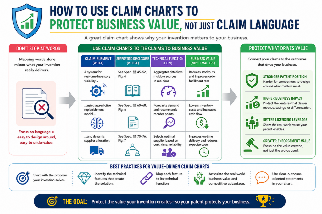
How to use claim charts to protect business value, not just claim language
A patent is not just a document. For a startup, it is part of the business. It can help protect a product, support funding talks, reduce copycat risk, and show that the company is building something real.
That is why Office Action responses should not be handled like paperwork only.
A claim chart helps connect the response to the business value. It shows which parts of the claim protect the real edge of the invention. It helps the team avoid amendments that may get a claim allowed but leave the core product exposed.
This is a big deal. A narrow claim may be easy to allow, but it may not stop a competitor from designing around it.
A broad claim may be more valuable, but it may need stronger support to survive. The chart helps the team find the right balance.
The best chart does more than answer the examiner. It helps the team ask whether the response still protects what matters most.
The chart should identify the feature competitors would want to copy
When reviewing the chart, look for the feature that gives the product its edge. It may not be the feature that sounds most impressive.
It may be the step that saves time, improves accuracy, reduces cost, cuts data use, improves safety, or makes the system easier to scale.
That feature should be protected carefully. If the response removes it, hides it, or narrows it too much, the patent may lose business value.
For example, a startup may have a system that reduces cloud cost by making local decisions at the device. The key value may not be the broad idea of using a model.
The value may be the local decision rule that avoids sending extra data. The claim chart should help make that clear.
Once the team sees the business-critical feature, the response can be shaped around it.
Strong patent responses keep the product roadmap in mind
Your current product matters, but your future product matters too. A claim amendment should not only fit what you sell today.
It should also consider where the company may go next.
If your team may support more sensors, more models, more device types, or more workflows later, be careful before adding limits that lock the claim to today’s version. Sometimes that limit is needed. Sometimes it is not.
The claim chart helps the team see these tradeoffs before the response is filed. That is much better than realizing later that the claim was narrowed in a way that hurts the business.
PowerPatent is built for founders who want this kind of control. It brings smart software together with real attorney oversight so patent work can move quickly while still keeping the company’s long-term value in view. You can learn more here: https://powerpatent.com/how-it-works
The chart should help the attorney understand what cannot be lost
Founders should be clear about what matters most. If a feature is central to the product, the attorney should know that.
If a feature is optional, the attorney should know that too. A claim chart can make this conversation much easier.
The founder can mark which claim features are tied to the product edge. The engineering team can explain why those features matter. The attorney can then decide how to use that information in the response.
This does not mean every business goal can fit neatly into the claim. Patent work has rules, and the application must support any amendment.
But business context still matters. It helps the attorney avoid choices that may look fine on paper but hurt the company later.
A claim chart is also a communication tool for busy teams
Startups move fast. Engineers are building. Founders are selling. Attorneys are drafting. Without structure, important details can get lost. A claim chart gives everyone one place to look.
It creates a shared view of the claim, the rejection, the cited art, and the possible response path.
That shared view can reduce long email threads and unclear calls. It can also help the team make decisions with more confidence.
This is the real power of claim charts. They do not just organize words. They organize thinking.
How to review a completed claim chart before it shapes the response
A completed claim chart should not be treated as final just because every row is filled in. The first draft is often only the raw material. The real value comes from review.
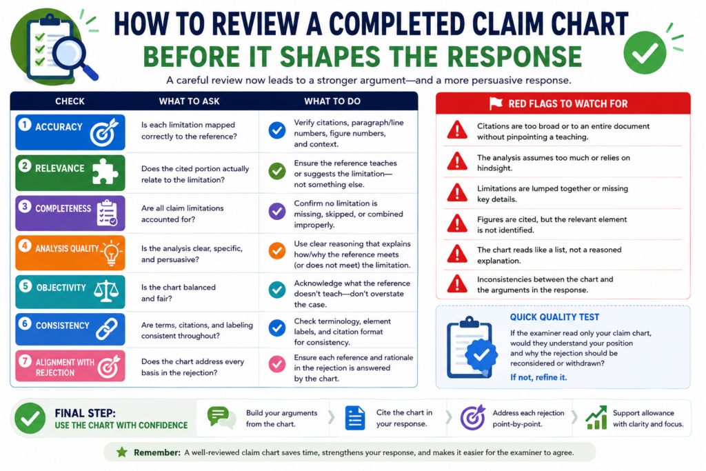
This is where you clean the chart, test the strongest points, remove weak points, and make sure the final response will not drift away from the claim.
The review should start with one simple question: does this chart make the main issue easier to see? If the answer is no, the chart needs more work.
A good chart should help a busy founder, engineer, or attorney understand the rejection faster. It should not force them to dig through long notes to find the point.
When reviewing the chart, look at the rows that matter most. These are usually the rows tied to missing claim parts, timing differences, data flow gaps, or weak combinations of references.
If those rows are clear, the response has a stronger base. If those rows are vague, the final response may become vague too.
The review should test whether each gap is real and useful
Not every difference is useful. A cited reference may be different from your invention in many ways, but only some of those differences matter to the claim.
This is one of the most important rules in claim chart review. The response must focus on claim-based differences, not just product-based differences.
For example, your product may have a faster interface, a better dashboard, or a more polished user flow.
Those facts may matter to customers, but they may not matter to the Office Action if the claim does not require them. The chart should keep the team focused on what the claim actually says.
A useful gap is one that ties directly to the claim language. It should show that the examiner has not proven a required feature.
It should also be easy to explain in plain words. If the gap needs five paragraphs to make sense, it may still be valid, but it may need sharper framing.
The chart should separate strong points from weak backup points
A strong chart does not pretend every point is equally powerful. Some rows will drive the response.
Other rows may only support the main point. Some rows may be left out of the final response entirely.
This is good. The goal is not to use every note. The goal is to use the right notes.
A clean review helps your attorney see which points deserve the most attention. It also helps the team avoid wasting time on small issues that will not move the case forward.
When the strongest points are easy to spot, the response can be shorter, clearer, and more persuasive.
The review should check whether the chart supports the business goal
The legal response is important, but the business goal matters too. Before the chart becomes a response, ask whether the likely path still protects the heart of the invention.
If the response strategy depends on a narrow detail that is not central to the product, the team should think carefully before moving forward.
This is where founders should stay involved. Your attorney can guide the patent strategy, but you know what makes the product valuable.
You know what a competitor would want to copy. You know which features are core and which are flexible.
The chart should help connect those views. It should show the technical gap, the claim language, and the business value in one clear path.
A final review can prevent a costly overreaction
Many weak patent responses come from fear. A rejection arrives, the team gets nervous, and the claims are narrowed too fast. That can lead to allowed claims, but those claims may not protect enough.
A final chart review slows that reaction down. It helps the team ask whether the examiner really found the claimed invention or only something close.
It also helps the team decide whether an amendment is needed and, if so, what kind of amendment makes sense.
PowerPatent helps founders handle this process with more control. Smart software helps organize the claim chart and invention facts, while real patent attorneys help shape the final response.
That mix can help you move faster without making rushed choices. Learn how it works here: https://powerpatent.com/how-it-works
How to use claim charts during attorney review calls
An attorney review call can be much more useful when everyone is looking at the same claim chart. Without a chart, the call can jump around. One person talks about the examiner’s rejection.
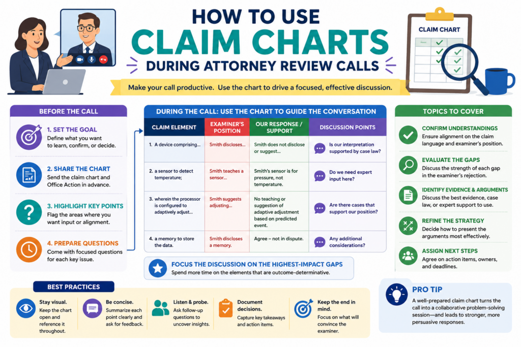
Another person talks about the product. Someone else mentions a dependent claim. By the end, the team may have more thoughts but not more clarity.
A claim chart gives the call a path. It lets the attorney walk through the key rows and ask focused questions.
It lets the founder explain the product difference without telling the whole product story. It lets engineers point to the exact technical reason the cited reference does not match.
The best review calls are not long lectures. They are working sessions. The claim chart keeps the session grounded.
The call should start with the rows that may decide the response
Do not begin the call by reading the whole Office Action from start to finish. That can waste time. Start with the rows where the chart shows the strongest gap. These rows are the likely center of the response.
The attorney may ask whether the technical difference is accurate. The engineer may explain how the system works.
The founder may explain why the feature matters to the product. This is the moment where the chart becomes a shared tool instead of a private note.
A strong discussion should answer a few direct questions. Does the cited reference truly show this claim part? Does the claim already contain the needed limit? Is an amendment needed?
If an amendment is needed, is the support already in the application? Does the proposed path still protect what the company cares about?
Those questions are not formal. They are practical. They help the team turn chart work into response strategy.
The attorney should leave the call with cleaner facts, not more confusion
A good review call should make the attorney’s job easier. That means technical notes should be clear, examples should be tied to the claim, and product details should be sorted by importance.
If the team shares too many side facts, the attorney may need extra time to sort them later.
If the team shares only broad statements, the attorney may not have enough detail. The claim chart helps find the middle.
The best input is specific. It explains what the claimed system does, what the cited reference does, and why the difference matters. That is the kind of input that can become strong response language.
The call should also test possible amendment language
If an amendment may be needed, the review call is a good time to test it. The team can look at the proposed language and ask whether it matches the invention, avoids the cited art, and keeps enough room for future product versions.
This part takes care. A small wording change can have a big effect. One extra phrase can make a claim clearer.
It can also make the claim too narrow. The claim chart helps the team see what the amendment is meant to solve.
For example, if the examiner found a general model update, the amendment may need to focus on the trigger for the update.
If the examiner found a device mode change, the amendment may need to focus on what causes the mode change. The chart shows the exact gap, so the amendment can be aimed at that gap.
Better amendment talks lead to better patent outcomes
Founders should not think of amendments as simple word edits. They are business choices. They can affect what the patent may cover later. That is why the chart and the review call should work together.
The attorney brings judgment about patent rules and response practice. The founder brings business context. The engineer brings technical truth. The chart gives all three a shared place to meet.
This is exactly the kind of work PowerPatent was built to support. It helps technical teams and attorneys work from organized invention data instead of scattered notes and long email threads.
See how PowerPatent helps founders move through patent work with more speed and confidence here: https://powerpatent.com/how-it-works
How to keep claim chart language clear, careful, and useful
The words used in a claim chart matter. They do not need to sound fancy, but they should be careful.
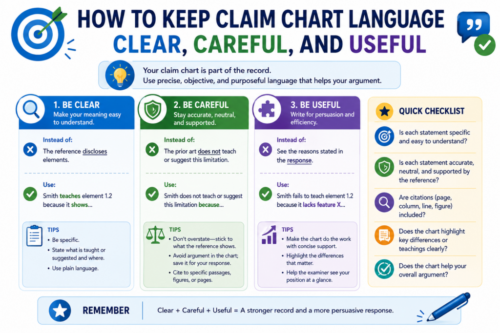
A chart can shape the final response, and the final response becomes part of the patent record. That means loose words can create problems.
The safest chart language is clear and tied to the evidence. It should avoid broad claims that are not needed. It should avoid emotional language. It should avoid saying more than the team can support.
For example, it is usually stronger to say that a cited reference does not teach a claimed trigger than to say the reference is completely unrelated.
The first statement is focused. The second may be too broad. Focused statements are easier to support.
Clear language also helps the team. When the chart is written in plain words, founders and engineers can review it without getting lost. Attorneys can then decide how to turn those points into the right response language.
The chart should use plain words without losing precision
Plain language does not mean casual thinking. It means the point is easy to understand. A good chart can explain a complex system in simple terms while still being exact.
For instance, instead of writing that the cited art “fails to disclose the claimed dynamic adaptive event-dependent model recalibration process,” the chart can say the reference does not show updating the model after the claimed event is detected.
That is easier to read and often more useful.
The attorney may later adjust the wording for the formal response. But the chart itself should help people think. It should make the issue clearer, not harder.
This is especially important for startups. Patent work often moves across founders, engineers, product leads, and outside counsel. Simple, exact language keeps everyone aligned.
The best chart language says only what needs to be said
A claim chart is not the place to overstate. If the reference shows part of the feature but not all of it, say that. If the reference is close but misses the trigger, say that. If the reference teaches the opposite flow, say that.
Careful wording builds trust. It helps your attorney rely on the chart. It also reduces the risk of the final response making a claim that is too broad or too easy to challenge.
Good patent work often comes down to clean thinking. The chart should show that clean thinking on the page.
The chart should avoid product-only phrases that do not match the claim
Founders naturally describe the invention through the product. That is useful, but it can also create confusion. The claim may not use the same names your product team uses. The chart should bridge that gap.
If your internal product calls a feature “Smart Guard,” the chart should explain what Smart Guard does in claim terms.
It may detect a pattern, change a threshold, block a command, or send a control signal. The response will likely need that functional meaning, not the product name.
This protects the team from mixing marketing language with claim language. Marketing language sells the product.
Claim language protects the invention. The chart should help connect them without confusing them.
Clear mapping helps the attorney protect the real invention
The attorney needs to know which product feature maps to which claim feature. If that mapping is not clear, the response may miss the strongest point.
A good chart can show that an internal feature name corresponds to a claimed step or system part. It can explain what the feature does in plain terms. It can also show where the cited reference falls short.
PowerPatent helps founders capture invention details in a structured way, so those details can support better patent work.
Smart software helps keep things organized, and real attorneys help make sure the final path is sound. You can explore the process here: https://powerpatent.com/how-it-works
How to use claim charts after the response is filed
A claim chart is not useless after the Office Action response is filed. In fact, it can become even more valuable. It can help the team understand what was argued, what was amended, and what may happen next.
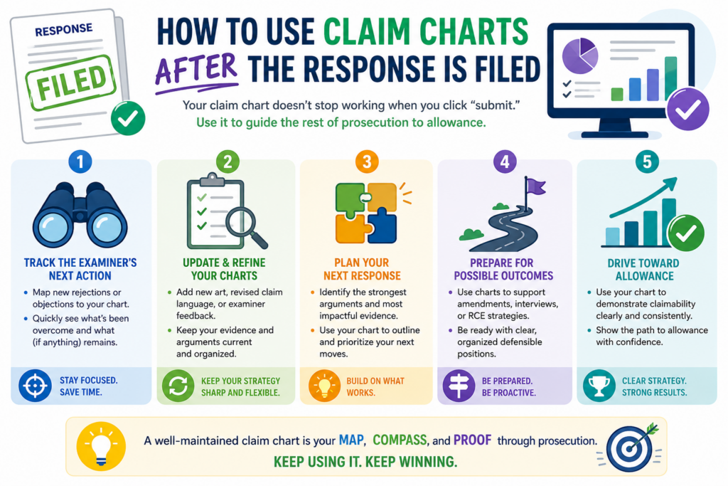
Patent work often takes more than one round. The examiner may allow the case. The examiner may issue another Office Action. The examiner may raise a new point.
If that happens, the old chart can save time. It gives the team a record of what was reviewed and why certain choices were made.
This is especially useful for startups where people move fast and memory fades.
A founder may not remember every detail from a response filed months ago. An engineer may have moved to a new project. The chart keeps the history clear.
The chart should become part of the patent file strategy
After filing, keep the chart with the response materials. It should show the key claim parts, cited references, response points, and any amendment reasons. This gives the team a working memory for the case.
If a new rejection comes in, the team can compare it against the old chart. Are the same references being used?
Did the examiner address the prior argument? Is the new rejection focused on a different claim part? Did the amendment solve one issue but create another?
These questions are easier to answer when the chart is preserved. Without it, the team may have to rebuild the thinking from scratch.
The filed response and the chart should tell the same story
The chart is usually internal, but it should align with the filed response. If the response says one feature is the key difference, the chart should show where that came from.
If the response includes an amendment, the chart should show why that amendment was chosen.
This helps later review. It also helps if the company needs to explain the patent family to investors, acquirers, or new counsel. A clean chart can make the prosecution history easier to understand.
The point is not to create extra paperwork. The point is to keep the patent story clear.
The chart can help with later patents in the same family
Many startups file more than one patent around the same technology. A claim chart from one case can help guide future filings. It can show which features were crowded by old references and which features looked more unique.
That insight can help the team draft better claims next time. It can also help identify new invention angles.
If the first application focused on one part of the system, the chart may reveal that another part deserves its own filing.
This is where claim charts become a long-term asset. They are not just response tools. They are learning tools.
A strong patent process gets smarter over time
Every Office Action teaches you something. It shows how the patent office is reading your technology.
It shows which old references are likely to appear. It shows which claim features need more support.
If you save and reuse that learning, your patent work gets stronger. If you treat each Office Action as a one-time task, you lose that value.
PowerPatent is built to help founders build a smarter patent process from the start. It brings software, structure, and real attorney oversight together so your IP work can improve as your company grows. Learn more here: https://powerpatent.com/how-it-works
How PowerPatent helps founders use claim charts without slowing down
Claim charts are powerful, but they can also take time. Founders do not want to spend days buried in patent papers.
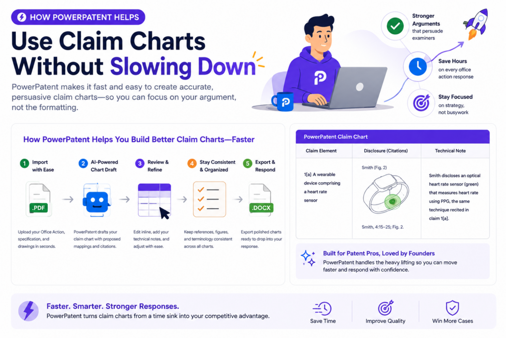
Engineers do not want to stop building. Attorneys do not want scattered notes that take hours to clean up. The process needs structure.
That is where PowerPatent can help. PowerPatent is designed for technical teams that need strong patent work without the old slow process.
It helps founders turn invention details, technical notes, and product logic into organized patent material that attorneys can review and use.
For Office Action responses, that structure matters. The team can work from a clearer view of the claims, the cited art, and the technical gaps. Instead of guessing what matters, the team can focus on the details that may change the outcome.
PowerPatent helps turn technical facts into response-ready material
Founders and engineers often have the right facts in their heads. The hard part is getting those facts into a useful form.
PowerPatent helps make that easier by creating a more guided way to capture how the invention works, what makes it different, and what details matter most.
That can make claim chart work faster. It can also reduce the risk that important details are missed. When the attorney sees cleaner inputs, the response can be more focused.
This does not replace attorney judgment. It supports it. Smart software can help organize the work, but real patent attorneys still guide the response. That combination gives founders speed without losing human care.
The best results come from software and attorney review working together
Patent work needs both structure and judgment. Software can help sort information, map details, and keep the process moving. Attorneys can make careful calls about claim scope, amendments, response tone, and legal risk.
PowerPatent brings these pieces together. That is why it is a strong fit for startups that care about speed but cannot afford sloppy patent work.
The goal is simple. You should be able to protect what you are building without feeling trapped in a slow, confusing process.
PowerPatent helps founders stay in control of the patent story
A good Office Action response is not just about getting past a rejection. It is about keeping the patent aligned with the company’s real value. That means founders need visibility.
They need to understand what is being argued, what may be amended, and why the response path makes sense.
Claim charts help create that visibility. PowerPatent helps make the process easier to manage. Together, they can help founders stay involved without getting pulled away from building the company.
When the process is clear, founders can make better choices. They can protect the features that matter. They can avoid rushed narrowing. They can give attorneys better technical input. They can move with more confidence.
Strong patent work should feel clear, not painful
Office Actions are normal. Rejections are normal. What matters is how you respond.
A claim chart gives you a way to break the problem down, find the real gaps, and build a response that is calm, sharp, and tied to the invention.
For founders, that can be the difference between feeling stuck and feeling in control.
PowerPatent helps technical teams handle this work with smart software and real attorney oversight, so patents become a business tool instead of a burden. See how PowerPatent helps founders protect what they are building here: https://powerpatent.com/how-it-works
How a practical claim chart example can make the response easier to write
A claim chart becomes much easier to understand when you see it in action. The exact format may change from case to case, but the thinking is usually the same.
You take one claim part, compare it with the examiner’s cited support, and explain the gap in plain words.
Imagine a claim for a smart device system. The claim says the device detects a change in sensor behavior, updates a control setting based on that change, and then changes how the device operates.
The examiner cites an older reference that collects sensor data and changes a device mode on a fixed schedule.
At first glance, that may sound close. Both systems use sensors. Both systems change device behavior. But the claim chart helps show the deeper difference.
Your invention changes operation because a sensor behavior change was detected. The cited art changes operation because a schedule says to do so. That is not the same thing.
How the example shows the value of claim-by-claim review
The chart should make the difference easy to see. For the claim part about detecting a change in sensor behavior, the team would look for that exact idea in the cited reference.
If the reference only collects sensor readings but does not detect a behavior change, that is one possible gap.
For the claim part about updating a control setting based on that detected change, the team would ask whether the old reference uses the detected change as the cause for the update. If the reference updates on a timer, that may be a second gap.
For the claim part about changing device operation based on the updated setting, the team would check whether the reference ties the operation change to the same chain of events.
If the old system changes modes for a different reason, the response may have a strong point.
The real power comes from showing the chain of cause and effect
Many strong patent claims are not just a group of parts. They are a chain. One event causes another step.
That step changes a setting. That setting changes system behavior. If the cited art does not show the same chain, the examiner may not have shown the full claim.
This is why the chart should not treat each word in isolation. It should track how the pieces connect. In many software, AI, sensor, and device inventions, the connection is the invention.
PowerPatent helps founders and engineers capture those connections in a structured way, while real patent attorneys help turn them into careful response strategy. See how that works here: https://powerpatent.com/how-it-works
How to turn chart notes into strong response wording
Once the chart shows the strongest gap, the next step is turning that gap into response language. This is where many teams overdo it.
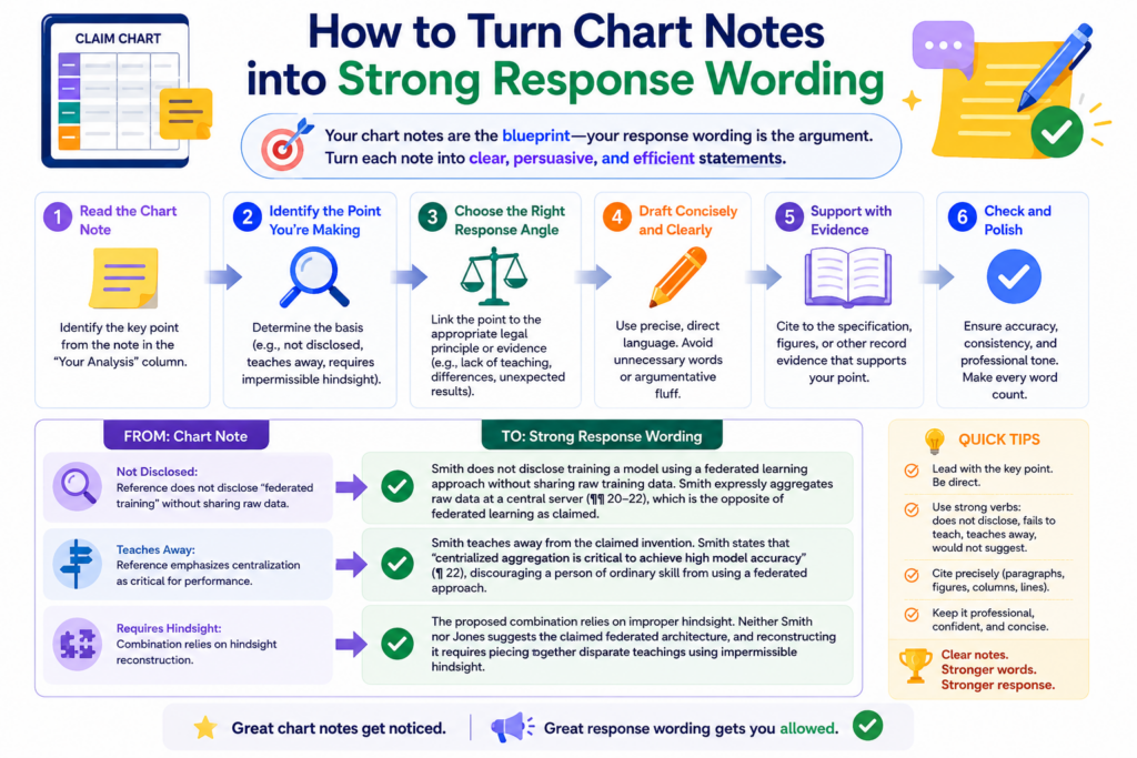
They write too much, use words that are too heavy, or try to prove every possible difference. A better response is simple, exact, and grounded in the claim.
The response should usually start by naming the claim requirement. Then it should explain what the examiner relied on.
Then it should explain why that cited support does not meet the claim. That order feels natural to the reader. It also keeps the response tied to the record.
For example, the response might explain that the claim requires updating a control setting based on a detected change in sensor behavior.
It can then explain that the cited reference changes settings according to a preset schedule and does not teach the claimed detected-change trigger. That is clear. It is not dramatic. It is useful.
How clear response wording keeps the examiner focused
The examiner is reading many cases. A response that makes the point quickly has a better chance of being understood.
The goal is not to sound clever. The goal is to make the missing claim feature easy to see.
This is where the claim chart saves time. Instead of drafting from scratch, your attorney can use the strongest chart row as the backbone of the argument.
The chart already shows the claim words, the cited reference, and the gap. The response simply turns that into a clean paragraph.
The best wording avoids broad attacks. It does not need to say the reference is bad or useless. It only needs to say the reference does not teach the claimed feature. That focused tone is often stronger than a loud tone.
Good wording should protect the record while making the point plain
Every filed response matters because it becomes part of the patent history. That does not mean the writing should be stiff or confusing. It means the words should be chosen with care.
A strong response does not say more than needed. It does not describe the invention in a way that may narrow it by accident.
It does not make emotional claims. It explains the missing feature, ties it to the claim, and shows why the rejection should be withdrawn or reconsidered.
This is one reason founders should work with real patent attorneys, not just templates.
PowerPatent combines smart software with attorney oversight so the technical facts can become response language that is both clear and careful. Learn more here: https://powerpatent.com/how-it-works
How claim charts can help prepare for examiner interviews
An examiner interview can be a useful way to move a case forward. It gives the attorney a chance to talk with the examiner, explain the invention, and test possible amendments or arguments.
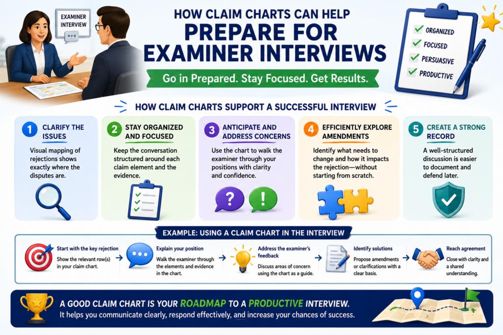
A claim chart can make that interview much more focused.
Without a chart, the interview may become too broad. The discussion may jump from the invention to the cited art to possible claim changes without a clear path. With a chart, the attorney can focus on the few claim parts that matter most.
The chart can help frame the conversation around one main issue.
For example, the attorney may explain that the cited reference shows collecting sensor data, but not detecting a change in sensor behavior and using that detected change to update a control setting. That is a clean interview point.
How the chart helps the team decide what to ask the examiner
The goal of an interview is not just to talk. The goal is to learn what may move the case forward.
The chart helps the attorney ask better questions because it shows where the examiner’s position is weakest or unclear.
The attorney may ask whether the examiner believes a certain paragraph teaches the claimed trigger.
The attorney may ask whether a proposed amendment would overcome the cited art. The attorney may ask whether the examiner is relying on a specific figure for a certain claim part.
These questions are easier to prepare when the chart is clear. The chart gives the attorney a map for the call. It also helps the founder and engineer understand what will be discussed before the interview happens.
A focused interview can prevent wasted amendments
One of the best uses of an examiner interview is testing whether an amendment is truly needed. Sometimes the examiner may agree that a certain feature is missing from the reference.
Sometimes the examiner may explain a different reading of the claim. Sometimes the examiner may suggest what type of change would make the case clearer.
That information can save time. It can also help avoid amendments that are too narrow. If the chart shows the exact gap, the interview can focus on that gap instead of guessing.
PowerPatent helps founders stay organized through this kind of process. The platform helps structure the invention facts and response issues, while real attorneys help handle examiner strategy.
See how PowerPatent supports faster patent work here: https://powerpatent.com/how-it-works
Conclusion
Claim charts make Office Action responses clearer, faster, and stronger because they turn a hard rejection into a step-by-step review. They help you see what the examiner claims, what the old art really shows, and where your invention still stands apart.
For founders and engineers, this means better input, smarter choices, and less risk of giving up claim scope too soon. The goal is not just to answer the Patent Office. The goal is to protect the value you are building. PowerPatent helps you do that with smart software and real attorney oversight. See how it works here: https://powerpatent.com/how-it-works