AI can make patent claim charts faster. It can read claims, scan product pages, compare features, and draft a first pass in minutes. But speed is not the same as truth. A claim chart that looks clean can still be wrong. The AI may guess. It may stretch a product feature to fit a claim. It may cite the wrong page. It may sound sure when the proof is weak.
Start by treating the AI claim chart as a draft, not as proof
AI is useful because it can move fast. It can read a patent claim, break it into parts, search a product page, and write a chart that looks neat.
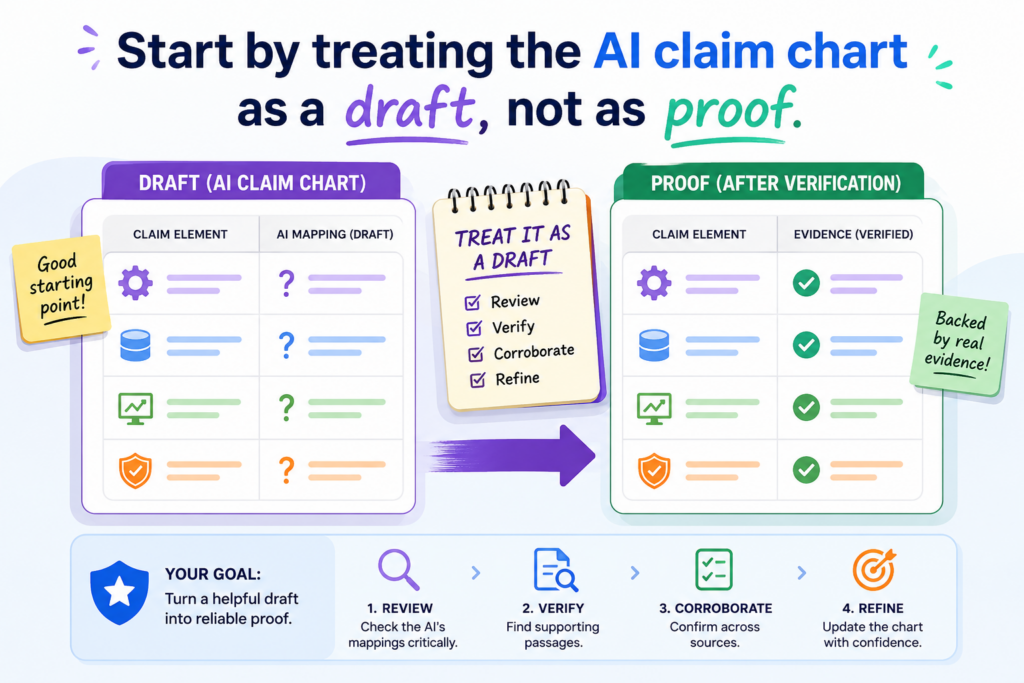
That can save hours. It can also create a false sense of safety.
This is where many teams get into trouble. They see a clean chart and think the work is done. The rows look right. The words sound firm. The links are there. The chart feels ready.
But the real question is not whether the chart looks polished. The real question is whether each row can survive a hard review from someone who is paid to find holes.
A claim chart is not a writing task. It is a proof task. Every claim part needs support. Every product feature needs a source. Every statement needs to match what the source actually says.
AI can help collect and arrange the pieces, but it should not be treated as the judge of whether the match is real.
The first mistake is letting strong language hide weak support
AI often writes with confidence. That is part of the problem. It may say a product “includes,” “performs,” “detects,” “generates,” or “controls” something even when the source only hints at it.
A product page may say the software “improves workflow,” while the claim chart says the software “automatically assigns tasks based on a trained model.” Those are not the same thing.
This kind of gap can be easy to miss because the chart sounds smooth. Smooth words are not enough.
A good claim chart should make the reader say, “I can see exactly where that came from.” If the reader has to guess, the chart is not ready.
This is why founders should not use AI claim charts as final work product without careful review. The safer move is to use AI as a first pass, then force every row to earn its place.
A simple rule is to ask where the exact proof lives
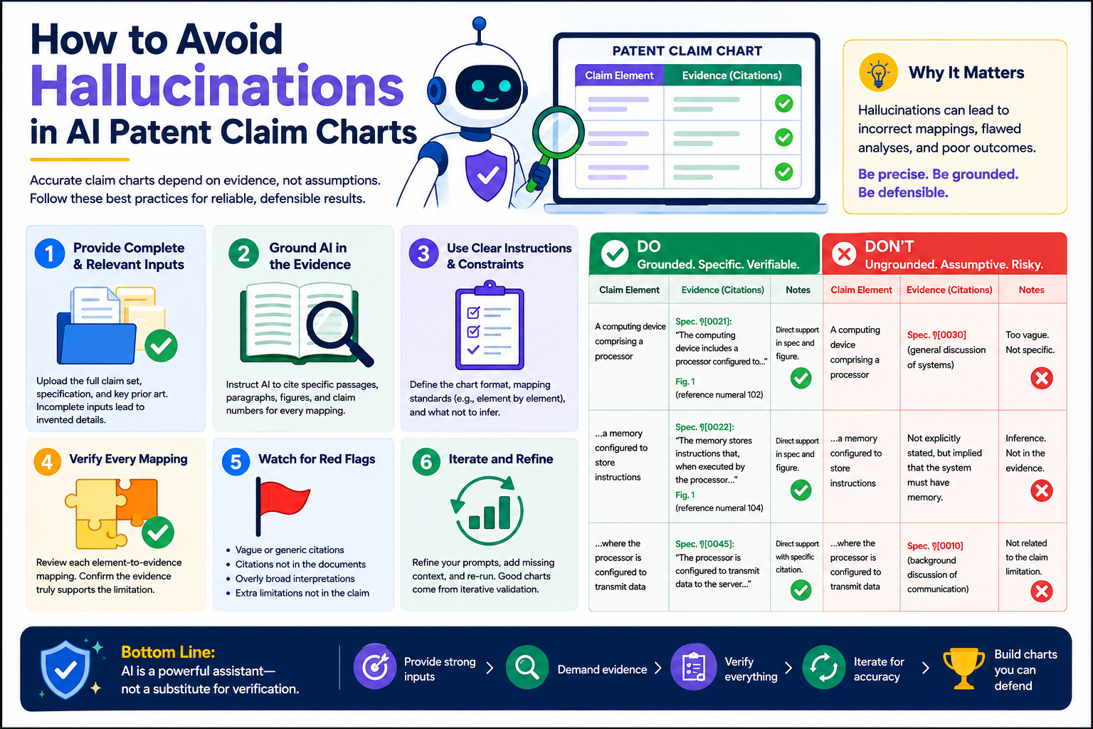
The easiest way to reduce hallucinations is to make the AI show its work. Do not accept a claim chart row unless it points to a real source and a clear part of that source. A link to a home page is not enough. A broad product page is not enough. A vague white paper is not enough.
The chart should tie each claim part to a specific sentence, screen, diagram, code note, API doc, demo clip, or public statement.
If the AI cannot point to that proof, the row should be marked as weak, missing, or needing human review. This one habit can prevent many bad charts.
This matters for startups because weak claim charts can waste money, slow deals, and hurt trust with counsel, investors, or partners. A fast chart that must be rebuilt later is not fast. It is just delayed pain.
That is why PowerPatent is built around a better model: smart software to help you move quickly, with real patent attorney oversight to help keep the work grounded.
You can see how that process works here: https://powerpatent.com/how-it-works
Break every claim into small parts before asking AI to compare anything
A claim chart becomes risky when the AI tries to match a whole claim to a whole product feature at once. That is too much room for guessing. Long patent claims often contain many small requirements.
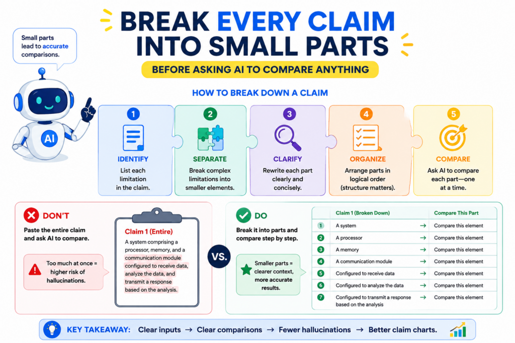
One claim may require a device, a processor, a memory, a data input, a model, a rule, a trigger, an output, and a timing step. If the AI treats that as one big idea, it may find only two or three matching items and then fill in the rest with guesses.
The safer method is simple. Break the claim into small parts first. Then ask the AI to find proof for each part one at a time.
This makes the work slower than a one-click answer, but far more useful. It also makes human review easier because the reviewer can see exactly where the chart is strong and where it is thin.
A strong claim chart does not hide the hard parts. It exposes them.
The claim language should control the chart, not the AI summary
AI likes to summarize. That is often helpful when you are reading a long document, but it can be dangerous in claim charts. Patent claims are built on exact words.
Even small words can matter. “Receiving” is not always the same as “detecting.” “Based on” is not always the same as “in response to.” “A trained model” is not always the same as “software logic.” If the AI changes the words too much, the chart can drift away from the claim.
When building a chart, keep the original claim language visible. Put each claim part in its own row. Then place the evidence next to it.
Then add a short explanation that connects the evidence to the claim part. The explanation should be plain and direct. It should not add new facts that are not in the source.
This is one of the best ways to catch hallucinations early. When the claim part is small, the AI has less room to invent.
When the source is next to the claim language, the mismatch is easier to see. When the explanation is short, weak logic stands out.
The best chart rows answer one narrow question at a time
Each row should answer a focused question. Does the source show this exact claim part, or not? That is it.
If the claim part says the system “stores a user profile,” the row should show proof of stored user profile data.
It should not rely on a general claim that the product is “personalized.” Personalization may suggest a user profile, but it does not prove one by itself.
If the claim part says the system “uses a machine learning model,” the row should show proof that a model is used. A page that says “smart automation” may not be enough.
If the claim part says the model “updates based on feedback,” the chart needs proof of that update step too. A model that makes predictions is not always a model that learns from feedback.
This level of care may sound strict, but it is what makes the chart useful. The goal is not to make the product fit the patent. The goal is to find out whether the product really maps to the claim. That difference matters.
For founders, this is also a better way to protect your own work. When you are building fast, it is easy to describe your invention in broad terms. But patent strength often lives in the details.
PowerPatent helps teams turn those details into clearer patent work, without forcing engineers to spend months stuck in legal back-and-forth. See the process here: https://powerpatent.com/how-it-works
Make the AI separate facts from guesses in every row
One of the biggest causes of AI hallucination is mixing facts with guesses. The AI may find a real fact, then add a guess that sounds natural. For example, it may find that a product uses sensors.
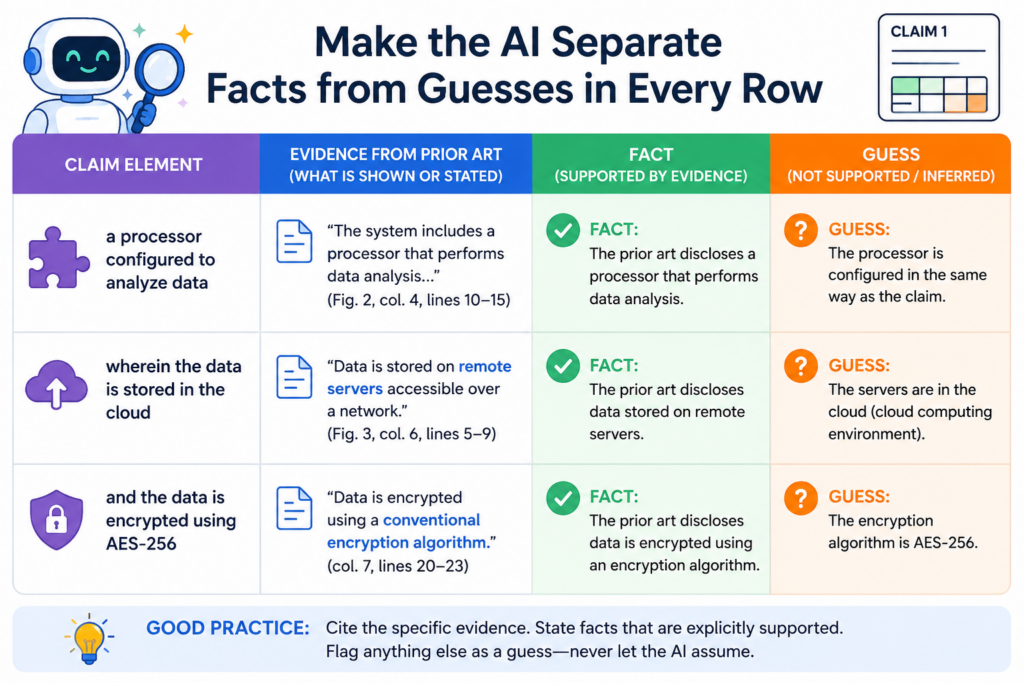
Then it may claim that the sensors collect a certain type of data. It may find that a platform has an analytics dashboard. Then it may claim that the dashboard ranks events by risk score. The first part may be true. The second part may not be proven.
This is dangerous because the false part is often built on a true part. That makes the chart feel believable.
The reader sees a real citation and assumes the whole sentence is supported. But a citation only supports what it actually says. It does not support the AI’s extra leap.
A good process forces the AI to label the difference between direct proof, reasonable inference, and missing support. Direct proof means the source clearly says or shows the thing.
A reasonable inference means the source points in that direction, but does not fully prove it. Missing support means the chart has no solid proof yet.
The chart should not pretend that weak support is strong support
Weak support is not always useless. It can help guide the next search. It can show where to ask a product team for more detail.
It can show what evidence might exist in a manual, demo, source code comment, API guide, or investor deck. But weak support should be labeled as weak.
The problem starts when the chart hides weak support under strong words. Words like “clearly,” “therefore,” and “as shown” can make a weak row look stronger than it is.
In claim chart work, those words should be used with care. The chart should not sell the match harder than the proof allows.
This is especially important when the chart is being used for a serious business choice.
A founder may use claim charts to understand a market, compare products, prepare for funding, support licensing talks, or decide how to improve a patent filing strategy. Bad proof can lead to bad choices.
A useful chart should include a confidence note that a human can review
A simple confidence note can make a chart much safer. It does not need to be long. It just needs to say whether the row is directly supported, partly supported, or not yet supported.
That small note helps the reviewer focus. It turns the chart from a polished guess into a work product that can be tested.
For example, a row may say that a product has a “user interface for selecting a training data set.” The source may show a dashboard where users upload data, but not a clear training data set selection step.
A safe chart would not state the match as complete. It would say the source supports user data upload, but more proof is needed for selecting a training data set. That is honest. That is useful. That is far better than a fake match.
This is also how smart founders should think about AI patent tools. The goal is not to remove human judgment. The goal is to give smart people a better starting point, better structure, and fewer blind spots.
PowerPatent combines AI support with real attorney review so founders can move faster without trusting a black box. Learn more here: https://powerpatent.com/how-it-works
Keep source evidence close to the claim language
A claim chart becomes easier to trust when the proof is close to the claim part it supports. This sounds simple, but it is often where messy charts fail.
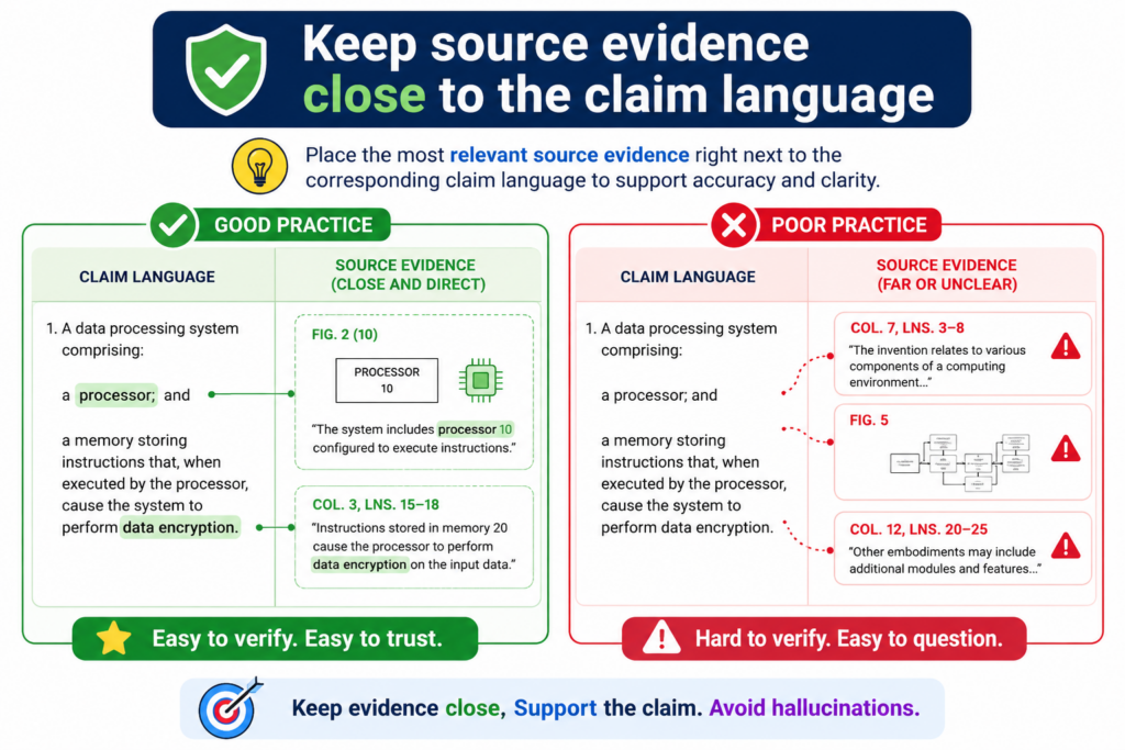
They place the claim language in one area, the product notes in another area, and the sources somewhere else. By the time a reviewer checks the row, the logic is hard to follow. That creates room for mistakes.
The best charts make the path clear. Here is the claim part. Here is the source. Here is the exact product feature.
Here is the short reason they match. If any part of that path is missing, the row should not be treated as final.
AI can help organize this, but it needs strict instructions. It should not be allowed to write broad summaries and attach broad links. It should pull evidence into the chart in a way that lets a human check it quickly.
The evidence should be narrow enough to test
A source link should not make the reviewer hunt for the proof. If the source is a long PDF, the chart should point to the right page or section. If the source is a video, the chart should point to the time range.
If the source is a web page, the chart should name the exact section or quote a short, fair excerpt. If the source is internal material, the chart should identify the file, version, date, and relevant part.
This helps avoid a common AI problem. Sometimes the AI uses a real source but pulls the wrong meaning from it.
The source exists, but the claim chart overstates what it shows. Narrow evidence makes that easier to catch.
This also protects the people reviewing the chart. No one wants to spend hours clicking through sources just to find out the proof was not there. A clean evidence trail saves time and builds trust.
The chart should preserve source context instead of lifting lonely phrases
AI can misuse short phrases. It may take one line from a product page and ignore the surrounding context. For example, a page may say a tool “predicts next steps” in a sales workflow.
The AI may treat that as proof of a specific machine learning model, when the page may only be using marketing language. Without context, the row can become misleading.
A safer chart keeps enough context to show what the source really means. It should not copy long sections, but it should explain the setting.
Is the source a marketing page, a technical guide, a patent filing, a help article, a code comment, or a demo? Each source type has a different level of detail. A marketing page may be useful, but it often needs support from a more technical source.
The more serious the use of the chart, the stronger the source should be. A quick market scan may start with public pages.
A licensing review, patent filing plan, or investor-facing IP story should be checked with more care.
That is why PowerPatent is helpful for technical teams. It gives founders a faster way to organize invention details, evidence, and attorney review in one flow, so the work is not trapped in scattered docs and guesswork. See how it works here: https://powerpatent.com/how-it-works
Make the AI prove each match with primary source material
The best way to cut down AI hallucinations is to feed the AI better proof. A weak source invites weak claims. A strong source makes guessing harder.
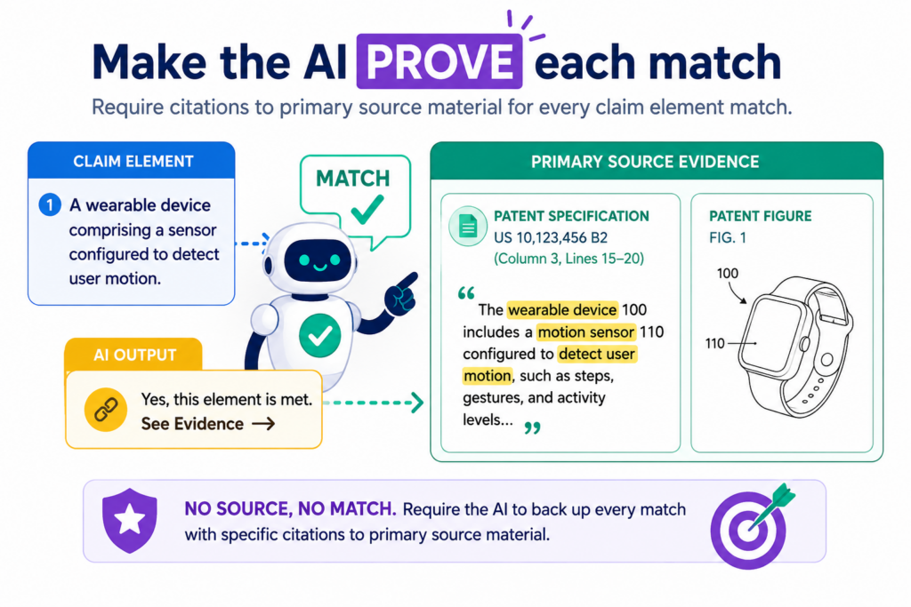
When the AI has clear product guides, technical pages, support docs, public demos, API notes, release notes, screenshots, diagrams, or internal invention notes, it has less need to fill gaps with made-up logic.
This does not mean the AI will always be right. It can still misread strong sources. But strong sources give the human reviewer a better path to check the work.
That is the point. The goal is not to make AI sound smarter. The goal is to make the final chart easier to test.
A public landing page is often not enough. Product pages are built to sell. They use broad words. They may say a tool is “smart,” “automatic,” “secure,” or “real time,” but those words may not prove the exact claim part.
For early review, public pages can help. For serious claim chart work, you need sources that explain how the system works.
The closer the source is to the real product, the safer the chart becomes
A claim chart is only as strong as the proof behind it. A developer guide is usually better than a sales page. A support article with screen steps is usually better than a broad feature page.
A technical diagram is usually better than a blog post. A product demo with visible steps may be stronger than a headline that says the feature exists.
This is not about making the chart longer. In fact, the best charts are often cleaner because they use better evidence. One strong source can do more than five weak ones.
A short line from a user guide that clearly shows the feature may beat a long marketing page filled with big claims.
AI should be asked to rank sources by strength before it writes the chart. It should treat technical sources as stronger than broad marketing copy.
It should warn the reviewer when the only support comes from a vague source. It should also show when a source supports only part of a claim part, not the whole thing.
This kind of source ranking helps teams avoid a common trap. Many AI charts look complete because every row has a citation. But a cited guess is still a guess. The source has to prove the point, not just sit next to it.
A good source record should tell the reviewer what was used and why it matters
When you use AI for claim charts, do not let the evidence trail become a pile of loose links. The chart should keep a small record of each source.
It should show what the source is, when it was accessed, what part of the source matters, and how it supports the claim part. This is simple, but it makes the work much easier to trust.
For example, if the chart uses a product help page, the source record should make clear that the page shows a user action, a system response, or a data flow.
If the chart uses a demo video, the record should name the scene that shows the feature. If the chart uses an API doc, the record should connect the endpoint, field, or event to the claim part.
This is where AI can help a lot. It can gather sources, pull short proof snippets, and place them in a clean format. But the AI should not decide alone that the proof is enough. A real patent professional should review whether the match is fair.
That balance is what modern patent work needs. Founders do not want slow, old-school back-and-forth. They also cannot afford sloppy AI guesses.
PowerPatent gives technical teams a cleaner path by combining smart software with real patent attorney oversight. You can see the process here: https://powerpatent.com/how-it-works
Use a strict no-proof-no-match rule
The simplest safety rule is also the hardest to follow under pressure. If there is no proof, there is no match. Not maybe. Not probably. Not “the product must do this somehow.” No proof means the row is not ready.
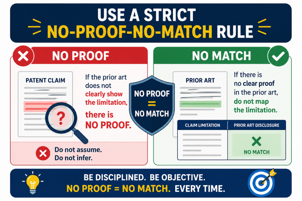
This rule protects the chart from the most common AI failure. AI likes to complete patterns. If it sees that a product has inputs, processing, and outputs, it may assume there is storage.
If it sees that a product gives a score, it may assume there is a model. If it sees that a system sends alerts, it may assume the alert is based on a certain rule.
Some of those guesses may turn out to be true. But until there is proof, they do not belong in a finished claim chart.
A strict no-proof-no-match rule does not slow the team down as much as people think. It actually speeds up the review because everyone knows what the chart means.
Supported rows are supported. Weak rows are weak. Missing rows are missing. There is no fog.
Missing proof is not failure because it is useful information
Many teams treat missing support as a problem they need to hide. That is backwards. Missing support is valuable because it tells you where to look next. It may show that you need a better source.
It may show that the product does not meet the claim part. It may show that the claim is too narrow for the target product. It may show that your own invention story needs clearer notes before filing.
This is especially useful for startups. If your team is building a new system, a missing proof row may reveal that the invention is still trapped in someone’s head.
The engineer knows how the feature works, but the draft materials do not show it. That gap can hurt later. It can lead to weak patent filings, unclear claim support, and long attorney follow-up.
A clean AI workflow should turn those gaps into action. Instead of pretending the row is done, the chart should mark the row as needing more proof.
Then the team can go find the right screen, doc, code note, architecture sketch, or founder explanation.
This is also how you build a stronger patent story. Great patent work often starts with asking better questions about what the product really does. AI can surface those questions faster, but humans still need to answer them.
The chart should have a clear place for unknowns
One of the best ways to reduce hallucinations is to give the AI permission to say “not found.”
Many AI tools hallucinate because they are pushed to fill every blank. The prompt asks for a complete chart, so the AI creates one. That is the wrong goal.
A better prompt tells the AI that “not found” is an acceptable answer. In fact, it should be required when the source does not prove the claim part. This makes the chart more honest. It also makes the next step clear.
The AI should not be rewarded for making every row look complete. It should be rewarded for being careful. That means it should leave rows open when proof is missing.
It should flag unclear matches. It should separate direct support from weak hints. It should avoid strong claim language unless the source supports that strength.
For a founder, this kind of honesty matters. You do not need a chart that flatters your idea. You need a chart that helps you make better choices. You need to know what is strong, what is thin, and what needs review before you spend more time or money.
PowerPatent is built for that kind of work. It helps founders move faster without turning patent work into a guessing game.
The software helps organize the technical story, while real attorneys help review the legal side. Start here to see how it works: https://powerpatent.com/how-it-works
Give the AI narrow prompts instead of broad commands
A broad prompt can create a broad mess. When you ask AI to “create a claim chart for this patent against this product,” you are asking it to make many hard choices at once.
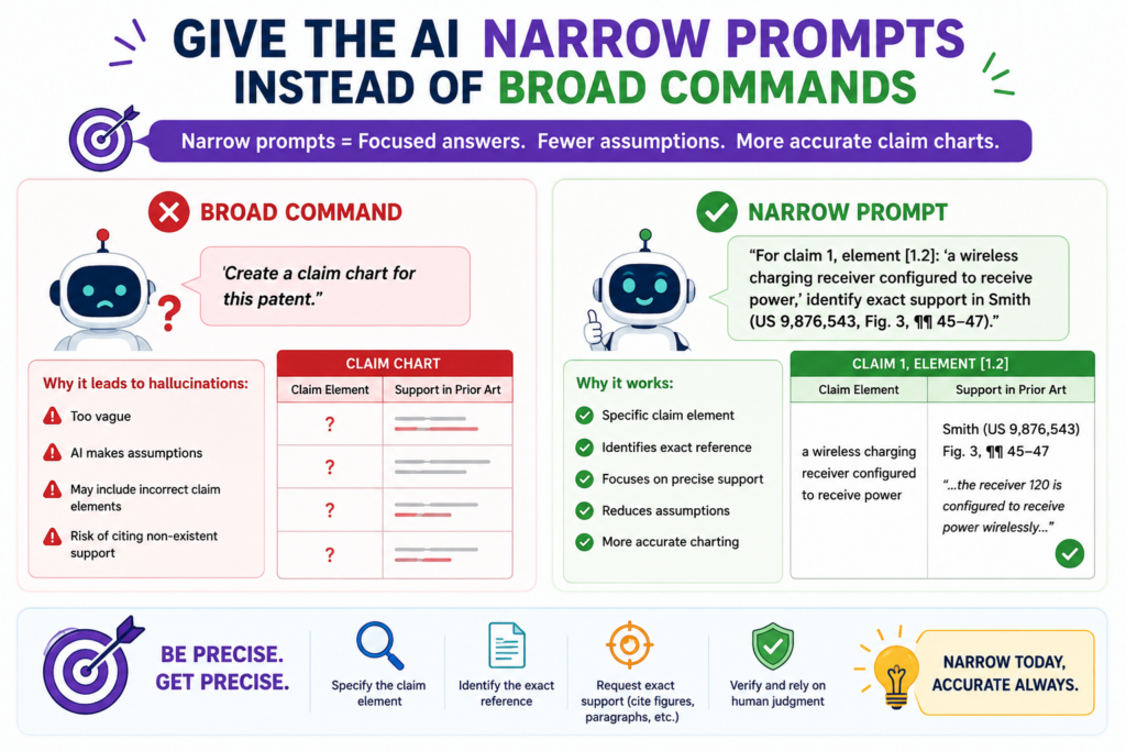
It must understand the claim, find product evidence, judge matches, explain the logic, and write the chart. That is too much room for quiet errors.
A better method is to split the work into stages. First, ask the AI to break the claim into parts. Then ask it to explain each part in plain words. Then ask it to find evidence for only one part at a time.
Then ask it to state whether the evidence is direct, partial, or missing. Then ask it to draft the row. This may sound slower, but it gives you a better chart because each step can be checked.
The best AI workflows feel less like magic and more like a careful assembly line. Each step has one job. Each output is easier to review. Each mistake is easier to catch before it spreads.
A safer prompt tells the AI exactly what not to do
Most people tell AI what they want. Fewer people tell it what to avoid. In claim chart work, that second part is critical. The AI should be told not to infer hidden product features. It should be told not to treat marketing terms as technical proof.
It should be told not to use claim language unless the source supports it. It should be told not to combine separate sources into one stronger fact unless the connection is clear.
This kind of instruction matters because AI often tries to be helpful by bridging gaps. In normal writing, that can be useful. In claim charts, it can be harmful. The AI may blend several weak clues into one firm statement.
It may read a product feature into a source because similar products often work that way. It may assume a backend process exists because the front end shows a result.
A good prompt blocks those habits. It asks the AI to stay close to the source. It asks for uncertainty when the proof is not clear. It asks for short reasons, not long arguments. It makes the chart easier to audit.
This is where prompt design becomes a real business tool. A founder does not need fancy words. A founder needs a process that reduces bad guesses before they become expensive mistakes.
A strong prompt should force the AI to show the gap between the claim and the proof
The most useful AI output is not always the polished chart. Sometimes the most useful output is the gap report. A gap report shows where the evidence does not fully match the claim.
It may say that the source proves data input but not data storage. It may say that the source proves alerts but not the rule that triggers them. It may say that the source proves a model makes predictions but not that it updates over time.
This is powerful because it turns the AI into a review helper, not a fake expert. Instead of hiding problems, it points them out. Instead of forcing a match, it shows the missing bridge.
Founders can use this to improve their own invention records. If the AI cannot find proof for a feature in your own materials, that may mean the feature needs to be described better.
Maybe the product has a smart routing step, but your notes only say “automation.” Maybe the system uses a special model update flow, but your draft only says “AI engine.” Those gaps can weaken a patent story if they are not fixed early.
A better patent process catches these issues before filing. That is the advantage of using tools that are built for patent work, not generic writing.
PowerPatent helps turn rough technical ideas into clearer invention records, with attorney review to help avoid blind spots. See how founders use it here: https://powerpatent.com/how-it-works
Use a human review step before the chart is shared with anyone important
AI can help draft a claim chart, but it should not be the final voice. A claim chart may be used in a serious setting, such as patent planning, investor review, licensing talks, product checks, or attorney strategy.
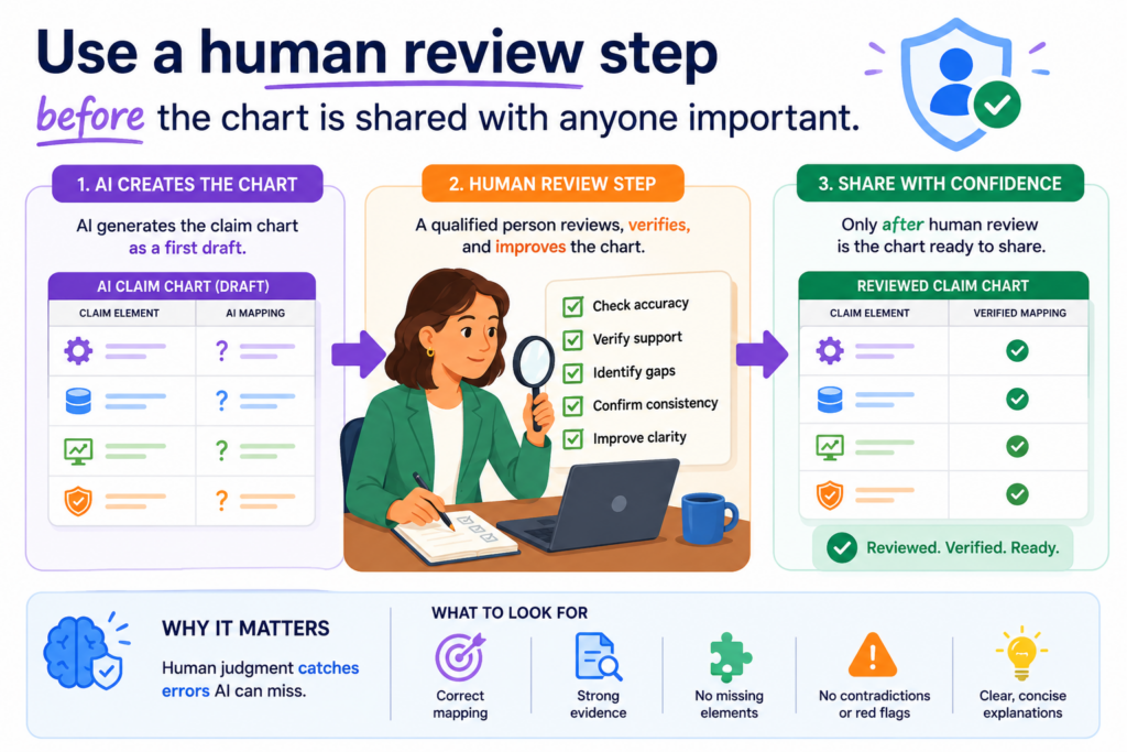
In those cases, one wrong row can cause confusion and lead people to trust a weak idea.
The human review step is where the chart becomes real work. The reviewer checks whether the claim language was split correctly, whether the proof matches the claim part, whether the source is strong, and whether the AI added anything that the source did not say. This is where many hidden errors come out.
A good reviewer looks for overreach, not just grammar
A weak review only checks if the chart reads well. That is not enough. AI text often reads well even when it is wrong.
The reviewer needs to look for overreach. That means finding places where the chart says more than the evidence proves.
For example, the chart may say a system “automatically trains a model,” while the source only says the system “uses AI.” That is overreach. The chart may say a product “stores a user profile,” while the source only shows a user login screen.
That is also overreach. The chart may say data is “encrypted during transfer,” while the source only says the platform is “secure.” That is not enough proof.
A strong review asks a direct question for each row. Does the source prove this exact claim part, or did the AI add a hidden guess? That question catches a large share of hallucinations.
The best human review is done while the evidence is still easy to check
Review is much harder when the evidence trail is messy. If the reviewer has to open ten links, search long pages, and guess what the AI meant, errors will slip through. That is why the chart should be built for review from the start.
Each row should show the claim part, the source, the exact support, and the short reason for the match.
The reviewer should be able to test the row quickly. If the chart cannot be checked quickly, it is not ready to be shared.
This is one reason PowerPatent matters for busy founders. You do not need a slow process that buries your team in legal tasks.
You need a clean way to capture your invention, organize support, and get real attorney oversight before small errors become costly. You can see how PowerPatent helps here: https://powerpatent.com/how-it-works
Keep a clean audit trail so every AI step can be checked later
A claim chart should not be a mystery file. If someone opens it two weeks later, they should be able to see how it was made.
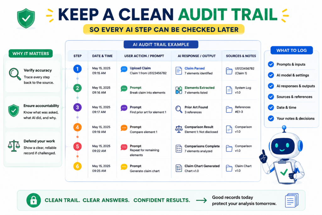
They should know what sources were used, what prompts shaped the output, what changed after review, and which parts still need support. This audit trail is one of the best ways to stop AI mistakes from hiding inside polished text.
AI hallucinations are harder to catch when the chart has no history. A final chart may look clear, but no one knows where the proof came from or why a row was written a certain way.
When the team cannot trace the work, the chart loses value.
The chart history should show what changed and why
A strong audit trail does not need to be complex. It needs to make the path visible. If the AI first marked a row as supported, but a reviewer later changed it to partial support, that change should be saved.
If a weak source was replaced with a stronger source, that should be clear. If a row was removed because proof was missing, that should not disappear without a trace.
This helps the team learn. It also helps stop the same mistake from happening again. If the AI keeps overstating certain types of product features, the prompt can be improved.
If the team keeps missing certain evidence, the source collection process can be improved. A clean audit trail turns errors into better process.
For startups, this is not just neat record keeping. It is a way to protect speed. Fast teams make many decisions. If the past work is easy to check, the team can move without starting over each time.
A strong audit trail makes attorney review faster and sharper
Patent attorneys can do better work when the material is clear. If the chart shows the source path, the proof level, and the review notes, the attorney can focus on judgment instead of cleanup.
That can reduce wasted back-and-forth and help the team move faster.
This matters because founders do not have time to explain the same invention ten times. Engineers do not want to pause product work to rebuild old notes.
A clean trail lets the attorney see what the system does, where the support is strong, and where more detail is needed.
This is the kind of workflow PowerPatent is built to support. It helps teams bring software speed into patent work while keeping real attorney review in the loop.
For technical founders, that means less chaos, less delay, and more confidence. Learn how it works here: https://powerpatent.com/how-it-works
Train the AI to be conservative instead of clever
In normal writing, clever can be useful. In claim charts, clever can be dangerous.
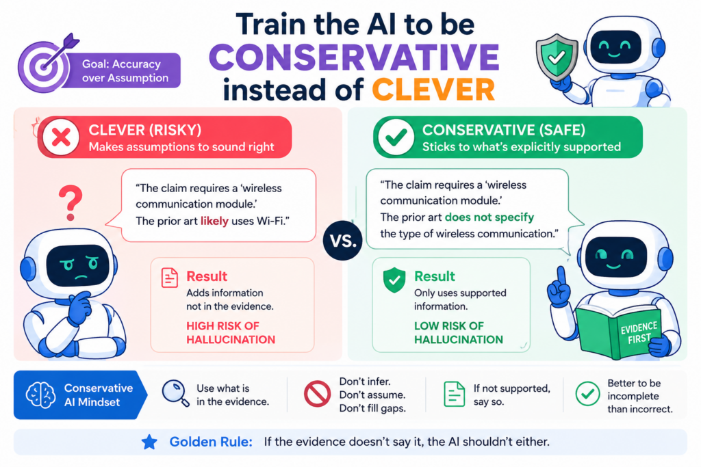
The AI should not be rewarded for filling every gap or making the chart sound complete. It should be rewarded for being careful, plain, and honest.
A conservative AI workflow may feel less exciting at first because it leaves more blanks. But those blanks are useful. They show where proof is missing. They show where a claim part may not match.
They show where a founder, engineer, or attorney needs to look closer. That is much better than a perfect-looking chart built on weak guesses.
A careful AI should prefer uncertainty over false confidence
The safest AI claim chart uses plain words when proof is clear and cautious words when proof is thin. It should not say “this limitation is met” unless the evidence strongly supports that statement.
It should say when a source only suggests a feature. It should say when a match depends on an assumption. It should say when no support was found.
This habit can feel strange because many people want AI to give fast answers. But in patent work, a fast wrong answer is not helpful. It creates risk. It can make a weak chart look strong. It can lead a team to spend time on the wrong path.
A careful AI is still useful. It speeds up reading. It helps sort sources. It helps draft first-pass rows. It helps find gaps. But it does not pretend that the work is finished before a human checks it.
A conservative process protects founders from expensive cleanup
Cleanup is costly. A founder may spend hours with counsel fixing a chart that should have been built right the first time.
An engineer may need to dig through old code notes to support a claim part that the AI overstated. A team may enter a meeting thinking a chart is strong, then find out the proof does not hold.
A conservative process avoids that pain. It makes the chart slightly more careful at the start so it does not become a major problem later.
It also builds trust between the startup team and the patent team because everyone can see the same truth.
This is one of the core ideas behind PowerPatent. AI should help founders move faster, but it should not replace sound review.
PowerPatent combines smart tools with real attorney oversight so technical teams can protect what they are building without handing the whole process to a guessing machine. Start here: https://powerpatent.com/how-it-works
Check whether the AI is confusing similar product features
A common AI mistake is treating similar features as the same feature. This is easy to miss because the chart may sound logical.
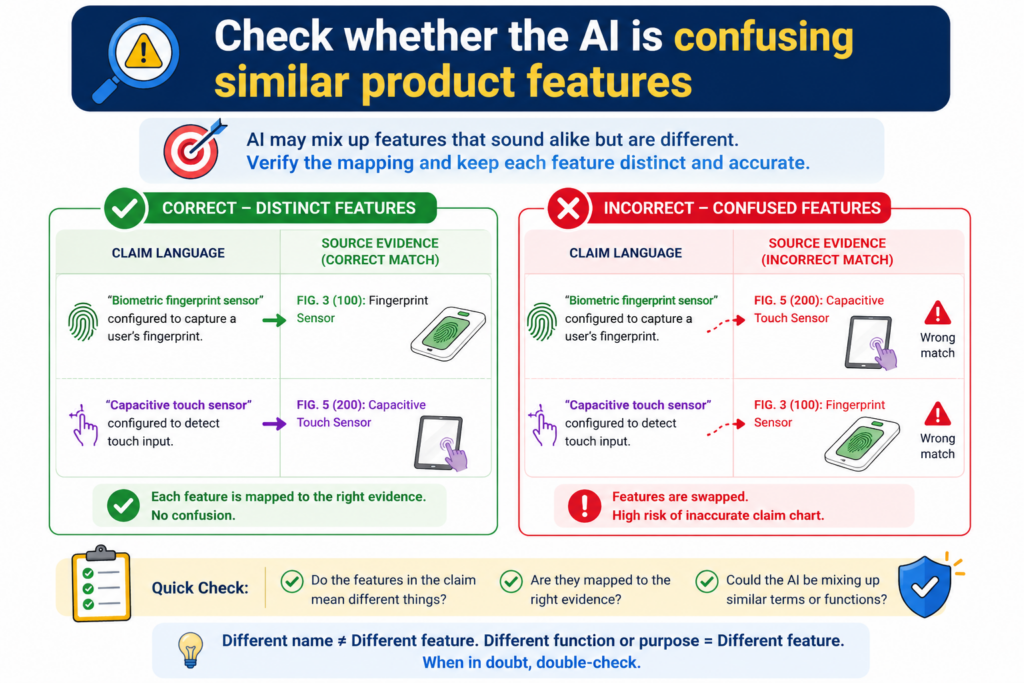
A product may have search, ranking, scoring, filtering, alerts, dashboards, models, user settings, and reports.
Many of these features can look related. But a claim chart needs the right feature, not a nearby feature.
For example, a claim may require ranking items based on a risk score. The product may filter items by status. Those are not the same. A claim may require updating a model using feedback.
The product may let users edit settings. Those are not the same either. A claim may require detecting an event in real time. The product may send a daily report. Again, close is not enough.
Similar words should not replace exact proof
AI often matches words before it understands meaning. If the claim says “score,” and the source says “rating,” the AI may treat them as equal. Sometimes that may be fair.
Other times it may be wrong. The only way to know is to check what the source means.
This is why the chart should explain the product feature in plain words before mapping it to the claim. If the product feature cannot be explained clearly, the match is not ready.
A reviewer should be able to say what the product does, what the claim requires, and why the two are the same or different.
This step is especially important for AI, software, robotics, medical devices, chips, and deep tech systems.
In these fields, small technical differences matter. A user-facing result may look the same, while the backend process is totally different.
The safest chart separates look-alike features before making a match
A strong chart does not force similar features into one bucket. It separates them. It asks whether the evidence supports the exact action, exact data, exact trigger, exact model, exact output, and exact timing required by the claim.
For example, if the claim requires an alert based on a threshold, the chart should not rely only on proof that the product sends alerts. It should also show the threshold part.
If the claim requires a model trained on user behavior, the chart should not rely only on proof that the product is personalized. It should show the training or behavior link.
This careful separation prevents the AI from turning a broad similarity into a false match. It also helps founders see their own inventions more clearly.
When you know exactly what makes your system different, you can protect it better.
PowerPatent helps teams capture those details while they are still fresh. That is important because the best patent work often depends on small technical choices that are easy to forget later.
See how PowerPatent helps founders protect those details here: https://powerpatent.com/how-it-works
Build a claim chart workflow that improves every time you use it
Avoiding AI hallucinations is not a one-time task. It is a workflow. The first chart teaches you where the AI gets confused. The second chart should be better. The third should be better still.
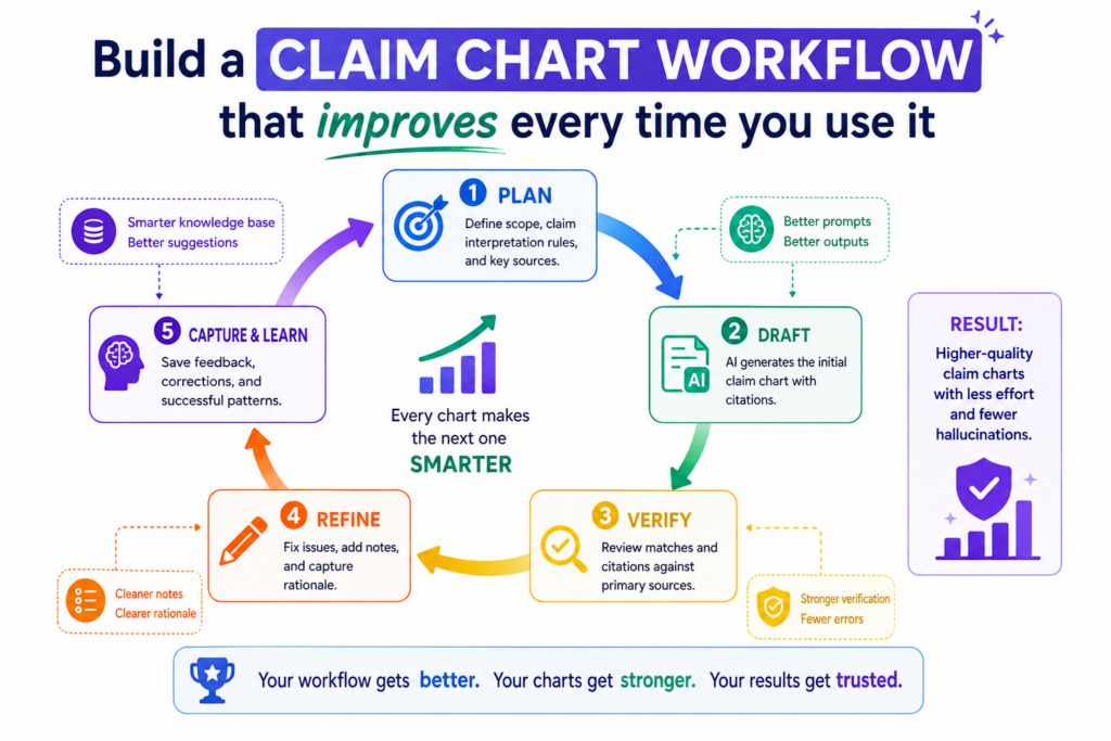
Over time, your team should build a repeatable way to collect sources, break down claims, check proof, mark weak rows, and involve attorney review.
This is how startups can get the speed of AI without losing control. The process should not depend on one person’s memory or one lucky prompt. It should be simple enough for the team to use again and again.
A repeatable workflow turns AI from a risk into leverage
AI becomes safer when the process around it is strong. The prompt is only one part. The source quality matters. The claim breakdown matters. The evidence format matters.
The review step matters. The audit trail matters. When all of those pieces work together, the AI becomes a useful assistant instead of a hidden risk.
This kind of workflow is especially important for growing startups. As the product changes, the patent story changes too. New features ship. Old features get replaced.
Model behavior changes. Data flows change. Integrations expand. If your claim chart process is messy, your IP work can fall behind the product.
A repeatable workflow keeps the patent work closer to the real invention. It helps the team capture what is new while it is still clear.
It helps counsel review better material. It helps founders make faster decisions with less guesswork.
The real goal is not just fewer hallucinations but stronger patent work
Avoiding hallucinations is only the first win. The bigger win is building a patent process that is clearer, faster, and more useful for the business.
A good AI-assisted claim chart can help a founder see what is protected, what is weak, what needs more support, and what may deserve a new filing.
That kind of clarity is powerful. It can help a startup tell a stronger story to investors. It can help the team avoid sloppy filings.
It can help engineers explain what they built without getting trapped in legal language. It can help founders protect the parts of the product that make the company hard to copy.
This is where PowerPatent fits. It gives technical teams a modern way to move from invention details to stronger patent work, with smart software and real patent attorneys working together.
You do not have to choose between speed and care. You can build both into the process from the start. See how it works here: https://powerpatent.com/how-it-works
Use source locks so the AI cannot wander outside the record
One quiet way AI hallucinates is by pulling from things that were never meant to be part of the review. It may rely on general knowledge about a product type.
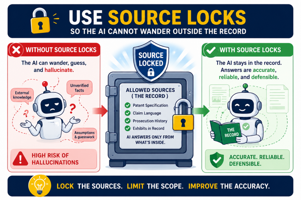
It may bring in facts from older web pages. It may use patterns from similar companies. It may even blend details from multiple sources and make the chart sound more certain than it should.
This is why source locks matter. A source lock means the AI is only allowed to use the documents, pages, screenshots, files, or notes you give it for that chart.
If the proof is not inside the approved source set, the AI must say the support was not found. That one rule can cut down a huge amount of hidden guessing.
A claim chart should not be built from memory. It should be built from the record in front of the team. When you lock the AI to the source record, you make the work easier to review and harder to fake.
The source set should be clear before the chart is drafted
Before the AI writes a chart, the team should decide what sources count.
This may include public product pages, help center articles, technical docs, demo videos, screenshots, white papers, API pages, release notes, internal design docs, invention notes, or code comments.
The source set should be named and saved so the reviewer knows what the AI used.
This step sounds basic, but it is powerful. It stops the AI from reaching beyond the material. It also helps the team see whether the chart is based on strong sources or weak ones.
A chart built only from sales pages should be treated very differently from a chart built from detailed technical docs.
When the source set is clear, every row becomes easier to judge. The reviewer can ask whether the approved sources support the claim part. If not, the row stays open. That keeps the chart honest.
The AI should not patch weak proof with outside knowledge
AI often tries to be helpful by filling in what “must be true.” For example, if a product has a dashboard, the AI may assume there is a database. If a tool has predictions, it may assume machine learning.
If a product has user accounts, it may assume stored user profiles. These assumptions may be normal in real systems, but they are not proof.
A source lock helps stop this. The AI cannot say, “This is likely true because systems like this usually work this way.” It must say, “The approved source does not show this.” That may feel less satisfying, but it is far more useful.
For founders, this matters because your team needs a chart that helps you make sound choices. You do not need a chart that sounds impressive but collapses when counsel reviews it.
PowerPatent helps bring order to this process by giving teams a clearer way to collect invention details, organize support, and work with real patent attorneys. See how it works here: https://powerpatent.com/how-it-works
Make the AI explain why a source does not support a claim part
Most people ask AI to find matches. Fewer people ask AI to explain non-matches. That is a missed chance.
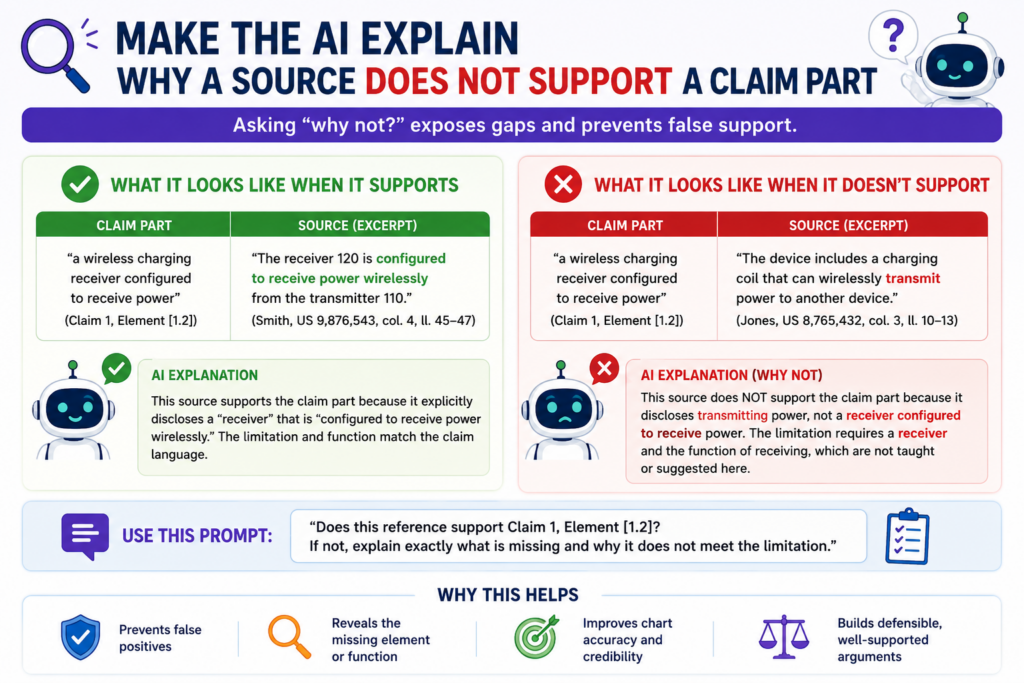
A non-match can be just as useful as a match because it tells the team what is missing, what is unclear, and what needs more proof.
When a chart only shows positive matches, it can create a false picture. The empty parts are hidden. The weak parts are skipped.
The reader may think the claim is fully mapped when several parts were never proven. This is how small AI gaps become big business mistakes.
A better claim chart process asks the AI to explain both sides. If the source supports the claim part, the AI should show where.
If the source does not support it, the AI should say what is missing. This makes the chart more useful and much easier to review.
A non-match explanation should be simple and specific
The AI should not write a long essay when support is missing. It should explain the gap in plain words. For example, the source may show that the product collects sensor data, but it may not show that the data is cleaned before processing.
Or the source may show that a model gives a score, but it may not show that the model was trained on a certain type of data.
That kind of explanation gives the team a next step. It tells the engineer what detail to provide. It tells the founder what part of the product story is unclear. It tells the patent attorney where review should focus.
This is much better than a vague note like “not enough information.” A useful non-match should tell the team exactly what proof is missing. That turns the claim chart into a map for better evidence collection.
The best gap notes help the team improve the patent record
A gap in a claim chart is not always bad news. It may show that the product does not meet a claim part. It may also show that the evidence has not been written down yet. In startups, this happens all the time.
The team may have built something smart, but the proof lives in a Slack thread, a demo, a notebook, a code branch, or one engineer’s memory.
AI can help surface those missing details early. It can say, “The current source shows the output, but not the process used to create it.” That kind of note can push the team to capture the missing process before it gets lost.
This is one reason founders should not wait too long to organize their invention records. The best patent details are often clearest when the feature is being built.
PowerPatent helps startups capture those details faster, then pairs the software flow with attorney review so the work can become stronger patent material. You can explore the process here: https://powerpatent.com/how-it-works
Keep claim charts away from marketing spin
Marketing language is useful for selling a product. It is not always useful for proving a patent claim. Words like “smart,” “seamless,” “real-time,” “automated,” “secure,” “AI-powered,” and “personalized” may sound strong, but they often do not show how the product works.
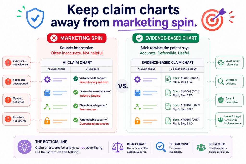
AI can be fooled by this kind of language. It may treat a broad marketing claim as proof of a specific technical step. That is one of the most common ways hallucinations enter a claim chart.
The words sound close, so the AI maps them to the claim. But close words are not the same as technical support.
A safer chart process treats marketing sources as starting points, not final proof. They can help identify features worth checking.
They should not carry a serious chart unless they show the exact claim part with enough detail.
The chart should translate marketing words into testable facts
If a product page says the tool is “AI-powered,” the chart should ask what that means. Does the source identify a model? Does it show a training step? Does it show an inference step?
Does it explain what data goes into the system and what output comes out? If not, the phrase may be too broad to support the claim.
If a page says the product works in “real time,” the chart should ask whether the claim needs true real-time operation or just fast updates.
If the claim requires detecting an event as it happens, a page that only shows daily reporting may not be enough.
This is where AI needs strict boundaries. It should not be allowed to treat a catchy phrase as proof. It should turn each phrase into a plain factual question, then check whether the source answers that question.
A strong review removes words that make the evidence sound better than it is
AI often makes weak proof sound polished. It may take a sentence like “our platform gives smart insights” and write, “the accused system applies machine learning to generate predictive recommendations.” That may be true, but it is not proven by that sentence alone.
A human reviewer should remove that kind of overstatement. The chart should say only what the evidence supports.
If the source shows smart insights but does not explain how they are made, the chart should say that. If more proof is needed, the chart should mark the row as incomplete.
This careful wording can feel less exciting, but it is far more valuable. A chart that shows the truth is better than a chart that sounds strong. Founders need clarity, not theater.
PowerPatent helps technical teams turn real product details into clearer patent work without forcing them to rely on vague marketing language.
The platform helps organize what was built, why it matters, and what support exists, with real attorney oversight in the loop. Learn more here: https://powerpatent.com/how-it-works
Review the chart from the other side before trusting it
A good way to catch hallucinations is to read the chart like someone who wants to break it. This does not mean being negative.
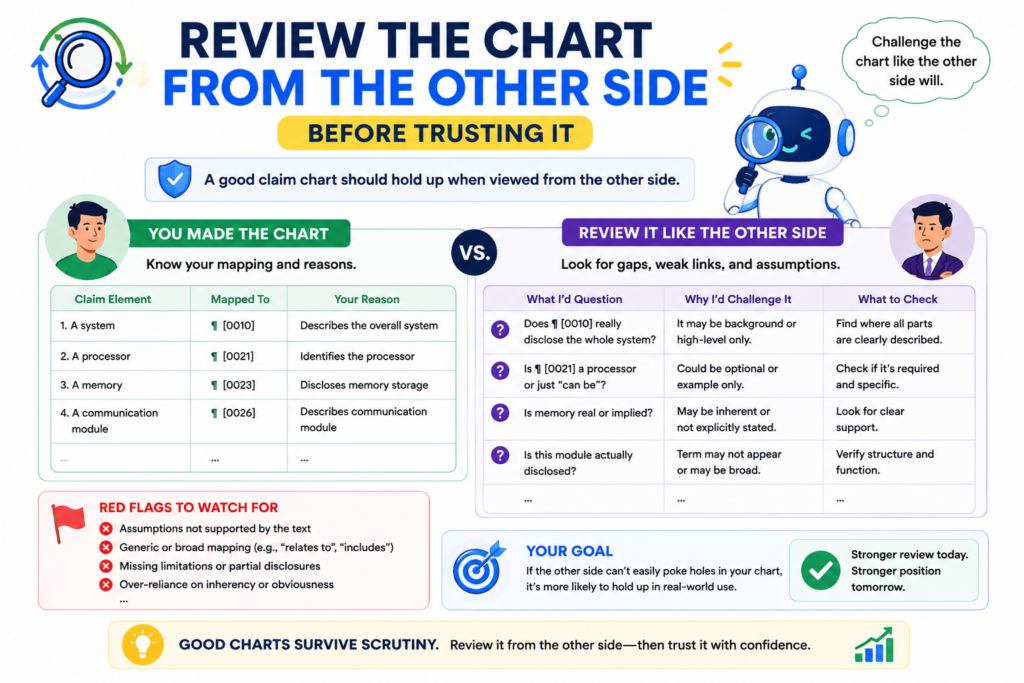
It means being honest. If a competitor, investor, examiner, licensee, or opposing counsel looked at the chart, where would they push back?
That mindset is useful because AI often writes from the side of support. It tries to help you prove the match. A strong review should also test the match.
It should ask where the chart is thin, where the source is vague, where the words are stretched, and where the AI may have assumed too much.
This kind of review can feel uncomfortable. But it is much better to find the weak spots inside your own process than to have someone else find them later.
A challenge review should focus on the weakest rows first
Not every row needs the same amount of time. Some rows will be clear. The source will show the feature directly, and the match will be easy to see. Other rows will be thin. Those are the rows that need attention.
The reviewer should look first at rows marked as partial, inferred, or based on broad sources. These are the places where hallucinations are most likely to hide.
The reviewer should also check rows where the explanation is long. A long explanation can mean the AI is working too hard to force a match.
A clean chart should not need a complicated argument for every row. When the proof is strong, the explanation is usually simple. When the explanation becomes twisted, that is a signal to slow down.
The best question is what would make this row fail
Every row should be tested with one hard question. What would make this row fail? Maybe the source does not show the timing step. Maybe the product feature is optional.
Maybe the source describes a future feature, not a current one. Maybe the chart combines two different product versions. Maybe the claim requires a backend process that the source never explains.
Asking this question helps reveal hidden risk. It also helps the team decide what to do next. Sometimes the fix is simple.
The team may find a better source. Other times, the gap may show that the claim does not map well to that product. Either way, the team gets clarity.
This is how smart founders should use AI in patent work. Not as a magic answer machine, but as a tool that helps them find what is strong and what needs review.
PowerPatent is built around that same idea: move fast with smart software, then use real attorney oversight to help protect the quality of the work. See the full process here: https://powerpatent.com/how-it-works
Make version control part of the claim chart process
AI claim charts can change quickly. A prompt changes. A source page updates. A new product document appears. A reviewer edits a row. A claim term is clarified.
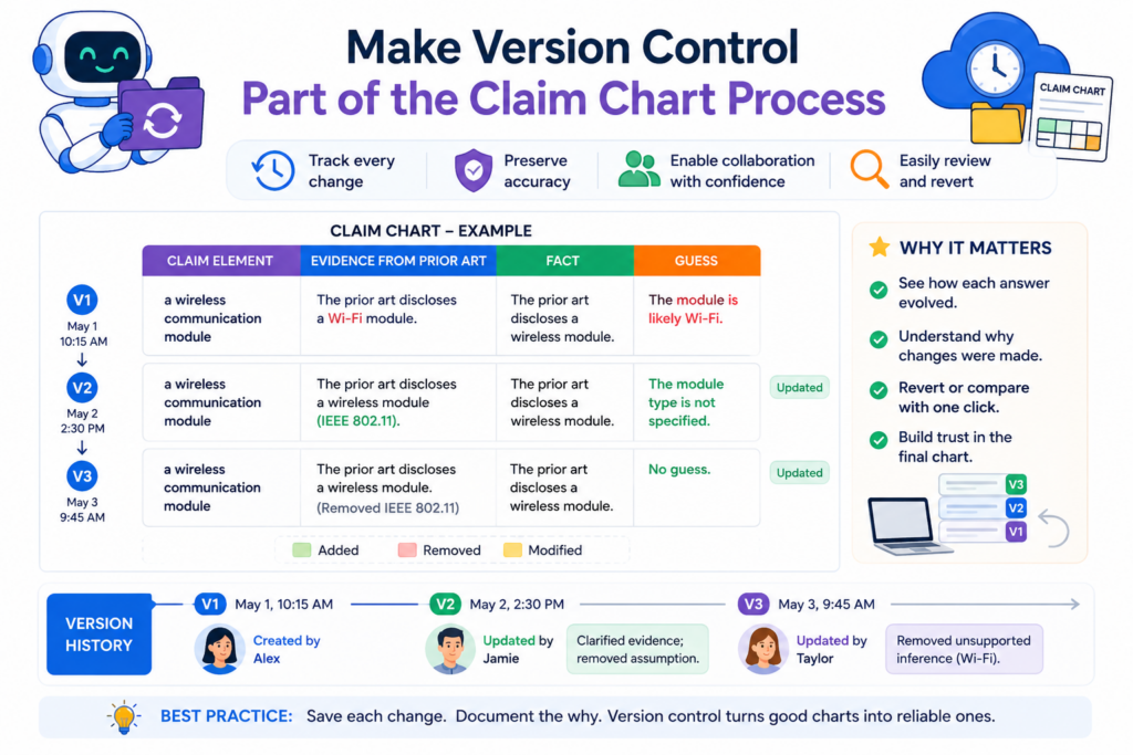
A feature name changes. If the team does not track versions, no one knows which chart is current or why a statement changed.
Version control is not just for code. It is also useful for patent work. A claim chart is a living document during review. It should show what changed over time, especially when AI was used to create or revise it.
Without version control, teams may rely on old rows, outdated sources, or unreviewed AI text.
That can create confusion and waste time. With version control, the team can move faster because everyone knows what they are looking at.
Each chart version should have a clear purpose
A first-pass AI chart is not the same as an attorney-reviewed chart. A source collection chart is not the same as a chart used for business decisions.
A draft used for internal discussion is not the same as a chart prepared for a more serious review.
Each version should say what it is. Is it an AI draft? Is it a human-reviewed draft? Is it waiting for more evidence? Has counsel reviewed it?
Are there rows still marked as weak? This helps prevent people from using the wrong document for the wrong purpose.
A version label can save a lot of pain. It tells the reader how much trust to place in the chart. It also helps founders avoid the mistake of treating an early AI output like a final work product.
A clear version history helps prevent old hallucinations from coming back
When a hallucination is fixed, the team should know it was fixed. If the AI once overstated a feature and a reviewer corrected it, that change should be visible.
Otherwise, the same bad language may return in a later draft, especially if someone reruns the AI with the same broad prompt.
A version history helps stop that loop. It shows which rows were changed, which sources were rejected, and which wording was softened.
It also helps improve future prompts because the team can see the types of mistakes the AI tends to make.
This is especially helpful for deep tech teams where product details change often. A model may be retrained. A data flow may be redesigned. A hardware part may be swapped.
A user interface may change. Patent work needs to stay connected to the real system, not an old description.
PowerPatent gives startups a better way to keep patent work aligned with the invention as it changes.
It helps founders move faster, keep control, and work with real attorneys without drowning in scattered files. You can see how that works here: https://powerpatent.com/how-it-works
Run a citation check before you trust any row
A citation is not proof by itself. It is only a door to the proof. The row still needs to show that the cited source actually supports the claim part.
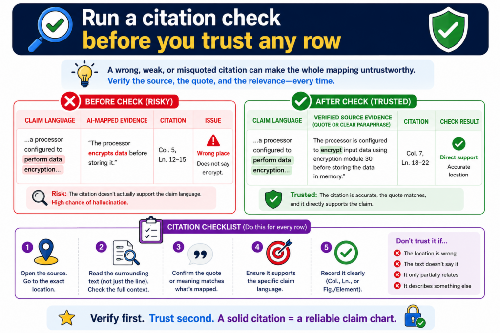
This is where many AI claim charts fail. The chart has links, but the links do not say what the chart says they say.
This mistake is easy to miss because citations make a chart look serious. A row with a link feels safer than a row with no link.
But if the AI used the wrong page, pulled the wrong meaning, or cited a source that only supports half the point, the row is still weak.
A citation check is simple. Open the source. Read the exact part. Compare it to the claim language. Then ask whether the chart is saying more than the source proves. If the answer is yes, the row needs to be fixed.
The source should support the full statement, not just a nearby idea
A common AI error is citing a source that supports a related point instead of the actual point. For example, the claim may require a system that updates a model based on user feedback.
The cited source may show that users can provide feedback, but it may not show that the model updates because of that feedback.
That is not full support. It is only partial support.
The same issue shows up with storage, alerts, scoring, training, ranking, filtering, encryption, and timing.
The source may prove one piece, while the chart quietly adds the rest. A good citation check finds this gap before the chart is used.
When checking citations, do not ask whether the source is close. Ask whether the source proves the row. Close is not enough in a claim chart.
The best citation check uses plain language before legal language
One helpful method is to restate the row in normal words. If the claim part says the system “generates a confidence score based on a trained classifier,” rewrite it in simple terms. The system uses a trained model to create a score that shows how sure it is.
Then check the source against that plain sentence. Does the source show a trained model? Does it show a score?
Does it show that the score is about confidence? If one of those parts is missing, the row is not fully supported.
This plain-language check helps founders and engineers take part in review without getting lost in claim words. It also helps attorneys work faster because the weak spots become clear early.
PowerPatent is built for this kind of practical workflow. It helps technical teams organize invention details, source support, and attorney review in a way that is faster and cleaner than old patent back-and-forth. See how it works here: https://powerpatent.com/how-it-works
Do not let AI merge different product versions into one fake match
Products change. Features move. Docs get updated. Screens change. APIs get renamed. A product page from last year may not describe the current product.
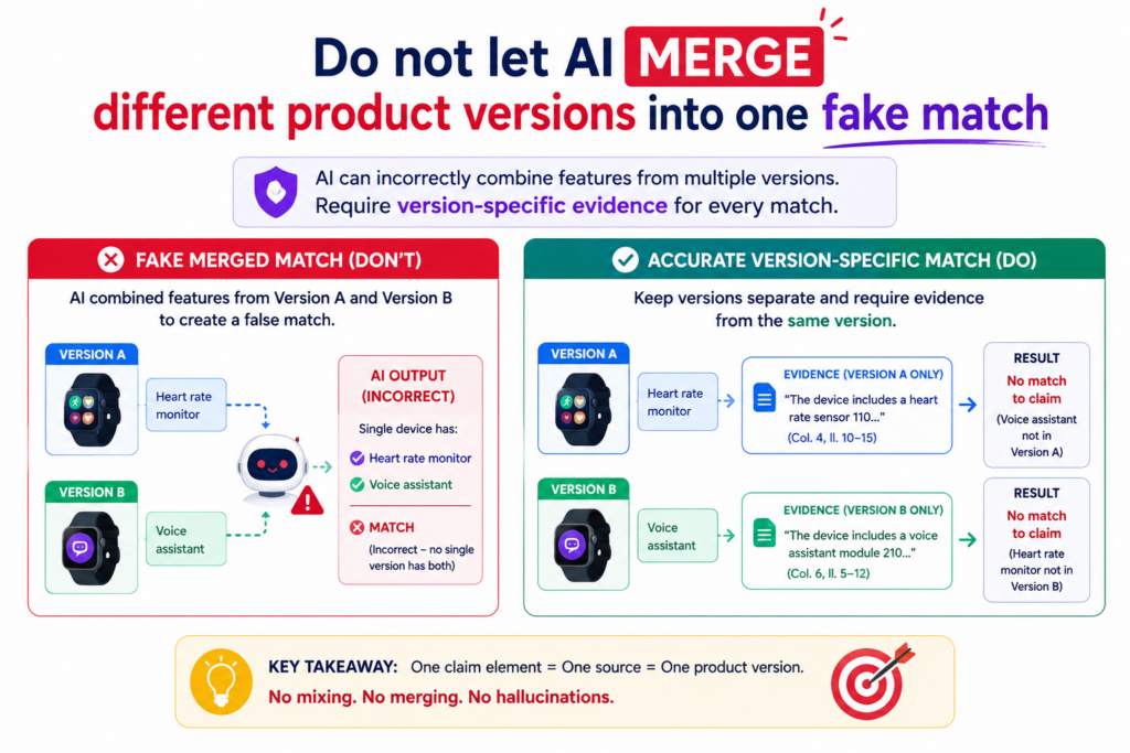
A beta feature may not exist in the public release. A demo may show a planned workflow, not the version customers use today.
AI can miss these time and version issues. It may combine facts from different versions and write a row that no single version supports. This creates a chart that looks complete but does not match reality.
A claim chart needs a clear product version. If the chart is about a current product, the evidence should come from current product material.
If the chart is about an older version, the evidence should match that older version. Mixing versions can create false proof.
Every source should be checked for date, version, and product scope
Before using a source, ask what product it describes. Is it the same product named in the chart? Is it the same edition, plan, module, or release? Is it describing a live feature, a roadmap item, a beta test, or a retired tool?
This matters because many companies have product families. A feature may exist in an enterprise plan but not in the standard plan.
A model may run in one module but not another. A dashboard may show different data depending on the customer setup.
AI may treat all of this as one product unless you force it to separate the sources. That can lead to false matches. A careful chart makes the scope clear.
A clean chart should say which version the proof belongs to
The chart should not leave version details buried in the source. It should state the product version or source date when that matters. If the source is a release note, name the release.
If it is a support page, capture the access date. If it is an internal doc, include the document version. If it is a demo, note what product build or feature set was shown.
This is not busywork. It protects the chart from confusion later. When someone reviews the chart months later, they can see what the proof was based on.
For startups, this habit is especially important because the product may change every week. Your invention story should stay tied to what was actually built.
PowerPatent helps founders keep invention details organized while real attorneys help shape them into stronger patent work. Learn more here: https://powerpatent.com/how-it-works
Watch for hidden claim words that AI may skip
Patent claims often include small words that do big work. AI may focus on the main nouns and verbs while skipping words that limit the claim. That can make the chart look stronger than it is.
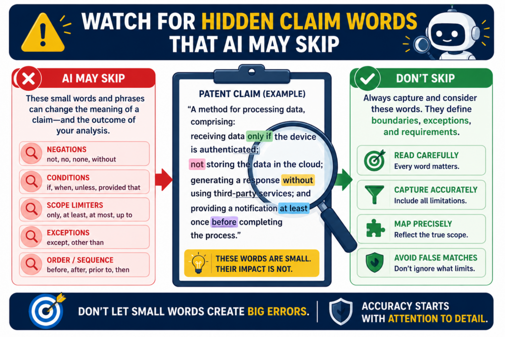
Words like “each,” “before,” “after,” “only,” “based on,” “in response to,” “without,” “automatically,” “periodically,” and “real-time” can change the meaning of a claim part. If the AI ignores these words, it may map the wrong product feature.
For example, a claim that requires sending an alert “in response to detecting a threshold event” is not proven by a source that merely shows alerts. The threshold event matters. The response link matters. The timing matters.
Small words often decide whether a row is supported
A strong claim chart should not only match the main feature. It should match the conditions around the feature. If the claim says the system ranks items based on two inputs, the chart should show both inputs.
If the claim says the system performs a step before another step, the chart should show the order. If the claim says the action is automatic, the chart should not rely on a manual user step unless the source supports automation.
This is where AI needs careful instruction. It should be told to flag every condition word in the claim before finding evidence. Then it should check whether the source supports each condition.
This simple move prevents many false matches. It also makes the chart easier for a human to review because the hidden requirements are no longer hidden.
A good row should prove the feature and the condition around it
The safest row connects both the action and the condition. If the claim requires “generating a report after receiving sensor data,” the row should not only show that reports exist.
It should show that sensor data is received and that the report is generated after that step.
If the claim requires “training a model using labeled examples,” the row should not only show a model.
It should show training and labeled examples. If the source shows only that the model exists, the row is partial at best.
This level of care may seem small, but it can change the whole value of the chart. A chart that respects small claim words is far more useful than one that only matches big concepts.
PowerPatent helps technical teams capture the exact details that matter, without forcing founders to become patent experts.
The software helps structure the work, and real patent attorneys help review it. See the process here: https://powerpatent.com/how-it-works
Conclusion
AI can make patent claim charts much faster, but speed only helps when the chart stays true to the proof. The safest path is simple: break each claim into small parts, use strong sources, keep evidence close, mark weak support, check every citation, and make sure a real human reviews the work before it matters.
Do not ask AI to guess. Ask it to show what is known, what is missing, and what needs review. That is how founders move fast without losing trust. PowerPatent helps make this easier with smart software and real attorney oversight: https://powerpatent.com/how-it-works