In an M&A deal, your patents may look strong on paper. You may have a clean patent list, smart claims, and a big market. But when the buyer starts due diligence, one question rises above the rest: “Do these patents actually cover what matters?”
Buyers want to know if the patents cover real business value
When a buyer looks at your patent portfolio, they are not only asking, “Do you have patents?” They are asking, “Do these patents protect the part of the company that makes money, blocks rivals, or gives this team an edge?”

That is the heart of M&A due diligence. A patent list is only the starting point. A claim chart helps turn that list into a clear business story.
It shows the buyer which patent claims match which product features, customer workflows, technical systems, or market uses.
A strong chart makes the buyer feel less blind. It gives them a clean way to see what the patents may protect.
It also helps them understand whether the deal includes something hard to copy, or whether the patents are too far away from the actual product to matter.
For a founder, this is a big moment. A buyer may love the team, the code, the revenue, and the customer base.
But if the patent story is weak, vague, or messy, the buyer may start to discount the value of the IP. That can affect price, terms, escrow, risk review, and even deal speed.
Buyers are trying to separate real protection from paper protection
A buyer may see ten patents and think, “Great, this company has IP.” But once legal and technical teams dig in, they may find that only two patents map to the product.
Or they may find that the strongest claims cover an old version of the system. Or they may find that the patents sound broad, but do not clearly cover what customers now use.
This is why claim charts matter so much. They help buyers see whether the patent claims are tied to the business as it exists today.
A buyer wants to see a chart that feels honest, clear, and grounded. The chart should not stretch the claim language just to make the patent look bigger. It should not use fancy words to hide weak links. It should show, in a simple way, how each claim part connects to real proof.
That proof can come from product screens, system diagrams, source code notes, model flow, API behavior, user steps, device behavior, lab tests, public product pages, technical docs, or customer use cases.
The point is not to flood the buyer with everything. The point is to make the match easy to follow.
A clean claim chart can make the buyer trust the whole IP story
Trust is one of the most valuable things you can build during due diligence. When the buyer sees a clear claim chart, they often feel that the seller understands its own IP. That matters because many startups do not.
A messy chart sends the opposite signal. It can make the buyer wonder whether the company filed patents without a clear plan.
It can make them worry that the claims were never compared to the real product. It can also create more work for the buyer’s counsel, which often means more questions, more delay, and more doubt.
A clean claim chart does not need to be flashy. It needs to be useful. It should help a smart buyer answer simple questions fast.
What does this claim cover? Where does that show up in the product? Why does it matter? What proof supports the match? What parts are strong? What parts need care?
If your team wants patents that are easier to explain when buyers start asking hard questions, PowerPatent can help you build from the start with smart software and real attorney oversight. You can see the process here: https://powerpatent.com/how-it-works
The best claim charts are built around the buyer’s real questions
A claim chart should not feel like a legal puzzle. It should feel like a guided tour of value.
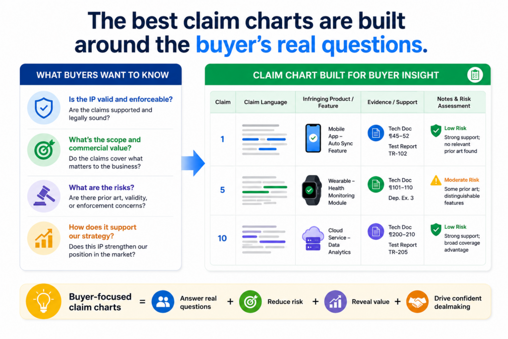
The buyer should be able to read it and quickly understand what the invention does, where it appears, and why it matters in the deal.
Many teams make the mistake of treating a claim chart like a form. They paste claim language on the left, add product notes on the right, and call it done. That may check a box, but it does not help much if the buyer still cannot see the business point.
The better path is to build the chart around the buyer’s real concerns. Buyers want to know whether the patents protect the main product. They want to know whether the claims cover features that drive revenue.
They want to know whether a rival would have a hard time copying the product without stepping close to the claims.
They also want to know whether the claims are easy to explain to a board, investor, partner, or future acquirer.
A buyer wants clarity before they want volume
In due diligence, more paper does not always help. Buyers often have limited time. They may be reviewing code, contracts, financials, security, privacy, employment records, customer terms, open source use, and patent files at the same time.
A claim chart that dumps too much into every row can slow everyone down. It may look complete, but it can bury the key point. A better chart is clear first and detailed second.
Each row should help the buyer move forward. The claim part should be easy to spot. The matching product feature should be described in plain words.
The proof should be specific enough to review. The notes should explain why the match matters without turning the row into a long essay.
This is especially true for deep tech startups. If the product involves AI models, chips, robotics, biotech tools, sensors, cloud systems, developer tools, or complex workflows, the chart should reduce confusion.
It should not make the invention feel harder than it already is.
The chart should tell the buyer what to look at and why it matters
A good claim chart works like a map. It does not only say, “Here is the product.” It says, “Look here. This is the part that lines up with the claim. This is the technical reason it matters. This is the business reason it matters.”
For example, a claim may cover a system that receives sensor data, filters the data, feeds it into a model, and triggers an action based on a confidence score.
A weak chart may simply say, “Product does this.” A stronger chart explains where the sensor data comes from, how the filter works in the product, where the model is used, what action is triggered, and why that flow matters to the customer.
That level of care helps buyers see that the patent is not floating above the company. It is tied to the engine of the product.
This also helps founders avoid a common trap. Many founders assume the buyer will “get it” because the invention is obvious to the team. But the buyer is not inside your daily build cycle.
The buyer may not know which feature took years to create, which model output drives the customer result, or which workflow makes the product hard to copy. The claim chart has to make that clear.
PowerPatent is built for this kind of founder reality. It helps technical teams turn hard inventions into clear patent work, with real attorney review so the output is not just fast, but thoughtful. Learn more here: https://powerpatent.com/how-it-works
Buyers want to see the claims mapped to the current product, not just the old idea
One of the most common problems in M&A due diligence is drift. The startup filed patents early. Then the product changed. The market shifted. The model improved. The system moved from a prototype to a real platform.
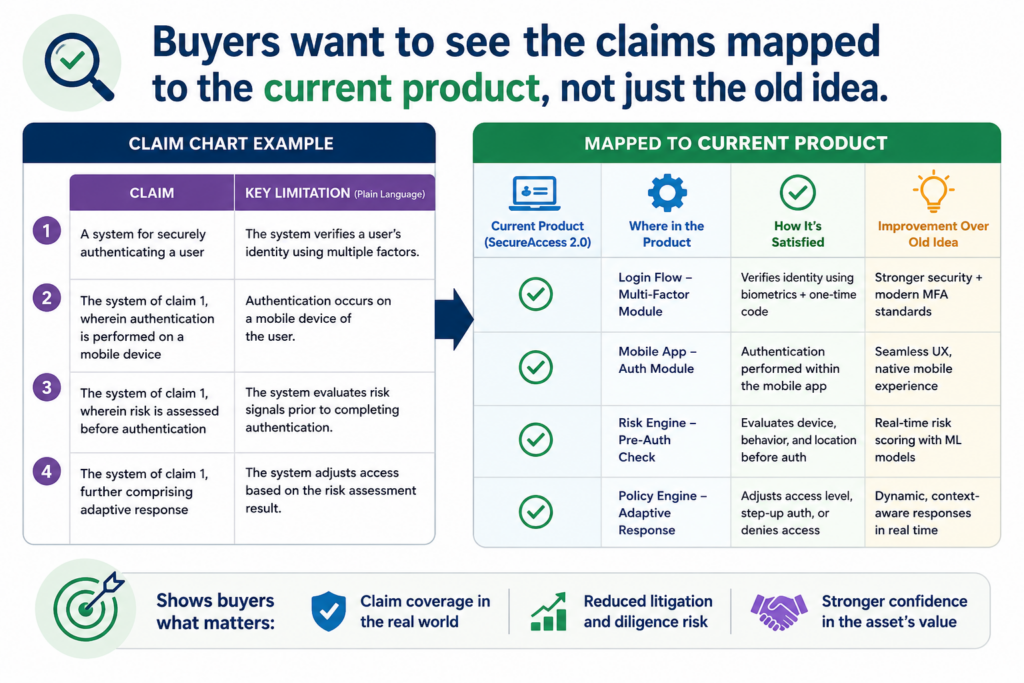
By the time a buyer enters the picture, the patent claims may still be useful, but nobody has checked how they map to the current product.
That gap can create stress. Buyers do not want to guess whether a claim still matters. They want to see the connection.
This is why claim charts should focus on the product as it exists now, while also noting future or planned uses when needed. If the patent only maps to a past version, the chart should not hide that.
If the patent maps to a current core feature, make that link easy to see. If the patent maps to a roadmap item that has not launched yet, say that clearly and explain the status.
Product evolution can make a strong patent look weak if the chart is not updated
Startups move fast. That is good for growth, but it can create IP confusion. A claim may have been drafted around a first system design, while the live product now uses a new flow.
The old system may still be inside the platform, but in a different form. Or the live product may include added steps that make the match stronger than before.
A stale claim chart can miss all of this. It may point to old screenshots, retired docs, or early feature names. That makes the buyer work harder. Worse, it can make the buyer think the patent no longer fits the business.
Updating the chart before diligence is one of the smartest moves a founder can make. It gives the team time to review the claims, compare them to the current product, and decide which patents should be placed front and center.
This review can also reveal gaps. Maybe the company needs a continuation, a new filing, or a better claim strategy for a new product line.
It is much better to find that before a buyer asks than after the buyer has already formed a weak view of the portfolio.
The current product map should use names the buyer can match to real materials
A claim chart should use product names, feature names, and system labels that match the company’s actual materials. If the chart says “adaptive ranking engine,” but the product docs call it “Smart Sort,” the buyer may wonder whether those are the same thing.
If the chart names a module that only engineers know, but the buyer has only seen customer-facing decks, the buyer may need extra help.
The best charts bridge that gap. They can use both names where helpful. For example, the chart may say, “Smart Sort, which is the customer-facing name for the adaptive ranking engine.” That small choice can prevent confusion.
The same rule applies to code, models, and architecture. A buyer does not need every private detail in the first pass, but they do need enough structure to understand the match.
Where the claim says the system “selects a response based on a score,” the chart should point to the product behavior, the relevant model or rule layer, and the result the user sees.
This is where the chart becomes more than a legal support file. It becomes a bridge between engineering, legal, product, and deal teams.
If your team is still building its patent story, it is better to create this bridge early. PowerPatent helps founders protect what they are building while keeping the process clear, fast, and tied to real technical value. See how it works here: https://powerpatent.com/how-it-works
Buyers want claim charts that show both strength and limits in a clear way
A strong claim chart does not try to make every patent look perfect. Buyers know that no patent is perfect.
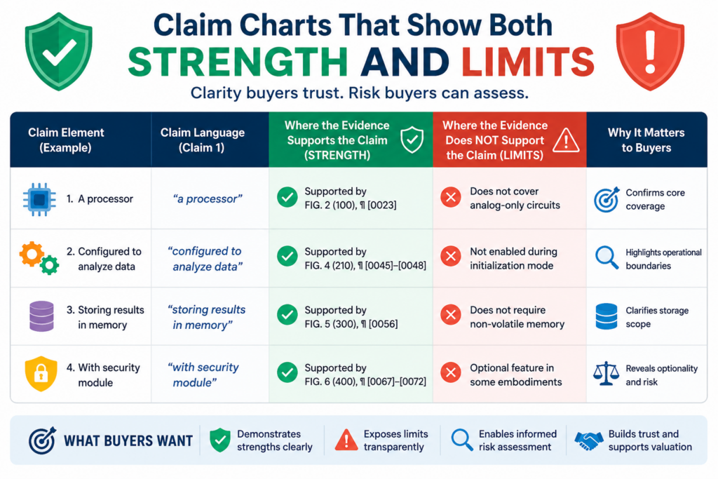
They expect some claims to be stronger than others. They expect some product matches to be clearer than others. What they want is a fair view that helps them judge risk.
This is where many sellers lose trust. They try to make every claim sound broad, every feature sound covered, and every gap sound small. That can backfire fast.
A buyer’s legal team will test the chart. Their technical team may compare it against product docs, code, demos, and public materials. If the chart feels stretched, the buyer may begin to doubt not just that chart, but the whole IP story.
The better move is to be clear. Show where the match is strong. Show where the proof is direct. Show where the match depends on a certain reading of the claim.
Show where a product feature changed over time. This does not make the company look weak. It makes the company look prepared.
A buyer does not need a sales pitch hidden inside a chart. They need a working file that helps them make a decision. The more honest the chart feels, the more useful it becomes.
Buyers care about confidence because they are buying future risk
In a deal, the buyer is not only buying what the company owns today. They are buying what may happen after closing.
They want to know whether the patents can support product plans, future licensing, partner talks, investor stories, and possible enforcement if a rival copies the technology.
That means they are looking for confidence. A claim chart can build that confidence by showing that the claims are not vague ideas.
They tie to real product steps. They tie to real systems. They tie to real technical choices that took skill, time, and money to build.
For example, a buyer may care deeply about a claim that covers how a model is trained, how data is cleaned, how a device chooses an action, or how a platform cuts compute cost.
If that part of the product is hard to replace, the patent may carry real value. But the chart has to make that value plain.
A weak chart may say that a claim maps to the “AI engine.” That phrase is too broad to help. A stronger chart explains what the engine does in simple steps, what input it uses, what output it gives, and how that output changes the product result.
It does not need to expose every secret at once. It does need to give the buyer a clear path to verify the match.
A chart that names weak spots early can protect deal trust later
There is a smart way to handle weaker parts of a claim chart. Do not hide them. Do not overstate them. Explain them with care.
Maybe a claim element maps to an optional feature. Maybe the current product does not use a certain step, but a customer deployment does.
Maybe the patent covers a backend flow, while the public product page only shows the front-end result. Maybe the evidence is in code comments, lab records, or internal docs that the buyer has not seen yet.
In each case, the chart should guide the buyer. It should say what evidence exists and where the buyer can confirm it during diligence. This reduces back-and-forth. It also shows that the seller has control over its own story.
This matters because M&A deals run on trust under pressure. Everyone is moving fast. People are tired. Questions pile up. A clear chart that admits limits can calm the room. A chart that hides hard points can create new problems at the worst time.
Founders often think IP value comes only from strong claims. That is only part of it. IP value also comes from how well the team can explain what it owns.
PowerPatent helps founders create clear, attorney-reviewed patent work from the start, so the story is easier to defend when buyers begin to ask hard questions. You can explore the process here: https://powerpatent.com/how-it-works
Buyers want the chart to connect the patent to the market, not just the product
A claim chart should not stop at showing that a product has a feature. In M&A, buyers also want to know why that feature matters in the market.
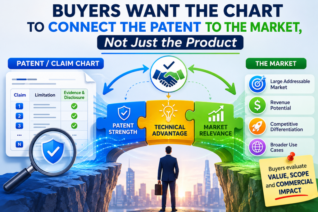
They want to understand whether the patent protects something customers care about, something rivals may want, or something that gives the company a real edge.
This does not mean the chart should become a market report. It should not drift away from the claim. But a strong chart gives enough business context to help the buyer see why the match matters.
A patent that maps to a small internal tool may still be useful. But a patent that maps to the core reason customers buy the product may matter much more.
A patent that covers a key workflow, a cost-saving method, a faster model process, a cleaner data path, or a safer device action may support the value of the whole deal.
The buyer wants to see that link. They want the chart to answer a simple question: “Why should we care that this claim maps to this feature?”
The strongest charts make business value easy to see without hype
Founders often live inside the product. They know what took years to build. They know which feature helped close the first big customer.
They know which model improvement made the product useful. They know which backend process cut costs enough to make the business work.
The buyer may not know any of that yet.
A claim chart can help by adding short, clear business notes where they matter. For example, it may explain that the mapped feature is part of the paid tier.
It may explain that the workflow is used in the largest customer deployments. It may explain that the system reduces setup time, improves accuracy, lowers cloud cost, or enables a result that older tools could not provide.
These notes should be simple and grounded. Avoid big claims like “revolutionary,” “game changing,” or “industry leading” unless you have hard proof and a reason to say it. Buyers hear those words all the time. They trust plain language more.
A good chart might say that the claimed method maps to the product’s real-time alert flow, which customers use to catch issues before they become costly.
That kind of statement is useful because it ties the patent to a customer result. It helps the buyer see that the patent is not just covering a background detail. It may be covering part of the value customers pay for.
A buyer wants to know whether rivals would need the same path
One of the biggest questions behind any patent review is whether a rival could avoid the claim while still copying the business value.
This is not always easy to answer, and the claim chart should not pretend that it can answer everything. But it can help the buyer think through the issue.
If the chart shows that the claim maps to a common and needed technical path, the patent may feel more important.
If the chart shows that the claim maps to a feature that can be removed with little harm, the patent may feel less central.
If the claim covers a deep system choice that makes the product work better, faster, or cheaper, the buyer may view it as a stronger asset.
This is where product and engineering context matters. A claim chart written only by someone far away from the product may miss the point. It may map words to features, but fail to explain why those features are hard to replace.
A better chart brings in the people who built the system. They can explain why the chosen approach matters, what problem it solved, and why a rival may face the same problem.
That does not mean the chart should become too technical. The best version is simple but not shallow. It gives the buyer enough detail to see the path from claim to product to market value.
This is also why patent work should not be treated as a last-minute legal task. When founders build a clear patent story early, they create better options later.
PowerPatent helps technical teams capture inventions in a way that is clear, fast, and backed by real attorney oversight. See how it works here: https://powerpatent.com/how-it-works
Buyers want proof that the seller owns the invention story from end to end
A claim chart can show that a patent maps to a product. But during M&A diligence, the buyer also wants to know whether the seller can support the full invention story.
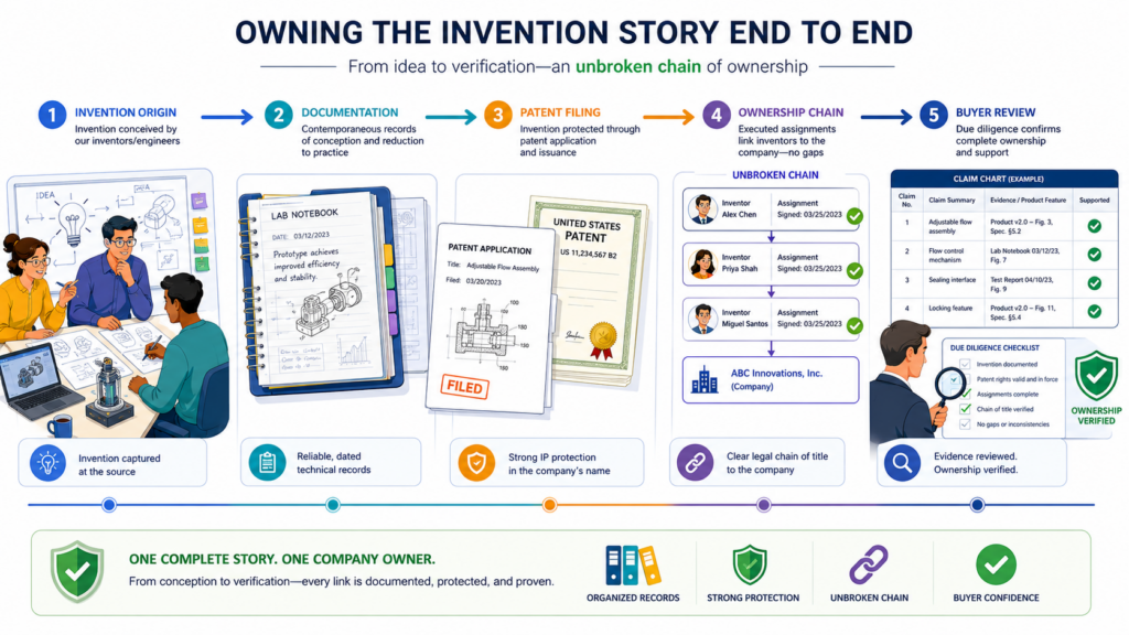
They want to see that the company knows who invented what, when the work happened, how the invention moved into the product, and whether the records are clean.
This matters because buyers do not want surprises after closing. They do not want a former contractor claiming rights. They do not want missing assignment papers.
They do not want unclear invention records. They do not want to find out that a key patent was filed around a feature built by someone who never signed the right documents.
A claim chart is not the only place to handle these issues, but it can reveal them. When a chart points to product docs, design files, code, model records, lab notes, and release history, it helps the buyer see that the patent story has roots.
It shows that the invention did not appear out of nowhere. It came from real work by the team.
Ownership proof can matter as much as technical proof
Many founders think the buyer only cares about whether the patent claim covers the product. That is important, but it is not enough. The buyer also cares whether the company actually owns the rights tied to that claim.
This can get tricky in startups. Early teams may include founders, advisors, outside dev shops, university labs, part-time engineers, open source contributors, research partners, or customer pilots. If records are loose, a buyer may ask hard questions.
A useful claim chart can help point to the right support files. It may connect a claim to an internal design note created by the engineering team.
It may refer to a release plan tied to employee work. It may show that the claimed feature grew from company-owned development, not from a random outside source.
The chart does not need to carry every ownership record inside it. That would make it too heavy. But it should not create a mystery. It should help the buyer know where the support lives and how the invention moved from idea to product.
This is especially helpful when the patent covers core technology. If the buyer is paying a premium because the company owns a key technical edge, the buyer will want comfort that the edge is truly owned by the company.
Clean records can help prevent price cuts and late deal friction
Late diligence problems are expensive. If a buyer finds missing records near closing, they may ask for extra promises, holdbacks, price changes, special indemnity terms, or closing conditions. Even when the issue can be fixed, the delay can hurt momentum.
A clear claim chart cannot solve every record problem, but it can help surface issues early. If the chart maps a claim to a feature built during a messy period, the company can review the records before the buyer asks.
If the chart depends on work from a contractor, the company can check the contract and assignment papers. If the chart points to a model trained on special data, the company can review data rights and customer terms.
This is how a claim chart becomes a deal tool, not just an IP tool. It helps the seller prepare. It helps the buyer review. It lowers confusion. It also helps both sides avoid wasting time on unclear claims and weak support.
For founders, the lesson is simple. Do not wait until an acquisition offer arrives to organize the invention story. Build it while you build the product. Keep the patent work tied to the real system.
Keep records clean. Keep claim charts current enough that your team can explain the value without panic.
PowerPatent was built for founders who want strong IP without slowing the company down. It brings smart software together with real attorney oversight, so your patent work is clearer, faster, and easier to use when the business moment arrives. Learn more here: https://powerpatent.com/how-it-works
Buyers want to see which patents matter most before they dig into the full portfolio
Not every patent in a portfolio carries the same weight. Buyers know this. A startup may have many filings, but only a few may protect the heart of the product.
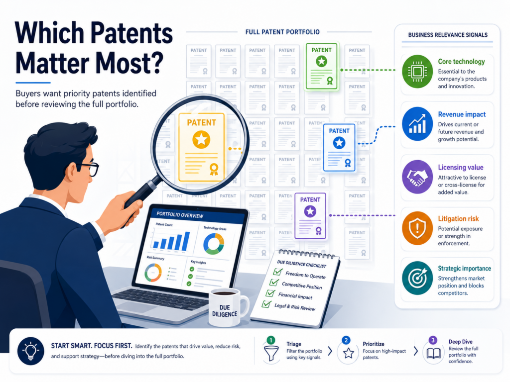
During M&A due diligence, the buyer wants to know which patents deserve the most attention and why.
A strong claim chart helps sort the portfolio. It shows which claims map to core features, which ones support future product plans, and which ones sit closer to the edge of the business.
This matters because buyers do not want to spend time guessing. They want a clear view of the IP that protects revenue, growth, product speed, or a hard technical lead.
For the seller, this is a chance to guide the review. When the buyer sees the most important patents first, the deal story becomes easier to follow. The buyer can connect the patents to what they already like about the company.
The strongest charts put the core value in plain sight
A buyer does not want a stack of patent files with no order. They want a clear path. The best claim charts make that path simple by showing which patents protect the main product and which claims are most tied to buyer value.
This does not mean weaker patents should be hidden. It means the seller should help the buyer see the difference between core assets and support assets.
A core patent may protect the main AI workflow, the key device action, the data process that improves results, or the system design that lowers cost.
A support patent may protect a smaller feature, a future use, or a side tool that still has value but is not the center of the deal.
This clarity saves time. It also helps the buyer explain the deal inside their own company. Many M&A teams must share findings with leaders who are not patent experts. A clean claim chart gives them simple language they can use.
A ranked patent story can stop the buyer from missing the best assets
Some great patents are easy to miss because the title sounds boring or the claims use dry words. A buyer may not see the value unless the chart shows how the claims connect to a product result.
For example, a patent title may sound like it only covers data handling.
But the claim chart may show that the data handling step is what makes the product fast enough for real-time use. That can change how the buyer views the asset.
This is why founders should not leave the buyer to discover the story alone. The seller should build claim charts that make the strongest assets obvious.
The chart should help the buyer see why a claim matters, where it appears, and how it supports the company’s edge.
PowerPatent helps founders build patent work around the real invention, not just around vague ideas. That makes it easier to show buyers what matters when the time comes.
You can see how PowerPatent works here: https://powerpatent.com/how-it-works
Buyers want charts that make technical proof easy to check
A claim chart is only useful if the buyer can test it. A chart that makes big claims but gives weak proof can create more doubt than trust.
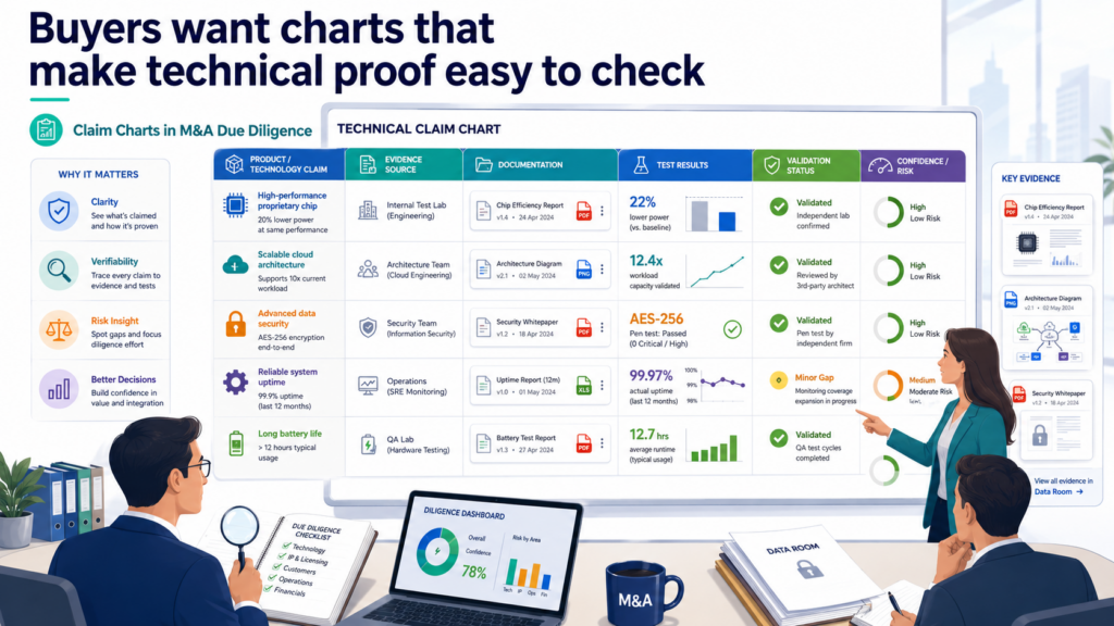
Buyers want to see evidence that is clear enough for legal, product, and engineering teams to review without getting lost.
This proof does not always need to reveal every secret at once. In early diligence, the seller may need to protect sensitive code, model details, customer data, or trade secrets.
But the chart should still point to the right proof. It should show where the buyer can verify each claim element under the right deal controls.
The goal is simple. The buyer should be able to say, “We understand what this claim requires, we see where the product does it, and we know what files support the match.”
The best evidence is specific, not broad
Weak proof often sounds broad. It may say the claim maps to the platform, the engine, the dashboard, or the model.
That does not help much. A buyer needs to know which part of the platform, which model step, which dashboard action, and which product behavior matches the claim.
Specific proof builds confidence. It may point to a product screen, a system diagram, a technical design doc, a model flow record, a test result, or a release note.
It may also point to code paths, API behavior, device logs, or data pipeline steps. The right proof depends on the invention.
For software and AI companies, this can be especially important. Many products look simple on the surface, but the protected invention may live deep inside the backend.
The claim chart should help the buyer move from the surface result to the hidden technical step that creates that result.
Technical proof should be simple enough for non-engineers to follow
A claim chart should not force every reader to become an engineer. The buyer’s technical team may inspect the details, but business and legal teams still need to understand the main point.
That means the chart should use simple words. It should explain what the product does before naming the deeper system. It should avoid internal shorthand unless the shorthand is defined.
It should use the same names found in product demos, technical decks, and diligence files when possible.
For example, instead of saying only that “Module X performs dynamic inference routing,” the chart can explain that the product sends each request to the model path most likely to give a fast and useful answer.
Then it can name the internal module. That makes the proof easier to understand without losing the technical point.
This is where strong patent preparation pays off. When your invention records, product notes, and patent claims are built with care, the claim chart becomes easier to create.
PowerPatent helps technical founders turn complex work into clear patent materials with smart tools and real attorney review. Learn more here: https://powerpatent.com/how-it-works
Buyers want to know whether the claims cover customer use, not only internal systems
In many deals, the buyer is not only buying code or patents. The buyer is buying customer adoption. So they want to know whether the patents cover what customers actually use and value.

A claim chart can help answer that question. It can show whether a patent maps to a feature customers touch, a workflow customers rely on, or a backend process that makes the customer result possible.
This is important because customer use often tells the buyer where the business value sits.
A claim that maps only to an internal admin tool may still have value. But a claim that maps to the paid product experience may carry a different level of weight.
If the protected feature helps close deals, keep users, improve results, or reduce customer pain, the buyer will want to see that connection.
Customer-facing proof can make the patent story more powerful
A buyer will often review sales decks, customer contracts, demos, product pages, support docs, and usage data. If the claim chart ties into those materials, the patent story becomes much easier to trust.
For example, the chart may show that a claimed workflow appears in the onboarding path used by enterprise customers.
It may show that a claimed alert process is part of the feature customers mention in renewals. It may show that a claimed data method supports a report that customers rely on each week.
This kind of mapping helps the buyer see that the patent does not just protect a hidden idea. It protects something linked to real customer value.
The chart should still stay careful. It should not claim that a patent covers all customer use unless that is well supported. But it should clearly show where customer use lines up with the claim.
Customer use can also show where future value may grow
Sometimes a patent maps to a feature that is still early but gaining traction. This can matter in M&A. Buyers often care about what the company can become, not only what it is today.
A claim chart can show this future path in a clear way. It can explain that the claim maps to a beta feature, a pilot deployment, a new customer workflow, or a product area planned for growth.
It should be honest about status, but it should not ignore future value.
This can help the buyer see why a patent may be more important after the acquisition. The buyer may have more distribution, more customers, more data, or more product lines.
If the patent supports a feature that can scale through the buyer’s platform, that may add strategic value.
Founders should think about this before diligence starts. The best claim charts do not only answer what the product does today. They also help buyers see why the protected work may matter tomorrow.
Buyers want claim charts that help them assess infringement risk and freedom to operate
Claim charts in M&A are not only used to show what the seller owns. They can also help buyers think about risk.

A buyer wants to know whether the company’s product may step on someone else’s patents. They also want to know whether the seller’s own patents could be useful if a rival copies the product.
These are different questions, but they both affect deal confidence. A buyer may love the product, but if the IP risk looks unclear, they may slow down. They may ask for deeper review.
They may change deal terms. They may also ask the seller to explain how the company has checked the space.
A strong claim chart does not replace a full legal review. But it can help frame the discussion. It gives the buyer a clean view of what the seller’s patents appear to cover and how those claims relate to the product.
Buyers want to understand the space around the product
A buyer may ask whether the seller has reviewed competitor patents, market patents, or older technical papers. They may want to know whether the company filed in a crowded field or in a space where it has a clearer lane.
This is where a claim chart can support a broader IP story. If the seller’s claims are tightly tied to the product and clearly different from older systems, the buyer can better understand why the patents may matter.
If the claims are vague or poorly mapped, the buyer may have less confidence.
For founders, this means the claim chart should not be treated as a last-minute document. It should reflect real understanding of the invention. What problem did the team solve?
What was different about the solution? Why does the claim capture that difference? How does the product use it?
When the chart answers these questions in plain words, it becomes easier for the buyer to assess value and risk.
A claim chart should not make promises it cannot support
This point is important. A claim chart should not say that a competitor infringes unless the team has strong support and proper legal review.
It should not say that the company has freedom to operate unless that review was actually done. Overstating these points can hurt trust.
Instead, the chart should stay focused. It should show how the seller’s own claims map to the seller’s own products or known evidence. If competitor mapping is included, it should be handled with care and attorney guidance.
The buyer will respect a careful chart more than an aggressive one. In M&A, bold claims can create fear if they are not backed by proof. Clear claims, backed by evidence, create confidence.
PowerPatent helps founders build patent work with the right level of clarity and review, so the company is not forced to invent its IP story under deal pressure. See how PowerPatent supports founders here: https://powerpatent.com/how-it-works
Buyers want the chart to be easy to use in board, investor, and post-close planning
A buyer’s diligence team is not the only audience for a claim chart. The chart may also help leaders, board members, finance teams, product teams, and post-close integration teams understand what the company owns.

This matters because M&A is not just a legal event. It is a business decision. The buyer wants to know whether the patents support the reason they are buying the company. They also want to know how those patents can be used after closing.
A strong chart can help the buyer plan. It can show which patents support current products, which ones may support future products, and which ones may help in partner talks or market defense. It can also help the buyer decide where to keep investing after the deal closes.
The best charts translate patent value into business action
A buyer may use the claim chart to decide which product lines deserve more funding. They may use it to brief sales teams, support partner talks, or guide future patent filings.
They may use it to decide whether to file continuations, expand coverage, or build around certain protected features.
This is why the chart should be clear enough to survive outside the legal room. It should not be so dense that only a patent lawyer can read it. It should help a product leader understand what is protected.
It should help an executive see why the asset matters. It should help an engineering lead know which technical paths connect to IP value.
When a chart does this well, it becomes more than evidence. It becomes a tool for action.
For the seller, this can support a stronger deal story. The buyer is not just seeing patents as files. They are seeing patents as assets that can be used after closing.
Post-close value starts with a chart that people can actually understand
After the deal closes, many patent files get buried. This happens when the buyer does not understand what the patents cover or how they tie to the product. A clear claim chart can prevent that.
It gives the buyer a head start. It shows what to protect, what to watch, and what to build on. It helps the buyer keep the invention story alive after the founders move into new roles or after teams merge.
This is a major reason founders should care about claim charts before the deal. A good chart can help protect deal value today and support IP value tomorrow.
The deeper lesson is simple. Buyers want proof they can use. They want charts that show real product coverage, honest limits, clear evidence, customer value, and future use.
When you give them that, you make the IP review easier and the deal story stronger.
PowerPatent helps founders create patent work that is easier to explain, easier to review, and easier to trust.
It combines smart software with real attorney oversight, so your strongest ideas do not get lost in messy documents or slow legal back-and-forth. Explore how it works here: https://powerpatent.com/how-it-works
Buyers want claim charts that are ready before the data room opens
A claim chart should not be built in panic after the buyer asks for it. By that point, the deal clock is already moving. The buyer has a timeline. Their counsel has a checklist.

Their technical team has questions. If the seller starts building claim charts only after diligence begins, the process can become rushed, messy, and stressful.
The better move is to prepare early. A founder does not need to wait for an acquisition offer to understand how patents map to the product. In fact, the best time to build a first claim chart is when the product is still fresh in the team’s mind.
The engineers know why certain choices were made. Product leaders know which features matter most. Founders know which parts of the system helped win customers.
That knowledge gets harder to collect later. People leave. feature names change. code moves. systems get rebuilt.
Old docs get buried. A buyer will still ask for proof, but the company may have to dig through years of history to find it.
Early claim charts help the team avoid late deal pressure
When a startup builds claim charts early, it creates a clean base for future diligence. The chart can be updated as the product changes.
It can show which patents still map to the live product and which filings may need more work. It can also help the company decide where to file next.
This is useful even if no deal is planned. Claim charts can help a founder see whether the patent portfolio is close to the business or drifting away from it. That is a powerful check.
If the strongest patents cover old features while the company is now selling a new system, the team can act before a buyer notices the gap.
Early work also helps the company avoid weak rush decisions. When teams move too fast, they may create charts that are vague, overbroad, or hard to defend.
A buyer can sense that. A clean chart prepared ahead of time feels calm. It shows that the company has been careful with its IP, not just reactive.
Preparation lets the seller control the first impression
First impressions matter in M&A. When the buyer enters the data room and sees clean patent files, clear ownership records, and useful claim charts, they feel that the seller is organized.
That does not mean every issue disappears. It means the buyer starts from a place of trust instead of doubt.
A prepared chart also helps the seller guide the story. The company can show the most important patents first. It can explain how the claims map to current products.
It can show which proof supports each match. It can do all this before the buyer forms its own view from scattered files.
That kind of control is valuable. It keeps the IP story from being shaped only by old filings, rough notes, or isolated questions from counsel. It gives the seller a chance to present the portfolio as a real business asset.
PowerPatent helps founders build this kind of clarity before the pressure hits. With smart software and real attorney oversight, teams can turn complex inventions into patent work that is easier to explain when the stakes rise. See how it works here: https://powerpatent.com/how-it-works
Buyers want the chart to show how hard the invention was to build
A buyer wants to know whether the protected technology is easy to copy or hard to match. This is not always clear from the patent alone. Patent claims can sound dry.
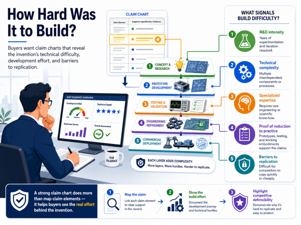
Product pages can make hard work look simple. A demo may show the result, but not the years of trial, testing, and fixes behind it.
A claim chart can help reveal the effort. It can show that a claimed feature is not just a simple button or common workflow.
It can show that the feature depends on a special data path, model behavior, device setup, control process, or system design that took real skill to create.
This matters because buyers pay for hard-to-copy value. If a competitor can rebuild the same thing in a week, the patent may not move the deal much.
But if the claim maps to a deep technical choice that took time, data, testing, and insight, the buyer may see stronger value.
The chart should explain the hard part without making it hard to read
The goal is not to turn the claim chart into a long engineering paper. The goal is to help the buyer see the part of the work that matters. A simple explanation can do a lot.
For example, a chart might explain that the claimed step reduces errors when input data is noisy. It might explain that the system chooses between model outputs without slowing the user experience.
It might explain that the device acts safely even when sensor data is incomplete. These are not empty details. They show why the invention may have real value.
Buyers want this kind of context because it helps them understand the moat. The moat is not just the patent.
It is the patent plus the product plus the know-how behind the product. A good claim chart helps those pieces fit together in the buyer’s mind.
The best charts show the problem, the fix, and the product result
A useful claim chart does more than match words. It shows why the claimed step exists. It explains the problem the team faced, the way the invention addresses that problem, and the result inside the product.
This is especially important for technical buyers. They do not want vague language. They want to know what the system actually does.
At the same time, senior deal teams may not want deep code detail right away. The chart needs to serve both groups.
The best way to do that is to write in plain words. State the problem. Tie the claim to the feature. Point to proof. Explain the user or system benefit. That simple path helps the buyer understand why the patent is not just paperwork.
Founders often undersell their hard work because they are used to it. A claim chart helps turn that hidden effort into a deal asset.
PowerPatent helps teams capture that effort early, so the patent story reflects the real invention instead of a thin summary. Learn more here: https://powerpatent.com/how-it-works
Buyers want charts that do not depend on one person’s memory
In many startups, the invention story lives in the heads of a few people. The founder knows why the first version failed. The lead engineer knows why the new model flow works.
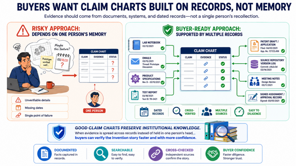
The product lead knows which feature changed customer adoption. That knowledge is valuable, but it is fragile.
During M&A, buyers do not want the patent story to depend only on memory. They want records. They want documents. They want charts that point to proof beyond someone saying, “Yes, we built that.”
This is not because buyers distrust founders by default. It is because deals require proof that can survive review.
The buyer may need to explain the portfolio to legal teams, finance teams, product leaders, boards, insurers, and future partners. A memory-based story is not enough.
A strong claim chart turns team knowledge into durable proof
The seller should use the claim chart to capture what the team knows in a structured way. The chart should not rely on vague statements. It should point to materials that show the product match.
Those materials can include product specs, release notes, design records, screenshots, system diagrams, test logs, model cards, architecture files, customer-facing docs, or controlled code references.
The right support depends on the invention, but the principle is the same. The buyer should be able to verify the match without chasing every team member.
This also protects the seller. If a key engineer leaves during diligence, the chart still helps explain the patent.
If a founder is tied up in deal meetings, the buyer still has a clear reference. If the buyer asks the same question twice, the chart can reduce confusion.
Durable records make the IP story easier to defend over time
A claim chart built with records has a longer life. It can support the deal today and help the buyer after closing.
It can guide future filings. It can help new team members understand what was protected. It can also help the company avoid losing track of important invention details.
This matters because patents often outlive product versions. The product may change many times, but the protected idea may still matter. A chart that links claims to real records helps future teams understand that history.
For founders, this is a strong reason to document inventions as they happen. Do not wait until everyone is trying to remember what happened two years ago.
Capture the technical choices while they are clear. Keep product and patent work connected. Make the invention story easy to hand off.
PowerPatent is built for this exact need. It helps founders and engineers move from raw technical work to clearer patent materials, with attorney oversight to keep the process grounded.
Explore how it works here: https://powerpatent.com/how-it-works
Buyers want claim charts that make pending applications useful too
Issued patents often get the most attention in M&A, but pending patent applications can also matter.
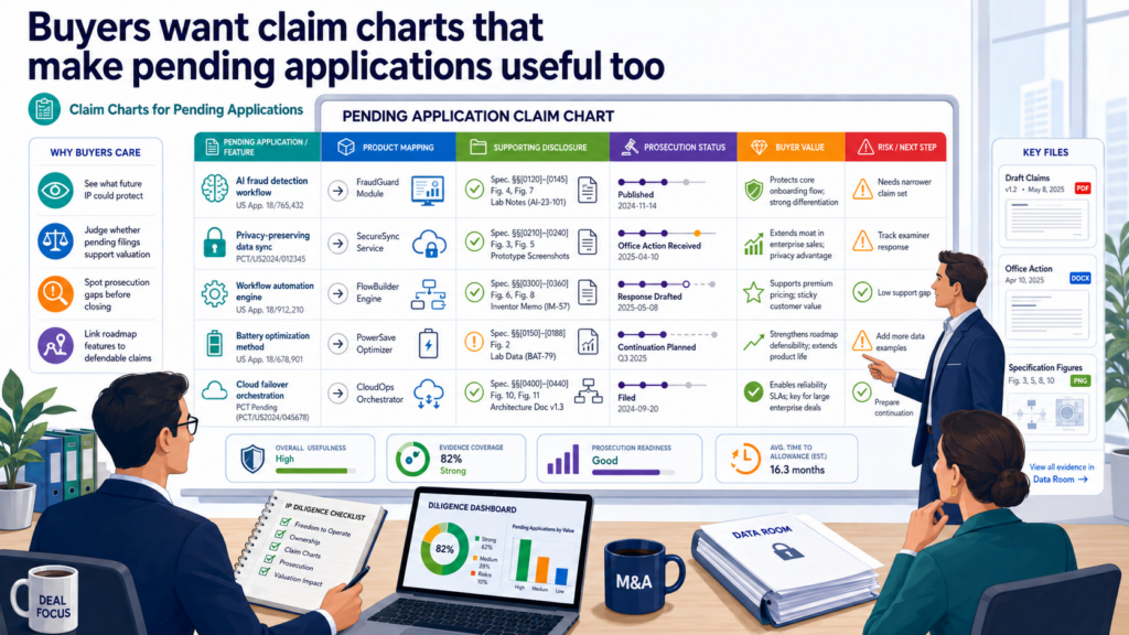
A pending application may give the buyer future options. It may allow the buyer to pursue claims that better match new products, new markets, or new competitor behavior.
A claim chart can help the buyer understand that future value. It can show how pending claims map to the current product.
It can also show where the application may support future claim changes, when handled by patent counsel. This can make a pending case feel less like an unfinished file and more like a live asset.
This is important for fast-moving startups. Many of the most valuable ideas may still be in pending applications because the product moved faster than the patent office.
A buyer will want to know what those applications may become.
Pending claims should be shown with care and clear status
A chart for a pending application should not make it sound like the company already owns issued rights. Buyers know the difference. If the chart blurs that line, it can hurt trust.
The better approach is to be plain. Show that the application is pending. Show what the current claims say. Show how those claims map to the product.
When useful, note that the application may offer room for future claim strategy, subject to attorney review and patent office rules.
This kind of clarity helps the buyer judge option value. They can see whether the pending case is tied to an important product area. They can also see whether it may support future protection after closing.
Pending applications can be powerful when they track the product roadmap
A pending application is often more valuable when it lines up with where the product is going.
If the buyer plans to expand the product, enter new markets, or combine the startup’s technology with its own platform, pending applications may matter a lot.
The claim chart can help show this. It can explain that a pending claim maps to a current feature, a pilot feature, or a planned workflow.
It can also connect the application to the technical path the buyer may want to keep building.
This is where sellers should be honest but strategic. Do not oversell future coverage. Do not promise outcomes.
But do show why the pending file is worth attention. A buyer may value the ability to continue building a stronger patent position after the deal.
PowerPatent helps founders avoid treating patent applications like static documents. With the right process, filings can stay closer to the product and support future deal value. See how PowerPatent helps here: https://powerpatent.com/how-it-works
Buyers want claim charts that are simple enough to move the deal forward
The best claim chart is not the longest one. It is the one that helps the buyer make progress. In M&A, every document should reduce friction.
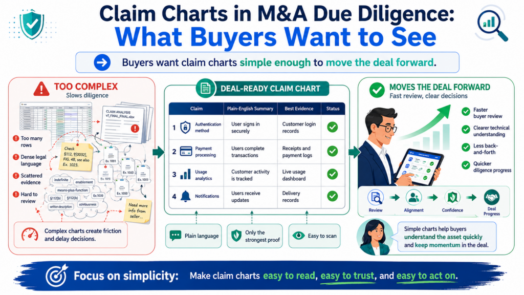
A claim chart should answer questions, not create more of them.
This does not mean the chart should be shallow. It means the chart should be well designed. It should use plain language.
It should avoid clutter. It should make the claim, product match, evidence, and business meaning easy to follow.
A buyer should not need to decode the chart. They should be able to read it and understand the main point. Then, when they need more detail, they should know exactly where to look.
Simple charts help every team work faster
Patent counsel may read the chart for claim support. Engineers may read it for technical accuracy. Product leaders may read it for feature mapping. Deal leads may read it for value. Executives may read it for risk and strategy.
A strong chart respects all those readers. It gives enough detail for serious review, but it does not drown people in terms they do not need. It explains technical points in normal words before adding deeper references.
This is one of the most practical ways to keep diligence moving. When the chart is clear, the buyer asks better questions.
When the chart is confusing, the buyer asks basic questions again and again. That slows the deal and creates avoidable stress.
Clarity can become leverage when the buyer is comparing options
Buyers often compare many deals, technologies, teams, and portfolios. A seller with a clear IP story can stand out.
That does not mean the buyer will pay more only because the chart looks nice. It means the buyer can understand the value faster and with less doubt.
In a competitive deal process, that matters. A buyer may feel more comfortable moving forward when the patents are easy to review. They may trust the team more when the evidence is organized.
They may see stronger value when the chart ties claims to product, customer use, technical effort, and future plans.
That is the real purpose of a claim chart in M&A. It is not just a legal table. It is a tool for trust, speed, and value.
Founders who want this kind of readiness should not wait until diligence starts. Build the patent story while you build the company. Keep the claims close to the product. Keep records clean.
Make proof easy to find. PowerPatent helps founders do that with smart software and real attorney oversight, so patents become less of a headache and more of a business asset. Learn how it works here: https://powerpatent.com/how-it-works
Buyers want the chart to show why the claims are hard to design around
A buyer does not only ask whether a patent covers the seller’s product. They also ask whether a smart rival could make a small change and avoid the claim.
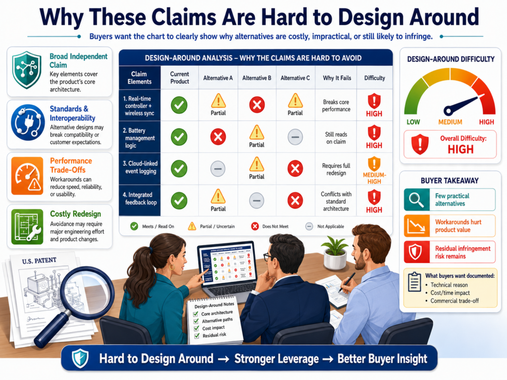
This is one of the most important questions in M&A diligence because it speaks directly to the value of the patent.
A patent may look broad at first glance, but if a competitor can avoid it with one easy change, the buyer may see less value.
On the other hand, if the claim maps to a path that competitors are likely to need, the buyer may see stronger value. The claim chart should help the buyer understand that difference.
A design-around story must be clear, not dramatic
A seller should never treat the claim chart like a weaponized sales deck. Buyers do not want bold talk.
They want a clear view of the technical path. If the claimed feature is central to how the product solves the problem, the chart should explain that in simple terms.
For example, the chart may show that the claim covers how the system cleans messy input data before a model acts on it.
If that cleaning step is what makes the product reliable, then a rival may have trouble removing it without hurting performance. That is the kind of point buyers care about.
The chart should not say a design-around is impossible. That is usually too strong and too risky. It should explain why the claimed path may be difficult to avoid while keeping the same product result.
A useful chart helps the buyer see the cost of copying
Copying is not always about copying code. A rival may copy the customer result, the workflow, the model behavior, the device action, or the business method behind the product.
The buyer wants to know whether the patent makes that path more costly.
A strong claim chart can show that the protected step is not a side detail. It can show that the step affects speed, accuracy, safety, cost, or user trust.
When a rival would need to reach the same result, and the claimed path is one of the cleanest ways to get there, the buyer may view the patent as more useful.
This is where founders should bring real product insight into the chart. Legal language alone will not show why a design-around is hard.
The team that built the product knows what failed, what worked, and what tradeoffs mattered. That knowledge can turn a plain chart into a powerful diligence tool.
PowerPatent helps technical teams capture those real invention details while they are fresh.
That makes it easier to build patents and support materials that buyers can understand later. See how it works here: https://powerpatent.com/how-it-works
Buyers want claim charts that make the data room feel organized and calm
The data room can either build trust or create stress. When a buyer opens the patent folder, they want to see order.
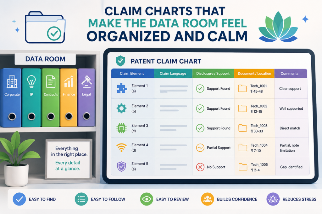
They want to know what each file is, why it matters, and where to begin. A claim chart can serve as the guide that keeps the buyer from getting lost.
This is especially important when a company has many patent filings, versions, office actions, invention records, product files, and technical exhibits.
Without a clear path, the buyer may have to piece together the story alone. That can lead to wrong guesses and extra questions.
The chart should connect to the rest of the diligence materials
A claim chart should not live in isolation. It should match the patent list, product docs, invention records, and proof files in the data room. If the chart points to evidence, that evidence should be easy to find.
If the chart names a feature, the same name should appear in the product materials or be clearly explained.
This may sound basic, but it is often where sellers stumble. A buyer sees one name in the chart, another name in the product demo, and a third name in the code notes.
Now the buyer has to ask whether those names mean the same thing. That slows the review.
The best data rooms remove that friction. They make the buyer feel that the seller has done the hard work of connecting the dots.
Clean organization helps the buyer ask better questions
When the chart and data room are organized, the buyer can move past basic confusion and ask more useful questions.
Instead of asking, “Where is this feature?” they can ask, “How often do customers use this feature?” Instead of asking, “Does this claim map to the product?” they can ask, “How important is this claimed workflow to future growth?”
That shift matters. Basic questions slow the deal. Better questions help the buyer understand value. A good claim chart can move the conversation from cleanup to strategy.
For founders, this means the chart should be written with the data room in mind. It should guide the buyer to the right support without overloading them. It should make the IP folder feel like a well-built product, not a file dump.
PowerPatent gives founders a better way to turn inventions into clear patent work before the deal pressure starts.
Smart software helps keep the process fast, while real attorney oversight helps keep it grounded. Learn more here: https://powerpatent.com/how-it-works
Buyers want the chart to support the price story without sounding like a pitch
In an acquisition, price is shaped by trust, growth, risk, timing, and leverage. Patents can affect that story, but only when the buyer understands what the patents protect.
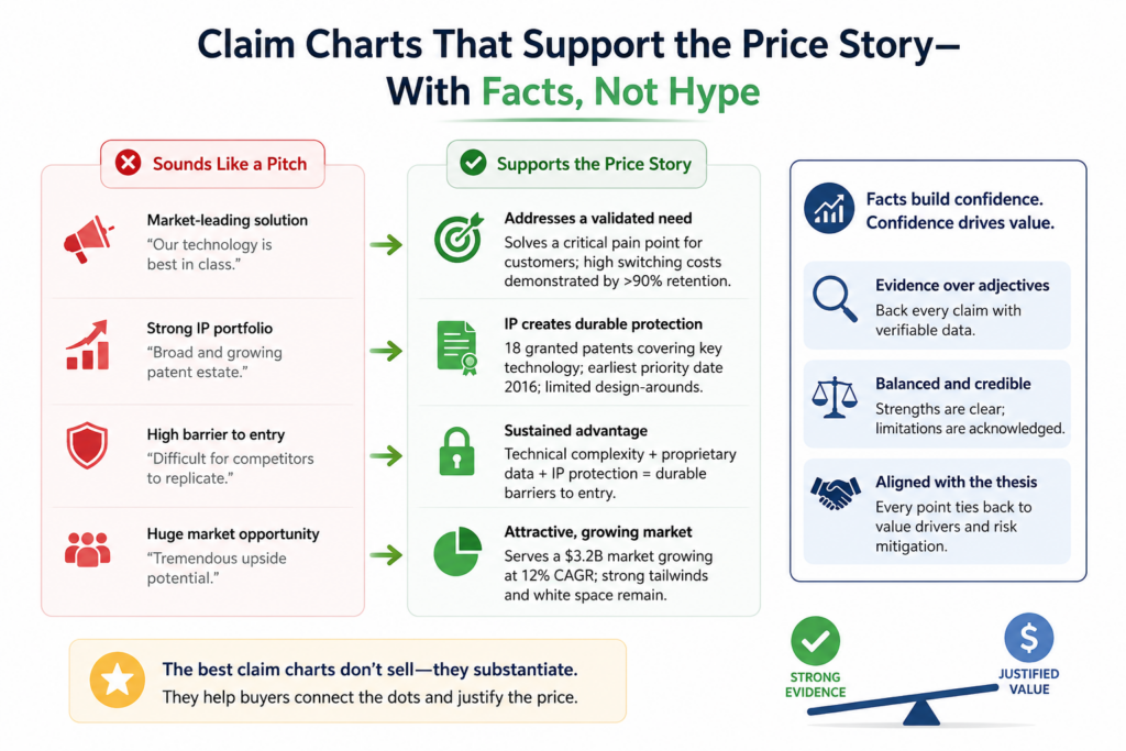
A claim chart helps make the price story more solid by showing how the IP connects to the company’s real value.
This does not mean the claim chart should argue for a higher price in loud terms. It should not sound like marketing copy. The chart should simply make the value easier to see.
When buyers can see that key claims map to core product features, customer value, and future plans, they have more reason to treat the IP as meaningful.
A useful chart turns hidden value into visible value
Many technical startups have value that is hard to see from the outside. The product may look simple because the team worked hard to make it feel simple.
The hard part may live behind the screen, inside the model, the system design, the data flow, or the device control layer.
A claim chart can bring that hidden value forward. It can show that the patent protects the part of the product that makes the simple user experience possible.
That can be powerful in diligence because buyers often need help understanding why a feature is special.
The chart should keep the language sober and clear. It can explain that a mapped feature supports faster onboarding, lower compute cost, better output quality, safer device behavior, or stronger customer outcomes.
Those points help the buyer connect IP to business value without feeling like they are being sold too hard.
The strongest price support comes from proof, not adjectives
Words like “key,” “core,” and “strategic” are only useful when the chart backs them up. If a feature is core, the chart should show why.
It may connect the claim to the main product flow, paid usage, customer demand, technical performance, or future expansion.
This is how a claim chart supports valuation. It does not shout. It proves. It helps the buyer see that the patents protect parts of the company that matter to revenue, growth, or defense.
Founders should remember that buyers discount what they cannot understand.
If the patent story is hard to follow, the buyer may leave value on the table or push for safer terms. If the story is clear, the seller has a better chance to protect the value it has built.
PowerPatent helps founders create patent work that is easier to explain when business moments get serious.
It helps turn technical depth into clear, attorney-reviewed protection. See the process here: https://powerpatent.com/how-it-works
Buyers want charts that show the difference between product coverage and competitor coverage
There are two kinds of claim charts that often appear in M&A. One maps the seller’s patents to the seller’s own product.
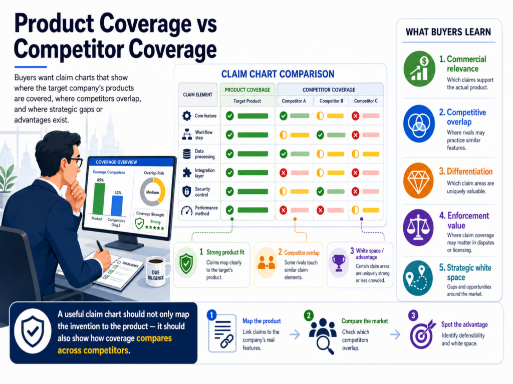
Another may map patents to a competitor’s product or public materials. Buyers care about both, but they are not the same.
A product coverage chart helps the buyer understand what the company owns and how it ties to the business. A competitor coverage chart may help the buyer understand market leverage. Mixing these two without care can create confusion.
The seller should keep the purpose of each chart clear
A buyer wants to know what question the chart is answering. If the chart is about the seller’s product, it should focus on the seller’s own systems, features, records, and customer use.
If the chart discusses competitors, it should be labeled and handled carefully with legal review.
This matters because competitor mapping can be sensitive. It may involve public product pages, demos, technical papers, app behavior, or other outside evidence.
A careless chart can overstate what is known. A careful chart shows what evidence supports each point and what remains uncertain.
For most sellers, the first priority is a strong product coverage chart. That is the base. If the buyer cannot understand how the patents map to the seller’s own product, competitor charts will not fix the problem.
Clear separation helps buyers judge value and risk fairly
When the charts are separated, the buyer can review each one in the right frame. Product coverage supports ownership, product value, and post-close planning.
Competitor coverage may support market defense or future enforcement thinking, but it often needs deeper review.
This separation also protects trust. The buyer will see that the seller is not trying to blur lines or make claims stronger than the proof allows. That matters because aggressive IP claims can create concern if they are not carefully supported.
A thoughtful seller keeps the story clean. It shows what the patents cover in the product. It shows where there may be broader market relevance.
It avoids making promises that should only be made after deeper legal review.
PowerPatent helps founders build clear patent materials around real inventions, so they can avoid vague or risky IP claims later. Learn how PowerPatent supports startup teams here: https://powerpatent.com/how-it-works
Conclusion
Claim charts can make or break the IP part of an M&A deal. Buyers want proof that patents cover real products, real customer value, and real future plans. They want clear links, honest limits, strong records, and simple evidence they can check fast. A good chart builds trust because it shows the company knows what it owns and why it matters.
For founders, the best time to prepare is before a buyer asks. PowerPatent helps teams turn technical inventions into clear, attorney-reviewed patent work that is easier to explain when deals get serious: https://powerpatent.com/how-it-works